Mimicking the physical world's graphic objects, environments, and experiences in mobile or website apps is always a vital design goal that UI/UX designers try to achieve. This exploration process led designers to discover the VR and AR design trend, as well as another new and shining design trend drawn from both flat and skeuomorphism design - "Neumorphic design".
This new design trend has a soft and plastic look, giving your website and mobile app a completely different aesthetic touch.
But, what is neumorphic design? How can you apply it to your UI/UX design? What should you notice when you're using neumorphim? Let's find all the answers in this article. The best examples and free UI kits are also included to help you incorporate neumorphism into UI/UX projects. Also, try to create a neumorphic design with an online prototyping tool while reading this.
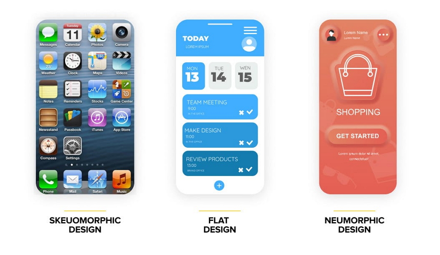
Neumorphic design, also known as "neumorphism" or "soft UI", is a minimal visual design style that uses monochromatic colors, subtle shadows and low contrasts to showcase buttons, switches, cards, progress bars and other elements from the background, creating a really soft and plastic-like look, with layers.
Neumorphic design makes people feel that components just come within the background, not being layered or overlapped on the background. They all are taken as a whole visually.
It provides a new way to imitate the real world in the website and mobile interface design, giving the feeling that all interface components are generated from or just within the background, rather than a part being layered or overlapped on the background as the flat design or the other design style does.
Neumorphic design is widely used in website and mobile projects for its soft aesthetic visuals. It is a new design trend drawn from flat design and skeuomorphism, but also different from these two design styles:
Every design trend has its own benefits and drawbacks, and so does neumorphic design. Before you decide to use this design trend, you may also first learn its pros and cons to see whether or not it is a right fit for your projects.
It gives your interface a fresh look and feel
Neumprphic UI design presents its components such as cards and buttons in a completely new way, making it easy to stand out from others. That's why it quickly gained a lot of attention and stirred up a design trend on Dribbble, Behance, and Instagram since it was first introduced. This is the in-trend style and will make your project stand out from the crowd.
It balances realism and minimalism perfectly
Neumorphic design widely uses shadows, colors and lights, starting a new simple design trend and helping show off design hierarchies in a natural way. The perfect balance between realism and minimalism makes it a perfect choice for designers to create a different web or mobile app design to promote their digital products.
It makes it easy to stay consistent and coherent
To create a coherent experience for users, designers always need to use the same shadow, color and light contrast to "neumorph" their interface. This helps designers stay consistent and accelerate their design process, no matter how many design screens they need to build and how many times they need to test and iterate their projects.
It may come with accessibility problems
Subtle colors and contrast make it a little hard for users to distinguish an element from the background and confirm whether an interface function works or not, causing bad accessibility problems.
Like a neumorphic CTA button, because of the very small difference between colors and contrast, buttons themselves might not be so noticeable. Even when users press on a button to check more product details or place an order, the "Pressed" button status may also be not so distinguishable from the other button state. All these designs can cause user loss problems.
Neumorphism makes it hard to stand out a CTA button, but you can use a different button color or a stronger margin contrast to resolve that problem.
It may take some time to adjust shadows and colors
To create an accessible neumorphic interface design, you may have to keep trying and testing over and over again to get the best color and shadow combinations. But this can be troublesome and time-consuming.
It may be a bit troublesome for developers to implement
To implement a neumorphic website and app, developers may need to update their CSS style codes and frameworks, and then start coding. This can take time and can be a hassle.
So if you want to apply neumorphism into your project, there can be drawbacks but if you take time to find a solution, the benefits may outweigh the cons.
To create the best neumorphic design, you need to select the right color palettes and then, visualize your designs with a prototyping tool like Mockplus to fully adjust and test your color, shadow and color contrast. The design accessibility and usability should also be evaluated in full in advance.
Mockplus, as an all-in-one online prototyping tool, offers everything you need to present and test your neumorphic website or mobile apps alone or with your team in one place, down to the super small details.
With this tool, you can not only enjoy a huge library of pre-made icons, components and templates to visualize your interface designs in minutes, you can also freely adjust the colors and shadows as you need. A color picker can even accelerate the adjusting process.
To avoid any potential accessibility and usability problems, you can share your completed project with your team members, clients and even stakeholders to test it all together and leave feedback directly on the design page.
Now, let's look at 20 of the best neumorphic design examples:
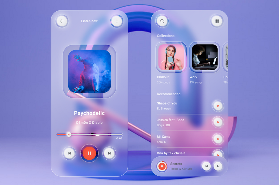
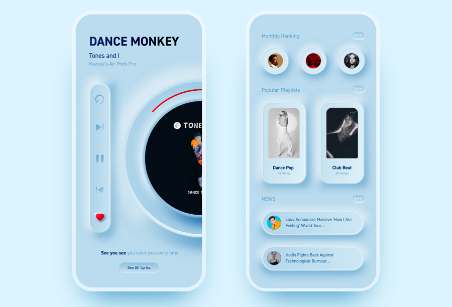
This music player creatively mixes the neumorphic and glassmorphic design styles, creating a new and unique visual experience for users. The designer has also added a special border to make all the buttons stand out, effectively resolving the less noticeable button issue mentioned above.
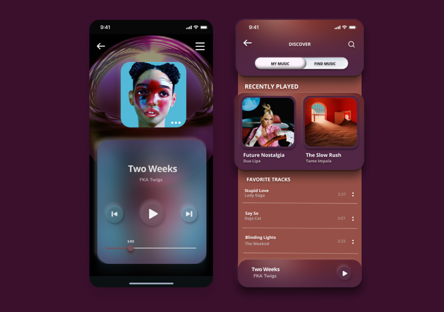 This app UI example wisely combines the neumorphic and flat design, giving users a completely different experience there. This design example uses a much deeper shadow to highlight all interface buttons and card designs.
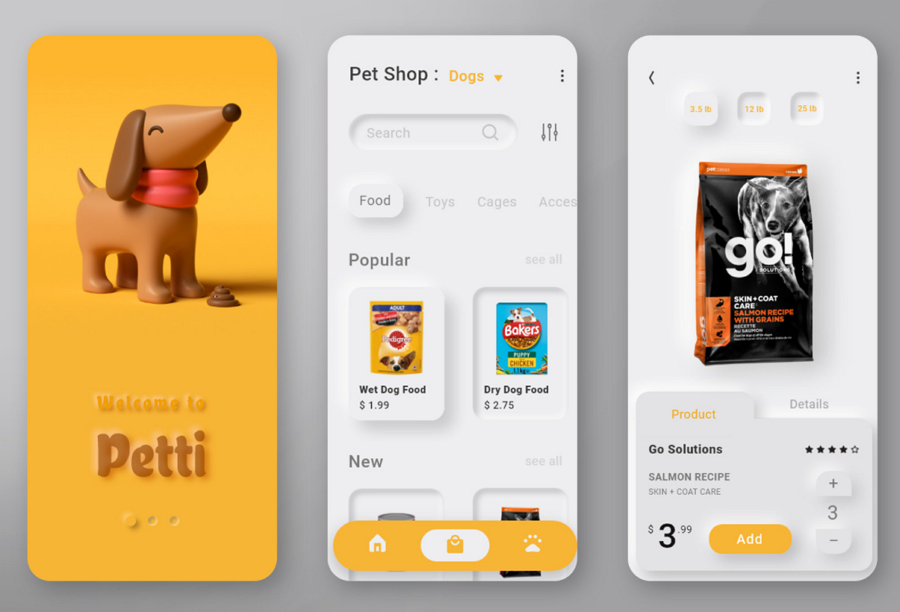
This pet shop app uses "intruded" and "extruded" designs to allow users to easily distinguish the "pressed" and "unpressed" buttons, effectively reducing the potential accessibility problems. A bright yellow color successfully helps the navigation and CTA buttons stand out. The 3D dog illustration is downloadable, and also gives this UI set a unique visual appeal.
Never miss out on this app’s UI if you are seeking inspiration to design a pet or pet shop app.
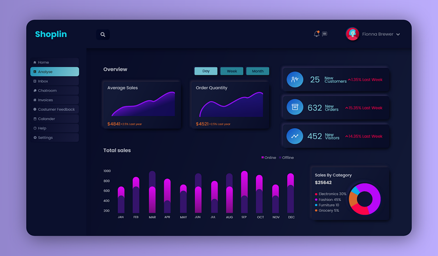
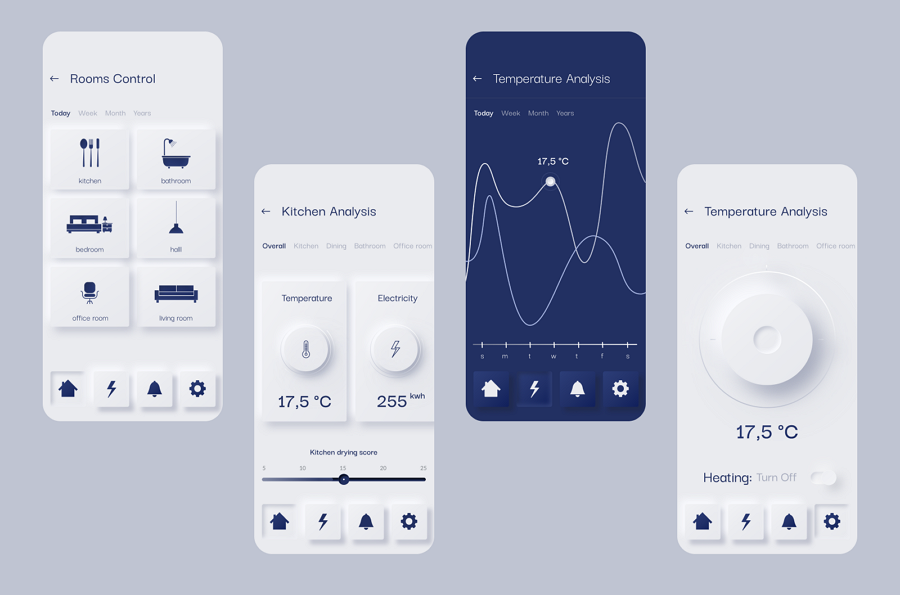
Don't know how to apply neumorphism to your data management app or interface? This dashboard UI design concept can inspire you. The neumorphic cards and buttons make it easy for users to switch between different interface blocks and buttons.
You can also check another 50 dashboard UI kits and templates to get inspiration.
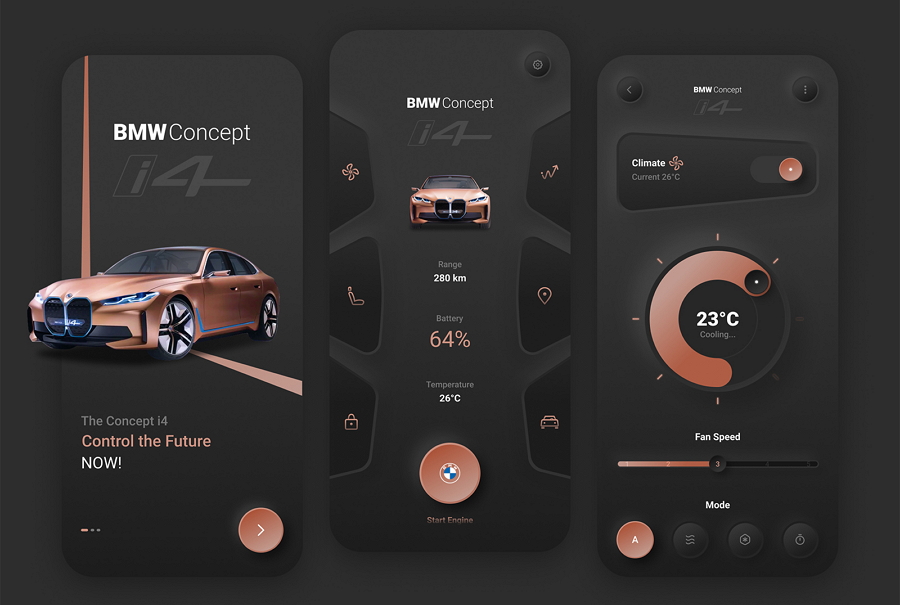
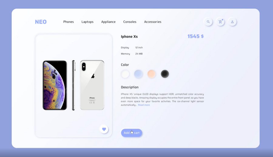
This BMW car app is designed with a cool neumorphic style. The colored CTA buttons, 3D card images, navigational icon buttons with an unusual shape and circular data visualizations create a unique and upmarket experience for users. This is a nice example that you can copy when designing a dark-theme app.
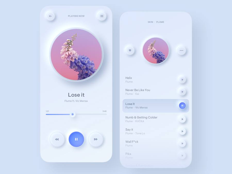
This app design concept presents the light mode design of a music player. It uses a white background and neumorphic elements to create a smooth plastic look, giving a compelling hyperrealism design feeling. This design looks so futuristic you may have thought this came from 2030.
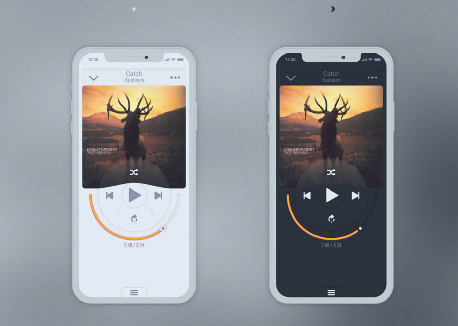
This is another music player concept in the neumorphic style. It has a unique circular navigation bar and the music track bar is also made with a circular shape, offering a completely different user experience. The light and dark mode designs give you a good example of how to create a dark and light theme for your music player, but you can adapt such principles to other projects as well.
This UI design example shares a vivid video to show you how to apply neumorphism to your ecommerce website projects. The home page, product page, signup pages and ordering process are included to give a full overview of its main pages. A nice example that you should check out to get inspiration for your ecommerce website projects.
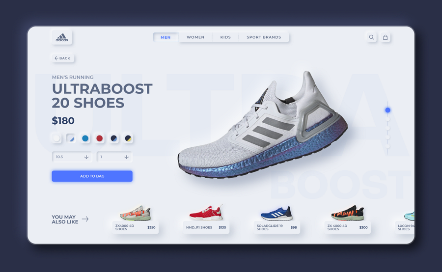
This example is a minimal neumorphic redesign of the Adidas product page. The top toolbar, color selection buttons, CTA buttons and even the recommended product sliders, all elements look naturally extruded from the background. A perfect example that you should check out and learn from when designing a shoe or online shop website.
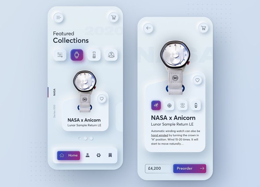
A light mode design concept for a creative watchmaker - Anicorn Watches. The designer uses strong light and shadow contrast to make all buttons and card designs lead out from the screen, and also lighten up the selected or pressed buttons with an eye-catching purple color. There is also a website version shared by the same design to inspire you.
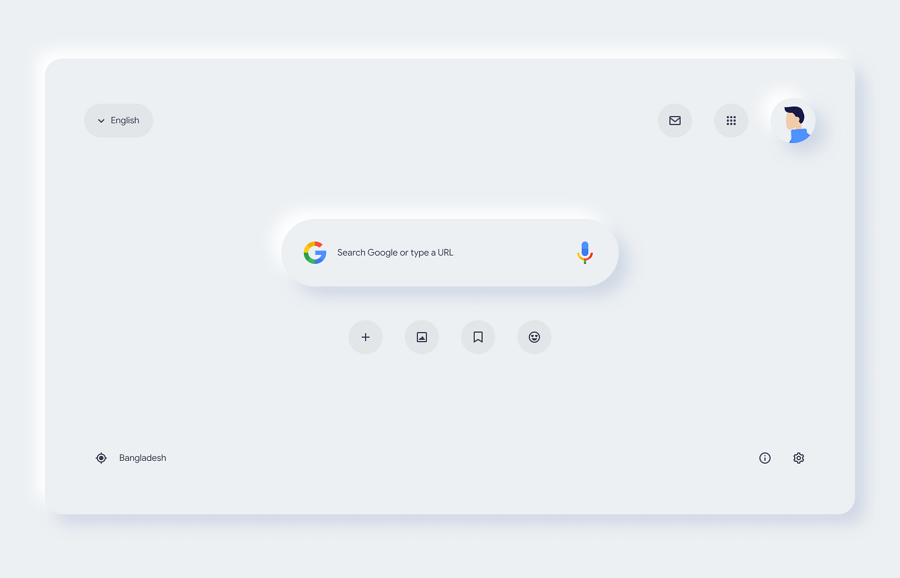
This is a modern neumorphic redesign for the Google search page. It perfectly combines the neumorphism and more common design styles into this page, creating a brand-new design style. So, what do you think of this redesign? Which one do you like, this redesigned one or the current version online?
This set of app design pages shows the concept of a smart home app used to help users remotely control and manage their devices in the home. All of these pages set a great example of how to aesthetically mix the neumorphism and realism down to the last detail. The icon buttons are also easy to understand, making it easy for users to find which button should be clicked to control the relevant devices.
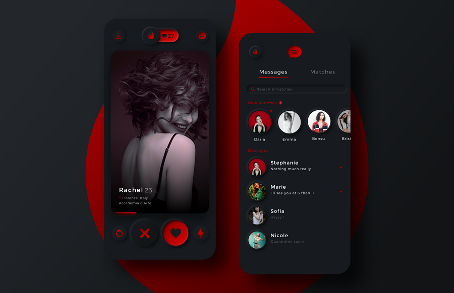
This example redesigns the Tinder dating app. Except for the great neumorphic design, the red and dark color scheme really opens my eyes as soon as I see this example. How about you?
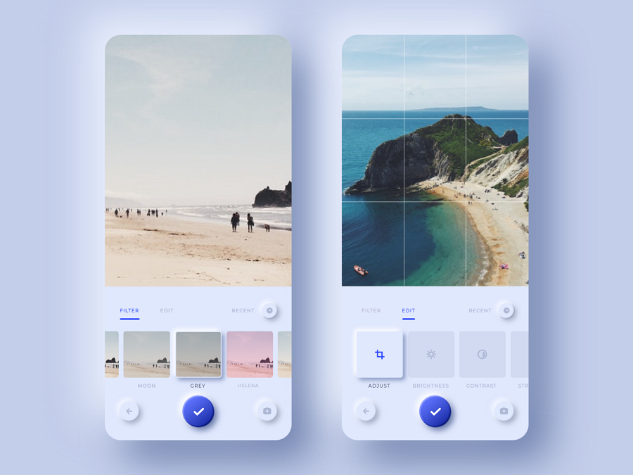
Photo editing apps are very popular these days. This app UI example shows how it neumorphes the editing tools, filters and navigation buttons. It is a greatexample that you should learn from to personalize your app with neumorphism.
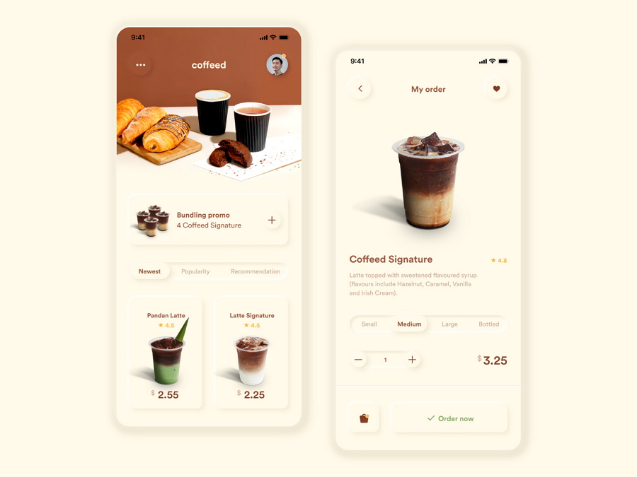
This design example shows how to incorporate neumorphism into a coffee shop app. The designer uses delicious coffee images to engage users and also extrudes all buttons to encourage them to place an order there. The white background also helps all the buttons, images, and other interface content to stand out.
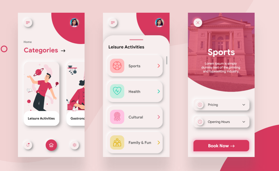
This is a free neumprphic UI kit in beautiful illustration style. All buttons, cards and switches naturally extrude from the background. The sports illustrations add interest to the set of interfaces, engaging users effectively for certain projects. This is a perfect fit to create an immersive illustration-style app for your project.
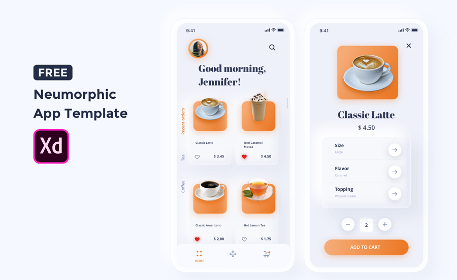
A free coffee app mockup template with soft-looking interfaces. After downloading, you can freely further edit all its cards, icons and UI patterns in Adobe XD to quickly create your own. A reusable template to help you create consistent and neumprphic style app designs.
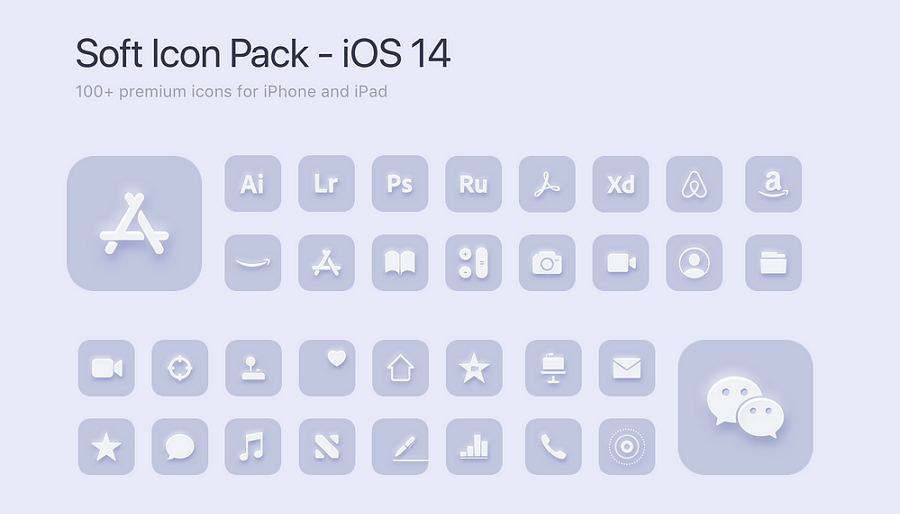
A free icon set that packs over 100 neumorphic style icons in all fields that you need when designing an iPhone and iPad app project. It is completely free for commercial and personal use. With this icon pack, you can also enjoy free continuous lifetime updates.
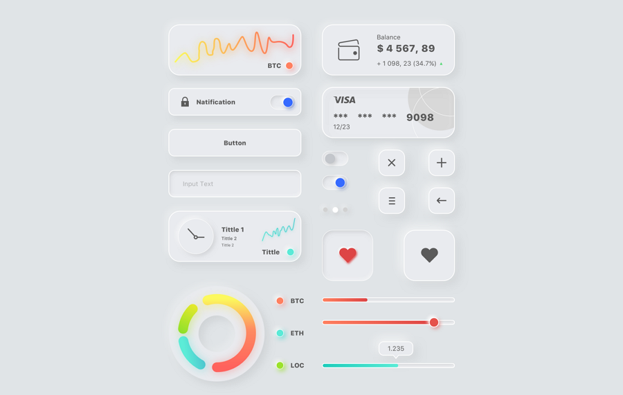
This UI kit shares a series of editable neumorphic buttons, cards, charts and other UI elements that you may use in daily design. A good template for your dashboard or mobile app projects.
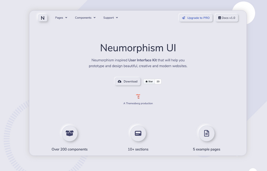
An open-source neumorphic UI kit for website projects. It comes with over 200 components and 5 pages to help you create your own soft neumorphic designs.
Neumorphism falls between the flat and skeuomorphism design, creating a really fresh visual effect to help you hook users into your products. However, the monochromatic color palette and soft visual could also put a negative impact on user experiences, causing some accessibility issues.
So, you should always consider all factors before you decide to use neumorphic design. Even after making a decision, also prepare necessary solutions to reduce the potential negative effects of neumorphism. Then make sure to use your prototyping tool like Mockplus to first visualize your neumorphic interfaces and fully test them all in advance.
 Mockplus RP
A free prototyping tool to create wireframes or interactive prototypes in minutes.
 Mockplus DT
A free UI design tool to design, animate, collaborate and handoff right in the browser.


 Sign up with Google