UI design is all about creating interfaces that users can interact with. The user interface is the most critical part designers need to pay close attention to.
How do you design interfaces that are beautiful, effective, and easy-to-use? One best practical solution is to follow the interface design principles. With these principles, guides, and concepts in mind, designers can design great interfaces faster and easier.
In this article, I'll share 20 most important UI design principles.
Clarity is the highest priority for an effective and easy-to-use interface. It enables the user to recognize static and interactive elements at a glance and predict what will happen next.
Clarity also ensures that the information can be accurately conveyed to the user and prevents the user from making mistakes. In other words, clarity is the crucial design principle that can deliver a perfect user experience.
User-centered design is all about creating products that users will love. It is your user who will interact with your product, and it’s your job to know your target audience. Designers should conduct insightful user research and figure out user needs, wants, and behaviors.
On the other hand, it is vital to Keep the user in control with regularly surfacing system status, direct and effective manipulations, similar environment, instant feedbacks, expectable interactions and outcomes, clear pathways, etc.
KISS is the most basic user interface design principle. Users will feel most comfortable if they can use your product without putting much effort into interactions. Due to the differences in user's habits and abilities, keeping your design simple is the best way to help users with various abilities to understand your UI.
One of the best practices is to allow users to rely on their previous experience when they interact with your product. Designers can achieve this goal by using familiar concepts and metaphors.
The consistent design creates a good impression on the user’s mind. Consistent navigation can guide users to find their most needed information quickly and effectively. Consistent operation design can make users quickly learn various product features.
Lack of consistency can mislead the users and cause bad user experience. Of course, the consistency principle does not mean that you need to follow it in all areas of your design. Intentional inconsistency can be good for user experience.
Visual hierarchy is the fundamental principle of web user interface design. Your interface will be overloaded or disorganized if you will use the equal importance for each individual element.
It is vital to present a clear viewing order to the visual elements on a screen:
Put more visual weight on primary information
The primary information, such as headlines, should be highlighted (using bigger or bold font) and placed in the focal area. It should catch the eyes of a viewer right from the start.
The secondary information should always stay secondary.
Secondary information such as subheaders or captions, are supportive information to the primary information. There are a lot of ways to prioritize it accordingly, including contrast, colors, shadows, sizes, and space.
The tertiary information doesn’t require much attention
Tertiary information, such as body text, is the part that users quickly scan. It is the relevant information to your primary information, so keep them readable.
We have more Golden Tips and Examples to Create Visual Hierarchy in Website Design.
Make your content legible and readable is vital. Users will not read your content if it doesn't look clear and digestible. Designers should always put the readability of the content in the first place, and look for styles that make the interface both usable and visually appealing.
A lot of factors can influence readability, including background color, visual hierarchy, white space, context, typography, etc. But the font selection is a crucial factor among them. Designers should use different fonts for different types of websites or applications. For example, a serif is easier to read for long content.
Color can speak, as powerful as any other elements on your interface. Human beings tend to be naturally attracted by beautiful visual appearance. Color is one of the key factors that can set the basic tone and mood of interfaces.
Use color wisely in UI design. Color can reflect the personality of a brand and even influence the purchasing decision. A well-designed color scheme is a half success of an effective and good-looking interface.
The human brain is not a computer. A brain's short-term memory has limited capacity, so it is usually hard to memorize many different things. On the other hand, it is quite common nowadays that users do not read the content; instead, they scan content.
It is a massive change in user behavior, which designers shouldn't ignore. Designers need to minimize the memory burden for the user by making content scannable.
It is vital to perfect the details of your design. Users notice details, and sometimes the small detail such as a button shape can easily make a huge difference to the user experience.
Every time the user performs an action, the interface should respond to them accordingly. Never let the user wait for a long time; this will make the user will cause anxiety and frustration.
It is essential to let users know how long they have to wait for the result. When it takes more than 7 to 10 seconds to complete the operation, users want to see a progress indicator.
It is vital to focus on improving the efficiency of user input. For example, it can be hard to enter text on a touch-screen device. The keyboard system of the smartphone usually has built-in keyboards for different types of content, such as text, numbers, emails, URLs, and so on. Make sure the user can use the corresponding keyboard for different content types.
The system should help users avoid bad outcomes. For example, when the user encounters a potentially dangerous decision, the system should show a prompt message and notify the user about that. It will make users feel safe and comfortable.
The best way to improve interface efficiency is to perform task analysis. Imagine you are the user, try to imitate the user's processes, understand the user's goals, and then streamline the process as much as possible.
Ensure that users can reach their goals quickly and easily. You must think carefully and thoroughly about any details that users might need during the interaction and prevent every possible vulnerability.
Put the user front and center when working on your UI. Apply personalization and bring in human-friendly options to the user. For example, allow users to change the color of the background according to their taste.
Don’t expect that users will explore your product on their own. You need to use directional cues to guide your user and make the way to the conversion easily.
Directional cues can help the user to find the content they want to read or some operation they need to complete. Directional cues has used by many good designer to build positive user experience. They can make the conversion reachable and users’ problem solved quicker.
One of the easiest ways to communicate with the user is to provide timely and contextually-relevant feedback. On the other hand, lack of feedback causes anxious.
Use both visual and audio feedback. Audio feedback works well when it’s necessary to notify the user about a problem. For instance, audio feedback can give a clear signal that one more operation may lead to data loss. Users should be able to disable audio feedback.
A user always expects to interact with the digital world through an interface. The interface should never break the connections between humans and machines.
Build an effective interface with a system that matches the real world. By doing that, we create relationships, bring people together, bring happiness to life, and ultimately get a successful business.
Whenever it comes to designing websites, it’s critical to get the layout well-organized. A clear, concise, logical, and well-organized layout helps the user understand your interface easier and faster.
Good layout reduces the cognitive load (the effort users have to spend to interact with your UI). There are 9 website layout ideas you can organize all the elements on your website or web apps.
It only takes 90 seconds to evaluate products online, which means you only have several seconds to convince users to interact with your product. The decision-making of the user is crucial. Still, the chance of success can be maximized if you have a concise interface that highlights all essential information and reduces all the elements that can disturb the attention of the user.
There is a lot of design principles, and they keep changing and improving. That means you need to be familiar with the latest design trends, technologies, science, art, design psychology, etc. By following design principles, you will have more chances to build incredible products.
Here are five websites with excellent user interface design for your inspiration. Pay attention to how the principles we’ve mentioned above were applied to the interfaces.
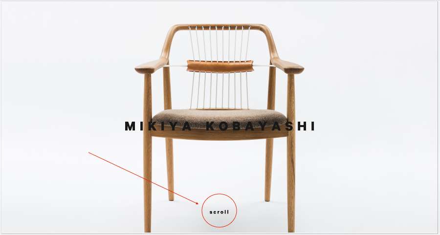
Mikiya Kobayashi a studio owned by a Japanese furniture designer. His website is a portfolio that showcases the furniture.
The homepage features a big hero image and gives users a hint that they should scroll. The interface is super clean, and the directional cue is understandable.
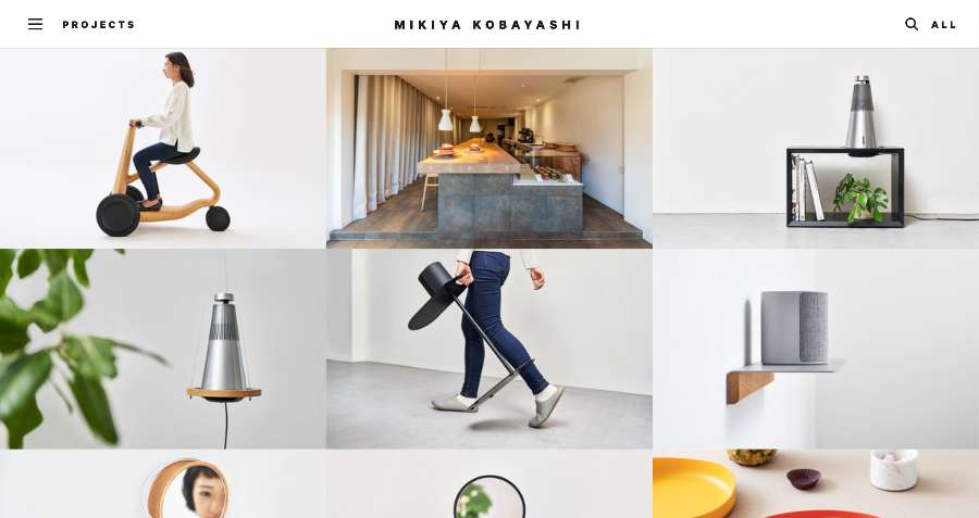
Here is what the users will see after the scrolling. The brand is in the top-center place, and there is navigation with a hidden box, which users can click to see more options. Each grid holds a project and has an on-hover overlay effect that lets the users know they are all interactive.
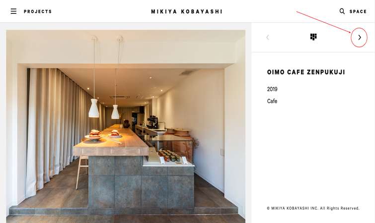
Here is the detail page. It presents a lot of pictures of products. The layout uses arrows as directional cues to show the horizontal interactions.
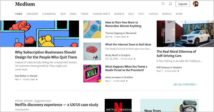
Medium is an online publishing platform. The users come to Medium to read and write. The readability is key to websites like this, and Medium has a strong focus on creating excellent readability.
Medium's homepage uses a multi-column grid. This layout creates visual rhythm and presents vast amounts of information to the reader in an easy-to-follow manner.
The article page is in a single-column layout with a clear hierarchy, making the content easier to scan and read. The best is the block of text only with one idea, which makes content more digestible, and users can skip without miss the information they are interested in.
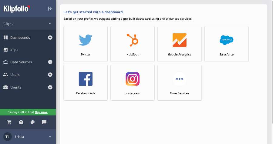
Klipfolio is an online dashboard platform. The UI provides instant feedback when the sign-up process went wrong.
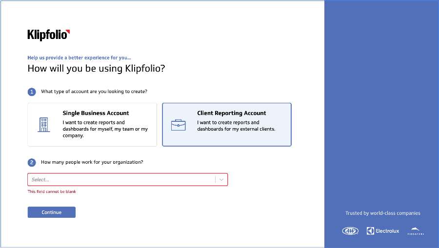
It gives the user absolutely full control based on how they want to build a powerful business dashboard.
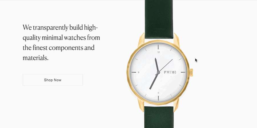
Tinker Watches is an online shop for watches. The interactions and transitions are amazing, and they can build connections with the user.
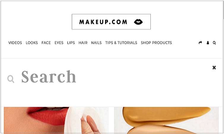
Makeup.com is a makeup website. The search option can help the user to find what they want.
Above are the 20 most crucial UI design principles and five good UI design examples. These principles will guide your interface design.
Great UI designs require a lot of work, and the following are some frequently asked questions about UI design:
The good UI design is all about user experience. Interface design deals not only with the visual element, such as a visual hierarchy of elements, buttons, icons, images, text, etc., but also the user interactions. That means you should consider how the user interacts with the real world, how the user can connect emotionally and effectively with others, what problem the user solve, and how your design can improve and change the user's life.
No. You don’t need to code while working on user interface design. But you should have a solid understanding of the platform you design for. That means you need to know the basic knowledge of development so that you can deliver the design assets to developers.
Some designers can create UI using HTML or other languages. I do not consider it as a proper way to design. Visual design is not about turning the visuals into reality. It’s about solving human problems through designing interfaces that humans can interact with.
Designers and developers have different tasks to perform within the team. Let the developers do the technical work.
Here are some UI design tools you can use.
Handoff design tool - iDoc
Design-to-development handoff is a vital design process for both designers and developers. Design is a team sport, so an excellent designer-dev collaboration is essential.
Mockplus iDoc is the tool when you need to do a design handoff. It allows you to handoff your wireframes and visual designs from Photoshop, Adobe XD, and Sketch, together with all auto-generated design assets (code snippets, specs, assets, style guides) to the developers.
Interface design tool - Sketch
Visuals are essential ingredients of an excellent user interface. The more beautiful your interfaces are, the more the chance your users will stay with you (of course, if you can provide solid functionality).
Sketch is a vector-based user interface design tool that helps you create hi-fi interfaces. You can reuse your designs through powerful Symbols and create design systems to maintain all the design resources.
Motion design tool - AE
Motion design is a big part of UI design. Motion effects can express designs like they are living in life, which can build connections between the designs and the user. Adobe After Effects is a frequently used tool for designers who want to create beautiful dynamics effects.
Wireframing/Prototyping - Mockplus RP
Visuals are usually starting from a wireframe or a prototype. Prototypes can help you quickly grab your ideas and thoughts into something that visible. You can use a pen and paper, or you can use a prototyping tool - Mockplus RP.
Mockplus RP is a clean and straightforward prototyping tool for creating wireframes and prototypes. Just with a simple drag-and-drop, you can build interactive prototypes without much effort. It also comes with more than 3,000 vector icons and nearly 200 components to help you quickly finish a screen. And you will have eight ways to preview and share prototypes with your team members and stakeholders.
A UI designer is quite a promising and highly-paid job — no wonder why people want to start a career in this field. If you're going to become a UI designer but have only limited knowledge about UI design, you may need this guide to learn UI designs all by yourself.
 Mockplus RP
A free prototyping tool to create wireframes or interactive prototypes in minutes.
 Mockplus DT
A free UI design tool to design, animate, collaborate and handoff right in the browser.


 Sign up with Google