Creating a portfolio is one of the best ways for designers to show their design ideas and talents. We collected the 10 Best UX Designer Portfolio Examples for UX designers a few months ago. But what about designers who have a passion for UI design? Are there any excellent UI designer portfolios out there for inspiration? How do you build UI design portfolios that can display your work and ideas just right?
Below are 20 of the best UI designer portfolio examples in 2019. In addition, you will also learn about UI portfolio design rules and UI designer portfolio templates. Enjoy!
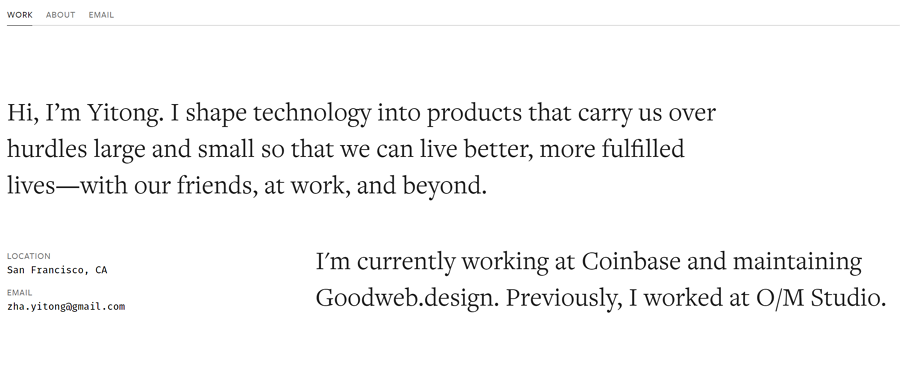
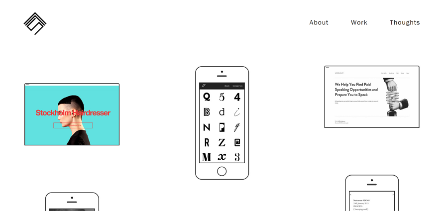
Yitong is a designer currently working at Coinbase and maintaining Goodweb in San Francisco. He is a designer with a passion for technology. In his own words, “I shape technology into products that carry us over hurdles large and small so that we can live better, more fulfilled lives—with our friends, at work, and beyond.”
Why does his portfolio look good?
His portfolio has 3 main sections, namely “work”, “about” and “email”, which you can easily find on the main navigation.
Yitong presents his rich work experience clearly with lots of convincing proof, there are nice big product images, interesting GIFs, videos, each with an introduction of the project. He concludes discussing his role in each project and what he achieved.
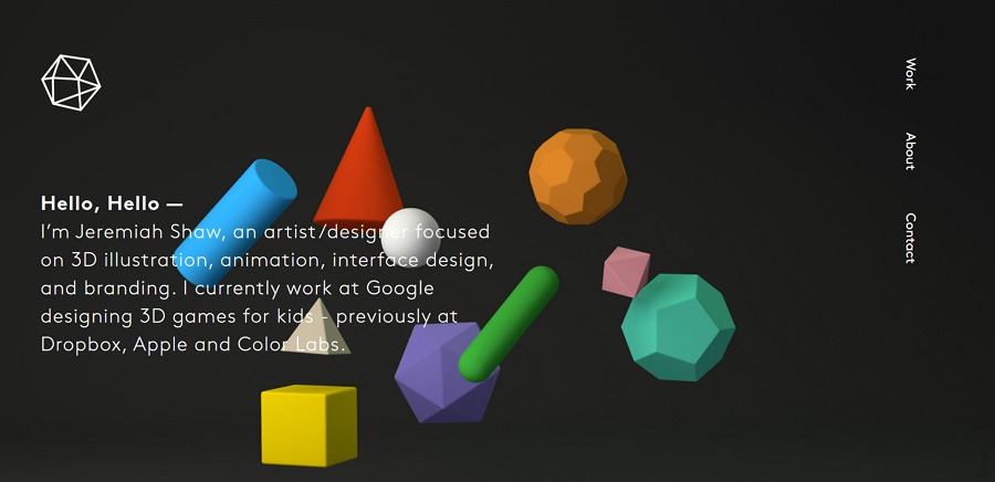
Jeremiah Shaw is an artist/designer focused on 3D illustration, animation, interface design, and branding. He currently works at Google, designing 3D games for kids - previously hacing worked at Dropbox, Apple and Color Labs.
Why does his portfolio look good?
Unique navigation:
Jeremiah’s portfolio has navigation that does not follow the norm. Instead, he uses a right sidebar.
Shaw uses a sophisticated black color with white words and colorful geometric figures to create an alluring, bold contrast.
Shaw displays each of his works in detail presenting the whole design process. For example, in his work Geo Jam Band, you can see it go from Pencil Sketches to Scene & Setting. He presents each stage: Pencil Sketches, Modeling, Color & Rigging, Animation + Sound, Audio Track and Scene & Setting.

Balraj is a Freelance Product Designer living in London, UK. He hand-crafts user interfaces placed firmly between the user and the code.
Why does his portfolio look good?
Circular Chaos looks more like a personal website than a portfolio. His site consists of 5 sections: home, about, design process, portfolio, and contact.
His work includes animation, branding, case studies, coding, illustration, interaction, presentation, UI design and UX design.
Balraj employed an iterative and adaptable design process to fit within his client’s methodology, introducing User Needs, Preliminary Brainstorming and Exploration, UX Design, Visual Design, Prototyping & Animation and Testing.
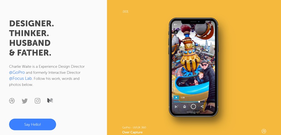
Charlie Waite is an Experience Design Director at GoPro and formerly the Interactive Director at Focus Lab. He is also a father, a husband, a surfer and a sports fan. He also writes and posts his writings on Medium.
Why does his portfolio look good?
There is a nice CTA which says “Say Hello!” on the landing screen.
Waite divides his site into 2 parts, the left side keeps still while the right side rolls with design workson different colored backgrounds when you scroll down.
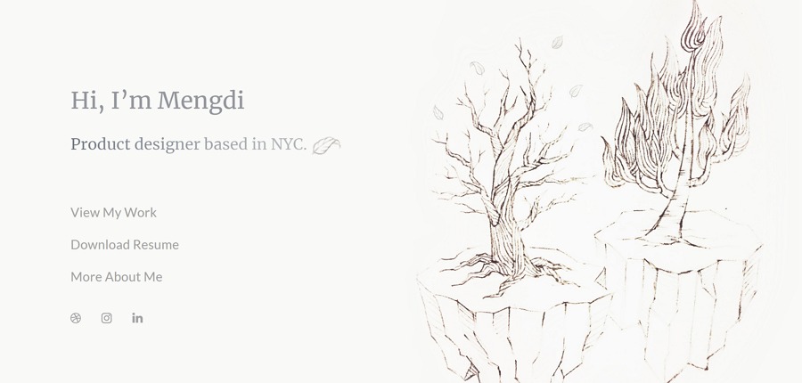
Mengdi Zhang is a Product designer who currently designs at DigitalOcean, based in NYC. She is striving to create emotional connections and social values through design.
Why does her portfolio look good?
Her portfolio only has one screen. You can click the navigation links to scroll to more pages.
The interface is beautiful. I personally like the trees and the leaves that look like a pencil sketch.
Contains a resume:
Her resume maintains the same style as her portfolio. You can click to download it in PDF format.
Simon Foster is an award-winning freelance front-end web designer. He specialises in intuitive, easy to use and beautiful responsive websites for projects both large and small that work on any type and size of a device. His work has a heavy leaning towards simplicity and typography with a gimmick-free focus on content and concise communication.
Why does his portfolio look good?
If you first see his portfolio, you may take it wrong, looking like some random black and white images, but once you hover your mouse over them, the color fills in.
Foster shares some of his thoughts on web design which you can offer you some inspiration. This part also shows his love of design, thinking and trying hard to make progress.
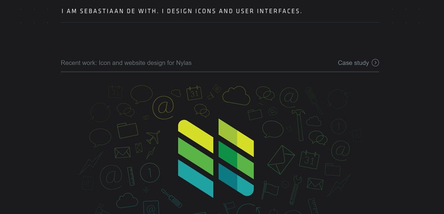
Sebastiaan de With is the Co-founder and designer at Halide camera. He is also a freelance designer and photographer. He loves to design icons and user interfaces. You can reach to him directly via twitter.
Why does his portfolio look good?
Writing a blog requires good writing skills and patience. As for designers, blogging can be a means of presenting design ideas and thoughts more clearly.
When you first visit his portfolio, his self-introduction will automatically type out on the screen. It feels like he is typing in front of you to introduce himself.
As he introduces himself with, “I design icons”, there are plenty noteworthy icon designs everywhere.
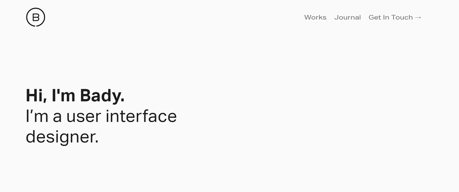
Bady is a user interface designer based in Singapore. He currently is working full time at DBS Bank and freelancing as well. He believes in design as an approach to solving human problems.
Why does his portfolio look good?
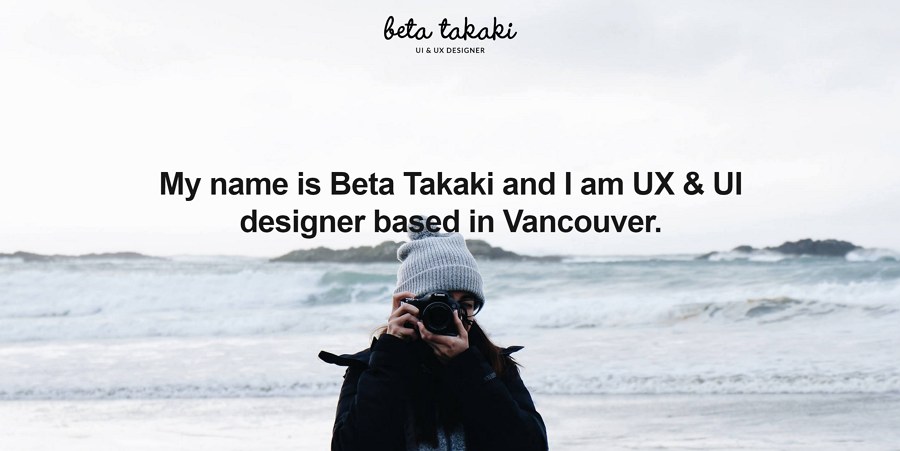
Beta Takaki is a UX & UI designer based in Vancouver. She is enthusiastic and passionate about User Experience and User Interface Design. This portfolio is UI focused, if you want to see a detailed case study of some of her work, you can contact her via linkedin.
Why does her portfolio look good?
Takaki uses grids to display her design work. When you click on any of the pictures, you will see her work in detail.
There is a large, eye-catching photo as the background on the first page of the portfolio. This can help to engage visitors.

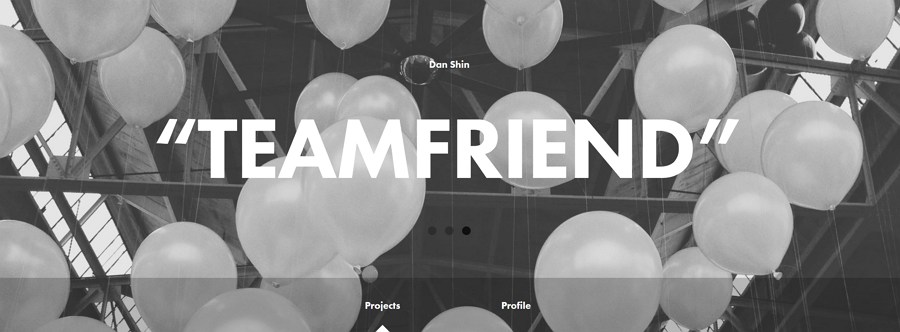
Dan Shin is a designer living in New York City with experience in identity and interactive projects. Currently, he is a product designer at Square.
Why does his portfolio look good?
His portfolio consists of 3 main parts: the first screen, the projects section and the profile section. The big photo and the blog typography create a stark contrast that looks appealing.
There is parallax effect when scrolling downward. In addition, when you select the projects or profile sections, you will see an animation bringing the whole page to life.
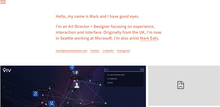
Mark Wheeler is an Art Director and Designer focusing on experience, interaction and interface. He is originally from the UK and is now in Seattle, working at Microsoft.
Why does his portfolio look good?
In order to see all the projects and portfolios in detail, Mark Wheeler uses a side-menu as a navigation to access each of his projects.
There are a few ways for visitors to interact with his projects. You can like, add to watch later, and share it directly.
Sam Small is currently based in Kansas City, working as a UI/UX Designer with Citrusbyte. He always had a passion for creating. He has worked on projects in web design, branding & identity, environmental graphics, and advertising for clients large and small.
Why does his portfolio look good?
His portfolio cleverly makes use of color patterns. He uses a blue gradient as the background that changes as the mouse moves around. This novelty creates a positive interaction with visitors.
When you hover the mouse on each portfolio cover, it displays information; such as the name, the type, and his part of the project.
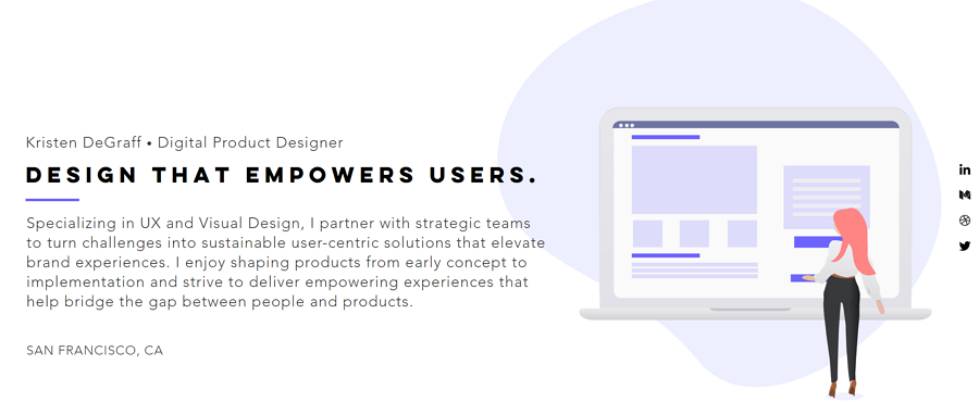
Kristen DeGraff is a Digital Product Designer. She Specializes in UX and Visual Design and has partnered with strategic teams to turn challenges into sustainable user-centric solutions that elevate brand experiences. She enjoys shaping products from early concept to implementation and strives to deliver empowering experiences that help bridge the gap between people and products.
Why does her portfolio look good?
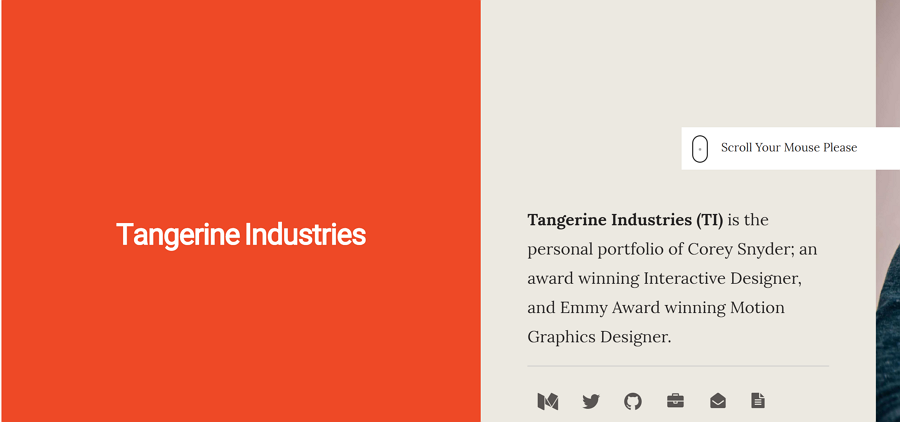
Tangerine Industries (TI) is the personal portfolio of Corey Snyder. He is an award-winning Interactive Designer and Emmy Award-winning Motion Graphics Designer.
Why does his portfolio look good?
when you first land on his site, there is a tip reminding you scroll your mouse. When you do you see a horizontal scrolling effect.
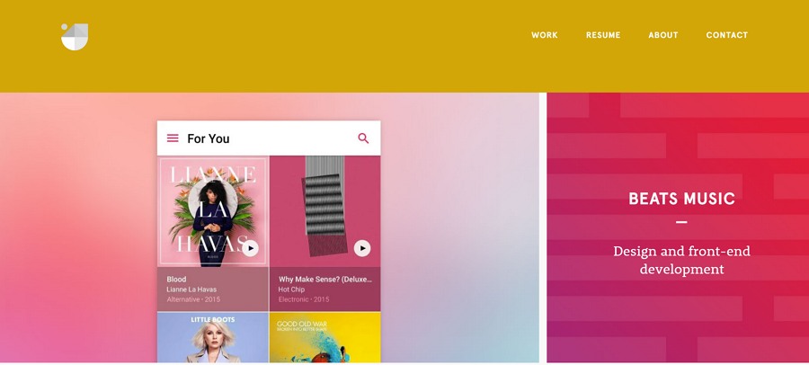
Jackie Ngo is now growing a coliving housing startup's brand and digital products. He has worked for Uber, Apple, Beats music, ZURB, MadeService, Zooka Creative and 1185 Design. He is good at visual design, ui/ux, front-end dev, illustration and branding.
Why does his portfolio look good?
Ngo a unique typeface that makes his whole interface more beautiful.
Ngo uses a parallax effect on his about page. When you scroll down, the first screen stays still until the portfolio covers it.
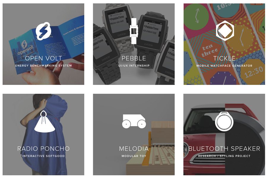
Liana Kong graduated from Carnegie Mellon University in May 2015 with a BFA in industrial design. She is a designer at Nest.
Why does her portfolio look good?
Each of her portfolios covers features a small white icon. She uses the icons to bring cohesion to the interface.
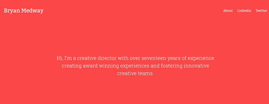
Bryan Medway is a creative director with over seventeen years of experience creating award-winning experiences and fostering innovative creative teams.
Why does his portfolio look good?
Medway uses red as the background and hove color. Red draws attention and influences users’ emotions and actions. If you wish to learn more about color, you may be interested in Use color in UI design wisely can create a perfect UI interface.
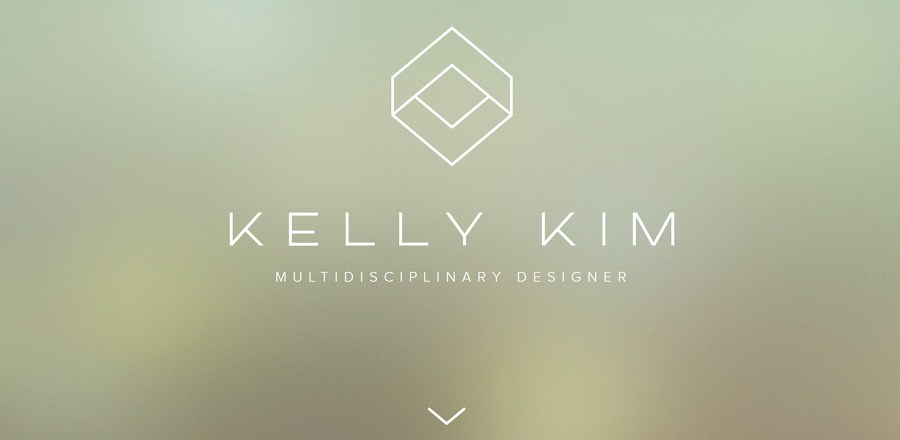
Kelly Kim is a Multidisciplinary designer based in the San Francisco Bay Area. She loves producing beautiful visual experiences for all media. She is a firm believer in producing meaningful designs that exist to solve real life problems.
Why does her portfolio look good?
Her portfolio is displayed using big photos with a parallax scrolling effect, catching user’s attention.
Dine is a creative design studio based in Beijing, China. They craft distinctive brand identities and create exceptional digital experiences.
Why does their portfolio look good?
You can subscribe to their newsletter to see what’s happening inside and outside the studio.
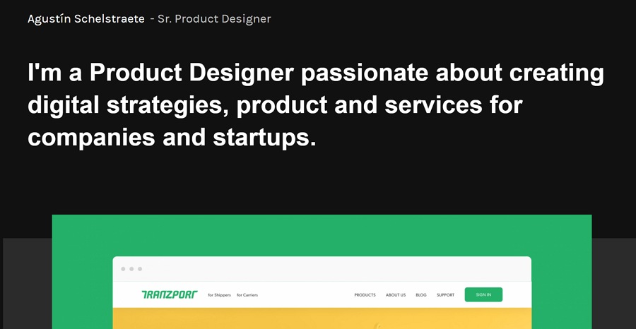
Agustín Schelstraete is a Product Designer passionate about creating digital strategies, products and services for companies and startups.
Why does his portfolio look good?
The solid black background and bold typography create a stark contrast. The information is more clear.
Above are 20 of the best UI designer portfolio examples for your inspiration in 2019. You are always welcome to help us add to this list if you find an exceptionally designed portfolio.
Related resources about designers portfolio:
20 Best Examples of Portfolio Design Websites That Bring You Inspiration(Updated)
How to Design a Portfolio in 3 Steps
 Mockplus RP
A free prototyping tool to create wireframes or interactive prototypes in minutes.
 Mockplus DT
A free UI design tool to design, animate, collaborate and handoff right in the browser.


 Sign up with Google