Good organization and positioning of UI visual elements is key to creating a great web or mobile experience. Designers rely on layouts to introduce structure in design and give users a predictable rhyme as well as a sense of familiarity.
Grids work as a framework that helps product teams to arrange UI elements in a way that allows maintaining good visual balance from page to page. It allows designers and developers to create more consistent and appealing UIs.
If you are learning how to create a UI grid layout, this guide is for you. It illustrates the basics of grid layouts, such as what they are, why they are so important, and how you can use and create effective grid layouts. Examples, templates, and tools mentioned below will help you make more professional designs.
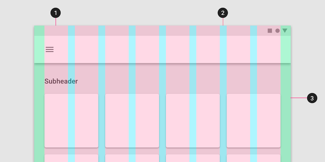
When it comes to website or mobile app design, a grid is a set of intersecting horizontal and vertical lines that divide your pages into countless columns and rows. No matter whether these lines are real or imaginary, a grid always serves as a framework or backbone that helps you position, align and arrange content on your page more precisely.
Let's first check a website grid example:
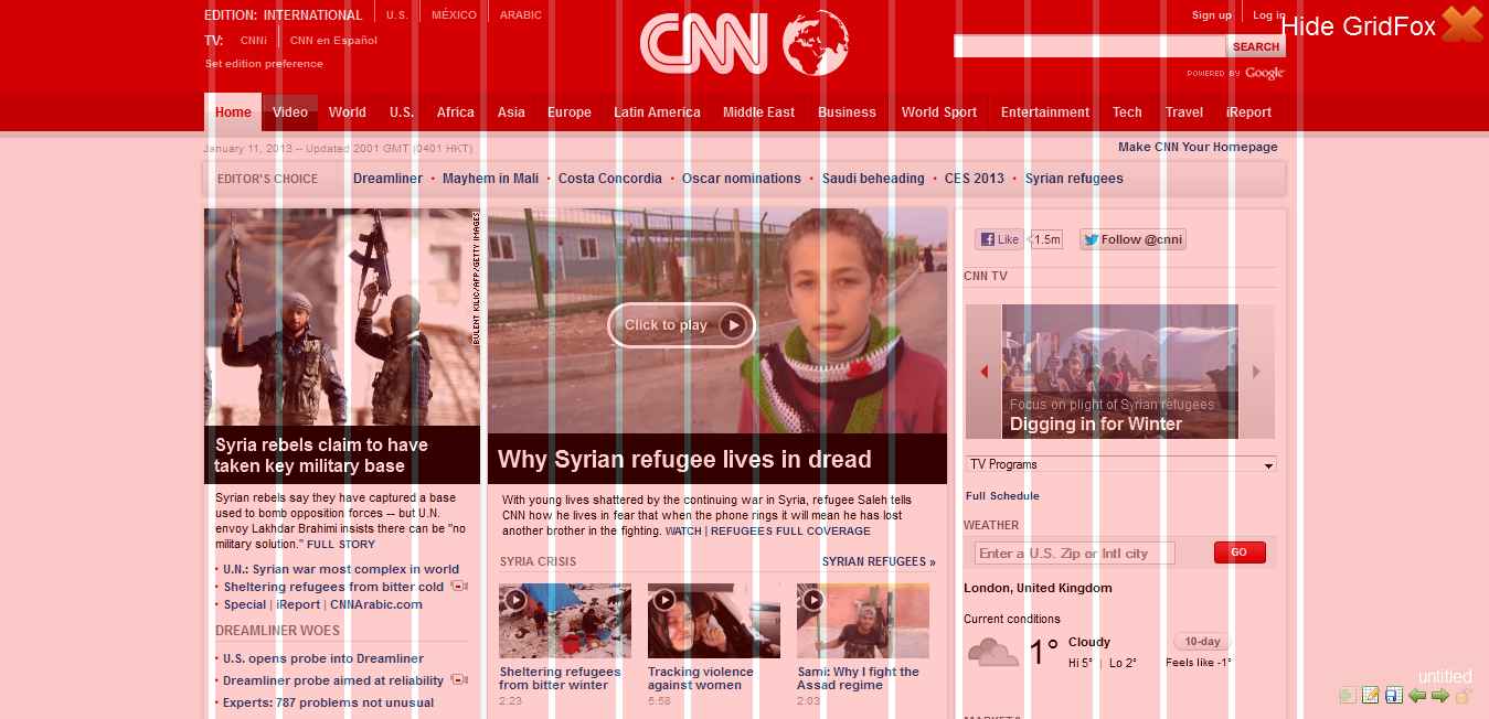
As the image above shows, the pink grid has divided the CNN web page into many columns and gives designers an easier way to position and align texts, images, videos, and other elements on the page.
Here are several things you should know to understand grid layouts better:
Generally speaking, there are two major types of UI grid layouts: Symmetric and asymmetric.
Symmetric grids often follow a center line and enable designers to distribute all content around a center point or axis. Equal columns or rows help designers create a comfortable and aesthetically pleasing layout.
Asymmetric grids, also called broken grids, do not have any center line or point. Asymmetric grid allows designers to create a more interesting yet ordered page layout. It can be a good choice for designers who want to create a distinctive yet personalized design for users.
“What is responsive grid layout, and how can I use it to improve my design?“ is a very common question among UI designers. So, let's talk about this type of grid.
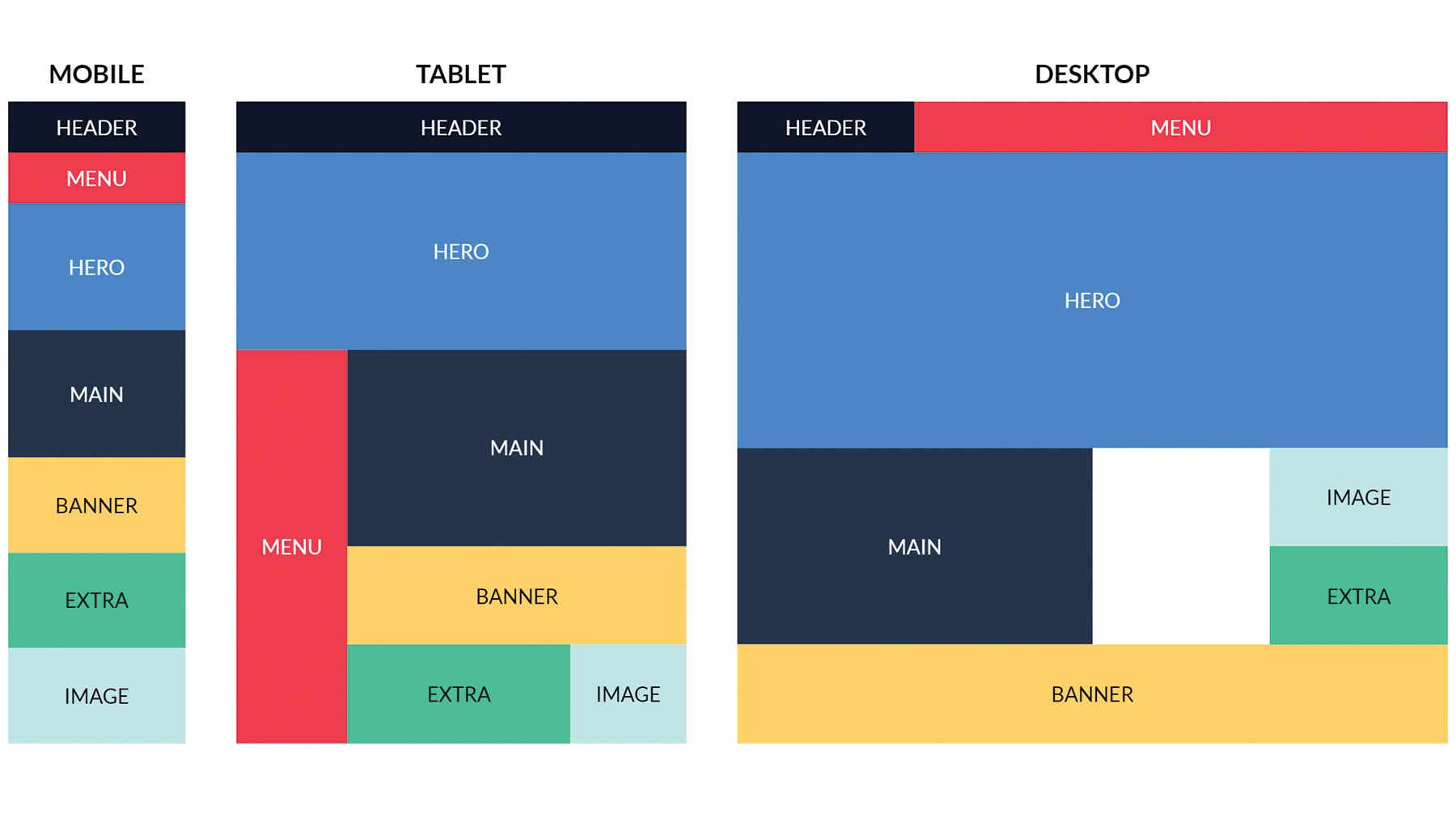
A responsive grid layout is a grid layout that can scale with different screen sizes. In comparison with the fixed grid layout that can only be viewed on a particular device, the responsive grid layout enables you to view page content on different devices and platforms. It is one of the most critical parts for designers who want to create fully responsive projects.
These days, designers always have their own reasons to use grid layouts. Here are the main reasons why you should build an effective yet eye-catching grid layout:
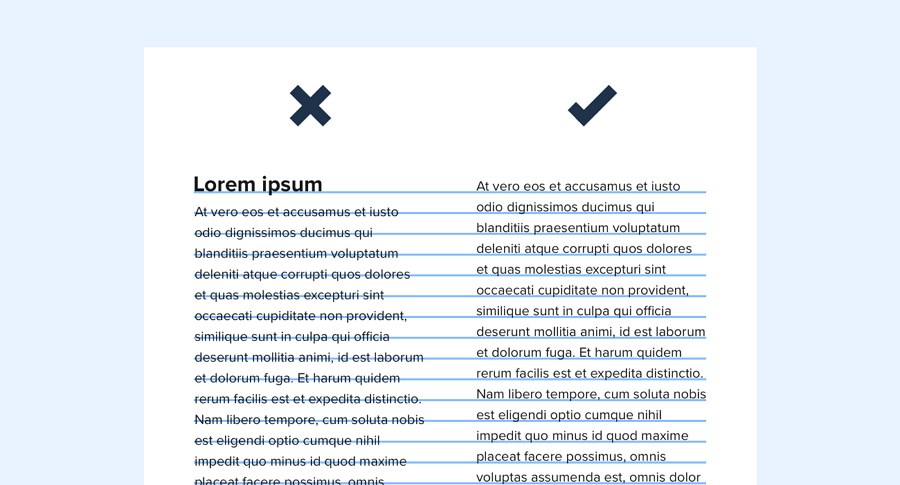
Grid layouts offer a clear structure of horizontal and vertical lines that makes it easier for designers to place and align elements on a page. Using a grid it's much easier to keep everything in order.
When working with designers and developers, a clear grid layout helps to avoid any misunderstanding and mistakes. Grid acts as a guide that allows you and your team to place elements and structure your designs consistently.
A clear grid layout can help you and your team to set consistent sizes, spacing, blocks for your projects. It can also help you create a layout template for all your key pages. The visual hierarchy will also be enhanced easily with the aid of the grid.
Unlike symmetric grids that help designers create comfortable UIs, broken grids help them showcase information on a page differently and create more interesting yet eye-catching visual effects. It is also a good method to impress users and promote product brands.
After learning the benefits that a clear grid layout can bring, let's see how you can create a grid layout. Here are several tips that you should keep in mind:
Grid layouts are often used to manage the relationships and proportions between page elements. That’s why you need to customize the grids according to your design needs. Here are several things you should consider:
Customize columns and rows
When designing with grids, visual designers typically ask the following questions:
All these questions should be asked before you start to work with the grids. It would be best if you always customized these properties based on your layout needs.
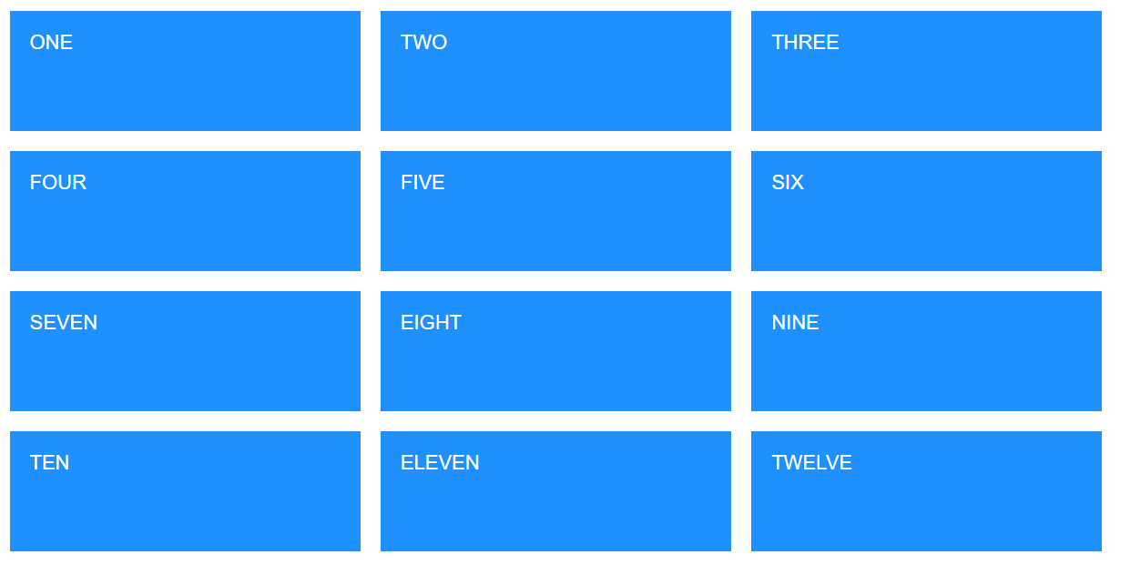
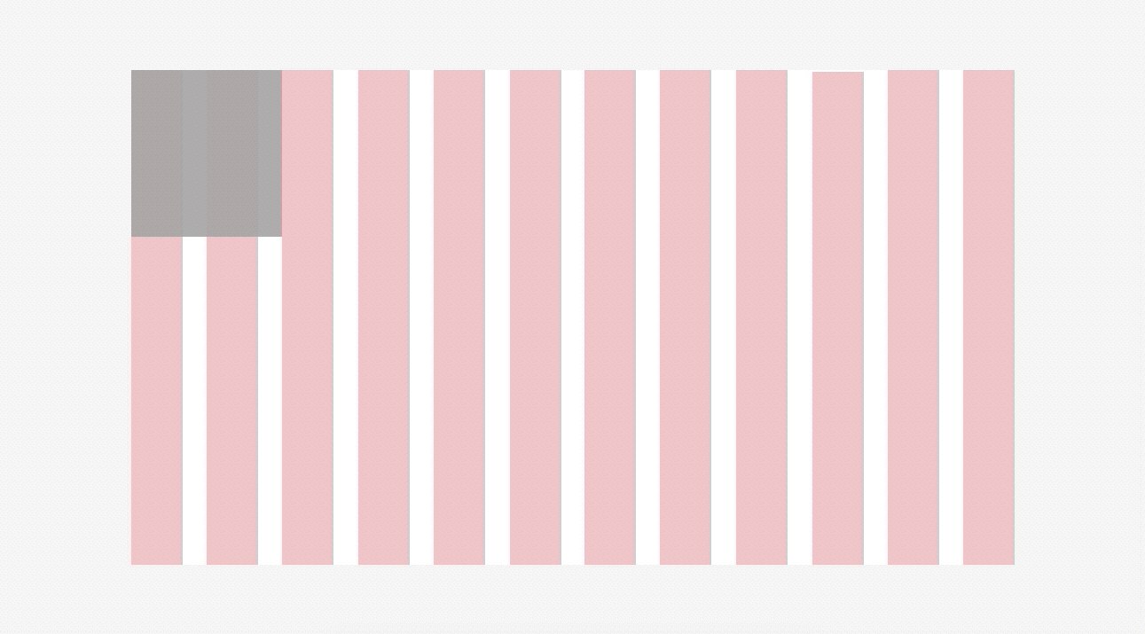
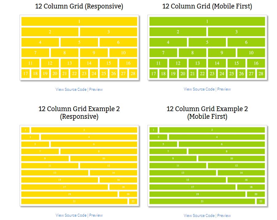
If you don't want to create a custom grid layout, you can start with a 12-column grid.
Consider constraints
When it comes to grid layouts, some designers insist that adding constraints can restrict their design creativity. However, it's important to remember the old saying, "No order without rules." Creative constraints not only can give you a different angle of view on your projects but also allow you to find better solutions. Sometimes, they can also help you create a far more distinctive design.
Use a baseline grid to align elements
A baseline grid is a dense grid of equally spaced horizontal lines that can help you align texts, images, videos, cards and other elements on your page. It is a good tool to create clear and near typography and enhance the visual hierarchy of your design.
Place elements inside a grid field, not in the gutter
To ensure that all elements on the page are properly organized and aligned, place elements inside a grid field.
Please note: It does not mean you can only begin and end everything inside a grid field. If necessary, you should also step outside the grid to emphasize a certain element or part of your page.
Pay attention to spacing, margin and other factors
The spacing between elements, the margin outside the grids, and the gutters between grid blocks can also leave a huge impact on how the grid works.
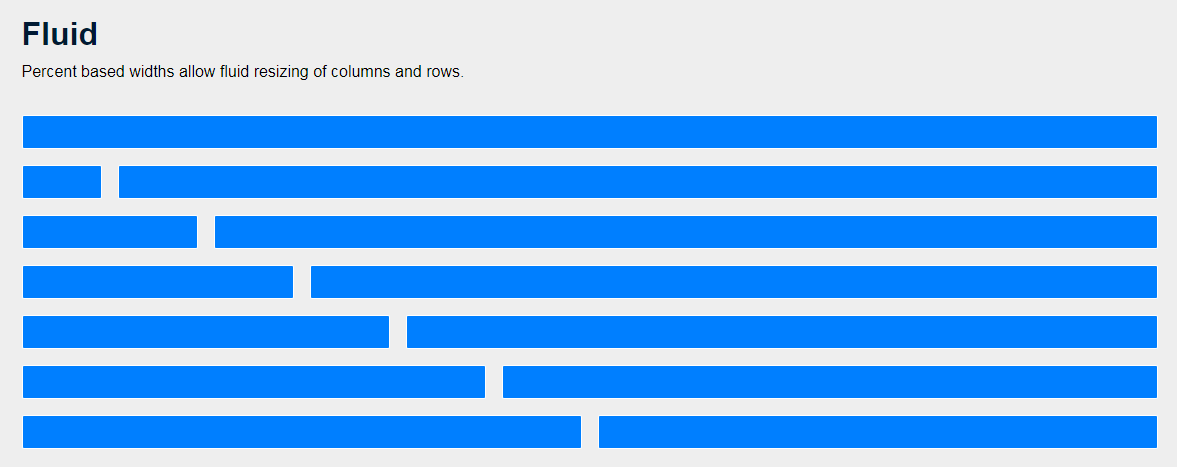
Responsive design is one of the most popular design trends. When designing with grids, never forget about responsive design. To ensure that your grid layout will also work across different screen sizes, design using values in percentages and proportions rather than exact pixels.
Use a grid layout tool to customize a grid layout for your project. Here are several tools that you should consider:
Pen and paper - map out and iterate grid layout ideas as soon as possible
At the very beginning of your design process, you may need to brainstorm your grid layout using a pen and paper. Map out everything that pops in your mind. It helps you save a lot of time and gives you more freedom to iterate your ideas quickly.
However, at the later stages, when you might want to discuss specific design details, you may want to switch to a more precise and refined design draft. The pen and paper method may no longer be suitable for you.
Mockplus - provides auto grid layouts to streamline your design workflow
Mockplus, a one-stop online product design platform, offers users an auto grid layout which enables them to customize all the columns, rows, gutters, and blocks with ease. You can show or hide these grid guides based on your needs. The auto responsive layout helps you create a responsive website or mobile app with ease.
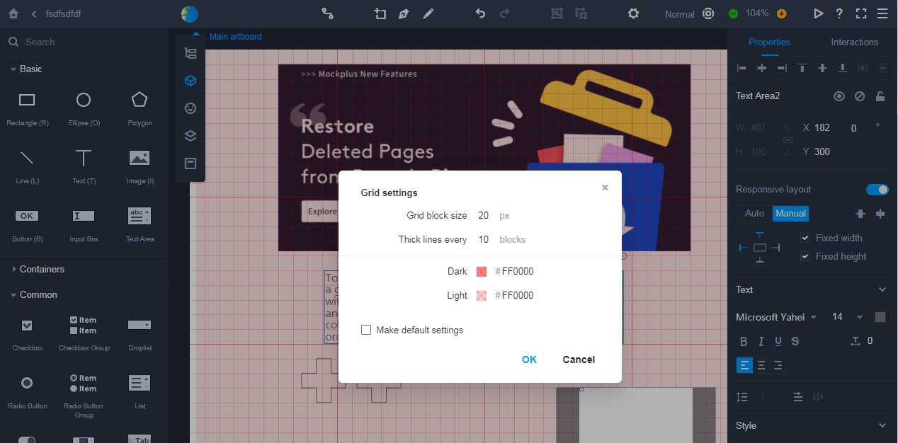
As an all-in-one design platform, Mockplus enables your entire team (designers, developers, product managers, clients, users and stakeholders) to work together on the same project. Your entire design workflow, such as UX designing, prototyping, commenting, collaborating and design handoff, is connected easily in one place.
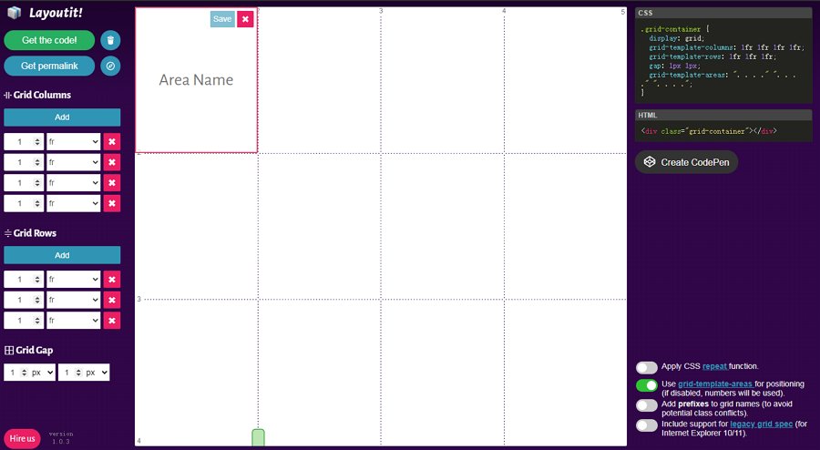
Layoutit - an online CSS grid generator
Layoutit is a simple online CSS grid generator that allows you to select your grid areas, add columns and rows, and name your grids with clicks. After creating the grid design, you can easily download the codes or share your grid as a link with your team.
No matter what type of product you are designing, you cannot ignore testing. The grid layout should also be tested and iterated.
To help you create your own grid layouts quickly, we've picked 10 of the best UI grid layout examples, templates and other resources:
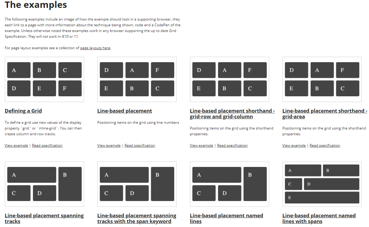
Example Grid Set shares a set of CSS and HTML grid examples that you can use during web design. Many popular grid layouts are included, so this set can give you a lot of inspiration when you are working on a website or mobile app project.
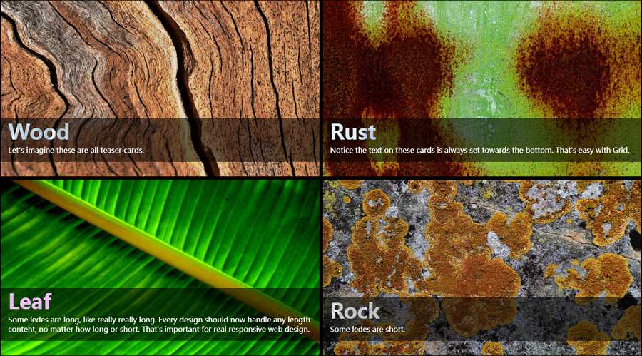
Website Grid Layout Set is a website that shows off new ideas about CSS grid layouts. A set of creative grid layout examples that are showcased on real websites are displayed there for your inspiration.
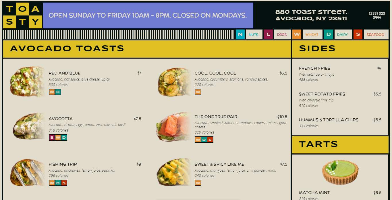
Restaurant Website CSS Grid is a two-column grid layout created for a restaurant website. With bright color schemes, bold design style and clear visual hierarchy, this website is an excellent example of a clear grid layout for common eCommerce websites.
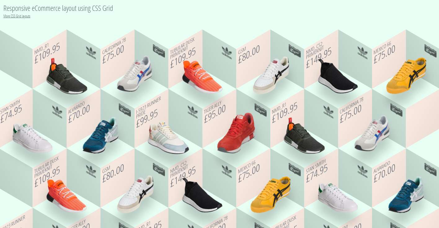
Isomtric Ecommerce CSS Grid is a responsive and interactive ecommerce grid layout created for a shoe website. The unique 3D visual effect gives users an engaging appeal.
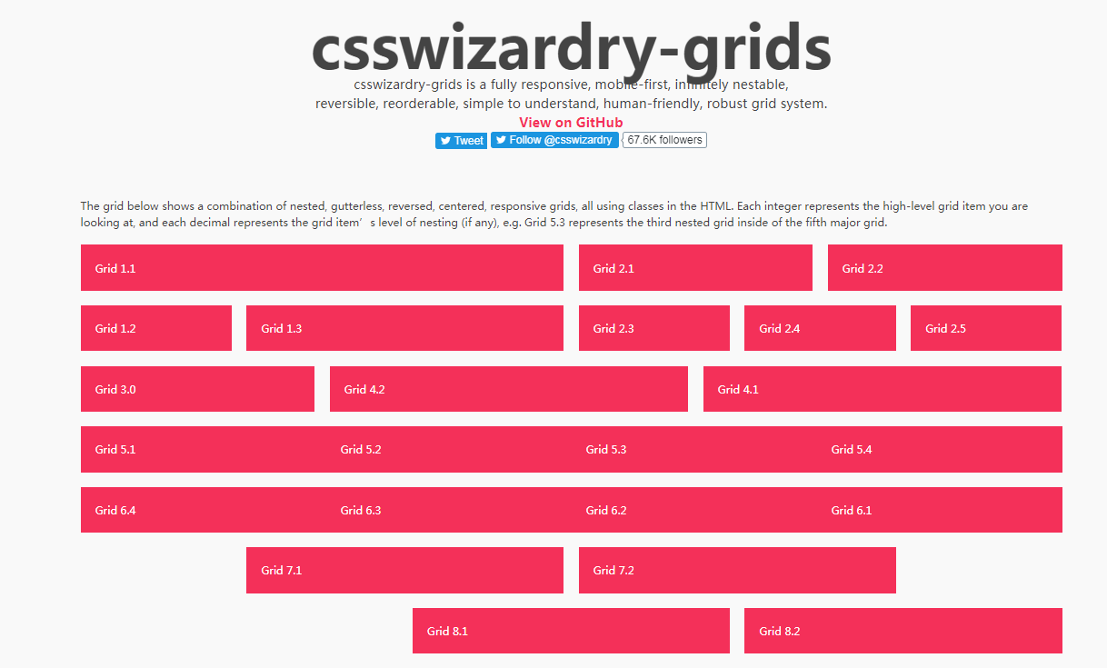
CSS Wizardry Grid System is a fully responsive and mobile-first CSS/HTML grid system. It is nestable and easily reversible.
Bootstrap Grid System is the fully responsive and mobile-first bootstrap grid system that has 12 columns.
Material Responsive Grid is a popular grid system for designers. It is fully responsive and can adapt to different screen sizes and resolutions.
Flexbox Grid is a responsive grid system based on the Flexbox display property. It enables you to specify different column sizes, offsets, alignment and more factors according to your needs.
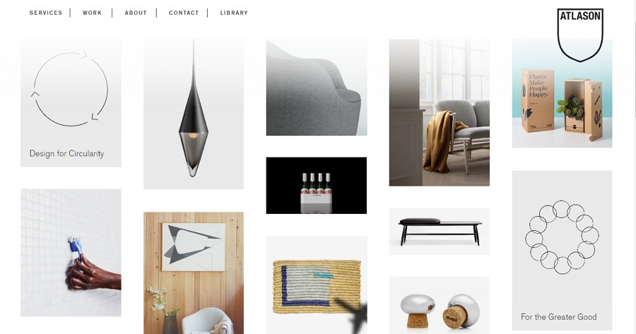
Altason is a strategic design and innovation studio that devotes to creating a more beautiful planet. Its official website uses asymmetric grids to showcase different products, and this grid helps to create a unique atmosphere.
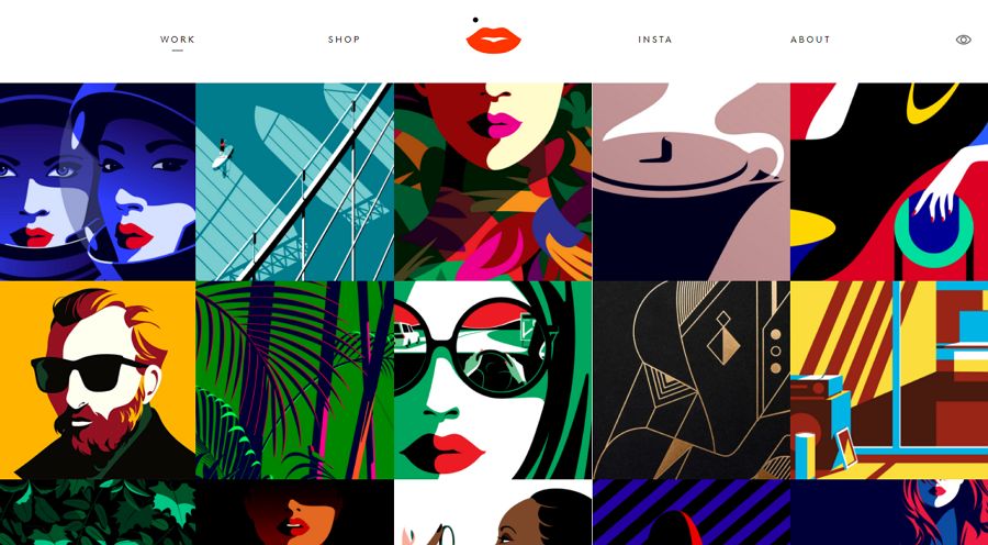
Malika Favre is a portfolio website with a bold and minimal design style. It is a good example of how designers can use space and colors in symmetric grids to attract and engage website visitors.
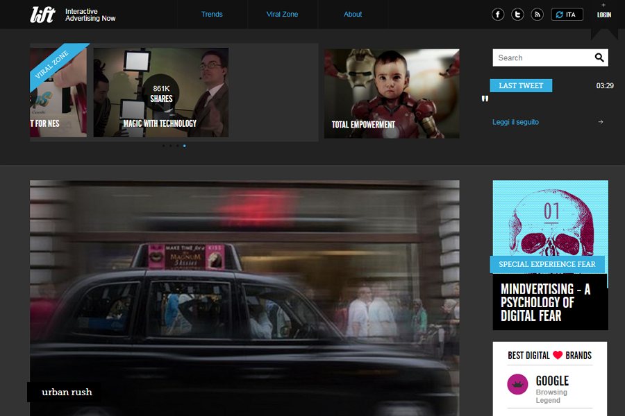
Lift Mag provides another grid example that uses a top carousel bar to help users navigate. If you are looking for inspiration to create a grid layout for a virtual magazine or video website, this is a perfect example.
Grid layout template series has picked a series of website templates using CSS grid layout. You can copy the source code and use it to improve your website project.
Yes. Here is what Wikipedia tells us:
"CSS grid layout or CSS grid is a technique in Cascading Style Sheets that allows web developers to create complex responsive web design layouts more easily and consistently across browsers."
CSS grids give designers an easier way to create a responsive grid layout.
No. These days, there are plenty of methods for designers to control web page layout, including the box model, CSS flexbox, tablets and more. And when it comes to mobile and web design, both CSS grid and Flexbox have their own pros and cons.
For example, Flexbox is best for organizing elements in a single row or column, while CSS grid is best for arranging elements in multiple rows and columns. So, instead of thinking about CSS grid vs. Flexbox, it's better to combine them to improve your design.
It depends. When you use Bootstrap, you need to write more HTML. However, when you use CSS grids, you need to write more CSS code.
Grid layouts offer rules of how you and your team should organize and position the UI elements to create a more consistent and effective layout. Grid layouts engage users and offer them a more appealing yet comfortable visual experience.
We hope this complete guide about UI grid layout design can help you better understand the concept of grids and create your grid designs.
 Mockplus RP
A free prototyping tool to create wireframes or interactive prototypes in minutes.
 Mockplus DT
A free UI design tool to design, animate, collaborate and handoff right in the browser.


 Sign up with Google
 Join our Discord community
 support@mockplusapp.com