A successful website requires not only compelling design but also excellent content. It should be designed to provide good user experience, at the same time enable users to understand the site’s overall theme at a glance.
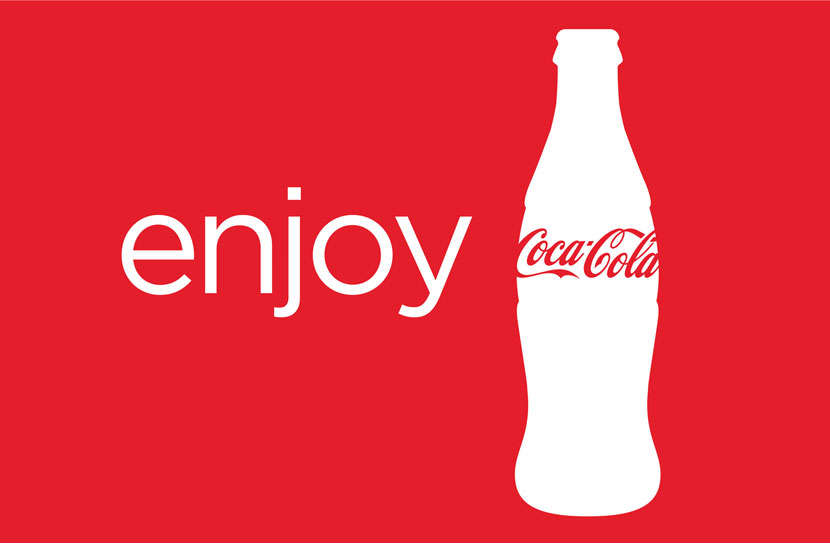
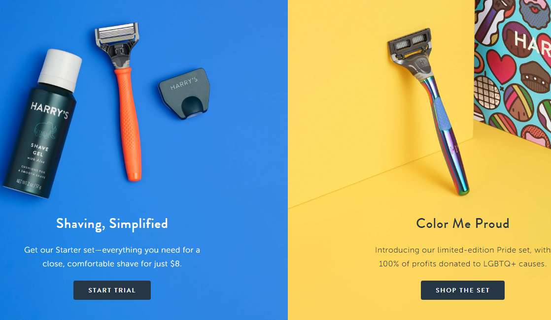
“A picture tells a thousand of words”. Pictures can convey the real value of the content, grab the user’s attention, and explain complicated concepts.
We are very visual creatures. Think about it: what did you first see on this blog? words or pictures? We are easily drawn by images and we retain information from them longer.
Tips:
Note: Do not use just any good-looking but irrelevant images for web design. Users will simply ignore them. Instead, choose pictures that show the use of the product, and capture the user's attention with an outstanding visual design.
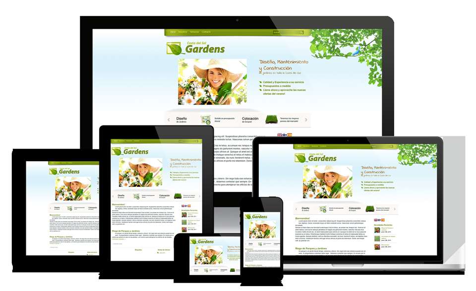
On March 26, 2018, Google officially announced Mobile-Friendly Update. This update penalizes sites that aren’t mobile-friendly.
We are now living in a society that can't be without mobile devices. When the user browses your website on a mobile phone, he expects to see the content exactly like he would see on a desktop or laptop. This requires better user experience design for the user. So, responsive design is a necessary element for every website.
Excellent interactive website design can bring enjoyment to users and improve the user experience. Mockplus helps you quickly create interactive prototype web pages and make your website design more attractive to users.
Tips:
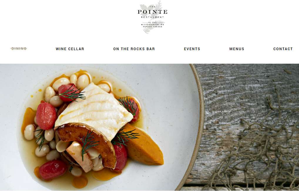
The most important element of a site is the navigation menu. This is the only way for visitors to browse your site and discover and learn about your products. Therefore, it must be simple and intuitive. Make sure easy navigation is a priority when you create your design.
Tips:
Having too many menu items only confuses visitors - they need to spend more time reading all the options in front of them. They may end up missing the important pages.
One of the most basic rules of usability design is to get all the necessary information after 3 clicks from the homepage.
Your brand logo is not only for appearance’s sake Users also expect to return to the homepage by clicking on it.
Why you should avoid the drop-down menu:
Users may use different keywords to reach your site, so you have to highlight the main product and content of your website. Make sure the user recognizes your website’s selling point at a glance.
Tips:
"White space" creates a more balanced layout, more clearly showing elemental effects and attracting users' attention. When a website’s layout is poor, users will find it difficult to understand what the site is trying to convey.
A good practice is to make sure there is enough spacing between words and segments. This makes for easier reading. Additionally, limit the number of design elements. If there are too many design elements, the user's attention will be dispersed. Improve user experience by using white space to guide the user so he can quickly find the information he seeks.
Bonus tips
Corlate is built with the powerful WP Page Builder. Using this free WordPress theme you will have the opportunity to experience the best page builder on the market.
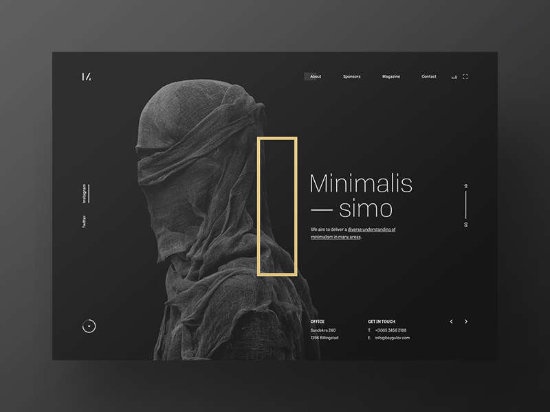
Minimalissimo
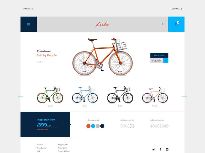
E-commerce theme
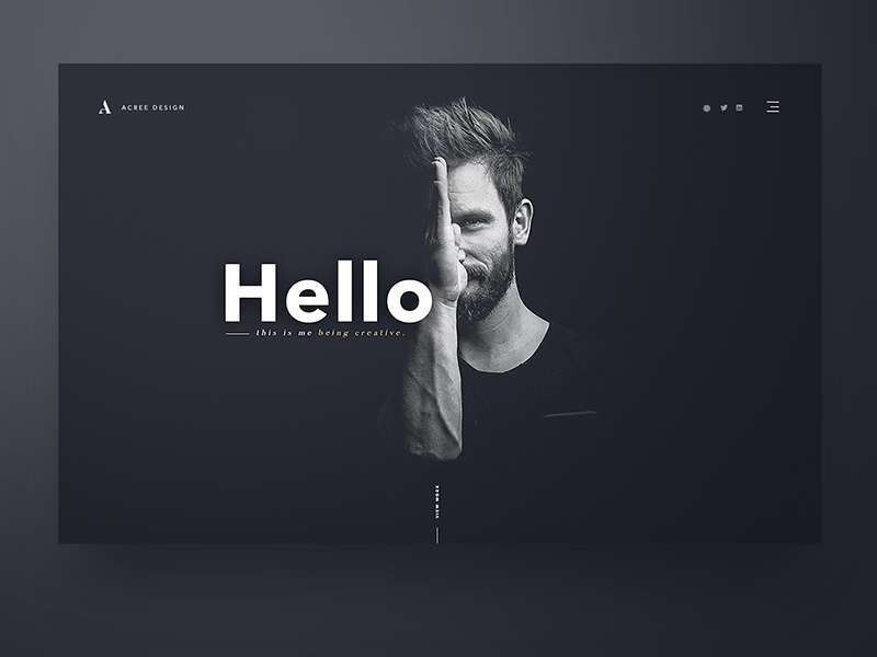
Personal Portfolio Site
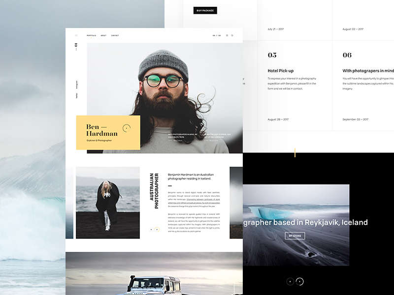
Ben Hardman
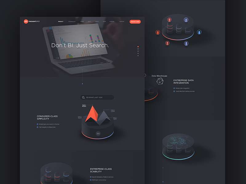
ThoughtSpot
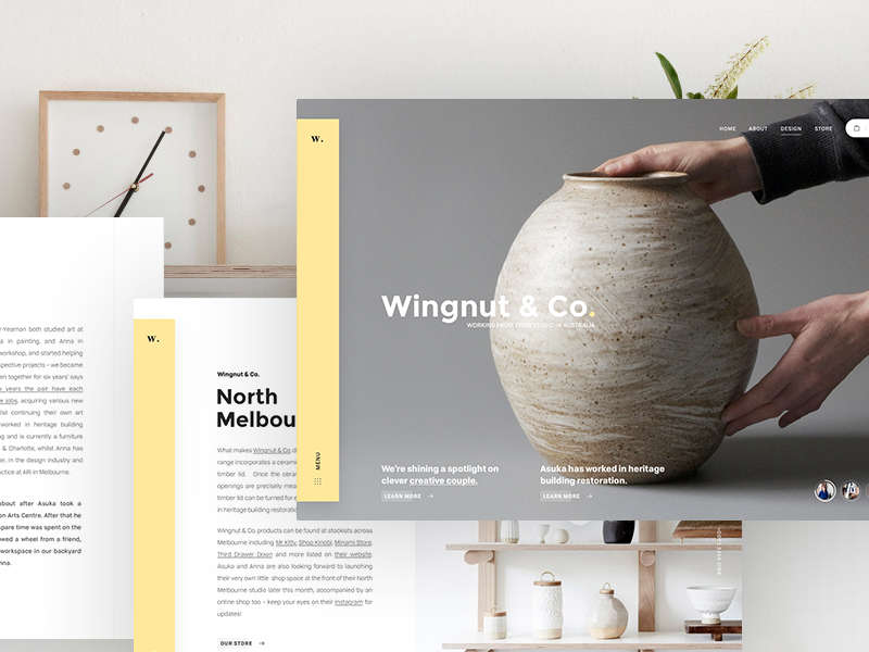
Wingnut & Co.
 Mockplus RP
A free prototyping tool to create wireframes or interactive prototypes in minutes.
 Mockplus DT
A free UI design tool to design, animate, collaborate and handoff right in the browser.


 Sign up with Google