When creating a new website or app, designers have to decide on one key navigational issue - to use vertical or horizontal navigation menus. There are merits to both and depend largely on the purpose of your website or app.
To cut out any confusion between the two options, here is the ultimate guide to vertical navigation menus to help you learn everything there is about them.
We’ll start by focusing on the basics and then go through advantages and disadvantages, along with best practices, examples, templates, and more. After reading this ultimate guide you’ll know for sure whether or not a vertical navigation menu is right for your next project.
Table of contents:
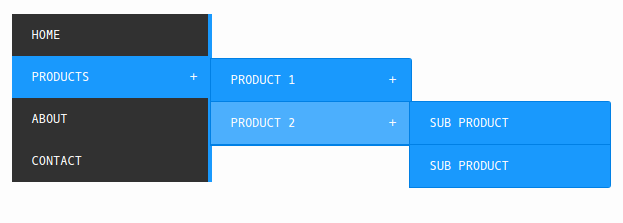
Vertical navigation, also known as the vertical sidebar or vertical navbar, is a navigation menu component stretching along the side of a page to present all links that will take users to different pages or parts of a website or mobile app.
Often, there is a clear tree structure, table, or group layout presenting all of the links hierarchically. This ensures fast navigation to desired areas, along with easy navigation between different pages in the app or website. Here is an example:
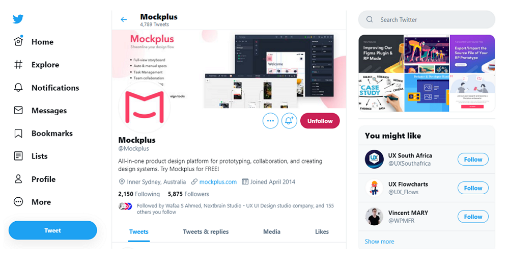
Twitter used vertical navigation to help users navigate between different content parts. The classic icons and simple item texts make the navigation easy to be noticed and understood when users need to navigate around.
The ideas of vertical and horizontal navigation are designed to help provide users a simple and effective way of presenting complex content in an app or website. But the design concepts behind each method are completely different.
Vertical navigation provides options in a clear hierarchical structure. It is easy for users to read, scan and locate content. This is far more mobile-friendly in size and is widely used in responsive websites.
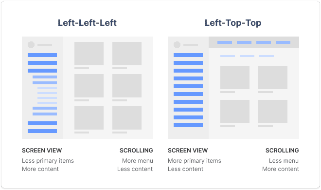
Horizontal navigation, on the other hand, is widely used by most websites and has been designed with limited screen space in mind. Often these are found at the top of the website, waiting for users to hover or click on the lists to expand it. Horizontal navigation bars can also integrate with full-width images, product sliders and other design options for eye-catching navigation.
Both of them have their own characters and should be used in different cases.
If this cannot help you make a decision, read more pros and cons of Horizontal vs Vertical Navigation Menus.
If you are thinking about using vertical navigation menus for your next project, here are the advantages and disadvantages you should know about:
Many designers choose vertical navigation since it brings a lot of benefits such as:
Easy to scan and locate With a large number of links or items along a page can look messy and ruin a website or app’s usability. By using a vertical structure to organize the links and items, you are creating a clear structure that is easy to scan and locate.
Easy to scale and iterate With a scalable tree or table structure to organize all items, vertical navigation is also easy to change or iterate. Being vertical, it is simple to add or delete anything in this list, all you need to do is find the right category.
Good for different screen sizes When working on a website project, choosing horizontal navigation menus means that you have to design another navigation version specially made for mobile devices. However, when you select vertical menus, there is no need to do that. You can simply adjust the width of the menu to fit it to the required size.
Vertical navigation also has its drawbacks:
Take more page space Vertical navigation menus often occupy the left or right column of your page, which seriously shrinks valuable page space. Sometimes, when the text of your menu items is too long, the vertical navigation can waste space.
Not a good fit to the user reading habit We all know that most users read website page content from left to right, making the horizontal navigation menus a much better option for them to scan, not the vertical navigation menus.
In short, you and your team should always evaluate the benefits and drawbacks carefully to see whether vertical navigation is suitable for your next project.
In most cases, when you want to showcase more menu links or fit more content into a list for users to choose from, a vertical list is perfect - especially if you’re mainly designing for mobile screen size. In these cases, horizontal is unable to showcase enough information and would take up too much screen space.
Here, we've compiled 5 best practices you can follow to build vertical navigation for your project:
Most designers prefer to put their vertical navigation on the left side since people always read horizontally from left to right when they are visiting a website. Nearly 80% of their reading time is focused on the upper-left corner of the page. Therefore, placing the vertical navigation on the left side is usually the right decision to engage with users.
However, that does not mean that you cannot put it on the right side. In fact, when you have limited page space and want to place more important or interesting elements in the upper-left corner to grab users' attention first, building the right navigation bar is also a good choice. This emphasizes what you want to deliver and also helps you create a unique navigation experience for users.
Generally speaking, put the vertical navigation on the left-hand side unless your design needs dictate otherwise.
No matter what type of websites or apps you are trying to design, a sticky vertical navigation menu is always a great way you should try to keep all menu links accessible from any point or section of your webpage. So, fix your vertical navigation at the left or right side for a better back and forth jumping between pages or page sections.
One-page layout websites put all page content within the same webpage reducing switching pages. However, this creates a difficult-to-navigate long page - this is when vertical navigation comes in handy. Now with links to certain parts of the page allows users to jump to their desired content.
So, using vertical navigation menus and a one-page layout together achieves a better UX.
Add simple and understandable link texts
You should make your menu text as simple as possible to ensure your users can understand what you offer and to create faster navigation around your website or app. It is also recommended to use recognizable icons to help create faster navigation by visually conveying links' meaning.
Use primary and secondary menu links
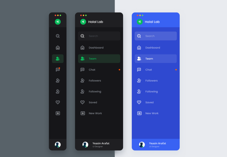
Similar to designing other types of menus, when designing a vertical navigation menu you should always use primary and secondary colors to show a hierarchy between menu items. Include hover and clicking interactions to create a more user-friendly approach to expanding the menus.
A selection effect, such as a different color shade when hovering or selecting a menu item lets users know where exactly they are and what they are choosing.
Group similar links and add subtitles
When there are many link options in a menu, try to group similar ones into categories and give them subtitles for faster visual navigation.
Vertical navigation bars take up much more page space and sometimes affect the display of the page content in a bad way. So, many designers choose to hide their vertical navigation menus to get more page space to display important content. As a result, users will need to click or hover over a brand logo or a hamburger menu icon (often in the upper-left corner) to expand the dropdown vertical navigation menus.

Click the three-line icon to slide out the vertical navigation panel
However, sometimes, hiding the menus may also hide it forever, letting users ignore the navigation menus completely.
Whether or not you hide the vertical navigation, you should always make a decision after you've fully tested your website or mobile app with the help of a design or prototyping tool. Such a handy tool translates your ideas into functional prototypes and helps you fully test on different devices, share and iterate with your team from start to finish.
Nowadays, when designers cannot make a decision on whether to use vertical or horizontal navigation, they also use both of them in their projects, letting users choose the desired one according to their habits. You have to be careful here not to overload the page with menus, you have to take a subtle approach when using both horizontal and vertical menus together.
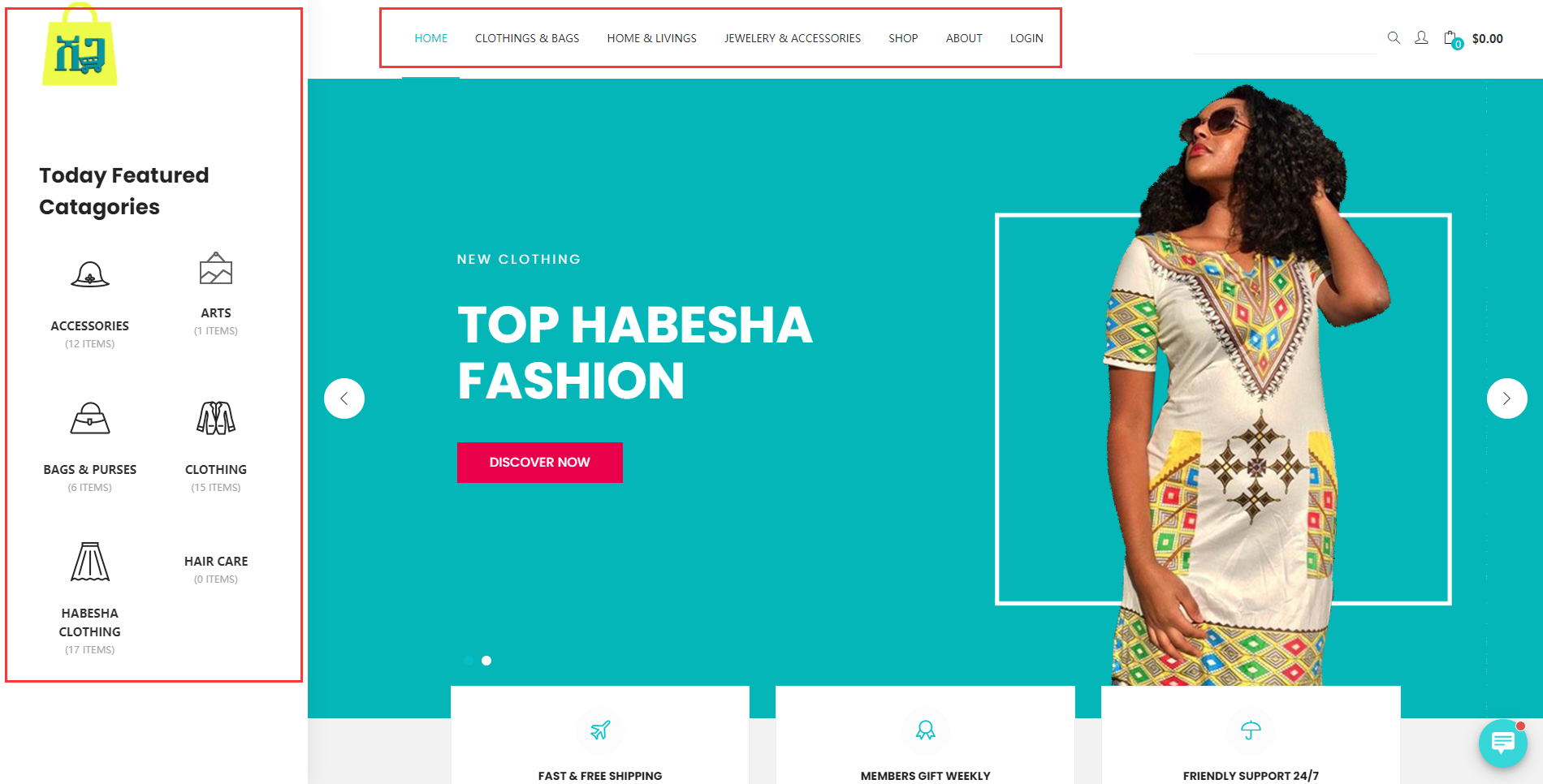
An online shopping website used both vertical and horizontal navigation to guide users to navigate around.
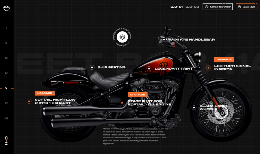
Harley Davidson is the official website of Harley Davidson Motor Company. To help site visitors check all the latest and best motorcycles and browse motorcycle parts and apparel as they wish. The Harley website uses a simple numerical sidebar, and while hovering over the sidebar, it will automatically slide out to show all menu links instantly.
The unique horizontal scrolling, rich videos, and high-quality images, detailed introductions, and other user-friendly designs help visitors locate their deals and find their information quickly.
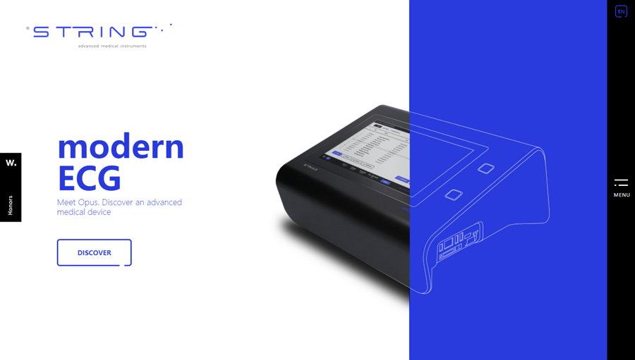
String is a minimal website selling ultramodern medical equipment. The navigation system is also minimal, with a hidden vertical navigation menu on the right-hand side. Clicking the menu icon then expands the menu. This integration is smooth and helps the user move through the website quickly.
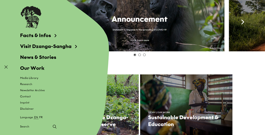
Dzanga Sangha Protected Area - a website made for an intact forest landscape that helps protect endangered species, uses a collapsible vertical navigation menu. Users click on the hamburger menu to expand the menu. There are smart hover effects with intelligent hierarchical options for efficient usability and scanning. Along with a good navigation menu, the color scheme also helps differentiate items in the menu from the main page.
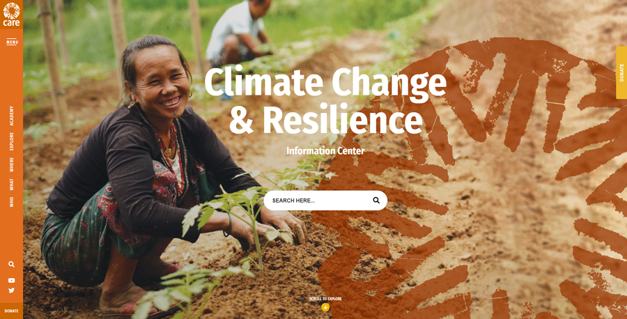
Care Climate Change is a modern website aiming to strengthen the awareness of climate change and offer support for people to tackle some problems caused by climate change. This website uses a collapsible vertical navigation bar. Users can easily click the "Menu" at the upper-left corner to expand all menu options.
With a smooth transition, a clean list layout, and bright background color, this vertical navigation menu is visually appealing to all.
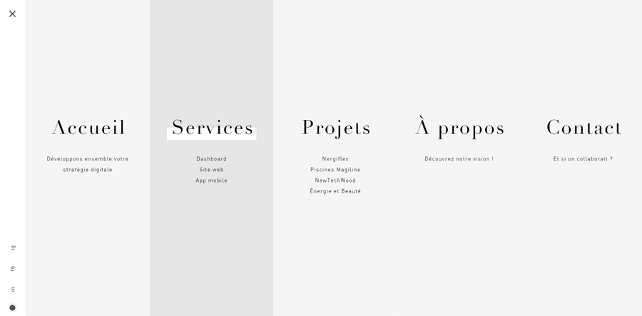
Everess is a concept website design made by a web agency that specializes in web and mobile app design. Similar to Care Climate Change above, this website also has a collapsible vertical navigation bar, but this website stands out for a sliding animation that helps expand all menu options gradually and elegantly.
For increased usability, all menu options are further divided into five lists with clear, scannable subtitles.
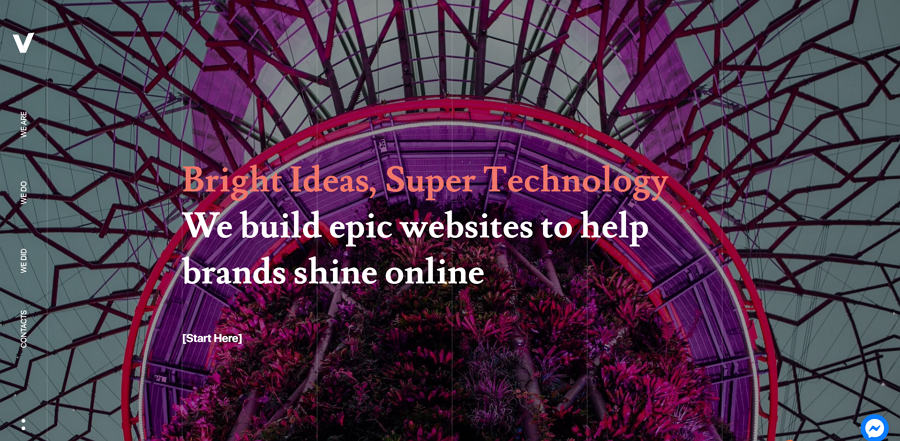
Veedoo is a high-end full-screen website designed by a digital agency. The vertical navigation bar incorporates brilliant touches such as micro-interactions and brings a delightful experience to the user. When hovering over a menu option, the background will immediately change into white to reduce any distraction on the user.
In the menu option, there are keywords such as “We are” when users hover over the words it has a simple one-word answer, in this case: “Agency”. This brings interactivity to a whole new level and reduces any wasted time in the user trying to guess what the company is, what they do, what they’ve done, and how to get in contact.
In addition to this, there are nice slideshows, text animations, and a full-page design to fully immerse users.
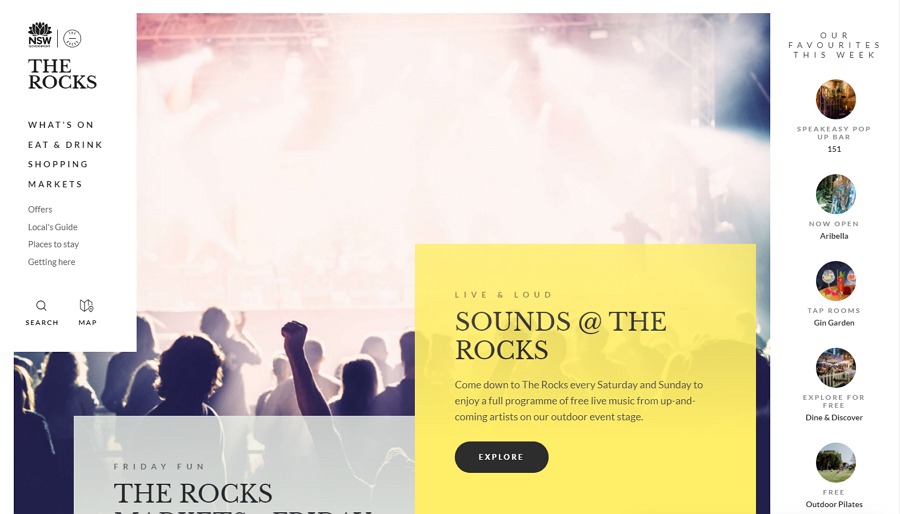
The Rocks has a creative vertical navigation menu featuring two different states. On the first arrival on the landing page, the user will be presented with a fully expanded navigation panel, including buttons for search and maps.
However, when the user scrolls down, out of the landing page, the navigation bar collapses, giving more space to the page's more important content. The user is made aware of the menu from when they first entered the page but when viewing the website's content the menu is collapsed, with buttons for expanding the menu, search, and maps. This is an innovative method for integrating a vertical navigation menu into a website and is worth noting for your own projects.
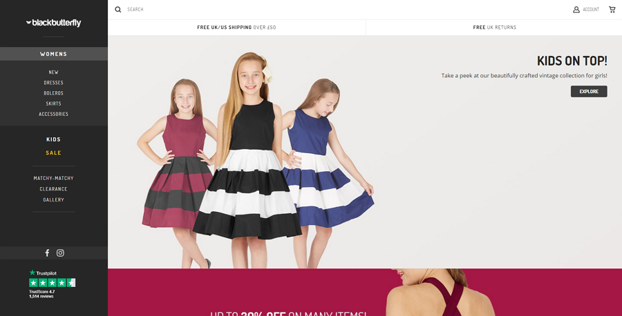
Black Butterfly Clothing is a modern eCommerce website featuring a nested vertical navigation bar. To help users find and purchase their clothes as quickly as possible, the designers separated products into three main categories and nested all smaller options into these three sub-categories. A lighter gray background color makes this dark navigation bar stand out from the main white page easily.
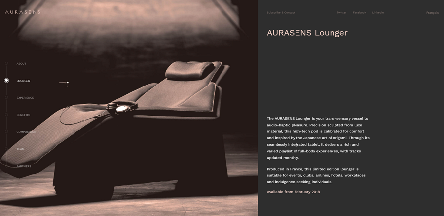
Aurasens is a beautifully refined website for a startup. As this is a one-page layout, the vertical navigation menu guides users trying to navigate between different page sections, helping them find their desired information quickly.
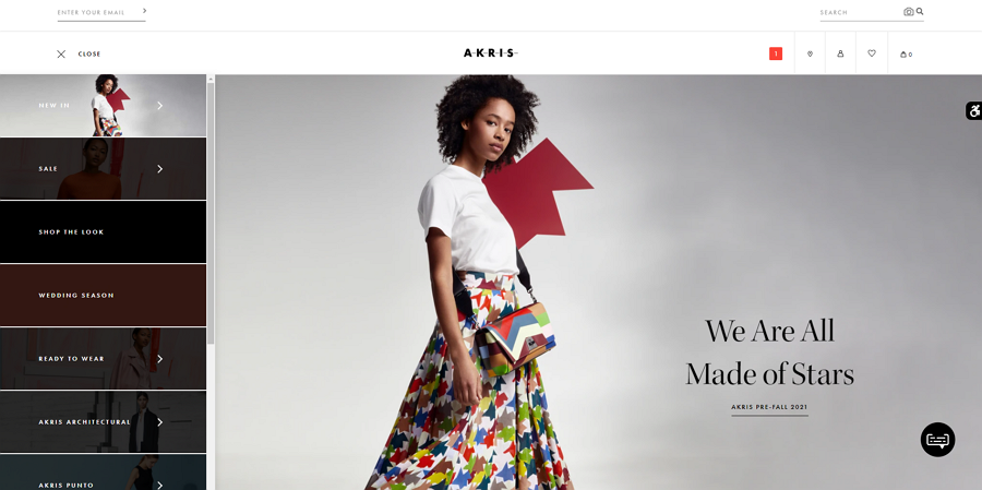
Akris is an online modern fashion shop for a luxury Swiss brand. This website features a collapsible navigation bar that consists of a scrollable image slider with descriptive text. Users can simply scroll the slider to find the needed menu options.
A thoughtful accessibility icon also sticks on the right edge of the page to help users quickly set and change their accessibility options according to needs and preferences.
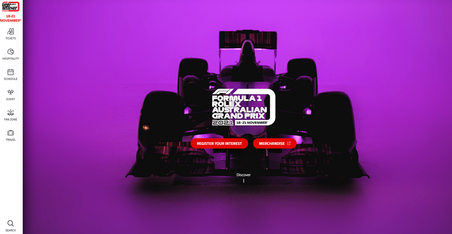
An icon tab bar is used in the F1 Australian Grand Prix website, allowing users to widely expand the main page. This menu is a good solution to people finding the large size of regular vertical menus restrictive.
There are also full-screen background videos to create an immersive experience, with the menu still being accessible and the color scheme bringing an impressive visual feast.
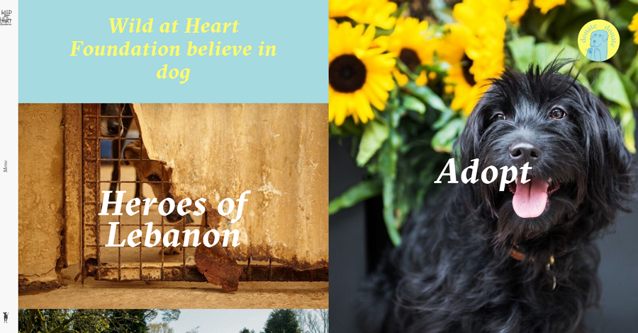
Wild at Heart Foundation is a heartwarming website made for rescue dogs and adoption projects. There is a useful sliding navigation menu giving information to users space on the main page without taking away from the main content.
When visitors open this website, there is a simplified menu bar placed on the left side. When users click the menu bar, a well-nested menu drawer will slide out aside the main page, with the main page also moving to the right correspondingly. The drawer sliding animation is slick, cool, and really adds to the user experience.
Needless to say, this website uses many good designs, such as clean, grid layouts, cute dog loading icons, bold colors, and more.
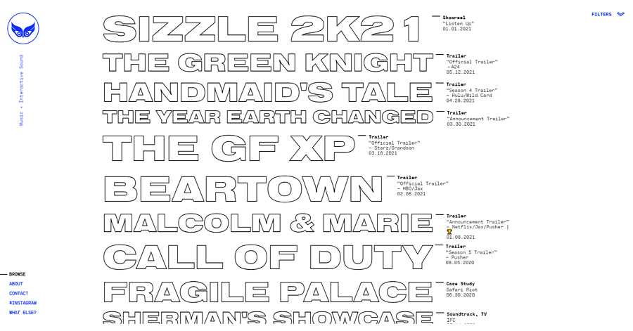
Safari Riot is a brutalist website that directly displays all projects with hollow fonts on the main page. To list as many projects as possible, the designer has squeezed the vertical navigation bar into a very small list in the lower-left corner.
If you also want to create a personalized brutalist website, the integration of a useful but well-hidden navigation system on this website would be an inspiration for yours as well.
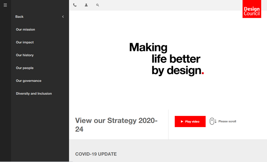
The Design Council website uses a collapsible vertical navigation menu with additional submenus. Unlike other websites when hovering is used to expand submenus, here, you need to click to expand the submenu.
The entire navigation menu is expanded further out from a slim bar, expanding whenever the user goes into a menu or submenu.
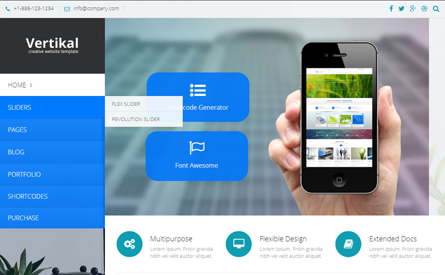
Vertikal Responsive Website Template is a business website template with a unique vertical navigation. Hover over one menu option and the submenus will immediately open up. There are drag-and-drop page builders with 50 elements, responsive design, unlimited color options, and instant customer support, these all features match your design needs easily.
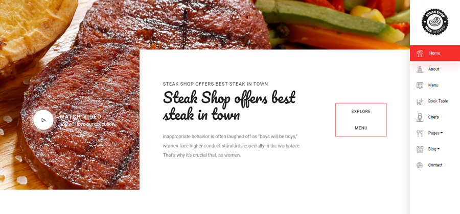
The Steakshop Restaurant Template is a beautiful website template made primarily with food and restaurant projects in mind. There is a sticky vertical sidebar with menu options remaining on the page wherever the user navigates. Designers can then freely add their own content as they wish, with drag and drop images, easy to edit forms, and more, to create an engaging website.
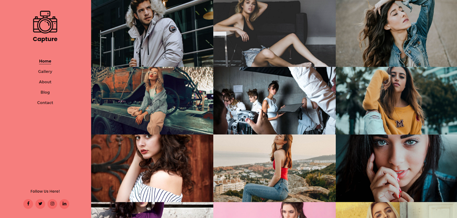
Capture Portfolio Website is a multipurpose website template for creatives such as designers, photographers, and artists to help create a beautiful portfolio or personal website. The vertical navigation menu is attractive and useful, fitting the overall feel of the website and brings impressive yet simple usability. There is also a grid layout to help present your portfolio and projects off in a clean and effective manner.
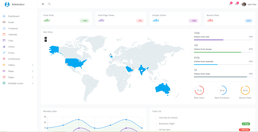
Adminator Dashboard HTML Template is a responsive Bootstrap template with a simple, customizable vertical navigation bar on the left-hand side. The icons bring different colors and are great for fast recognition in the menu, g, helping users quickly understand visually and distinguish different options.
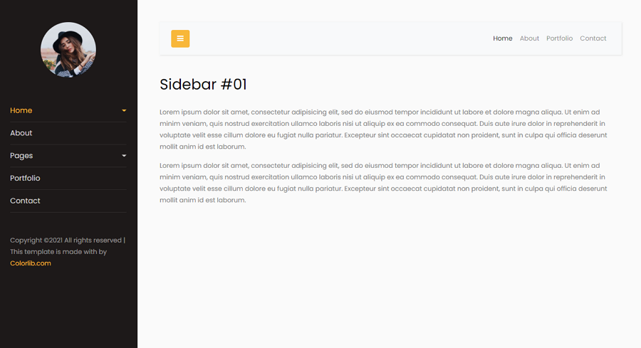
This free Bootstrap website template has a nested vertical navigation menu. You can also click the three-line icon to hide the entire navigation panel, providing a simple and easy-to-customize template for your project.
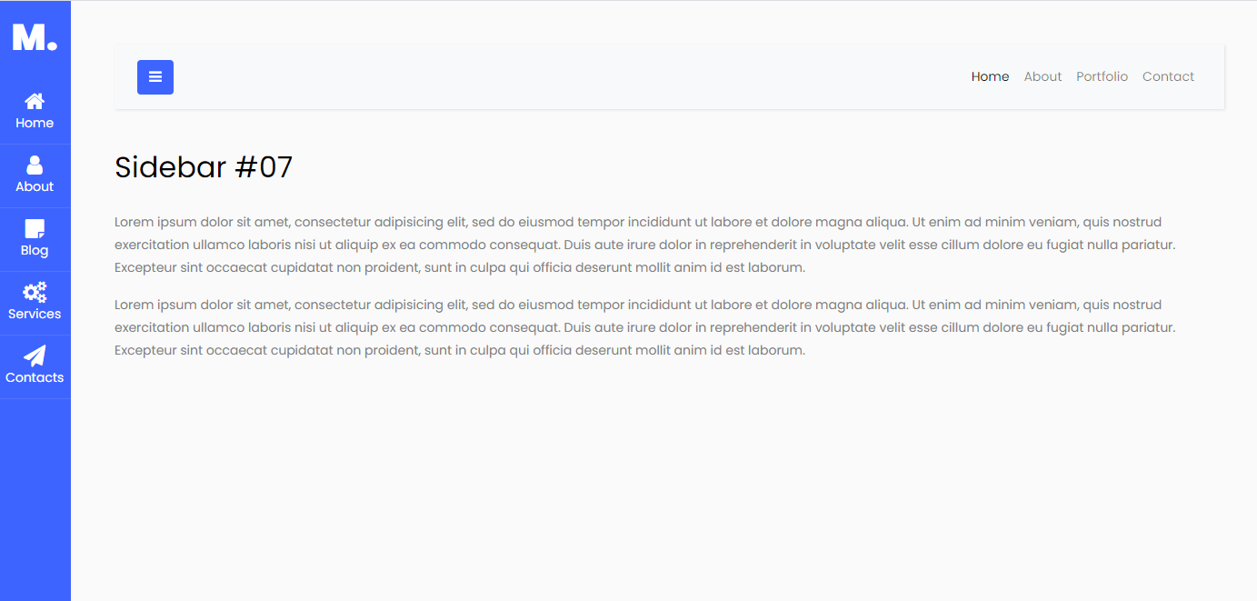
This free icon tab Bootstrap template has an icon tab bar navigation, providing simple and easy-to-understand usability and visuals. This is a great template for designers looking to have a useful vertical navigation bar while maintaining page space.
Vertical navigation provides a more natural hierarchy list for links while potentially taking up more page space. The benefits when implemented correctly are striking as you can see in the above examples. If you are designing a responsive website that is suitable for mobile as well as desktop, take a long look at vertical navigation menus.
Using this ultimate guide, you should now be able to decide between a horizontal or vertical navigation menu, take all of the benefits into account, and bring in your own uses before making a decision.
 Mockplus RP
A free prototyping tool to create wireframes or interactive prototypes in minutes.
 Mockplus DT
A free UI design tool to design, animate, collaborate and handoff right in the browser.


 Sign up with Google
 Join our Discord community
 support@mockplusapp.com