When it comes to designing a first-class website, there are many things that designers need to take into account. Content, layouts, typography, colors—the number of topics can be overwhelming. To make things easier for our readers, we’ve created this guide with basic web design principles.
In this article, you will find:
12 basic web design principles
4 best responsive design principles
3 recommended books about web design.
Content is the reason why people visit websites and web designers should strive to provide useful content for their visitors.
Things to remember:
Ensure that content is relevant to your business and user needs. Every piece of information should be valuable for people who visit your website. When you design a website, always start with content inventory and content audit. Identify what content you have and prioritize it according to the value it provides to your users.
Avoid jargon. Unfamiliar terms make it harder for users to comprehend the information. It’s recommended to write for all levels of readers—pick words that everybody can understand.
With professional web design services, you can ensure that the overall look and feel of your website remains consistent across all pages. All web pages should look like parts of the whole product, rather than a collection of individual pages. Consistency of functional design (UI controls) and visual design (colors, typefaces, styles) will make your website more predictable for your visitors and improve the overall usability of your product.
When people visit websites, they don’t read web pages; they scan them. When a visitor lands on a new page, they scan it in an attempt to find valuable information. And you, as a designer, can help them with that by designing a proper visual hierarchy.
Things to remember:
Ensure that the visual hierarchy of your pages follows the natural scanning patterns. Web visitors typically read left to right and from top to bottom. Two popular scanning patterns are F-shape and Z-shape patterns.
Always break long sections of text into chunks. Break blocks of text into paragraphs and use headers and bullet points. By doing that you help visitors more easily scan the page.
Try to provide the most valuable information at the top area of the page (‘above the fold’ area) so the user doesn't need to scroll through the page.
Stick to a grid layout. Grid layouts help to create consistent layouts on various screen sizes. When you use grid, all assets such as images adapt to various screen sizes & resolutions. As a result, visitors will have great UX no matter what device they use.
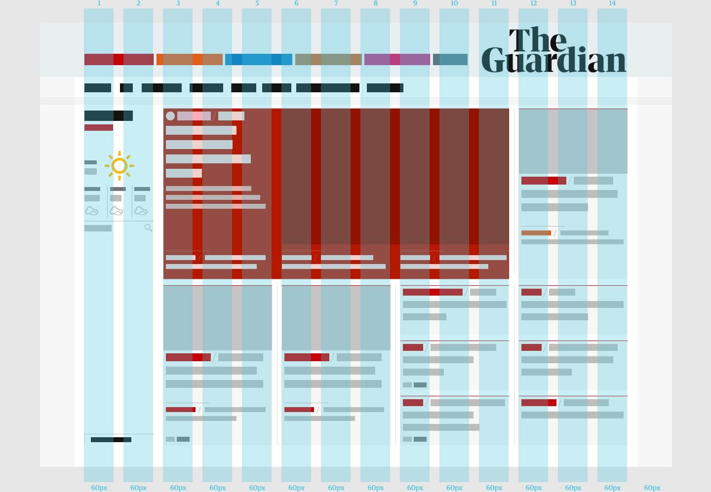
12-column grid layout of The Guardian. Image by Guardian
Effective navigation is an essential part of good web experience. No matter how beautiful your website is, when users are unable to navigate it, they leave it.
Things to remember:
Invest time in building a robust information architecture. Good navigation design is rooted in solid information architecture. Conduct card sorting to learn how your visitors structure content and organize content according to their mental models. Only after that, build menus that allow visitors to navigate between the critical sections of your website.
Do not hide navigation. Hidden navigation patterns like hamburger menus hurt website usability. Users are more likely to abandon your website if you make them hunt for navigation.
Put the menu in places where visitors expect to find it. Typically, it’s at the top of the screen or sidebar.
Use clear labels for navigation options. Labels should be descriptive—they should tell visitors what they will see when they click on them.
Limit your top-level navigation options to a maximum of seven choices. Cognitive psychologist George Miller stated that an average human could hold in working memory 7 ± 2 objects. This rule applies to anything in your design, including navigation. By minimizing the number of choices, you help users make a decision.
Put navigation options to the footer of the page. A footer is a place where visitors expect to find navigation options when they scroll down to the bottom of the page.
Minimize the number of clicks. The three-click rule says that visitors should never be more than three clicks away from what they are looking for. Keep in mind that when designing your navigation experience.
More visual weight means more emphasis on certain items. It’s possible to add more visual weight using color contrast, size of items, and the whitespace between elements. For example, if you want to ensure that visitors will notice your call to action button, make it large enough with a contrasting color.
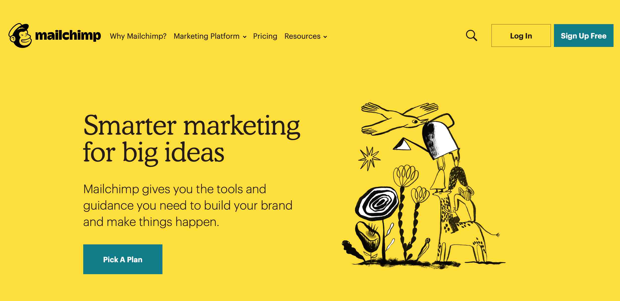
Mailchimp makes the most important elements (call to action buttons) on a page stand out
More than 95 percent of information on the web is in the form of written language. It’s vital to ensure that visitors can read the text without any problems. Make text both legible and readable.
Things to remember:
Do not use more than 3 font families. Too many font families can make your design look sloppy. When you want to create a hierarchy using typography, you can always play with the size or weight of existing fonts, rather than add a new font. Strive to use a maximum of three different typefaces in a maximum of three different sizes.
Ensure that the body text is easy to read. A rule of thumb is to select 16px size for body text because this size guarantees good readability.
Ensure that the text has a proper color contrast. Quite often, designers use light grey text on light backgrounds to create nice visual aesthetics. While this approach is fine in terms of graphic design, it leads to lousy UX because it affects the content’s readability. The W3C recommends a 3:1 contrast ratio for large text (at 14 pt bold/18 pt regular and up) and graphics and 4.5:1 for small text. Tools like Color Contrast Checker will help you check if you have a sufficient color contrast for your text.
Images can be more powerful than words. Humans are visual learners, and relevant imagery can be beneficial for understanding the concepts described in the text. However, the keyword here is ‘relevant.’ Incorrect image choices can easily confuse visitors.
Things to remember:
Avoid purely decorative images. Such images do not serve any functional purpose and can easily introduce more clutter to the layout.
Avoid using generic stock photos of people. Images with human faces can be a very powerful tool for engaging your visitors and building trust. However, too many websites use inauthentic stock photography, and when visitors see such images, they feel a sense of fake.

Generic photography rarely portrays a positive image for your organization. Image by lifeofpix
Slow loading time is one of the reasons why visitors leave websites—almost 50 percent of users expect a web page to load in two seconds or less.
Things to remember:
Optimize content for fast loading. Focus on optimizing heavy content such as high-resolution images and videos. Use Squoosh to compress large raster images and try to use more SVG than raster graphics.
Do not use blank pages during loading. When loading takes some time, consider displaying a loading indicator (such as an animated spinner) or skeleton screen.
Use Google’s PageSpeed Insights to identify performance problems on your website.
There are two types of links—internal links (links that lead to other pages on your website) and external links (links that lead to other websites). All internal links should open in the same tab because it allows visitors to use the browser “Back” button to go back to the previous page.
Any expected UI objects that suddenly appear on the screen can easily confuse and frustrate the site’s visitors. Pop-ups are interruptive by nature, and this makes them bad in terms of UX. Since a majority of pop-ups serve as advertising and do not provide much value to the site’s visitors, people tend to ignore them. This phenomenon is known as banner blindness.
Unexpected music or sound can cause problems for the site’s visitor's━ people might be visiting your site at work or in a public place, any unexpected music will make them search for the Close button. Always mute music by default, but allow visitors to turn it ON if they want (by clicking on the sound control).

Facebook auto-plays videos but turns the sound off
A visitor can easily become frustrated when they click a link on a site and receive a 404 error page in response. Tools like Brokenlinkcheck and Deadlinkchecker can help you find deadlinks on your website.
Today there are billions of devices running web browsers. Site visitors can come to your site from various devices such as a desktop, tablet, phone, or even a watch. A big part of good web experience is ensuring that no matter what device the visitor uses, all vital information is displayed correctly on their screens. Responsive web design is an approach that uses CSS media queries to change the page layout based on the target device dynamically.
Below are the top 4 best responsive design principles:
Group various screen sizes into a few major categories, and design for each group. Typically, you want to design for mobile, tablet, and desktop screens. Use CSS media queries min-device-width, max-device-width, and orientation to define the characteristics of individual screens.
Flexible layouts are layouts created using grids. Such a layout consists of columns that automatically rearrange themselves to fit the size of the screen or browser window.
The content in flexible layouts is also flexible. For example, every image is loaded in its original size, unless the viewing area is narrower than the image’s original width. Never hardcode the height and width of the image; instead, let the browser resize the images as needed.
When designers have less space to display information, they have to carefully select the content they want to show to visitors. When users navigate your website on a small screen device, they tend to look for specific information such as contact information. You need to prioritize the primary information and hide/remove all secondary info.
Here are two things to remember:
Create a mobile layout first. The mobile-first thinking is essential in web design because it will help you create a content-first experience.
Use CSS queries visibility: hidden to hide some content on mobile.
Mobile visitors use their fingers to interact with UI elements. To make the interaction more comfortable for them, it's recommended to size interactive elements appropriately (make elements like buttons larger on the touch screen). The recommended target size for touchscreen objects is 7-10mm.
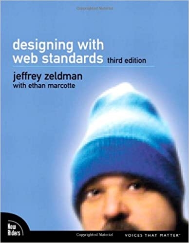
Book by Jeffrey Zeldman and Ethan Marcotte
Jeffrey Zeldman is one of the web’s first designers and bloggers. He publishes A List Apart “for people who make websites.” In the book “Designing with Web Standards,” he shares an essential guide to creating sites that load faster, reach more users, and cost less to design and maintain.
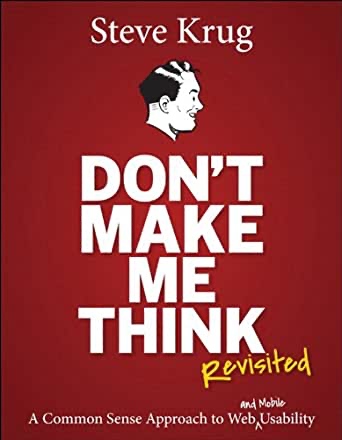
Book by Steve Krug
Since Don’t Make Me Think was first published in 2000, thousands of web designers and developers have relied on Steve Krug’s guide to help them understand the principles of intuitive navigation and information design.
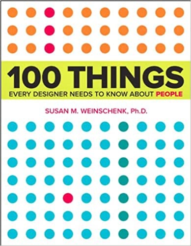
Book by Susan Weinschenk
Design is not for designers; it’s for users. Designing without understanding what makes people act the way they do is like exploring a new city without a map: results will be far from efficient. In her book, Susan Weinschenk combines real science and research with practical examples to deliver a guide every web designer needs.
When you design a website, you should always think about your visitors. Every design decision should be focused on making the experience as pleasant as possible. At the time when you finish working on your design, it’s vital to test it with real users. When you see how real visitors interact with your website, you will notice what areas of your design require refinement.
 Mockplus RP
A free prototyping tool to create wireframes or interactive prototypes in minutes.
 Mockplus DT
A free UI design tool to design, animate, collaborate and handoff right in the browser.


 Sign up with Google
 Join our Discord community
 support@mockplusapp.com