Aside from the main body content, a website includes a header and footer, which serve a particular purpose to help visitors. We previously shared 20 best free website header design templates and examples for your inspiration. Since we believe that website footer design is just as important, we’ve also put together a list of 20 best free website footer designs for you to look at.
Before we dive into our list of footer designs, let’s answer two vital questions:
A website footer is a section of content at the very bottom of your webpage. The opposite of a website header, which appears at the very top of your page, the footer might be the last thing your visitors see -, especially for those who scroll down quickly.In this case, the footer may be more important than you think.
In general, a footer provides two benefits which enhance your website:
Provide key information you want your visitors to see again.
Your website’s body contains the essential message you want to convey, but the footer can help emphasize core information. In addition, if you have more content that cannot be displayed on the page properly, the footer provides screen real estate. For example, links to external resources, links to secondary pages, your sponsors, privacy policy, and terms and conditions.
Offer guidence to your visitors without the need to scroll back to the top.
Your visitors may have no idea how long your page is, and it is not user-friendly if they have to scroll all the way up to the header if they need to search for something. The website footer will allow your visitors to navigate your site easily even when they are near the end of the page (especially if you don’t have a “back to top” button). Make sure your website footer contains all the sections of your site as comprehensively as possible. You’ll then increase your visitor retention rate.
If you want to use a footer to attract your visitors’ attention successfully, it should be functional and aesthetically pleasing.. Below are some principles you should bear in mind:
Make it simple and clean: You should keep all the content organized and easy on the eyes.
Make it professional and trustworthy: If you want visitors to take action, you must earn their trust.
Make it aesthetically pleasing: You should carefully choose colour contrasts, font size, and structure. Also make sure your footer blends well with your overall website design.
Designing a functional and beautiful footer actually requires a lot of work. Before you start, you need to think certain things through: What should be in your footer? What should NOT be in your footer? .
So, what should be in the footer of a website?
These three sections of content are essential for any website. They are necessary for legal protection.
Copyright: The year and the copyright symbol will protect your website from plagiarism.
Privacy Policy: Explains how you will use and protect your visitors’ personal data and other information.
Terms of Use: Offers general rules and guidelines governing the use of the site and/or products.
Want to your visitors to get in touch and become your customers? Then it is imperative to offer them straightforward ways to contact you. The most common means of contact are:
Phone number: It is better to have a CTA button for visitors to dial directly.
Email address: Email is still one of popular ways to boost business and get in touch.
Address: Show your visitors that you’re a real entity by providing a physical address. This will also help earn their trust.
Social icons: Make it easy for visitors to share your page and find & follow you elsewhere online.
A sitemap allows visitors to navigate your website easily. Furthermore, it helps Google index your pages better.
Highlighting your personality and brand makes your website more trustworthy and push your business to succeed. Use photos, videos, and galleries to share your identity.
CTAs in the footer allow your visitors to use your product or contact you more conveniently because they don’t need to scroll back up.
Sign up: Where your visitors can sign up with an email
Sign in: Where your visitors can sign in with an email
Subscribe: Where your visitors can subscribe to newsletters
If you want to look better in the eyes of Google, then you can use some keywords for search engine optimization. However, do not overdo it as Google does not like over-optimization.
Tell your visitors who you are, what you do, and where you are. Step out of the boring business box and show some personality instead.
Events: Share milestones and important past events, as well as upcoming ones.
Logo: Display your logo in the footer for branding.
Gallery: Insert a mini gallery of your members.
Awards: Showcase your awards.
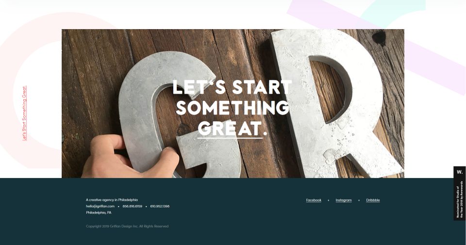
Griflan offers web design, print, brand marketing, illustration, and animation services. Its entire webpage is dominated by dark blue and white, and the footer uses the same color scheme. This makes the footer consistent with the main body of the webpage.
The design is very simple and clean and only contains contact options, such as email, phone number, and social media. The best part of the design is the large image right above the footer, which features a strong overlay effect and animated text underline effect. Better yet, it is clickable!
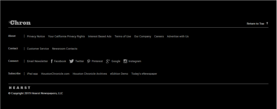
Chron is one of the largest newspapers in the United States. Its unique website footer design does away with verticle colums, but uses a horizontal structure and layout to display the content instead. Like most newspaper websites, Chron offers several subscribe options, giving users the freedom of choice.
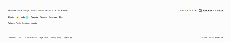
Awwwards is a website which aims to recognize and promote the talents and efforts of the best developers, designers, and web agencies in the world. Its footer features minimalistic, simple, and aesthetic design with the use of thin sans serif and plenty of white space.
The footer displays its personality and brand with maximum impact, especially by leading with the line “The awards for design, creativity and innovation on the Internet”. At the very bottom, it contains a navigation bar to encourage visitors to explore the site further.
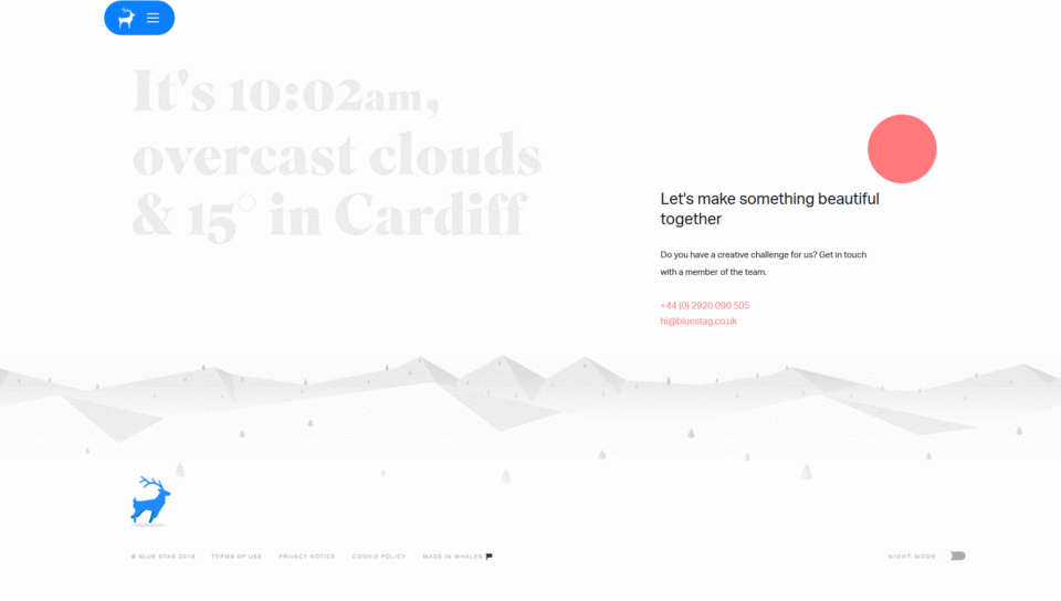
Bluestag is a very creative design studio, and their footer design is a testament to that creativity. The animation is absolutely fantastic. The eye is caught by a running blue stag (which takes on the form of the logo) and gray mountains in the background. This combination makes the brand sticky, leaving a memorable impression on visitors. In addition, the design works in tandem with the fixed logo at the top-left of the page. An ingenious way to magnify the brand, for sure.

WPB is a resource site for WordPress beginners. Their footer design is very straightforward with little decoration. However, it is well-designed and uses three sections to convey more information. The first is the association memberships, which is shown at on the top of the footer. The main part consists of their mission and values. The very bottom shows the copyright.
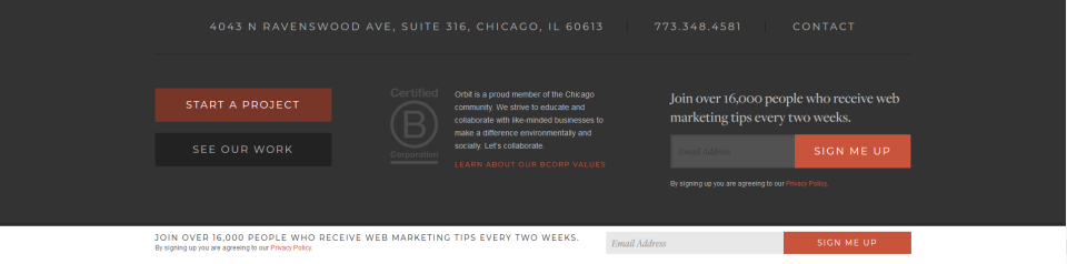
Orbit is a design studio that makes the internet more helpful and informative one website project at a time. Its footer has almost everything we discussed in Part 2. The contact option is at the top right. Orbitmedia only only offers an email address, a phone number, and social icons, but the contact copy is also clickable, redirecting to a form. In addition, the footer is CTA-focused and About Company-focused. You can choose to subscribe, start a project, or explore their work.
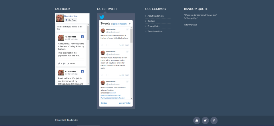
Random claims to be the most random site on the web. It specializes in randomizing different things. The footer design is quite different from the norm, and it almost reaches the length of a complete screen size. It emphazises the power of social media like Facebook and Twitter.
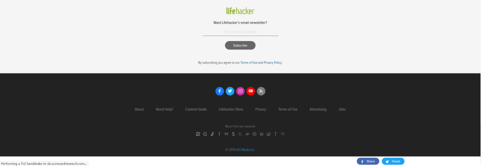
The site covers a wide range of content - from food and health to gossip and politics, and everything else under the sun. Their footer design highlights two big chunks of social media and newsletter subscription options. You can click on “More from our network” icons to explore the rest of the site.
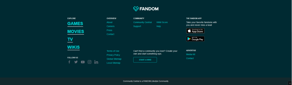
Fandom has a well-defined and brightly-colored footer design. The vibrant color scheme draws users’ attention and the copy features a hover effect. The download options serve as an incentive for users, boosting Fandom’s user base.
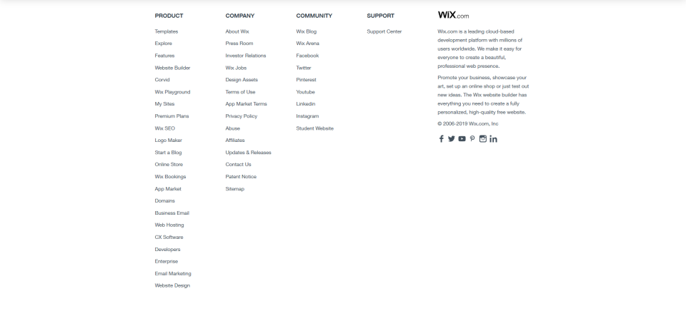
Wix groups all the function pages of the website clearly, all with black text on a white background - clean, simple, and concise. Its footer is CTA-focused and About Company-focused, and you can easily navigate to anywhere on the site.
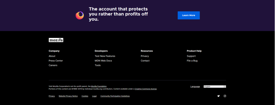
Although the footer’s color scheme is heavy, it doesn’t overwhelm the user. On the contrary, it exudes a feeling of calmness. It highlignts the download option with compelling context and a big image. There is also a language option for visitors who may not speak/read English.
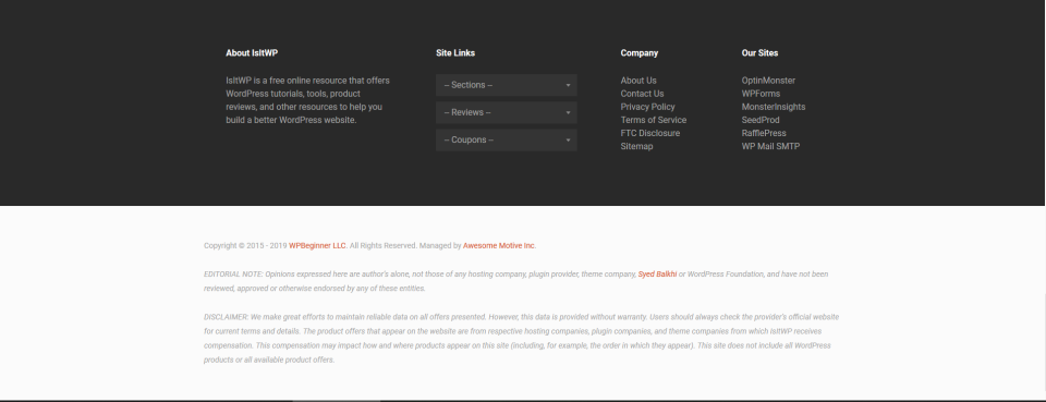
A Wordpress-themed online community, isitwp has a very functional footer. It displays the brand’s personality with well-written copy: “A free online resource that offers WordPress tutorials, tools, product reviews, and other resources to help you build a better WordPress website.” The site links contain a drop-down menu to guide you where you want to go. In addition, the sub-footer adds legal information such as copyright, EDITORIAL NOTE and DISCLAIMER.
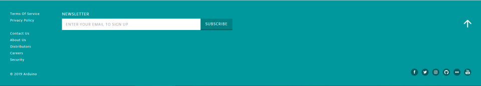
This open source community’s CTA to subscribe to their newsletter cannot be ignored. The footer design is quite straightforward, providing all the necessary information without any fuss.

Roblox is a game platform and its footer design highlights the different app stores where users can download the app.
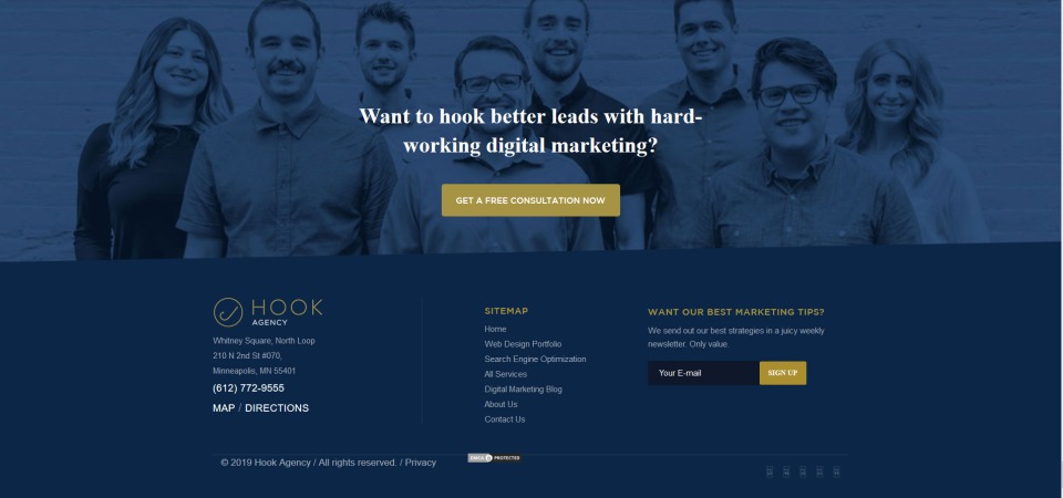
Hook offers services such as web design, SEO, and data analysis. The best part is the big background image of their team members, adding an element of personalization and trust. In addition, it highlights the company identity, sitemap, and signup CTA.
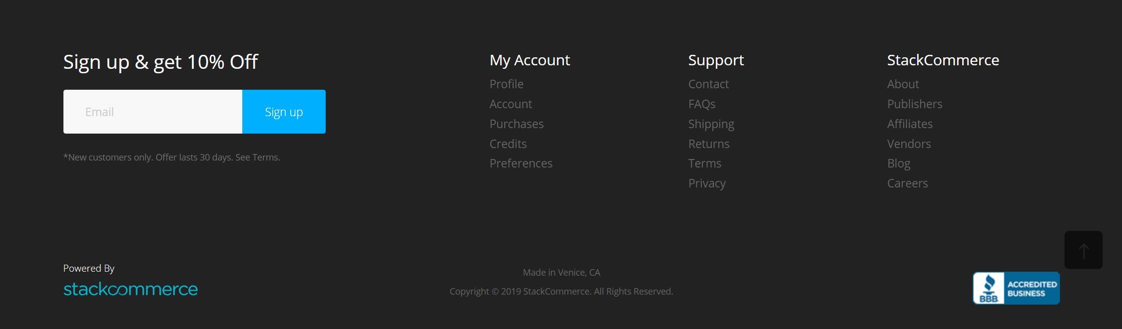
Stacksocial is a website that helps customers worldwide source amazing products. Its footer highlights their special offer for new customers - 10% off for new signups. This makes it compelling for first-time visitors who have gone through the site and have decided to make a purchase.
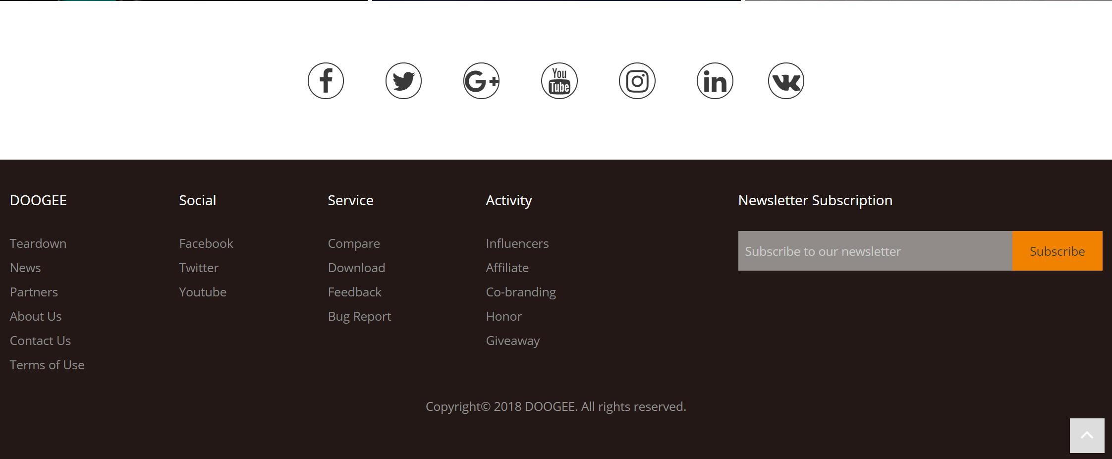
Doogee brings high- performance products to the global market with beautiful design and features. The website isdark-themed and the footer keeps things organized. With the social icons and social links displayed in an orderly fashion, Doogee shows they really want users to get in touch. At the right is a highly-visible CTA for newsletter subscription.
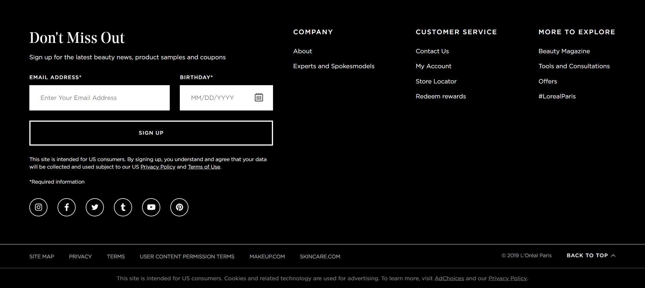
L’Oréal Paris is a leading total beauty care company based in Paris, France. You will see affordable luxury goods with detailed information when scrolling down. Its website footer design is also pretty impressive, reflecting its mission of excellence in beauty. At the right is a big area which encourages users to sign up for the latest beauty news, product samples, and coupons. The subfooters include additional useful information.
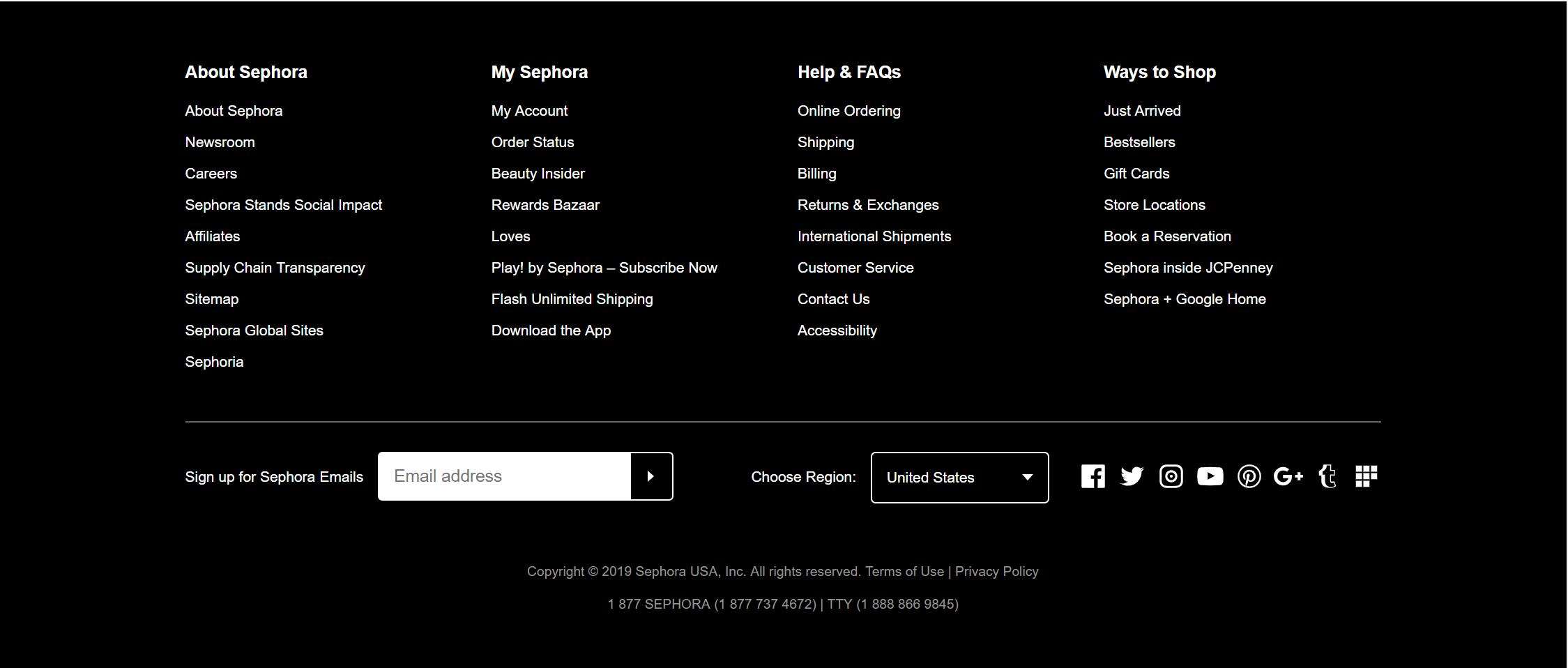
Sephora is a famous makeup brand. Its footer design is extremely simple, using only a white sans serif font against a black background. There is a big input box in white where you can enter your email to sign up.
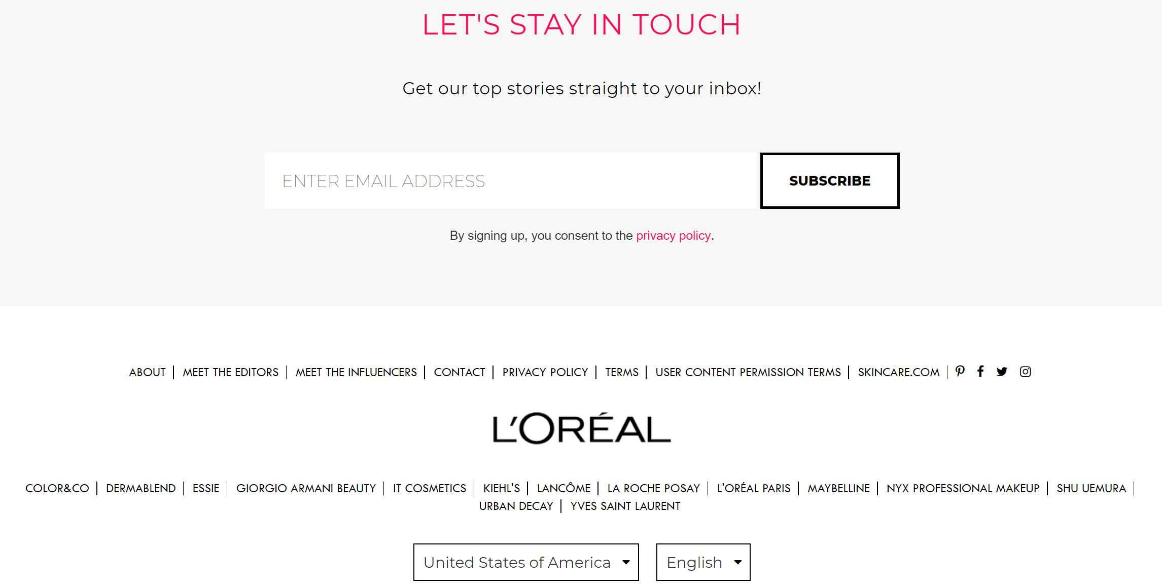
Makeup is a website where you can break down looks across the beauty-sphere. Its footer design is exactly the opposite of Sephora. The thin black sans serif font against a white background gives it a more feminine touch.
To give you more ideas on creating a great website footer design, we have tried our best to answer some questions that we thought you might ask.
If you want to start from the very beginning, follow these tips:
Make a decision based on research and your business: Figure out what type of content and information you want to put on your website. Then draw your information architecture, much like a roadmap.
Wireframing and prototyping: Use a prototyping tool to turn your ideas into a prototypes and test until it fully meets your needs.
Use screen design tools to work out designs: You need to customize every element.
Handoff to developers and development: Turn your visuals into real webpages.
If you want a headstart, then free website footer templates can be a great help. You can simply download the footer template and customize it to fit your needs with drag and drop. Here are some free website footer templates:
We also highly recommend this YouTube video: How to create a totally custom website footer with elementor.
1. Over-optimizing for SEO: Google will know that you are using black hat SEO practices.
2. Too many links: The design will be cluttered and vital information will get drowned out.
3. Absolutely not everything: Some articles may list20+ practices about designing a website footer, but do not put everything on your webpage. Everything depends on your business needs, so pick wisely.
Actually, not every website has a footer. Some companies choose an infinite scroll design. That means there is no “page bottom”. This provides visitors endless content but this makes it more difficult to search the website’s content. It does fit certain types of websites, though.
Websites that may use a infinite page: News and media sites.
Websites that are better off with a footer: E-commerce sites.
Pretty much the same thing as the footer. A footer helps your visitors navigate to other content on your site by clicking on the links.
We hope these 20 best website footer design examples will spark your imagination and make your work easier. If you have other amazing website footer designs, share them with us!
 Mockplus RP
A free prototyping tool to create wireframes or interactive prototypes in minutes.
 Mockplus DT
A free UI design tool to design, animate, collaborate and handoff right in the browser.


 Sign up with Google