Understanding the various UI elements and their functions is essential for any UI designer who wants to craft effective and engaging experiences. In this article, we will discuss what UI elements really are, the difference between UI elements and UI components, a list of common UI elements along with tips on how to use them in UI design, and, lastly, trends for UI element design.
UI elements are the various pieces that make up the user interface of a digital product. They are the building blocks that make up a user interface.
UI elements can range from small items like static text blocks and icons to larger elements like tabs and modal windows.
UI elements can be characterized by their functional and visual properties. Functional purpose is all about what the element does. For example, a call to action button "Submit" in a data input form allows the user to submit the data to the system. Visual properties are attributes like color, typography, and size that a particular element has.
UI components and UI elements are closely related but distinct concepts in user interface design.
UI elements are the individual building blocks that make up a user interface. UI elements are typically self-contained and serve a specific purpose or function within the interface. Think of UI elements as atoms that make the user interface. Good examples of UI elements are functional controls (buttons, checkboxes, etc) and decorative elements (images, illustrations, geometric shapes).
UI components, on the other hand, are more complex and often consist of multiple UI elements combined and arranged in a specific way. Think of UI components as molecules that consist of individual atoms. Components are reusable modules that encapsulate structure, content, and behavior. For example, a date picker UI component might be composed of several UI elements, such as text fields, dropdown, and a calendar widget.
Let's quickly summarize the key differences between UI elements and UI components:
Complexity: UI elements are simpler and more granular, while UI components are more complex and encompass multiple UI elements.
Reusability: UI components are designed to be reusable across an application, whereas UI elements might be used only once (i.e., welcome illustration that the visitors see on the home page).
Structure: UI components often have a predefined structure and layout; they typically combine multiple UI elements in a specific arrangement.
In this section, we will discuss UI elements that you can find in almost any product. We will cover both functional UI elements like buttons and toggles as well as decorative elements like geometric shapes and illustrations.
Static text refers to non-interactive, read-only text elements within a user interface. While it may seem simple, effective use of static text is crucial for providing clear information, instructions, and context to users.
Principles to remember when designing static text:
Use appropriate heading levels, font sizes, and styles to establish a clear hierarchy and structure for the text content. This helps users quickly scan and comprehend the information.
Choose a font family and size that promotes readability, especially for longer passages of text. Consider factors such as font weight, line spacing, and letter spacing to enhance legibility.
Ensure sufficient color contrast between the text and its background for optimal visibility and accessibility. Follow accessibility guidelines, such as WCAG (Web Content Accessibility Guidelines), to accommodate users with visual impairments.
Backgrounds are an essential element in UI design, as they provide the canvas upon which all other UI components are placed. Backgrounds can significantly impact the overall aesthetics, usability, and user experience of an interface.

Animated background example. Image by Pixflow.
Principles to remember when designing background:
Ensure that the background provides sufficient contrast with the foreground elements, such as text, icons, and other UI elements. This is crucial for maintaining legibility and accessibility, especially for users with visual impairments or color vision deficiencies.
Align the background with your brand's visual identity, color palette, and overall design language. Consistent use of brand colors and patterns can reinforce brand recognition and create a cohesive user experience.
In many cases, simple and minimalistic backgrounds can be more effective than complex ones, especially for content-heavy interfaces. Simple backgrounds can help ensure that the focus remains on the primary content and interactions.
It's nearly impossible to imagine a UI without buttons. Buttons enable users to take actions, such as submitting a form or opening a new page.

Button example. Image by Nikola Popovic.
Principles to remember when designing buttons:
Use concise and descriptive labels that accurately convey the action or purpose of the button. Avoid ambiguous or vague labels like “Okay” that may confuse users.
Maintain consistent styling for buttons throughout your application or website. This includes the button shape, color, typography, and overall appearance.
Use visual cues like size, color, and placement to establish a hierarchy among buttons. This can help users quickly identify the primary or most important actions.
Forms are another essential attribute of modern web and mobile products. And text fields are perhaps the most common UI element of a form because they allow users to enter text.

Text field example. Image by Nik Williamson.
Principles to remember when designing text fields:
Clearly label the input fields to convey their purpose.
Use appropriate field sizes and input masks (e.g., for numbers, dates) based on the expected input.
If applicable, implement auto-complete or suggestion features to assist users in entering data more efficiently, especially for fields with predefined options or inputs like shipping addresses.
Icons are symbols that represent actions, objects, or concepts. They save space and can improve the aesthetic appeal of a product.
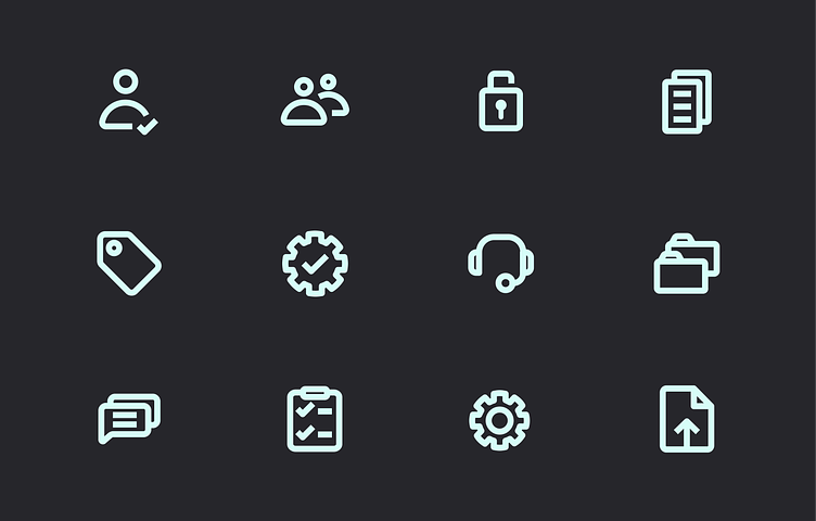
Icon set with consistent styling. Image by Coloristy Media.
Principles to remember when designing icons:
Icons should be simple, clear, and easily recognizable. Avoid using abstract or ambiguous icons that may confuse users or require excessive interpretation.
Maintain consistency in the style, size, and usage of icons throughout your application. Define specific rules that your icon library should comply with to ensure visual cohesion.
Consider the context in which an icon will be used. Icons should be relevant and meaningful within the specific context in which they are presented.
While icons can be self-explanatory in some cases, it's often helpful to provide text labels or tooltips alongside them, especially for actions or functionalities that may not be immediately apparent.
Imagery, including images, photos, and illustrations, plays a crucial role in creating visually appealing and engaging user interfaces. Imagery can play a purely decorative role, reinforcing the visual aesthetics of the product, or it can play a clear functional purpose, such as supporting textual information.

Theming imagery. Image by Microsoft Design.
Principles to remember when designing imagery:
Use high-quality, crisp, and clear imagery that is legible and easily recognizable. Avoid using blurry, low-resolution, or distorted images, as they can negatively impact the overall user experience.
Ensure that images are sized and scaled appropriately for the context in which they are used. They should be large enough to be easily recognizable but not so large that they overwhelm the user interface.
Provide appropriate alternative text (alt text) for images that serve functional purpose to ensure accessibility for users with visual impairments or those using assistive technologies like screen readers.
Be mindful of cultural differences and sensitivities when using imagery, particularly if your application or website targets a global audience.
Geometric objects, such as shapes, lines, and patterns, are often used in UI design to create visual interest, establish structure, and convey meaning. While they may seem like simple elements, their effective use can significantly impact the overall aesthetic and usability of a user interface.

Collection of geometric patterns. Image by Avkadre.
Principles to remember when designing geometric objects:
Purpose and meaning: Ensure that the geometric objects you use serve a specific purpose or convey meaningful information. Avoid using shapes or patterns solely for decorative purposes, as they may distract or confuse users.
Favor simple and clear geometric forms over complex or intricate patterns. Simple shapes and lines are easier to perceive and understand, especially at smaller scales or on lower-resolution displays.
Consider how geometric objects will adapt and scale across different screen sizes and resolutions. Simple shapes and patterns are generally more adaptable and less prone to distortion or visual degradation when scaled.
Loading and progress indicators are UI elements that provide visual feedback to users about the status or progress of an ongoing process or operation. They are essential for keeping users informed and preventing confusion or frustration during potentially lengthy or complex tasks.
Loading indicator example. Image by Felix Teichgräber.
Principles to remember when designing progress indicators:
Display progress indicators at the right moment, typically when an operation or process begins, and provide updates until its completion or termination.
In addition to visual progress indicators, consider providing contextual information or labels that explain the nature of the ongoing process or operation. This can help users better understand what is happening and manage their expectations.
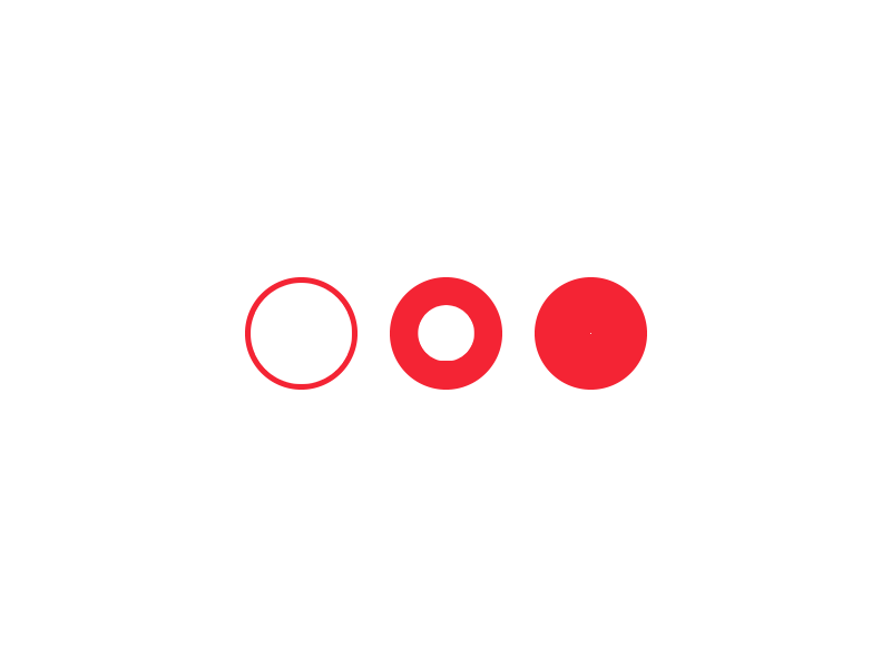
Checkboxes and radio buttons have one thing in common—they allow users to choose a particular option(s) but there is a difference in how they allow it. Checkboxes allow users to select multiple options from a set, whereas radio buttons are used for selecting a single option. Similar to the text field that we’ve discussed before, checkboxes and radio buttons help in making forms more interactive and user-friendly.

Checkbox example. Image by Roman Bulakh.

Radio buttons. Image by Vitaly Silkin.
Principles to remember when designing checkboxes and radio buttons:
Use checkboxes for multiple selections and radio buttons for a single selection.
Provide clear and concise labels that accurately describe each option.
Group related options together and use fieldsets or visual separators.
Provide clear visual feedback when checkboxes or radio buttons are interacted with, such as changes in appearance or animations, to indicate the state change.
Toggles, also known as switches or toggle buttons, are UI elements that allow users to enable or disable a specific setting or feature with a single click or tap. They are commonly used for binary choices or to turn options ON or OFF.
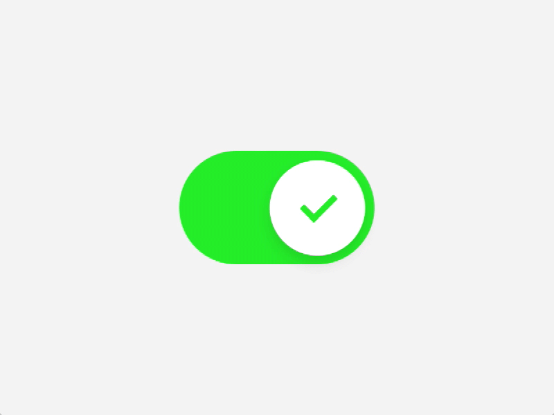
Toggle example. Image by Eike Drescher.
Principles to remember when designing toggles:
Provide a clear and concise label that accurately describes the setting or feature controlled by the toggle. The label should be easily understandable and leave no room for ambiguity.
Consider the appropriate default state (ON or OFF) for toggles based on user expectations and common use cases. Avoid confusing or surprising users with unexpected default states (such as when you set “receive ad newsletters” to ON by default).
Ensure that the toggle is large enough to be easily tapped or clicked, especially on mobile devices or touch screens. Provide ample touch areas around the toggle to improve usability.
Provide clear visual feedback when the toggle is interacted with, such as animations or color changes, to indicate the state change. This reinforces the user's action and enhances the overall experience.
Dropdown (also known as dropdown list) is used to offer a selection of options in a compact space. They can simplify the interface by hiding options until they are needed.

Dropdown example. Image by Felippe Silveira.
Principles to remember when designing dropdown:
Order the options within the dropdown in a logical manner, such as alphabetically, numerically, or based on frequency of use. This helps users quickly locate the desired option.
Include a placeholder or default option (e.g., "Select an option") at the top of the list to indicate that a selection needs to be made.
For dropdowns with a large number of options, consider implementing a search or filter functionality to allow users to quickly find the desired option.
Ensure that dropdowns are accessible via keyboard navigation, allowing users to open the list, navigate through options, and make selections using keyboard controls.
Sliders allow users to adjust a value or range within a predetermined set, such as volume or brightness. They offer a more interactive and visual way to input data.

Slider example. Image by Jared Lodwick.
Principles to remember when designing slider:
Clearly define the minimum and maximum values of the slider's range. Additionally, specify the step value (increment) to determine the granularity of adjustment.
Use a visual bar or track to represent the entire range of values, with a handle or thumb that can be dragged along the track to select or adjust the desired value.
Consider displaying the current value selected by the slider, either inline or in a separate display area. This provides users with immediate feedback and facilitates precise adjustments.
Tooltips are small messages that appear when the user hovers over an element. They provide additional information about what an element does or is used for.

Tooltip example. Image by Katie Pohlman.
Principles to remember when designing tooltip:
Use concise and clear language. Avoid lengthy or unnecessary information that may overwhelm users or distract from the primary purpose of the tooltip.
Position tooltips in close proximity to the UI element they are associated with, ensuring a clear visual connection and context.
Position tooltips in a way that avoids overlapping with other UI elements or obstructing important content or functionality.
Good navigation is key to a positive user experience. Breadcrumbs is a part of the navigation scheme that reveals the user's location in a website or application. They provide a trail of links that allow users to quickly navigate back to higher-level pages or sections. It's particularly useful for sites with a complex structure.
Breadcrumbs example. Image by Ennio Dybeli.
Principles to remember when designing breadcrumbs:
Breadcrumbs are typically placed horizontally across the top of the page, below the main navigation menu or header. They should be easily visible and accessible.
Each breadcrumb item, except for the last one that represents the current page, should be a clickable link that takes the user to the corresponding higher-level page or section.
Use a clear visual separator (e.g., ">" or "/") between each breadcrumb item to clearly delineate the hierarchy.
Ensure that breadcrumbs are accessible to users who rely on assistive technologies, such as screen readers, by providing proper labeling and navigation cues.
Tabs help organize content in a high-level way, allowing users to easily switch between different views or datasets without leaving the current page or screen.
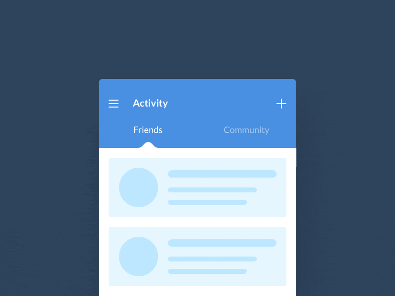
Tabs example. Image by Oleg Frolov.
Principles to remember when designing tabs:
Use clear and concise labels for each tab that accurately describe the content or functionality it represents. Avoid ambiguous or overly long labels that may confuse users.
Group related content or functionality under the appropriate tab. Arrange tabs in a logical order that follows a natural flow or hierarchy.
Clearly differentiate the active tab from the inactive ones using visual cues such as contrasting colors, borders, or styling. This helps users easily identify the currently selected tab.
Modal windows, also known as modal dialogs or modals, are temporary UI overlays that appear on top of the main content and require user interaction or input before proceeding with the current workflow. They are commonly used for displaying important information, confirmations, or additional input forms.

Example of modal window. Image by João Oliveira Simões.
Principles to remember when designing modals:
Keep the content within modal windows focused and relevant to the task at hand. Avoid presenting excessive or irrelevant information that might distract or overwhelm users.
Ensure that modal windows are visually prominent and easily noticeable when triggered. They should capture the user's attention without being disruptive or obtrusive.
Use a semi-transparent backdrop or overlay behind the modal window to distinguish it from the main content and prevent interaction with other UI elements while the modal is open.
As technology continues to evolve rapidly, new UI design trends emerge. The trends are shaped by various factors, including advancements in user expectations and technological innovations. The recent shift that the tech industry has made towards spatial computing (augmented and virtual reality) will likely significantly impact UI design. Here are the most notable changes that this shift will introduce:
The trend towards clean user interfaces has been gaining momentum in recent years. Designers are prioritizing simplicity, reducing clutter, and focusing on essential elements to create intuitive and user-friendly experiences. This trend is likely to continue as users demand efficient and streamlined interactions. Designers will trim all unnecessary visual details to prioritize the clarity of UI elements, which is especially relevant in processes like Figma to HTML conversions where simplicity enhances performance.
With the proliferation of devices and screen sizes, responsive and adaptive design approaches have become crucial. UI elements need to adapt seamlessly to different contexts, ensuring optimal usability across various platforms, form factors and environments in which users will interact with digital products. This trend will persist as users expect consistent and cohesive experiences across multiple touchpoints.
Gestures are the primary way of interaction with AR and VR devices. As gesture-based input methods become more prevalent, UI elements will increasingly incorporate gesture-based interactions. This could include swiping, pinching, and other intuitive gestures, enabling more natural and immersive user experiences. UI elements should be optimized for gesture interaction, making it comfortable for users to interact with the UI.
Microinteractions, such as subtle animations and visual feedback, can enhance the user experience by providing contextual cues and making interfaces more engaging. Designers will likely leverage microinteractions when designing UI elements, making animations an integral pat of UI elements. It will help create delightful and memorable interactions.
The rise of spatial devices will make designers focus more on making UI design accessible to all groups of users, including people with disabilities. Ensuring that UI elements are accessible and inclusive for users with different abilities and needs will be a priority. Designers will consider factors like color contrast, font sizes, and alternative input methods to create inclusive user experiences.
Mastering UI elements is not just about understanding their individual functionalities but also about thoughtfully combining them to create cohesive and seamless experiences. By focusing on user needs, embracing simplicity, and fostering creativity, we can design interfaces that genuinely resonate with users and leave a lasting positive impression. Great design is not just about aesthetics; it's about solving problems and creating meaningful connections with users. By keeping this principle at the forefront, we can continue to push the boundaries of UI design and craft experiences that delight and empower users across various platforms and contexts.


 Join our Discord community
 support@mockplusapp.com