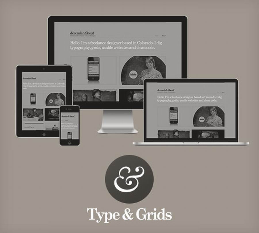
Today, we release a free responsive HTML5 template by Jeremiah Shoaf. It looks great on all devices, including desktops, laptops, tablets and phones. All of the content resides in a single HTML file, so setting it up is super-simple.
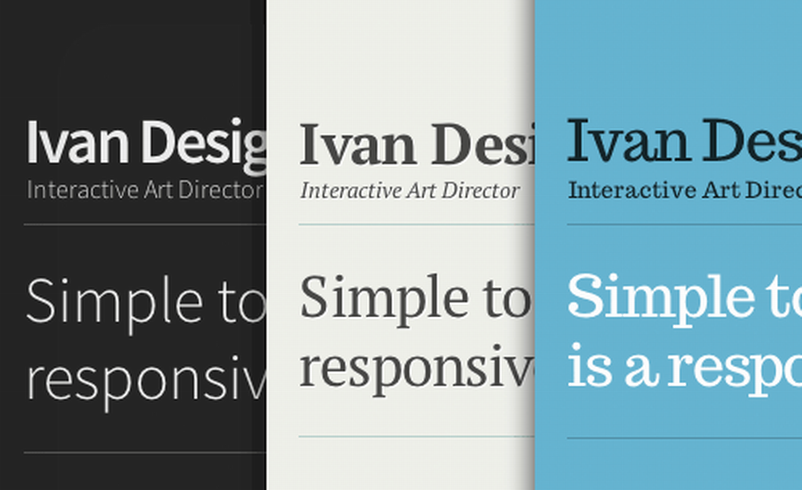
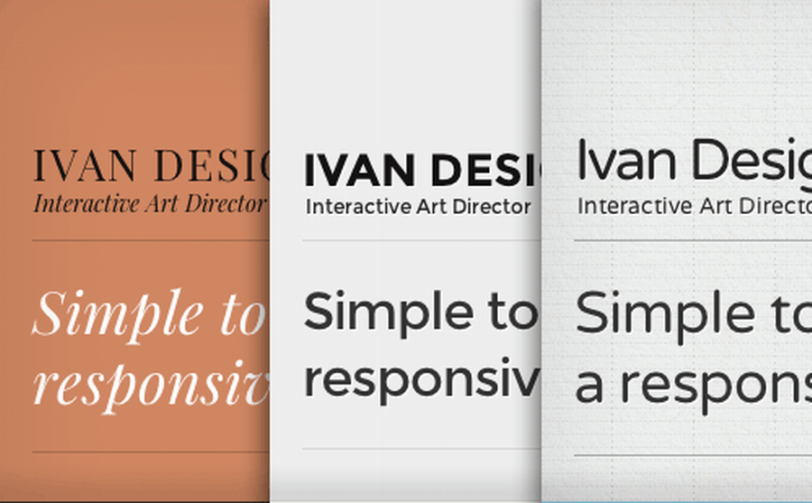
Each type theme is meticulously handcrafted, with attention paid to the smallest typographic details. The 16 thumbnail shape variations and 58 background textures that are included allow for a nearly endless combination of design styles — no two Type & Grids websites will look the same.
Download and open the ZIP file.
Edit the only HTML file, index.html, to add your own content.
Mix and match the included type and color CSS files to customize the design. All fonts shown in the demo are included.
Upload your new website to your Web host. Done!
Responsive HTML5 template.zip (HTML)
Size: 7.32MB
Source: smashingmagazine.com
 Mockplus RP
A free prototyping tool to create wireframes or interactive prototypes in minutes.
 Mockplus DT
A free UI design tool to design, animate, collaborate and handoff right in the browser.


 Sign up with Google
 Join our Discord community
 support@mockplusapp.com