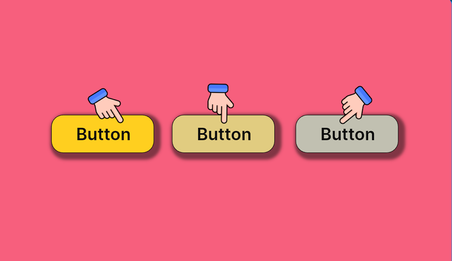
Designing clear, consistent button states is a fundamental skill in modern UI design. While buttons are among the most basic components, the way their states are designed, such as hover, pressed, or disabled, has a direct impact on how users interact with a product.
When button state design is treated as an afterthought, users may struggle to understand what actions are possible, what’s already been done, or why a button doesn’t respond. This often leads to hesitation, misclicks, or even abandonment. In contrast, well-designed button states provide intuitive feedback, reinforce trust, and guide user flow.
In this article, we’ll explore what makes button state design so critical to great UX, break down commonly used state types, and share 20 best practices that will help you design button states with more clarity, creativity, and consistency. While focusing on your button state design, also try our free prototyping tool to fully visualize your button ideas and test timely.
Button states are the visual representations of a button’s condition at any given moment during user interaction. These conditions change based on factors like whether a button is being hovered over, clicked, disabled, or actively loading content. Instead of being static UI elements, buttons evolve through various states to reflect real-time feedback and interaction logic.
In digital interfaces, these states help bridge the gap between user intention and system response. A button that lights up on hover, shows a spinner when processing, or becomes dimmed when inactive. All of these variations provide subtle but crucial cues that shape the user experience.
At a conceptual level, button state design transforms buttons into dynamic communicators. It shifts them from passive elements to active participants in the interaction flow. When thoughtfully designed, the button states:
Indicate status — visually expressed when a button is ready, active, unavailable, or processed.
Reinforce clarity — help users understand what’s happening or what action is expected.
Enhance interactivity — make the interface feel responsive, guided, and human.
These characteristics are what make button state design essential to modern UX. It’s not just a styling detail—it’s a fundamental component of interaction design that directly affects usability and user trust.
In the next section, we’ll break down the most common types of button states you’ll encounter in real-world UX design, and explore how they function in practical UI scenarios.
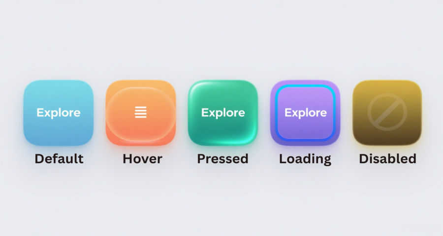
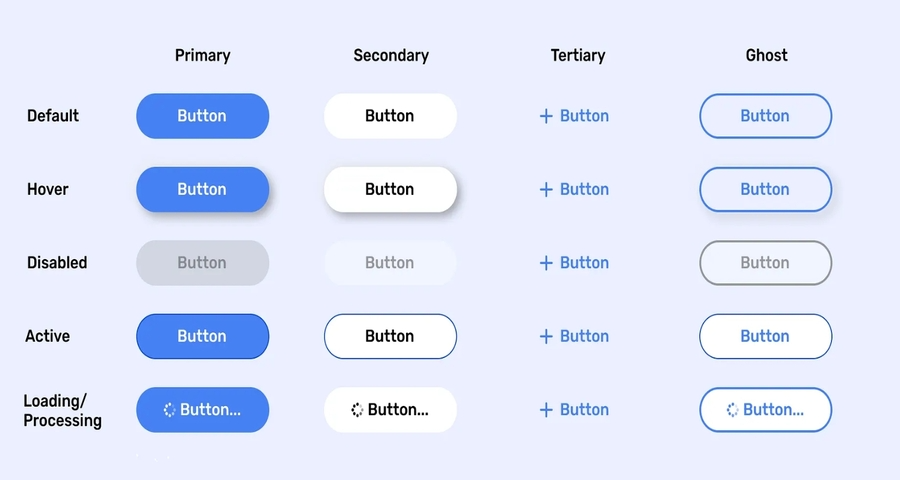
While button designs vary across brands and platforms, most effective UIs rely on a consistent set of button states that shape the user journey. Each state plays a specific role in communicating what the button is doing, what action is possible, and how the system is responding.
Let’s take a closer look at six fundamental button states, along with their definitions, traits, and practical usage scenarios.
What it is:
The default or normal state is the baseline appearance of a button when it is visible and idle, awaiting user interaction. It acts as the visual anchor of the button component.
Traits:
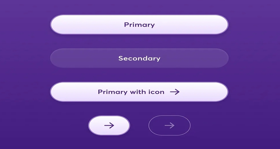
Full-color background for primary actions or outlined style for secondary actions
Clear, readable label
Balanced spacing and padding
Use cases:
Primary calls-to-action like “Start Trial” or “Continue”
Secondary actions such as “Cancel” or “Learn More”
Any clickable interface element before user interaction
What it is:
The hover state is triggered when a user moves their mouse over the button. It provides a real-time visual cue that the element is interactive.
Traits:
Color darkening or lightening
Subtle drop shadow or elevation
Slight size change or border highlight
Use cases:
Desktop interfaces and navigation menus
Interactive marketing websites
Dashboards with visual affordance for mouse users
What it is:
The pressed state appears when the user clicks or taps on a button. It visually confirms the action was registered.
Traits:
Slight "inset" look (button appears pressed in)
Deeper color tone or shadow compression
Quick animation or ripple effect on mobile
Use cases:
Submit buttons for forms
Instant interactions like "Like", "Bookmark", or "Add to Cart"
Touch-based feedback on mobile and tablet UIs
What it is:
The disabled state indicates that a button is currently inactive and cannot be clicked or tapped. It sets user expectations and prevents errors.
Traits:
Lower opacity or grayscale color
No hover or pressed effect
Cursor changes to “not allowed” on hover
Use cases:
Incomplete forms with required fields left blank
Buttons gated by user permissions
Step-by-step flows where prerequisites aren't met
What it is:
The focus state is activated when a button is selected via keyboard, screen reader, or assistive tech. It ensures keyboard and accessibility navigation is possible.
Traits:
High-contrast outline or glow
Sometimes paired with a subtle background highlight
Must follow accessibility standards (e.g., WCAG)
Use cases:
Login forms and tab-based navigation
User flows for accessibility compliance
Interfaces where keyboard input is preferred or required
What it is:
The loading state indicates that an action triggered by the button is in progress. It provides feedback while temporarily disabling the button.
Traits:
Replaces text with a spinner or progress animation
May include the word “Loading…”
Disables click interactions while active
Use cases:
Form submissions (e.g., "Sign Up", "Reset Password")
Payment and checkout processes
File uploads or API-driven actions
These six button states form the foundation of interactive UI design. By understanding their roles and applying them consistently, designers can enhance usability, reduce friction, and create a more polished digital experience.
In the next section, we’ll explore why button states matter so much, especially in terms of user feedback, clarity, and accessibility.
Button states may seem like a small part of interface design, but they play an essential role in shaping how users experience and understand a product. Today, button state design is everywhere—spanning web interfaces and mobile button design alike—and is crucial for creating clear, engaging interactions across platforms. Whether you're a UI designer, product manager, or a student learning UX principles, mastering button states helps you build interfaces that feel polished, responsive, and intuitive.
Here’s why button state design deserves your attention:
A well-defined button state clearly communicates whether an action is available, unavailable, or already in progress. Without this visual clarity, users may feel unsure, hesitate to click, or try to interact with something that won’t respond.
For example, a disabled “Submit” button signals that required fields haven’t been filled out—preventing confusion and reducing errors.
When users click a button, they expect the interface to respond instantly. Button states like “pressed” or “loading” confirm that the action has been received and is being processed. This immediate feedback helps users stay confident and informed.
For example, a loading spinner on a “Send” button assures users that their message is on its way, even if it takes a few seconds.
In multi-step forms, dashboards, or app workflows, button states act as visual markers that help users progress smoothly. From hover states that invite action to confirmation cues after submission, each transition keeps users oriented and engaged.
For example, each “Next” button reflects the state of completion and readiness, helping users feel in control.
Design consistency isn’t just about aesthetics—it builds trust. When buttons behave the same way across pages and platforms, users don’t have to guess what will happen next. That reliability strengthens the overall user experience.
Whether it’s a primary CTA or a secondary “Cancel” button, consistent state behavior improves usability across web and mobile interfaces.
Accessible design ensures that everyone can use your product, regardless of ability. Focus states make buttons navigable via keyboard, and strong visual contrast helps users with low vision identify actions easily.
For example, a student using only a keyboard or a visually impaired user navigating with screen readers relies on these states to interact successfully.
Ultimately, button states are about communication. They help users understand what’s happening and what they can do next. For any team involved in building digital products, getting button state design right is key to delivering clear, efficient, and user-friendly experiences.
In the next section, we’ll look at 20 creative button state examples that show how these principles come to life in real design work.
Designing button states isn’t just about functional feedback. It’s also a creative opportunity to inject clarity, personality, and delight into your interface. A well-executed state change can elevate a basic button into a key moment of interaction, guiding users intuitively while reinforcing your branded voice.
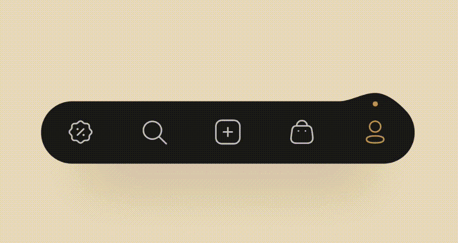
Here are 20 creative button state designs from Dribbble that highlight different ways to approach button states in UI/UX design. Each example demonstrates how designers creatively implement hover, active, disabled, and other button states to enhance usability, interactivity, and user experience.
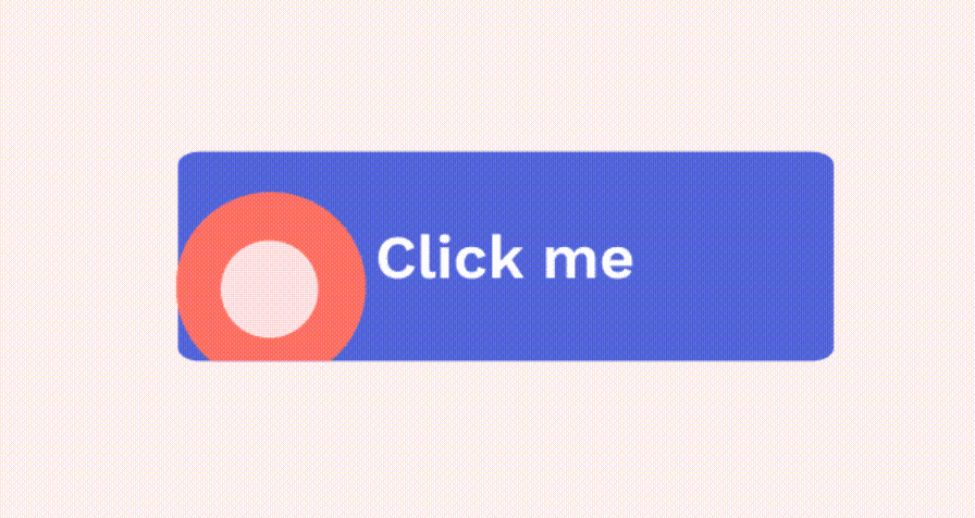
This example showcases a button where the hover state triggers a smooth color transition, giving users a clear visual cue of interactivity. The change in color is not too jarring but provides enough contrast to highlight the button’s activity.
Why it works:
A simple yet effective hover state that enhances user feedback without overwhelming the interface.
In this design, the button states include a “pressed” effect that simulates depth through shadows. When the button is clicked, it appears to be “pushed” into the page, giving it a tactile feel.
Why it works:
Adds a sense of physicality to the digital interface, improving the user’s interaction with the button.
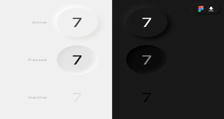
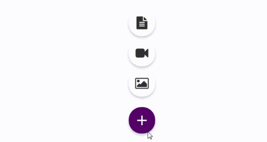
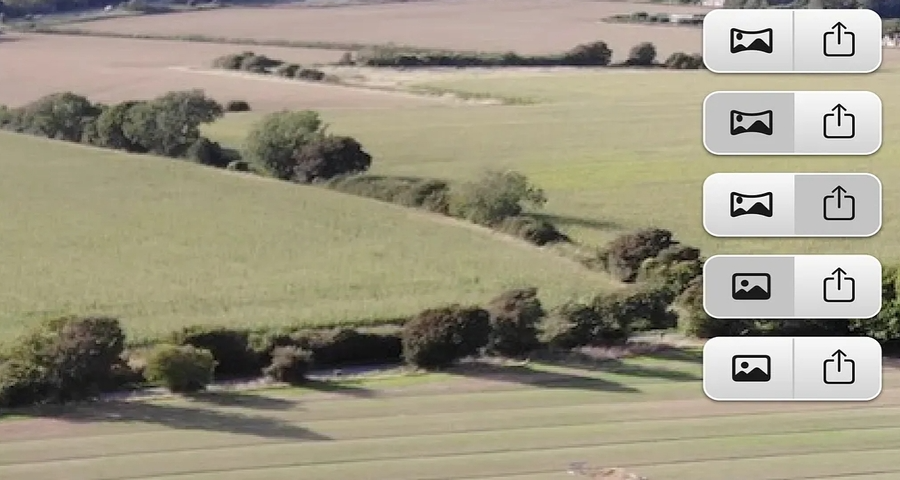
This design features a set of icon buttons with clear, defined states including default, hover, and pressed. The buttons are visually minimalistic, using simple icons without any text.
Why it works:
The use of icon-only buttons makes the design clean and modern, perfect for interfaces that require minimalism. The hover and pressed states add an interactive layer that guides the user without overwhelming the design. These effects provide instant feedback, making the interface feel
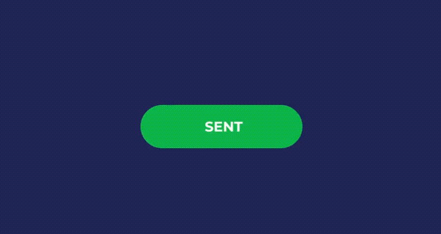
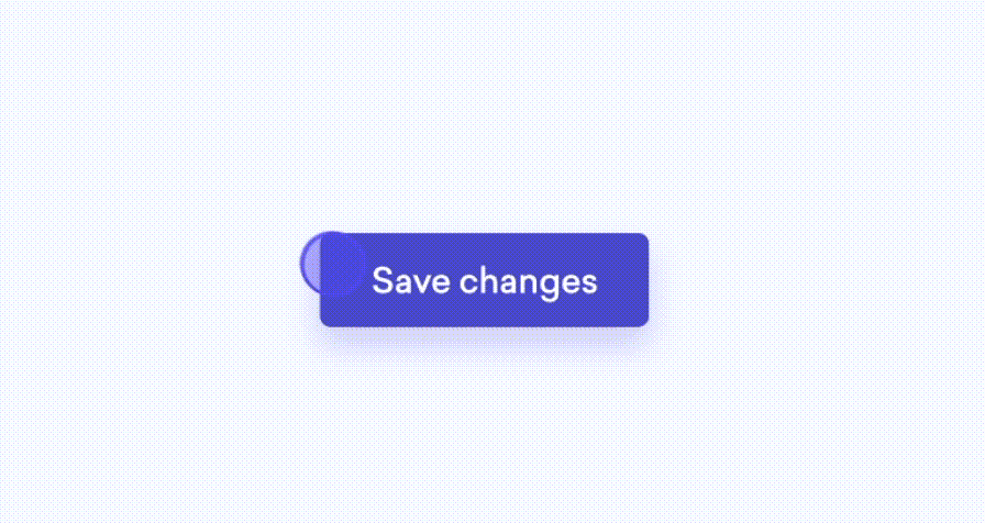
This design features a send button with interactive states—hover, pressed, and loading. On hover, the button changes background color. When clicked, it shows a ripple effect, and the text changes to "Sending..." with a spinner. Once the action is complete, it reverts to the default state with a "Sent" message.
Why it works:
The transition between states provides clear feedback to the user, ensuring they understand when the button is being clicked, when the action is processing, and when it’s completed.
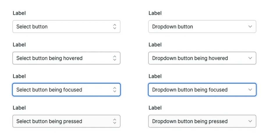
This design showcases a select dropdown button with clear states—default, hover, and active. On hover, the button background subtly changes color, indicating it's interactive. Once clicked, the dropdown expands, revealing additional options, and the button state switches to active, displaying a focus ring for better user orientation.
Why it works:
The hover and active states enhance the button's functionality, guiding users intuitively through the selection process. The focus ring ensures accessibility, making the dropdown button usable for all types of users.
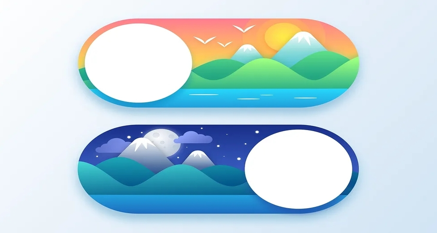
This design features a toggle button for switching between day and night modes. The button transitions smoothly between two states: a sun icon for day mode and a moon icon for night mode. A subtle animation highlights the toggle effect, providing visual feedback to indicate the mode switch.
Why it works:
The clear transition between icons provides an intuitive way for users to switch modes, with the animation adding a dynamic touch that enhances the user experience.
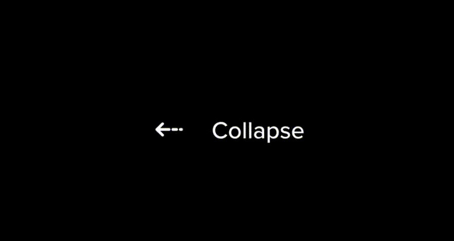
This design showcases an expand/collapse button used in menus or lists. The button changes states from a plus icon to a minus icon when clicked, indicating the expanded or collapsed status. The smooth transition between these states ensures the interaction feels seamless.
Why it works:
The button clearly signals its action, making it easy for users to understand the functionality. The icon shift provides immediate feedback, improving usability and clarity.
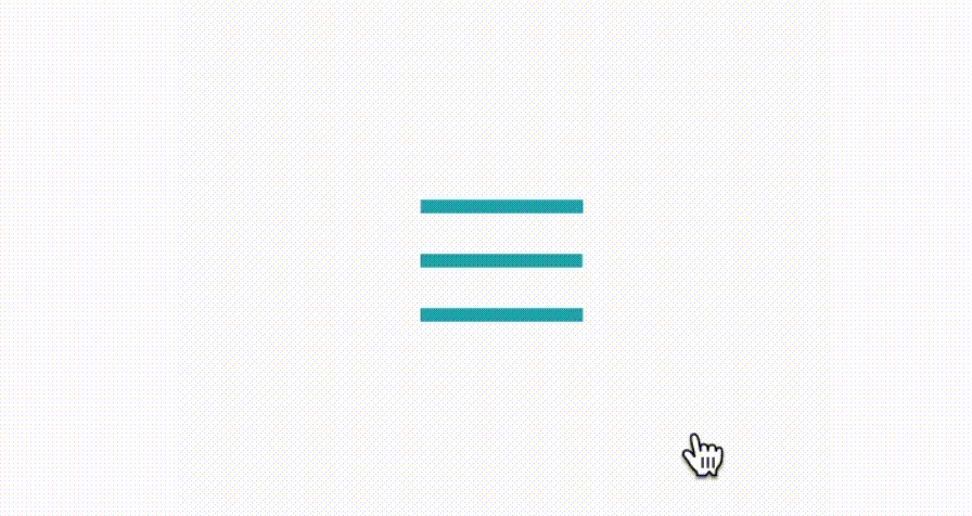
This design features a hamburger menu button that transitions into an "X" shape when clicked, indicating the menu has been opened. The animation adds a playful yet functional element to the interface, enhancing user engagement with the menu toggle.
Why it works:
The smooth transformation of the button from a hamburger to an "X" icon provides an intuitive and interactive way for users to open and close the navigation menu.
This design focuses on navigation bar buttons with hover and active states. When hovered, the button's background changes color, and when clicked, it stays highlighted, providing users with clear visual feedback about the active page or section.
Why it works: The hover and active states guide users through the navigation, making it clear where they are on the site. This visual feedback increases usability, especially on complex sites with multiple sections.
This design explores UI button states using different colors and shapes. The buttons change color and shape on hover, providing dynamic visual feedback. The use of varied shapes makes each button feel unique, adding personality to the UI.
Why it works:
This approach uses creative color and shape shifts to draw attention and engage users while ensuring that each button state feels distinct and interactive.
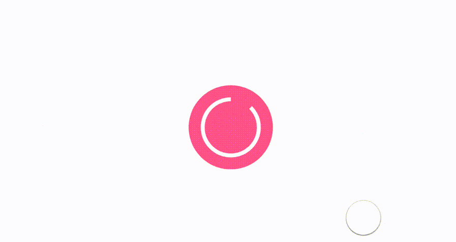
This loader button design includes a loading animation within the button itself. Upon clicking, the button changes into a circular loading indicator, informing the user that their request is being processed.
Why it works:
This design keeps the user informed during background processes, reducing the likelihood of repeated clicks and improving the overall user experience by indicating progress.
This set of Soft UI buttons in Figma demonstrates subtle hover and active states. The buttons feature a soft shadow effect that deepens on hover and shows a subtle change in color, providing smooth interaction feedback.
Why it works:
The gentle animations and soft shadow effects create an elegant user experience, with clear visual cues that enhance usability without overpowering the design.
This design showcases a button with an onclick animation, where the button briefly shrinks and then expands back to its original size when clicked. This subtle animation provides tactile feedback, simulating a physical press.
Why it works:
The shrinking and expanding effect mimics real-world interactions, making the button feel more responsive and engaging. It improves the user experience by adding interactivity without overwhelming the design.
This Add Button showcases a micro-interaction where the icon and text change to indicate the action being performed. The button shows an "Add" icon, and upon clicking, it morphs into a checkmark, indicating success.
Why it works:
This design provides clear visual feedback on user actions, ensuring that users understand their interaction was successful. The smooth transformation keeps the interface intuitive.
This design highlights a submit button with a loading state. After the user clicks the button, a progress bar fills up inside the button, indicating that the form submission is being processed.
Why it works:
The progress bar provides real-time feedback during the form submission process, keeping users informed and preventing frustration from multiple clicks.
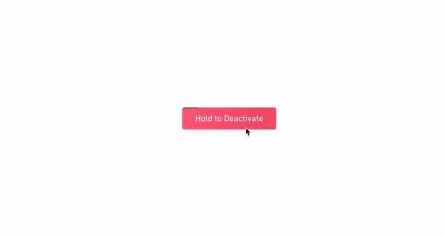
This hold to deactivate button shows a unique interaction: users must press and hold the button for a specified time to deactivate the feature. The button’s background color changes as the user holds it.
Why it works:
This approach creates clear, intentional interaction, preventing accidental deactivation. The changing background color reinforces the action and guides the user.
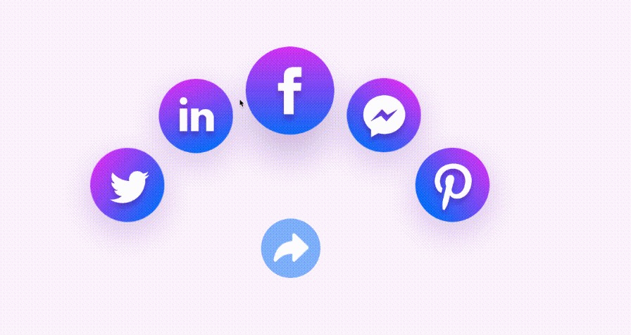
This share button animates upon hover, expanding and showing different share options. The button changes shape and provides instant feedback, showing the available sharing channels.
Why it works:
By showing the share options directly within the button, this design provides an intuitive way for users to interact with the sharing functionality, improving engagement.
This design showcases different button styles for a mobile app design system, including default, hover, and active states. The buttons are designed with simple, modern visuals that are easy to integrate into mobile apps.
Why it works:
The consistent button states make the UI intuitive and consistent across all pages of the mobile app, improving the user experience and ease of navigation.
19.Spherium Overlay Buttons
This design features overlay buttons that appear when hovered, revealing additional controls or options. The button states change subtly as the user hovers over the overlay, making the interaction feel smooth.
Why it works:
The overlay effect provides an elegant and non-intrusive way to display additional options, enhancing the user experience without cluttering the interface.
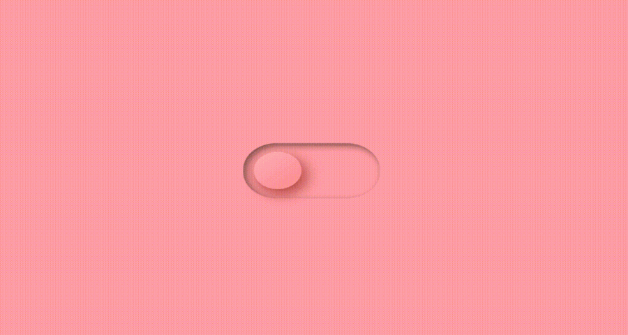
This On/Off switch button design smoothly transitions between the on and off states, with a clear visual change in color and position of the slider. The state change is accompanied by a subtle animation.
Why it works:
The smooth transition and animation offer users clear feedback on the toggle action, making the switch easy to understand and use.
These 20 examples show how creative button state design can go far beyond utility. It can reinforce your brand, improve clarity, and make every interaction more meaningful. Whether you’re designing a dashboard, a marketing site, or a mobile app, consider how your button states—be it solid, gradient, or ghost button styles—guide, reassure, and delight your users.
In the next section, we’ll shift from inspiration to application, exploring best practices for designing button states that are clear, consistent, and easy to scale.
Great button states don't just look good—they guide users, provide clarity, and reinforce trust in every interaction. After looking at 20 real-world examples, you might wonder: how do we translate those creative patterns into repeatable design rules?
This section outlines 12 best practices that combine both design principles and practical tips. These are not abstract theories, but clear, actionable insights you can apply directly to your workflow—whether you’re designing from scratch, working with a design system, or prototyping in tools like Mockplus.
Each tip covers:
Why it matters
What to do and what to avoid
How to implement it in real tools
Let’s break down what thoughtful button state design looks like in practice.
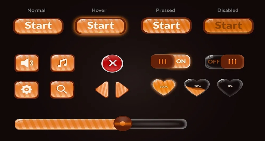
 1.Visually Distinguish Every State Clearly
Each button state, default, hover, pressed, disabled, loading, should have a distinct visual treatment to avoid ambiguity. When all states look too similar, users may not understand what's clickable or happening.
Do: Use color, depth, motion, or icon changes to signal transitions.
Don't: Rely on subtle tint shifts that are hard to notice, especially for color-blind users.
Tool Tip: In Mockplus RP, you can define and preview states using the built-in State Panel, including custom styles for hover and pressed.
Inconsistent button states confuse users and increase learning curves. When one screen uses a glow-on-hover and another uses none, it breaks the interaction rhythm.
Do: Standardize interaction patterns in your design system and stick to them.
Don't: Over-customize per page or feature unless you’re intentionally breaking a pattern.
Tool Tip: Use design systems in Mockplus to sync shared button components and states across teams.
Responsiveness reinforces user control. The faster a button responds to clicks, the more confident users feel. A visual delay—even of 500ms—can cause confusion.
Do: Animate state transitions quickly (100–300ms). Use tactile effects like scale or ripple on mobile.
Don't: Add laggy animations or use no visual feedback at all.
Tool Tip: Mockplus RP allows smooth micro-interaction transitions without writing any code.
Hover doesn’t exist on touch. Tap areas vary. Keyboard focus is essential for accessibility.
Do: Include visual focus states, ensure touch targets are at least 44x44px, and test across devices.
Don't: Assume users will use a mouse.
Tool Tip: Use Mockplus's Preview Mode to test interactions in mobile and keyboard navigation views.
5.Make Disabled States Understandable—Not Just Grayed Out
Disabled buttons shouldn’t be a mystery. Why is it disabled? What should the user do to enable it?
Do: Pair disabled visuals with hints (tooltips, field validation, helper text).
Don't: Use low-contrast alone or remove hover/cursor changes completely.
Tool Tip: Add tooltip interactions in Mockplus to explain disabled state logic.
Loading buttons stop users from clicking twice and offer feedback that the action was accepted.
Do: Replace the label with a spinner or show progress text (“Sending…”).
Don't: Keep the button looking normal during background actions—it’ll get clicked again.
Tool Tip: Use Mockplus’s Interaction feature to swap state from “Normal” to “Loading” with a simple event flow.
Hover animations should feel light and purposeful. Over-the-top motion slows users down and reduces perceived quality.
Do: Use hover to confirm interactivity—color tint, shadow, or a slight scale.
Don't: Add distracting particle trails, spinning icons, or complex morphing unless on branded landing pages.
Color is powerful—but alone it’s not enough. Combine it with form or icons for states like disabled or pressed.
Do: Use icons (lock, checkmark), outlines, or text changes to reinforce meaning.
Don't: Assume red always means error—context matters.
Tool Tip: In Mockplus, layer icons and text labels dynamically with different state layers.
9.Update Labels to Reflect Button State
Buttons should speak in verbs, and those verbs should evolve as the state changes. A changing label improves flow and reassures users.
Do: Use progressive labels: “Send” → “Sending…” → “Sent”
Don't: Keep static text when something is in progress.
Tool Tip: Mockplus supports label swaps within interactions.
Motion should support user understanding—not steal attention.
Do: Use easing, scale, and fade subtly.
Don't: Loop animations endlessly or use harsh color shifts.
What if loading fails? What if the action can't proceed? Button states must include fallback behaviors.
Do: Reset button to “Retry” or “Try Again.” Use timeouts to return to normal if the server hangs.
Don't: Leave the button spinning forever.
Tool Tip: Use timed interactions in Mockplus to automatically revert state after X seconds or link to an error modal.
Design tools now let you simulate entire button behaviors—test your ideas before investing development resources.
Do: Show every possible state in your prototype: default, hover, pressed, disabled, loading, success.
Don't: Only design the default and assume devs will “fill in the rest.”
Tool Tip: Mockplus RP lets you build full button interaction flows with no-code logic, sharable to developers.
When applied thoughtfully, these best practices help transform buttons from static visuals into dynamic, communicative elements that support every part of the user journey. But strong design principles alone aren’t enough—you also need tools that let you bring these states to life efficiently, accurately, and without unnecessary complexity.
In the next section, we’ll show you how to do exactly that using Mockplus. From custom button states to interactive flows and developer-ready specs, Mockplus makes it easy to prototype, test, and deliver responsive UI components at scale.
Mockplus RP offers a no-code powerhouse to craft, prototype, and test button states—from hover and pressed to custom transitions like loading and success. Here’s how to implement our best practices with real-world mockups:
How to do it:
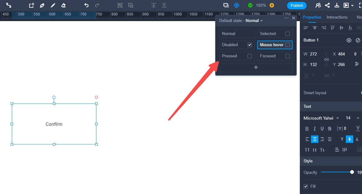
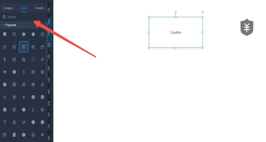
Select any button → open the State Panel → click “+” → choose from built-in states like Mouse Hover, Pressed, Focused, or Disabled.
What happens:
A new visual state tab is added. You can switch between them and edit each state individually.
Why it matters:
These preset states are the foundation for responsive feedback. They help users understand when a button is clickable, active, or unavailable.
How to do it:
Switch to a specific state in the State Panel → adjust fill, border, shadow, icon, or text in the right-side properties panel.
What happens:
Each state gets its own unique visual design, instantly visible in Preview.
Why it matters:
Clear visual differences between button states improve usability and reduce interaction ambiguity.
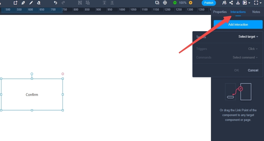
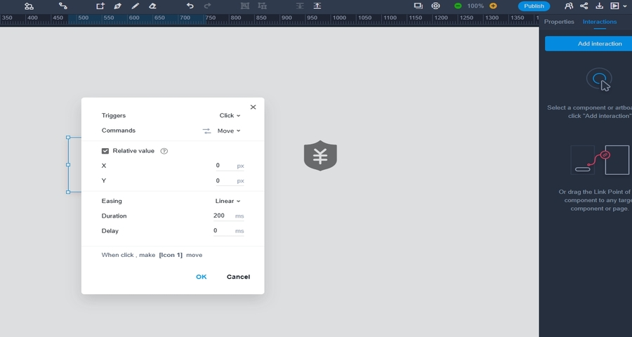
How to do it:
Click the button → open the Interaction Panel → add actions like “On Click → Switch to ‘Loading’ State”, then “After 3s → Switch to ‘Success’ State”.
What happens:
Mockplus simulates a full button flow with real-time feedback, just like in production apps.
Why it matters:
You can test and iterate all interaction scenarios early, reducing rework during development.
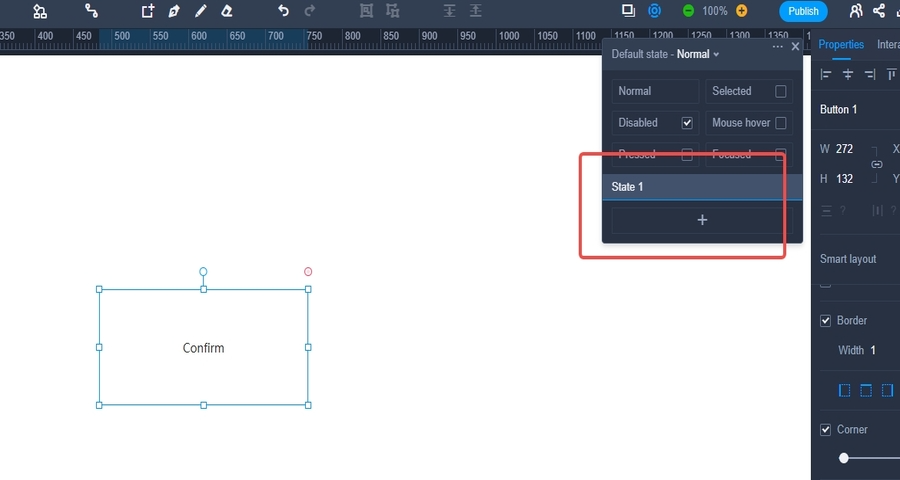
How to do it:
State Panel → “+” → select “Custom State” → name it (e.g., Success) → style it with unique visuals (e.g., green fill, checkmark icon).
What happens:
Your button now supports flexible feedback loops tailored to your product flow.
Why it matters:
Custom button states support nuanced user interactions like form validation, e-commerce feedback, or system errors.
How to do it:
In the Interaction Panel → add a Content Switch action → replace text, add spinner icon, or change alignment per state.
What happens:
When the state changes, your button label might change from “Submit” to “Sending…” with an inline spinner.
Why it matters:
Dynamic content switching creates rich, emotional micro-interactions that enhance perceived performance.
How to do it:
Interaction Panel → add delay (e.g. 3 seconds) → action: switch back to “Default” or “Error” state.
What happens:
If no further response occurs (e.g. API times out), the button resets automatically or provides feedback.
Why it matters:
Prevents stuck buttons or broken flows, helping maintain a seamless experience.
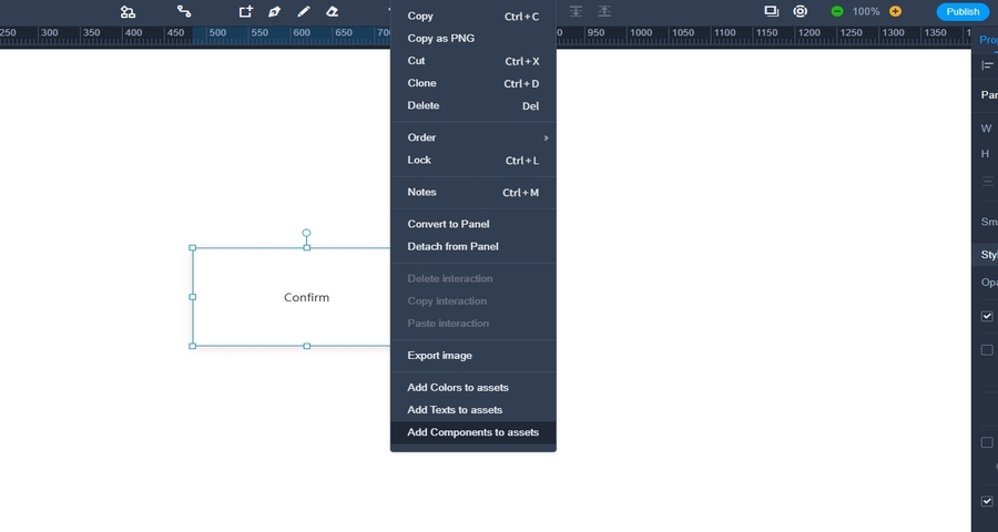
How to do it:
Right-click the button → “Convert to Component” → use across pages or import into Design Systems.
What happens:
All button states and interactions are preserved. Changes made to the component apply globally.
Why it matters:
Scales your design system, ensures consistency across interfaces, and speeds up collaborative workflows.
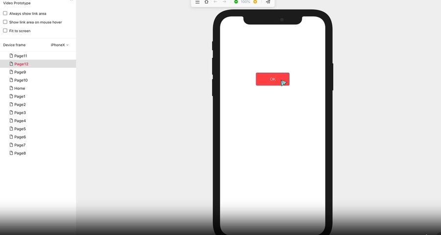
How to do it:
Click Preview → test your button in real-time for hover, tap, click, or keyboard focus across desktop and mobile modes.
What happens:
You see exactly how each state behaves under different input types—mouse, touch, or keyboard.
Why it matters:
Helps you validate accessibility and responsiveness before handing off to developers.
Each of these steps maps directly to Mockplus RP's documented capabilities. From adding preset and custom button states to orchestrating full interaction flows and content swaps, the tool offers a complete environment to design, preview, and iterate on button states, without touching code. You get scalable designs, accessible flows, and interactive prototypes ready to share with your team.
In modern UI design, the smallest elements often make the biggest difference. Button states, though subtle, play a crucial role in guiding user behavior, offering feedback, and shaping how people experience and trust an interface. When designed thoughtfully, they help users feel in control, informed, and confident with every click.
Throughout this article, we’ve explored what button states are, why they matter, and how they function in real products. We’ve looked at inspiring examples, covered practical design principles, and walked through the actual process of building interactive button states in Mockplus RP. These insights are not just theory. They’re meant to be applied directly to the way you design, prototype, and collaborate.
As you design your next project, take a closer look at how your buttons behave. Are they communicating clearly? Are they responsive, accessible, and consistent? With the right approach and the right tools, even the simplest button can become a powerful part of your user experience.
 Mockplus RP
A free prototyping tool to create wireframes or interactive prototypes in minutes.
 Mockplus DT
A free UI design tool to design, animate, collaborate and handoff right in the browser.


 Sign up with Google
 Join our Discord community
 support@mockplusapp.com