Responsive web design is the best way to make your website look great on any mobile device. If you’ve just stepped into the world of web design and you still have no idea what responsive web design is or how to make a responsive web page, you’ve come to the right place. This article showcases 20 of the best responsive web design tutorials to get you started.
Responsive web design, also called RWD, was coined by Ethan Marcotte in 2010. It is an approach using HTML and CSS that makes web pages respond to different devices or screen sizes. With RWD, even if your design is meant for the web, there is no need to create new designs for the iPhone or the iPad - or any other mobile device. With one responsive web page, it will look good on all devices.
Responsive web design is essential nowadays. How so? Here are some compelling reasons.
Your users are likely to visit your site on mobile devices, so you need to make your web pages responsive to provide your users with good user experience.
Building a website with responsive design can help to improve your rankings in search engines, so you will get more organic traffic and leads.
You don’t need to manage two (or more) separate sites. Create a responsive site that works on both web and mobile, so it easy to maintain and you can save on costs.
If your website is responsive, your users can change the pages quickly and easily. There is no need to resize, scroll, zoom in and out, etc.
Building a responsive website is not that difficult. It is actually pretty easy if you follow the right instructions. With a 4-step process, you can build one on your own:
Designing the website layout is always the first step. In this stage, you don’t have to think of a responsive design yet. Just focus on building the website layout. You can use a website layout template or use a prototyping tool to quickly finish the skeleton of your website.
This is where you make your website responsive. In this stage, you need to use development languages like HTML and CSS. You can follow this guide to build a responsive Bootstrap website. In the following section, you will find tutorials to learn exactly how to make your website responsive.
In this stage, you need to add content to make your website readable and useful. When creating content, typography is the most important element from a design standpoint. You should make your font responsive as well.
Once you finish the design and development, you should launch your website and test it. You need to test your website on as many different devices as you can. One way to gather feedback is to invite your friends to visit your site using their own devices. This will help you pinpoint areas for improvement.
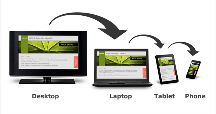
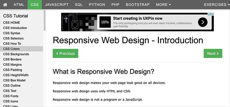
With the rapid growth of the use of smartphones, tablets, and other mobile devices, more and more people use small screens to access online content. Responsive web design is the perfect solution for allowing users to view web pages on a variety of devices and still maintain the readability of the content.
On March 26, 2018, Google announced mobile-first indexing, making the responsive design even more important for any website. For designers who have no idea about responsive web design, this article is an excellent place to start.
If you are completely new to the concept of responsive web design and don't want to read lengthy articles, then this video is your best choice. It explains responsive web design clearly and simply.
With the use of specific examples, it gives you a practical understanding of the concept. Most importantly, it teaches you how to write the necessary code to create custom responsive web layouts.
This tutorial explains the differences between responsive web design and adaptive web design. It teaches you how to create responsive web pages with HTML & CSS, as well as how to use media queries and mobile-first design.
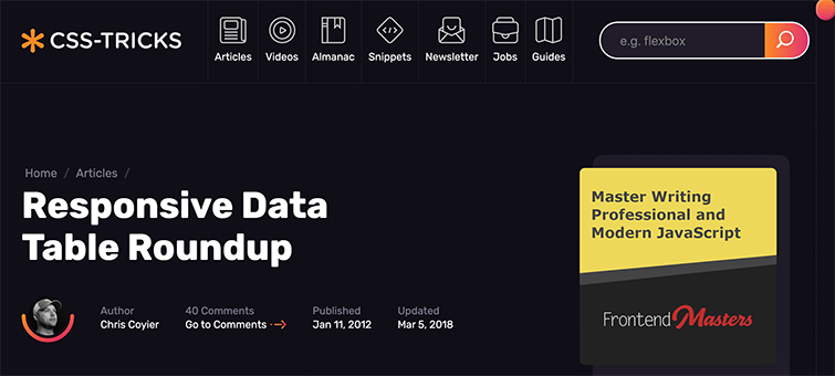
Data tables are an important part of HTML, and although their original purpose was for layouts, they are now mainly used to mark data. This article specifically describes how to make a responsive data table. Additionally, it contains multiple demos for reference.
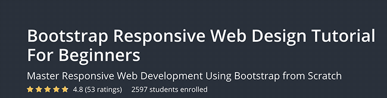
Bootstrap is one of the most popular HTML, CSS, and JS frameworks for developing responsive, mobile-friendly projects on the web. This tutorial teaches you how to develop a responsive web page using Bootstrap. You will also learn the basics of creating responsive web designs using Twitter Bootstrap.
This tutorial is for webmasters and web developers who want to expand their knowledge base. It requires a basic understanding of HTML. The price is $11.99.
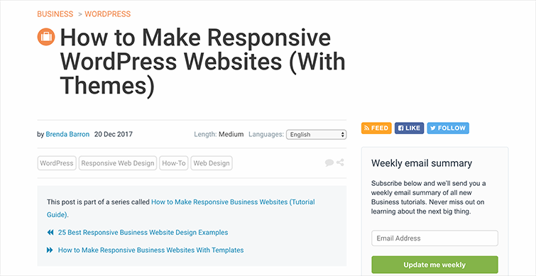
When building a website, using responsive design is no longer merely an option. It has become a must if you want your website to bring in users and keep them as well. For many businesses, WordPress is a good choice given its flexibility and ease of use. In this tutorial, you will learn how to use responsive WordPress templates to create your website and how to choose a responsive WordPress theme.
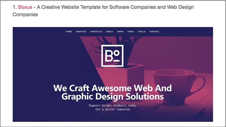
Here are 10 Inspiring Examples of the Best Responsive Web Design.
W3schools is a code learning website where you can find everything and anything under the sun. It has an excellent reputation for comprehensive and high-quality responsive web design tutorials. You will learn the following from this particular tutorial:
This article provides the best free responsive HTML5 web templates in 2020 that are easy to learn and quick to implement.
Watch Chris Converse as he shares his own specialized techniques for creating a responsive site for beginners. Chris demonstrates how to load images with CSS, reposition the navigation bar for better viewing on mobile devices, and how to shorten the download time of small screens by providing multiple versions of banner graphics and other images.
In addition, you will learn how to replace graphics with the high-resolution version of the Retina display with CSS media queries. This tutorial is indeed the ultimate responsive web design tutorial for beginners.
This video teaches you how to create an HTML5 responsive web page. It covers semantic HTML tags like header and footer, as well as the basics of HTML and CSS. This video provides good practice for beginners.
This series covers 12 learning videos and is a complete tutorial for responsive web design. You will learn everything there is to know about responsive web design - from understanding the basic concepts to creating an actual responsive web page.
We all know that responsive design is the best solution for every website, but we also know that it is not always easy to implement. If you’re looking for a more comprehensive and high-level tutorial, this article is what you need. It compiles advanced techniques from top web designers but also covers basic knowledge for a solid foundation.
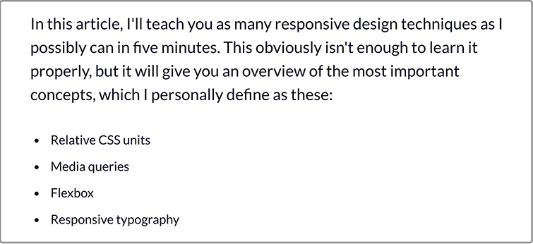
This is an article written by Per Harald Borgen, the Co-founder of Scrimba. He shares a host of responsive design techniques in this article. You will have an overview of the most important concepts about web responsive design, including:
Want to build responsive websites from scratch? Then this tutorial is the one you shouldn’t miss. Beginners will learn everything they need to get a leg up from this four-hour-long tutorial.
From explaining the core concepts needed to start thinking responsively to taking you through every single step in building a professional-level responsive website, this tutorial has everything you needed.
The teacher is the brilliant Kevin Powell, who will guide you through the content, which includes CSS units, CSS units - percentage, controlling the width of images, the problem with ems, and much more.
Even though this lesson is a little bit older than the others (it was published in 2017), it is still very useful. It continues to garner views and positive feedback. This lesson will teach you how to make a website responsive using CSS media queries.
This tutorial will guide you step by step to learn how to create a responsive web design using CSS grid & CSS media queries. It begins with a comprehensive look at responsive design and then goes straight to the creation of HTML5 and CSS from scratch. This tutorial involves nothing that requires using any CSS frameworks.
This tutorial will teach you how to build a responsive Bootstrap website. Drew Ryan will guide you from start to finish, tackling Bootstrap 4, HTML5, & CSS3.
This tutorial is quite popular on Youtube, and viewers regard it as the tutorial to understand the logic of the Bootstrap engine.
In this tutorial, Gary Simon shows you how to create a fully responsive image gallery in the simplest way. Designers used to have to create a whole slew of media queries at various breakpoints to overwrite certain CSS properties, but in this lesson, you just need to use 2 CSS grid properties without the use of any media queries.
This is a free responsive web design tutorial specially made for beginners, so it is super easy to understand and learn. To make the content more digestible, Flux uses many examples to explain.
This tutorial is made for those who are planning to start a responsive blogger website. This tutorial is complete, easy-to-understand, and concise. You will learn how to build a responsive blogger website using HTML and CSS.
Responsive and adaptive design are both popular in the web development field. While these two terms are similar in many respects, they are actually different from each other. RWD is not AWD, and designers need to figure out what is the difference between responsive and adaptive design.
Here, we have picked up five of the best examples and concepts in responsive web design.
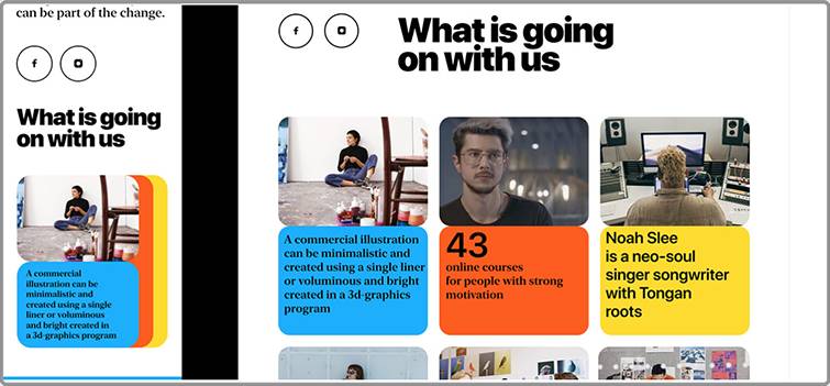
This is an online school interface concept. It features a flexible grid and four columns on desktop and only one column on mobile phones.
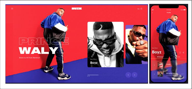
Muzik is vibrant with its bold color pattern. By using a fluid grid and flexible visuals, it also one of the best responsive website examples. When it displays on mobile devices, the images can change orientation as well.
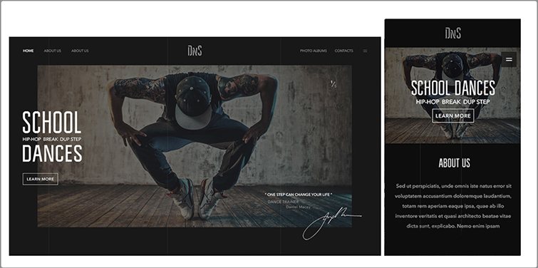
Dance school features a big hero image. It looks perfect on both desktop and mobile devices thanks to the use of responsive design.
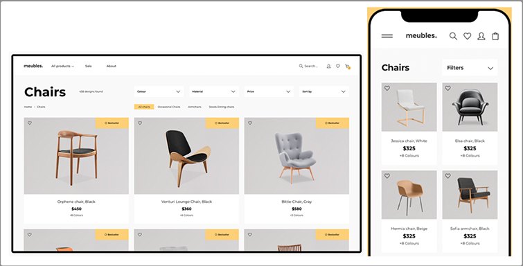
Meubles is a furniture store that offers users a good experience on all devices. The design on desktop features a three-column layout and full menu, which converts to a one-column layout and filters on tablets and mobile devices.
Here are another 20 inspiring examples of the Best Responsive Web Design in 2019.
Bootstrap is a free front-end framework for faster and easier web development developed by Mark Otto and Jacob Thornton, the designers of Twitter. It is also the most popular HTML, CSS, and JS framework for developing responsive layouts and mobile-first web projects.
Mockplus is an online collaborative design tool that allows you to create interactive web pages and prototypes. This tool is very powerful, can quickly output interactive web pages, and provides users with the best UI toolkit and component library.
This is a responsive web testing tool that makes it easy to know whether your site is mobile-friendly or not by simply entering the URL of your website. Furthermore, you can directly interact with your web page.
A responsive layout provides users with a more comfortable interface and a better experience on any mobile device. We hope the above 20 responsive web design tutorials will point you in the right direction.
 Mockplus RP
A free prototyping tool to create wireframes or interactive prototypes in minutes.
 Mockplus DT
A free UI design tool to design, animate, collaborate and handoff right in the browser.


 Sign up with Google
 Join our Discord community
 support@mockplusapp.com