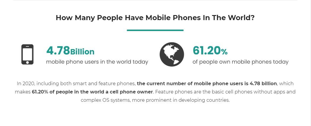
Today, more than 4.78 billion people around the world—over 60% of the global population—use mobile phones as the most important communication method to keep in touch with others and to shop online. This number continues to grow, along with mobile eCommerce sales which are expected to hit $2.92 trillion in 2023.
This makes responsive online store websites that can work on both computers and mobile devices one of the overwhelming current trends in web design.
To help you to create stunning and mobile-friendly websites, we've picked 18 of the most responsive web design tools, tutorials, and other resources. Whether you are a design beginner or a seasoned professional, you are bound to find what you need here.
So, let's get started!
Generally speaking, when we talk about “responsive” web design, we are referring to a special design technique that ensures that a website looks good and works well on all devices, regardless of the device’s screen size and page content. In other words, a responsive website scales its page elements and content automatically to fit different devices, such as all popular mobile phones, tablets, computers, PCs, and so forth.
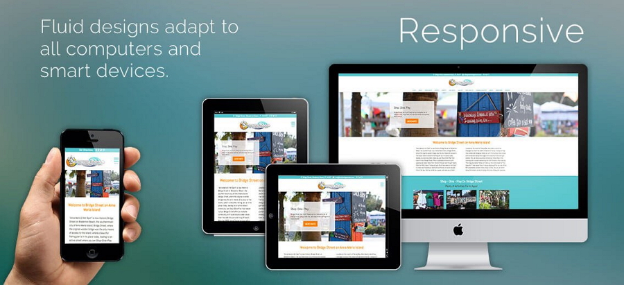
So, a responsive design makes an online store website mobile-friendly, allowing website owners to reach far more customers and increase sales. Moreover, to better understand responsive web design, you should also read more about the difference between responsive and adaptive design.
If this has whetted your appetite, you should also check 20 responsive web design examples to give you some inspiration.
Nowadays, responsive design is essential for any website hoping to reach more customers and provide them with a better user experience. Let's look at some of the reasons behind this.
As we mentioned at the beginning, over 4 billion people around the world now use mobile phones to shop online. This means that owners of online store websites can no longer afford to ignore the importance of mobile users.
To attract more mobile users and increase mobile sales, mobile-first website design has now come into its own.
In comparison with a single web page, a responsive web page always matches more device screen sizes, enabling web visitors to check the same website content from different devices.
So, responsive design gets visitors to linger on your website for longer and it makes it easier to meet their needs. This will improve a website's SEO ranking, something website owners and marketing managers will welcome.
You no longer need to create separate websites for all devices, so the cost of designing, building, developing, and testing a new site will obviously be much lower, saving you and your team valuable time and money.
So, now you only have to build and maintain a single website. This will make life much easier for you and your team and enable you to make sure everything is under control.
Needless to say, there are plenty of handy tools, like website prototyping tools, user testing tools, and even responsive design tools, to help you design, build, test, and maintain your responsive website.
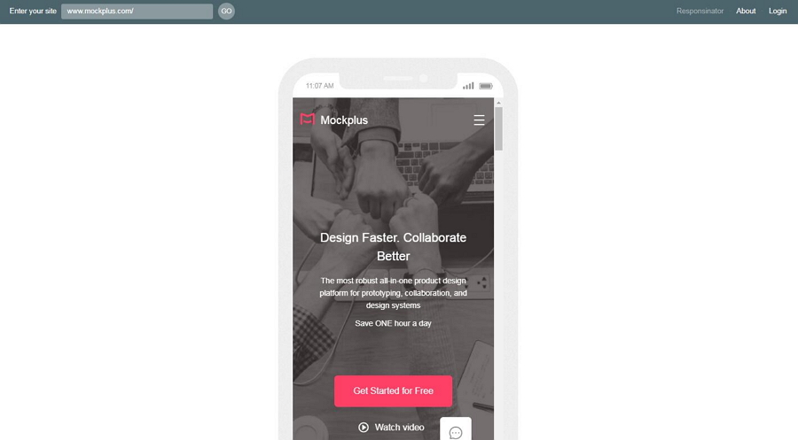
For example, a handy prototyping tool like Mockplus makes it easy to create responsive elements, layouts, and pages with simple clicks, and to test them quickly on different devices. It also makes it easy to share web prototypes with your team, clients, and even with stakeholders, all with a single HTML link.
Once you've mastered the key elements of responsive website design, the next step is to learn how to make a responsive website. Here, we've compiled a list of the best responsive web design tools, video tutorials, and other free resources to help you design a brilliant responsive website easily and quickly.
To make it easier for you to select the right tool, we've grouped the tools available into the following categories:
Tools to create responsive web templates
Tools to make responsive web designs from scratch
Tools to create responsive web layouts
Tools to test responsive web designs
Price: Start with a Personal Plan at $12 a month (billed manually)
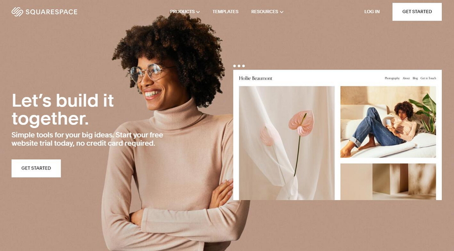
If you are building a responsive website and are not familiar with UI/UX design or coding, an online responsive website builder like Squarespace that allows you to create responsive websites on your browsers could be the perfect tool for you.
With Squarespace, it is easy to start creating your website by choosing a template with powerful features. You will find dozens of useful design themes, high-quality, colorful backgrounds, smart scrolling interfaces with fully customizable elements, rich style options, and a lot more.
Price: Basic Free
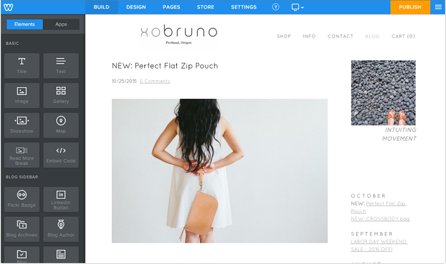
Weebly is a free online drag-and-drop website builder that has over 40 mobile-friendly themes that make it easy to create responsive web designs. If you do not want to deal with web coding languages, Weebly is a good alternative to try.
Even though Weebly does not have as many tools, responsive templates, or features as Squarespace, it is a good option if you are looking to create a minimalistic or simple responsive design in a short space of time.
It also allows you to download your website codes as standard HTML/CSS.
Learn how to use Weebly step by step
Price:
Premium themes available at $129 (purchase once, use forever)
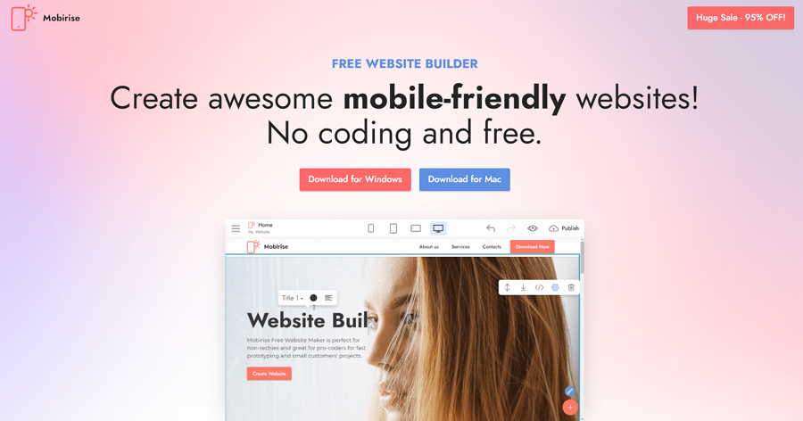
Mobirise is a free offline app for Windows and Mac users who want to create beautiful, mobile-friendly websites. It offers over 3,500 website blocks, templates, and themes.
With Mobirise, you can create a project, and drag and drop the desired block to a page to get started. After completing a website, you can also switch different device buttons on the top toolbar to preview how your website will look on different devices.
This is perfect for non-techies with no coding skills who are trying to design or create a responsive website.
Check tutorials to get started with Mobirise quickly
Price:
Basic features are free
Additional features: $2.42 a month
8b Website Builder is a free and simple online website builder that enables you to create a mobile-optimized and Google-friendly website in minutes. It offers over 250 sections and templates, 950 Google fonts, 1,000 web icons, and 1 million royalty-free images to give you plenty of variety as you create different websites.
This is another good option for those who want to design responsive websites but lack the coding skills required. It offers unlimited hosting, SEO, PWA, and other features.
Price: Free
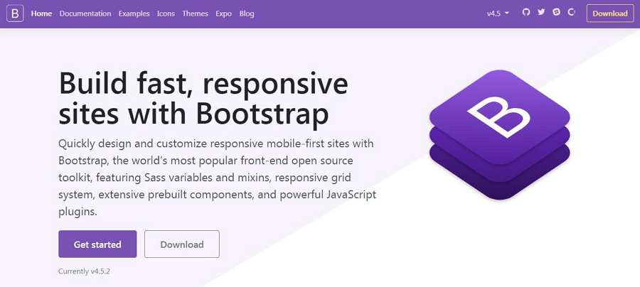
Bootstrap is the most popular free HTML, CSS, and JS library in the world for building mobile-first responsive websites.
It provides users with a powerful front-end open-source toolkit, including responsive grid systems, responsive components, layouts and elements, JavaScript plugins, CSS front-end framework, and much more. All of this will help you create responsive websites quickly and easily.
It is free to download the resources to use in your website project.
Price: Start with a Personal Plan at $17 a month (billed manually)
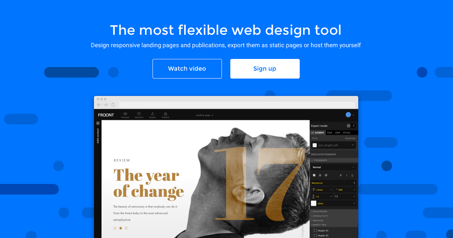
Froont is a web-based website design tool that can help you create from scratch responsive websites, landing pages, and publications in your browser.
A drag-and-drop editor makes it easy to create your design and to test the visual effects. An ever-growing library of responsive components helps simplify your design process. It is easy to export the design codes into a Zip file if necessary.
Price: Start with a Standard Plan at $29 (purchase once, use forever)
Bootstrap Studio is a desktop app for designers and developers who want to create responsive websites using the Bootstrap framework. With a large number of pre-installed responsive components, it is easy to create a website with drag-and-drop and export it as clean and semantic HTML codes.
Price: Start with a Basic Plan as $12 a month (paid manually)
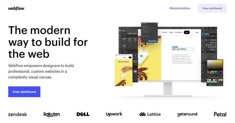
Webflow is an online website tool that can help you design, build, and even launch responsive websites visually within your browser without coding. The site combines design, animation, content management, marketing, and other tools into a single visual web development platform, providing a great place for non-coders and coders alike to create and promote responsive websites quickly and effectively.
Whether you actually know coding or not, Webflow is a good option for designing and creating a responsive website project either on your own or collaboratively.
Price: Free
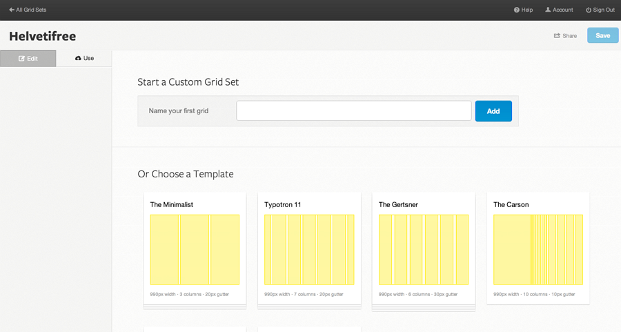
Are you looking for a powerful tool to create clean, responsive grid layouts for your website project? Gridset would be a great choice.
It allows you to make responsive grid layouts or layout systems of any type, including the trendy asymmetric, symmetric, fixed, compound, or columnar systems. It works well with many popular content management tools, such as Joomla, Drupal, and WordPress.
Follow this tutorial to get started with Gridset
After creating a responsive website, you should be looking for tools to preview or test the website to see how it will look on different devices.
Price: Freemium
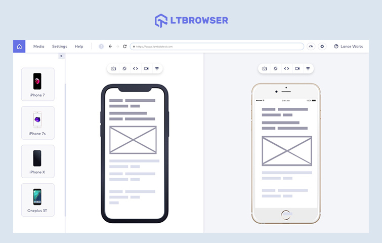
LT Browser is an intuitive tool for responsive testing and debugging. You can instantly check how your website looks on the most popular viewports like mobile, tablets, and desktop. It also helps you debug on the go and perform local testing by simply turning in the URL!
You can check your website's performance on 45+ viewports simultaneously on LT Browser, and 2000+ browsers, OS, and resolution combinations on LambdaTest Dashboard. Additionally, LT Browser also integrates with all prominent communication and project management tools for seamless sharing and reporting.
Price: It offers a free trial on request. Provides Pro and Enterprise pricing plans.
Testsigma is a powerful, Agentic AI-powered test automation platform for web, mobile, desktop, API, SAP, and Salesforce application testing. It is a codeless testing platform that allows testers to create their tests in plain English and execute them across 3000+ real devices, browsers, platforms, and versions on the cloud.
Testsigma accelerates test automation by 10x, enabling you to execute multiple tests in parallel and significantly reducing overall test execution time. It is a unified testing platform that simplifies and scales your entire testing workflow.
With its codeless, agentic AI capabilities, you can create automated test scripts in seconds without coding. And it doesn't stop at responsive testing. Testsigma supports a wide range of testing types, including UI, Functional, Accessibility, Visual, Regression, Cross-browser, and Cross-device testing.
Price: Free
Responsive Website Design Tester is one such tool. It is a fast tool that allows you to check how a website looks on most popular devices, including mobiles, tablets, and desktops, simply by entering your website link.
Different devices and screen sizes are provided for you to choose from. You can also customize a screen size to test out your ideas if necessary.
Price: Free
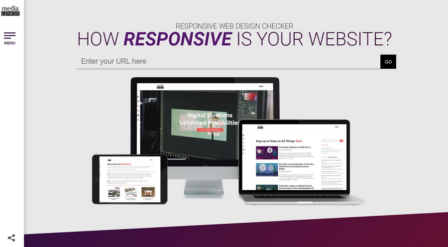
Responsinator is a free responsive testing tool that can help you check the responsiveness of any website online simply by entering the URL. Commonly used device frames, such as tablets, iPhones, iPads, and other mobile phones are all preset in both portrait and landscape views, enabling you to quickly check the visual appearance of your website.
It also provides a handy Google Chrome extension tool to check websites quickly with a few simple clicks.
Price: Free
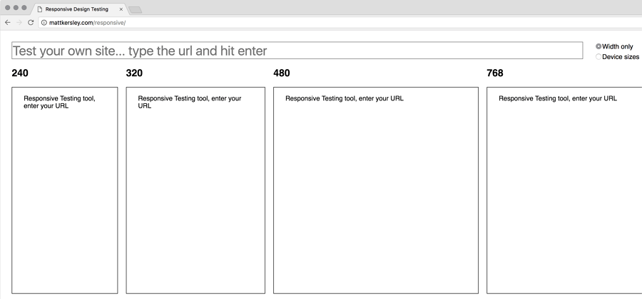
This responsive web design testing tool, created by Matt Kersley, can help you test out your website projects during the build and design phase.
The site provides two methods to test your website on different devices: choosing the right width or the right device size.
Price: Free
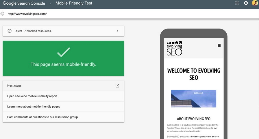
Google Mobile-Friendly Test is made by Google specifically for testing responsive websites. It is easy to use and it will evaluate how fluid the layout of your website is and how mobile-friendly. Just enter the website URL or codes and wait. You will be given a testing result that tells you whether there are any errors or other issues that need to be addressed.
This is a good tool for testing the flexibility and responsiveness of websites.
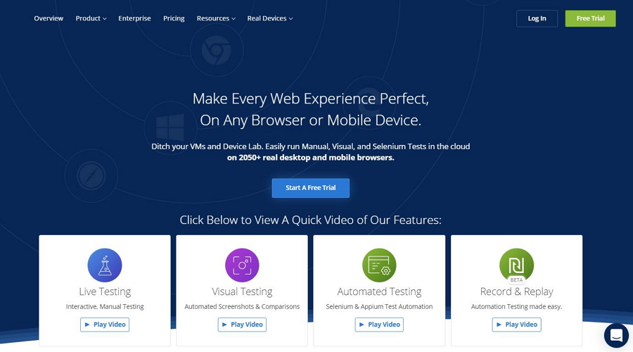
Price: Start with a Live Testing Plan at $29 a month (billed annually)
When you are working on an online website application, as well as testing whether it is workable on all popular mobile devices, you may also need to check whether it is compatible with all the current web browsers.
CrossBrowserTesting is a tool that will do this by testing your websites on almost any browser or mobile device. It includes many powerful features to help you get your web page into the best state possible, including debugging tools, local testing tools, screenshot engine and comparison tools, and much more.
Price: Free
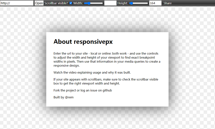
Responsivepx.Com is a simple responsive web testing tool that enables you to test out your website project with a single URL. It works both online and locally so that you can adjust the width and height of your viewpoint to whatever you need. It has a feature that allows users to resize websites pixel by pixel.
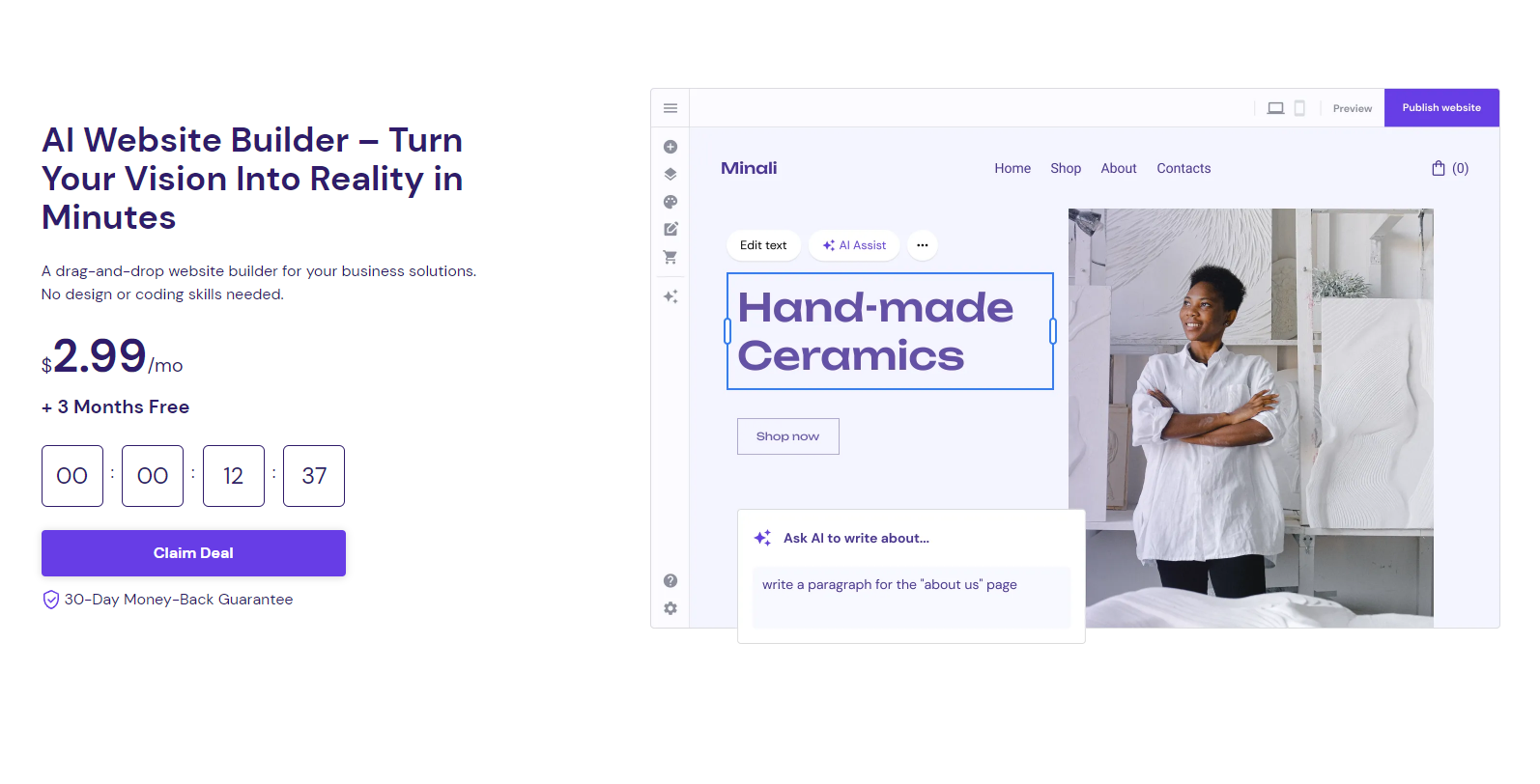
Price: $2.99 per month
With Hostinger, you can build a website with AI. With a library of professionally designed templates and the builder's intuitive drag-and-drop interface, you can effortlessly transform your ideas into reality.
As you customize your site, the AI system adapts, learning from your choices and anticipating your website needs.
In addition to AI, Hostinger packs many features into its website builder plan, including SSL encryption, free domain registration, email hosting, website backups and more. You can also enjoy extra add-ons for added functionality like G Suite integration and blog networks.
Learn more about Hostinger Website Builder
1. What is Responsive Web Design
If you are a design beginner, still in the dark about responsive web design, this responsive web design tutorial is the perfect place to start learning all the important details.
2. Introduction to Responsive Web Design: HTML and CSS Tutorial
Don't fancy reading long articles on the subject? This video tutorial aims to teach you how to build responsive websites from scratch. This four-hour video tutorial explains almost everything you need to know to be able to create a responsive website. It offers a step-by-step guide.
3. How to Make a Website Responsive
In this video lesson, you'll learn how to create a responsive website using CSS Media Queries. It has three parts: Introduction to responsive design; Creating the content; and How to use CSS Media Queries.
4. Responsive Web Design: 10 Basics
Responsive design is now a must if you want to make your website viewable on different tablets, mobiles, or PC devices. To help you get started, this basic responsive web design tutorial gives you 10 basic points and must-haves for the process.
5. Create a Responsive Website Using HTML5 and CSS3
This one-hour responsive web design video tutorial shows you how to make a responsive web design using HTML5 and CSS3. The related demo and files can also be downloaded if you need to follow the video steps to get off the ground.
Want more tutorials? Why not check 20 Best Responsive Web Design Tutorials?
Here are five of the best free design resources to help with your responsive web design process:
1. The 20 Best Free Responsive Mockups for Inspiration [PSD+Sketch]
This is a collection of 20 of the best free responsive website mockups in PSD and Sketch formats. They are all easy to download and will help you create the website you want.
2. The 20 Best Login Page Examples and Responsive Templates [Free download]
This is a list of login page examples and responsive templates, useful for every designer. Most of them are gathered from Dribbble, putting the latest responsive design trends at your fingertips!
3. 20 Inspiring Examples of the Best Responsive Web Design (Updated)
This article shares 20 of the most inspiring responsive website designs and has recently been updated.
4. The 20 Best Free Responsive HTML5 Web Templates
Here is another collection of responsive HTML5 website design templates. Most of these templates are free and downloadable. If you are looking for a fully responsive HTML web template, this collection could have just what you want.
5. The Eight Best Free Responsive CSS Website Templates for Building Your Website
Here you can get eight of the best free CSS website templates that you can use to build a website for your business. They all are 100% responsive and downloadable.
Wrap up
Responsive website designs help you load product or service information smoothly on different devices and can thus be an effective way of increasing sales. Responsive website design tools will simplify your design process and make it much easier for you and your team to create and maintain a website.
We hope this article will have given you a good overview of responsive design and set you on your way to creating your own killer designs.
 Mockplus RP
A free prototyping tool to create wireframes or interactive prototypes in minutes.
 Mockplus DT
A free UI design tool to design, animate, collaborate and handoff right in the browser.


 Sign up with Google
 Join our Discord community
 support@mockplusapp.com