SaaS (Software as a Service) has continued to gather momentum. So far, it has become the most viable and popular on-demand software solution for numerous individuals and enterprises. It's estimated that SaaS will gradually take over the cloud computing market. In fact, the global service-based cloud application industry will hit a market worth $143.7 billion by the end of 2022, according to Gartner, a research and advisory company.
As a new model of software distribution, SaaS offers many benefits to companies. Today, most companies are in the process of providing SaaS services. As a result, the demand for Saas website designs is getting stronger and stronger. Though there are many Saas websites out there, it's still hard for designers to find great SaaS website examples. In this article, I've rounded up the 20 best SaaS website design examples to help you build your own SaaS websites. Let's check them out.
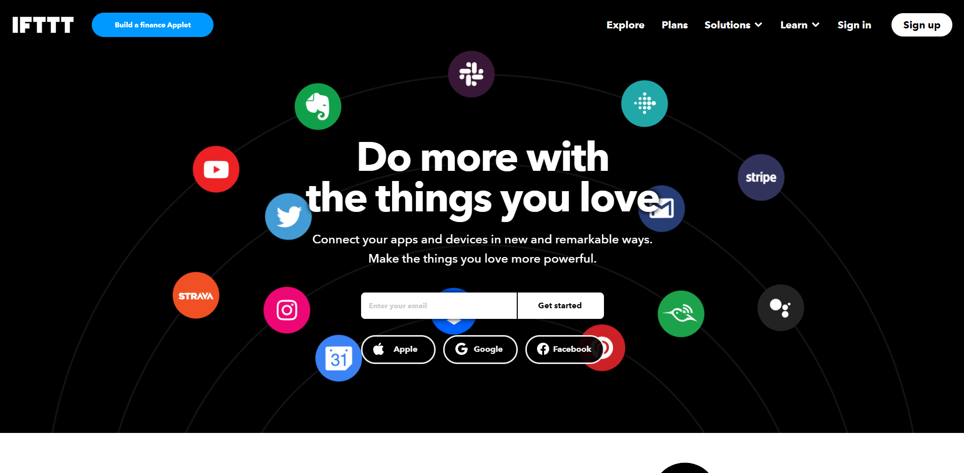
IFTTT is a free platform that connects and makes products and services work better. The website design has a dark color scheme, which looks super cool and futuristic. It provides information in a clear and easy-to-digest way that a developer can see its potential. Besides, the home page is extremely clean and simple. There are no extra details and information. The page length is moderate. This makes it approachable to different visitors without feeling overwhelmed.
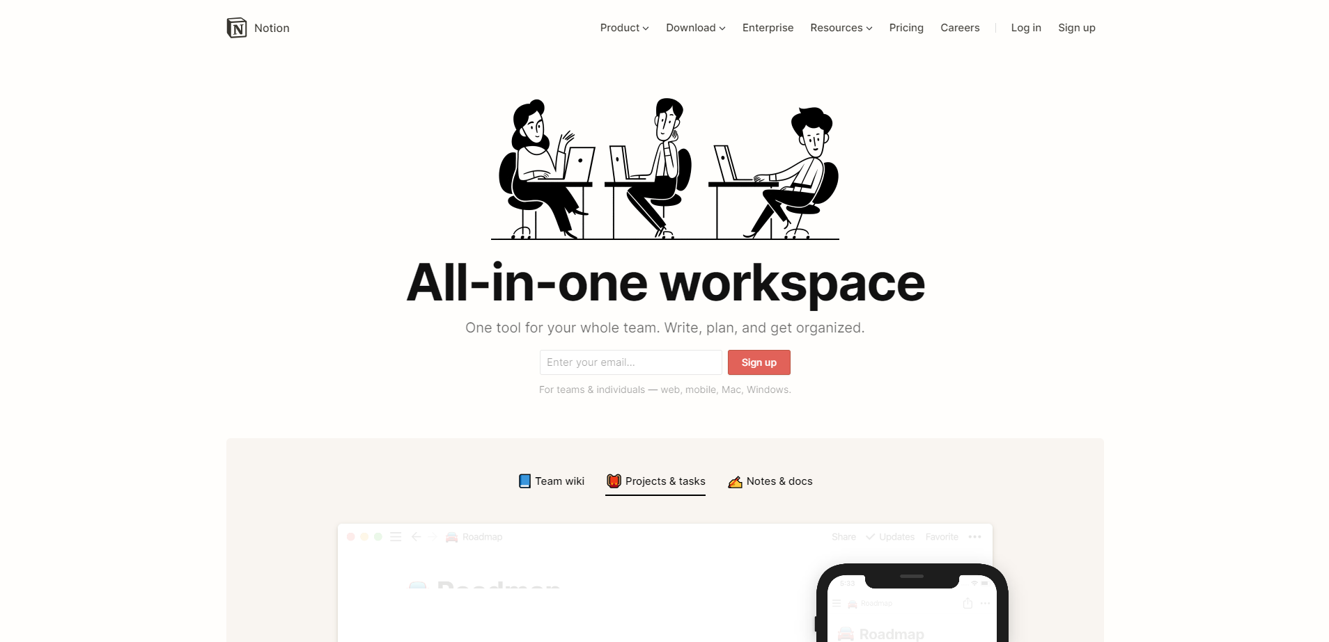
Notion is an all-in-one workspace where you can write, plan, collaborate and get organized. The website features delicate and simple illuminations. The black and white images are nice and attractive. They give the website elegant and reminiscent vibes. The combination of notes and documents clearly show their major features. Though there is a lot of different information they need to provide, the smart arrangement of each item has made it rather clear. The use of the grid and big numeral numbers acts as great signposts.
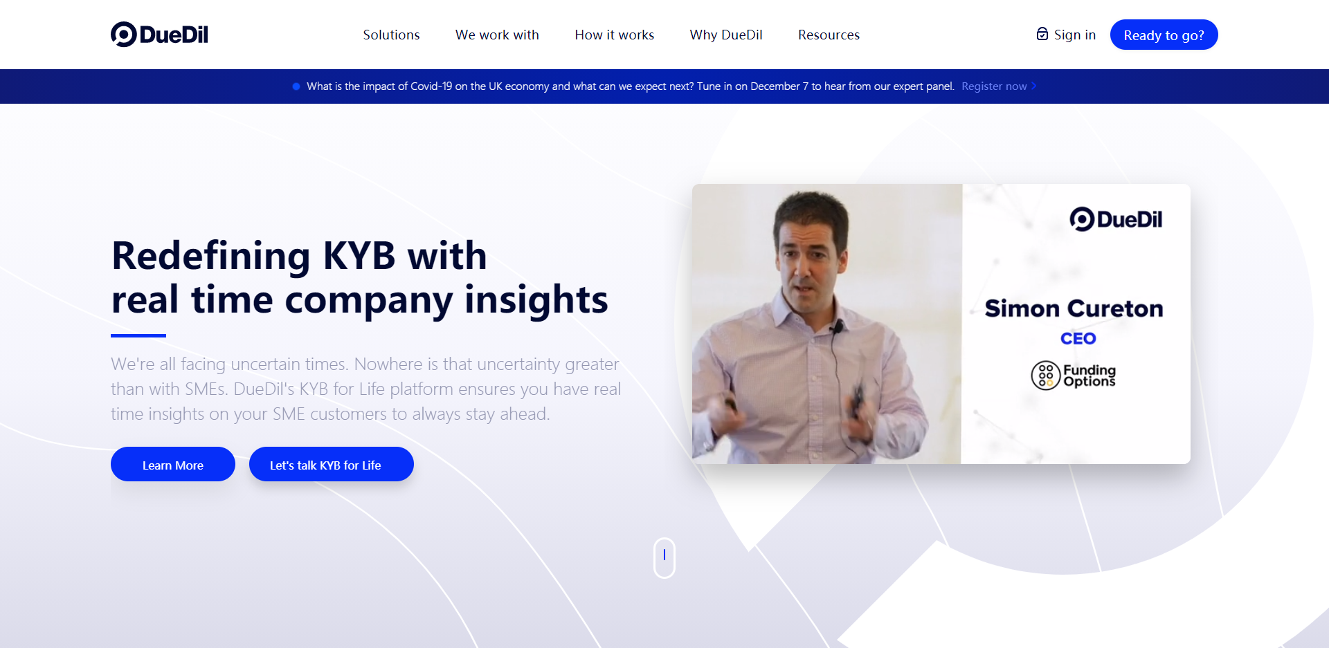
DueDil is a company intelligence platform covering the SME economy. The website is a great example of a strong copy. The overall visual appeal is boosted to improve conversion. As the average attention span of users is getting shorter and shorter. The site has done an excellent job to grab the attention of the users. The single-page design is quite straightforward, which only requires a few seconds to get the core information. And visitors are encouraged to learn more about this site. Then, they can check the video or explore different categories on the top menu.
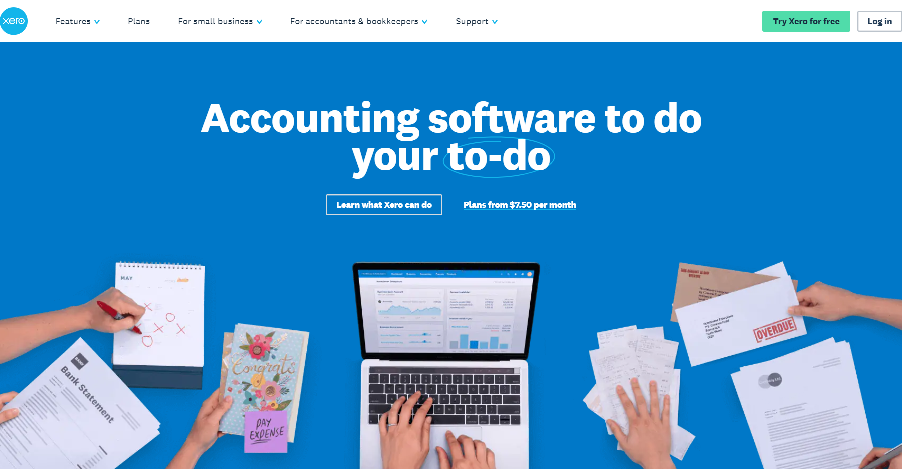
Xero is online accounting software for small businesses. The use of different shades of blue is amazing and visually appealing. The images and background match well. They contrast each other and create a great visual harmony. Though there are lots of different information, such as product features and customer stories, the layout, and flow of content are clear and highly consistent. As visitors look through the home page, they can quickly get the logical map and find what they need at the first sight.
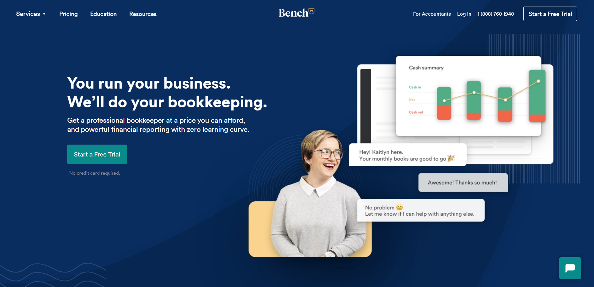
Bench is a fintech company that provides financials to business owners and uses software to help them automate bookkeeping. The website design has catchy text and a consistent color scheme. There is a sharp contrast between white text and dark background. This makes their headlines and CATs stand out and speak for themselves. The overall design looks clean and simple. The use of images from confident staff and clients gives the website a human aspect. This also comes as a trustworthy endorsement for this website.
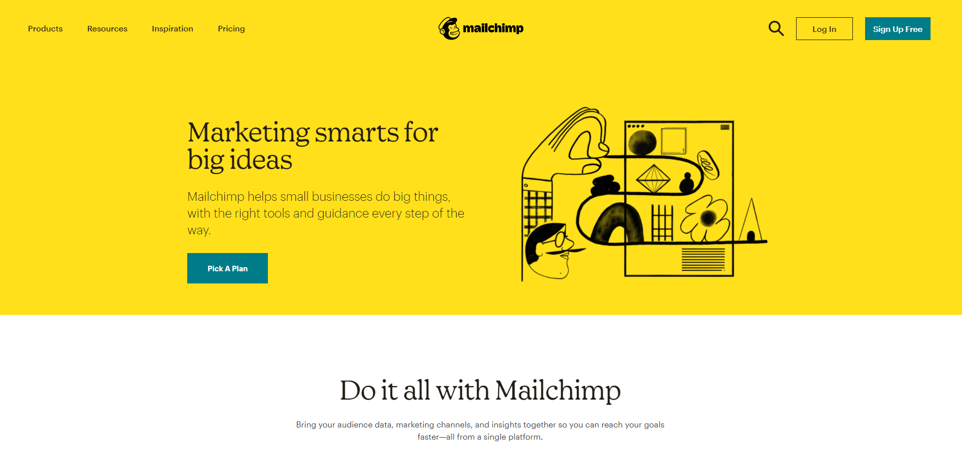
Mailchimp is a popular email marketing service and marketing automation platform. This site has the beauty of symmetry as elements are balanced and well-arranged. The color scheme is warm and sweet. With a vibrant, yet minimal design, the website has properly shown its services and highlights that are exclusive to them. Besides, there are several clear paths to conversion with various CTAs, such as Sign Up Free, Pick A Plan and Learn More. You can always access the Sign Up Free at any time when you're viewing this website. It's fixed at the top right of the home page.
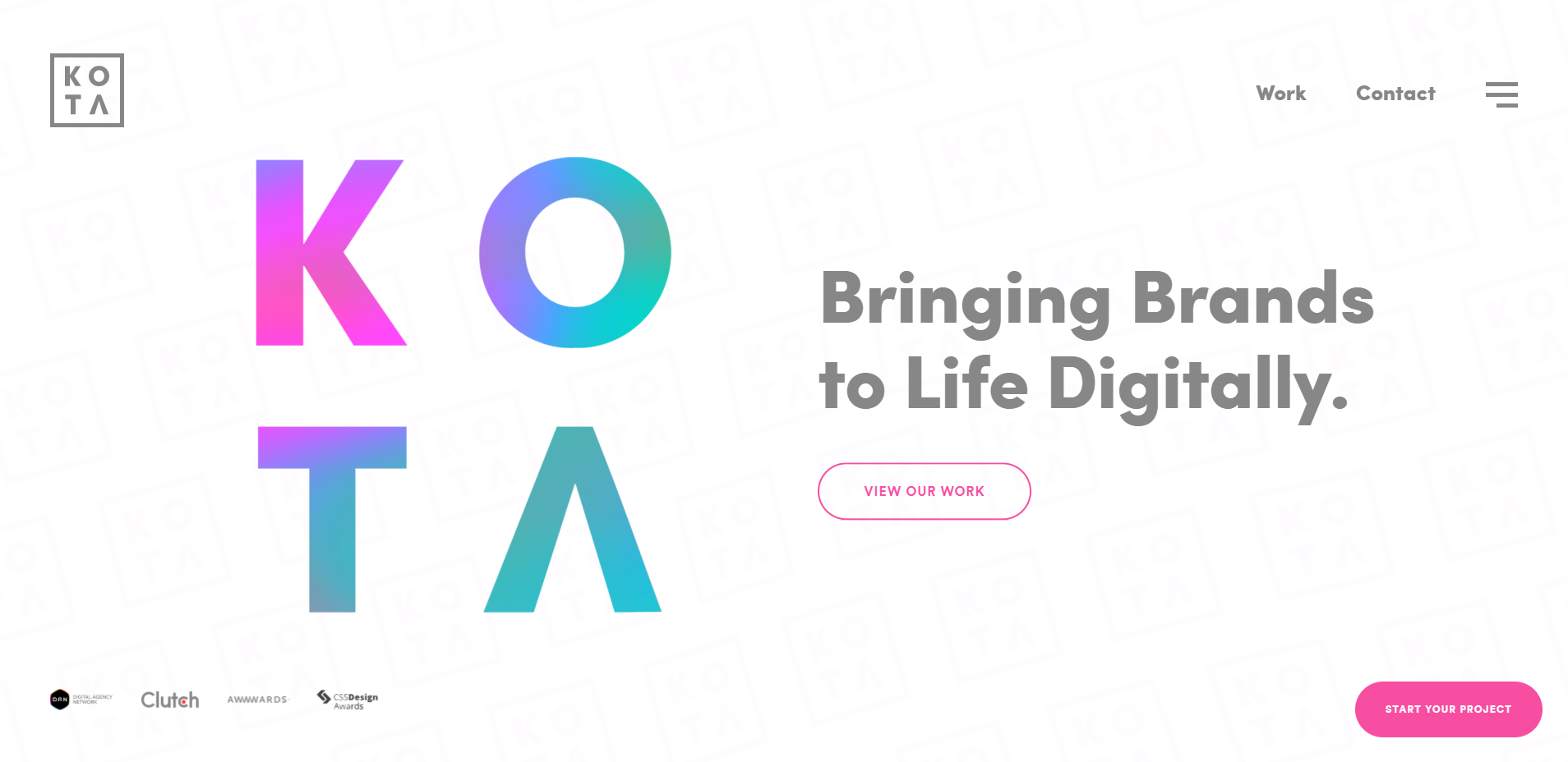
KOTA is a London-based creative web design and branding agency. The website is dynamic and vibrant. The use of interactive elements makes visitors want to stay longer and explore more. This will boost lead generation and contribute to the conversion. As you scroll down the home page, it's like taking a short trip. At first, you can interact with their brand logo, twisting and stretching it. Then, there are clear illuminations answering a few basic questions. The website also goes from bright to dark and finally back to bright.
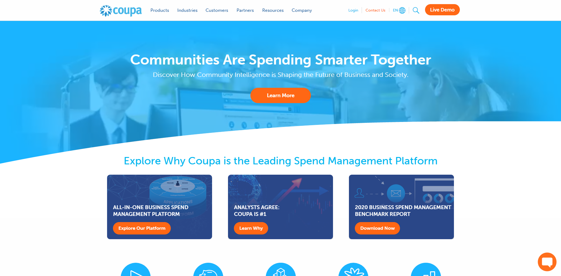
Coupa is a global technology platform for Business Spend Management. The color scheme is subtle and refreshing. The overall design maintains a high degree of consistency. The use of color draws the attention of visitors to key elements like CTAs. The CTAs are arranged in different sections of the page where visitors can easily access what they need. The overall navigation is simple, intuitive and straightforward. As you scroll down, you will always find the right CTA that you want to explore more.
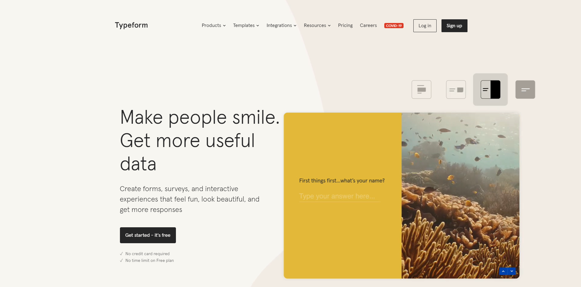
Typeform is a Barcelona-based online software as a service company that specializes in online form building and online surveys. The website design is extremely intuitive. It goes the extra mile and has a unique color scheme. The home page features several dynamic images, which clearly demonstrate their service. They are delicate and pixel-perfect. The combination of different colors is amazing. The layout is split as well as comes as a whole. There are parts of the page with a split-screen. And others are in a complete set. All in all, it's a good SaaS website design.
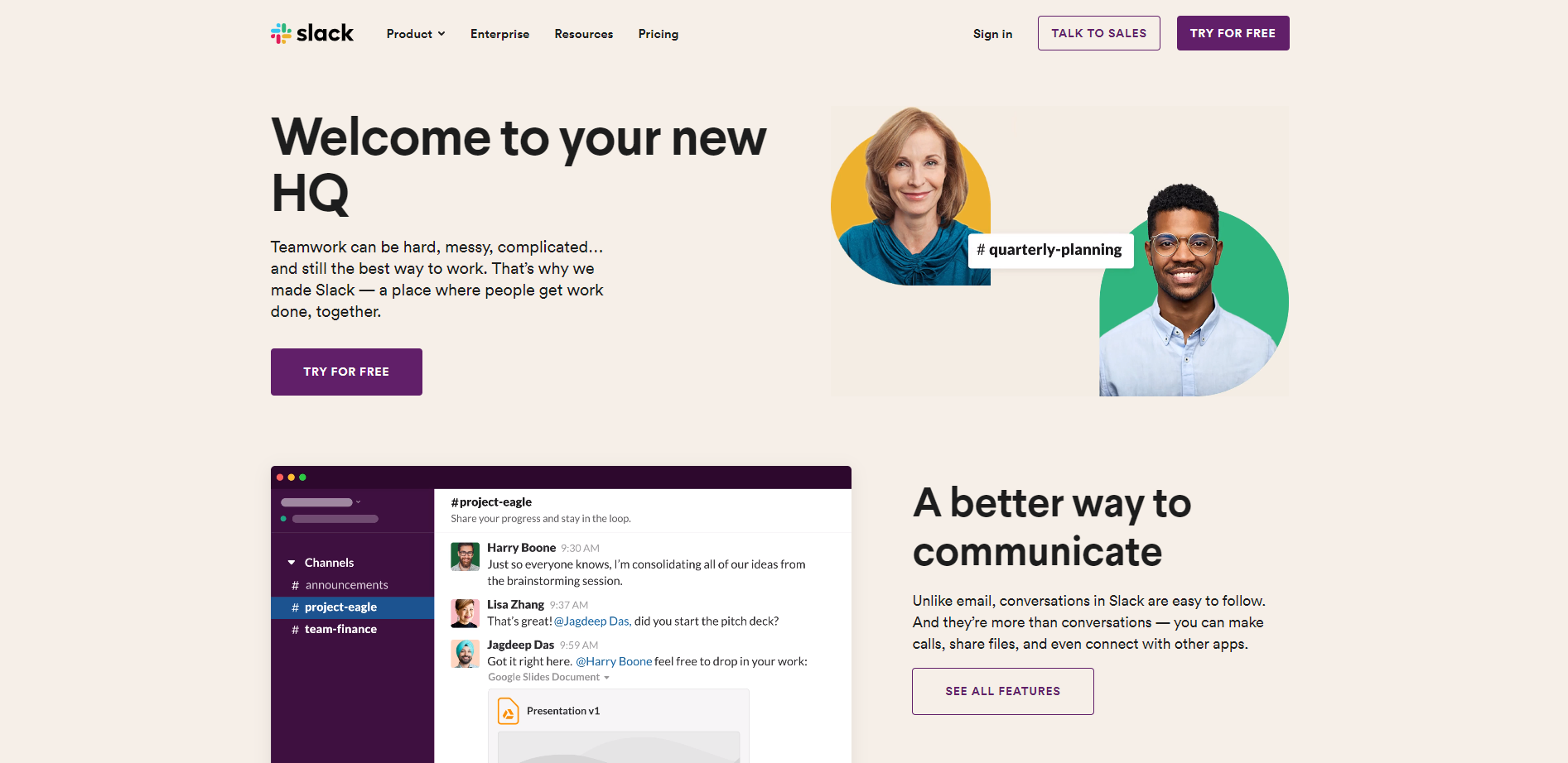
Slack is a messaging program that helps colleagues keep in touch, plan schedules, share documents and more. Compared to traditional white background, the use of a mild color is nice. It reduces eye strain and comes easy on the eyes. The website layout is clean, simple and concise. There is only a short and limited length of the page. As you scroll down, the floating toolbar will fix to the top of the screen, showing CATs and major categories. And it only takes a little time to come to the bottom of the website. This conciseness makes visitors want to check the content more times subconsciously.
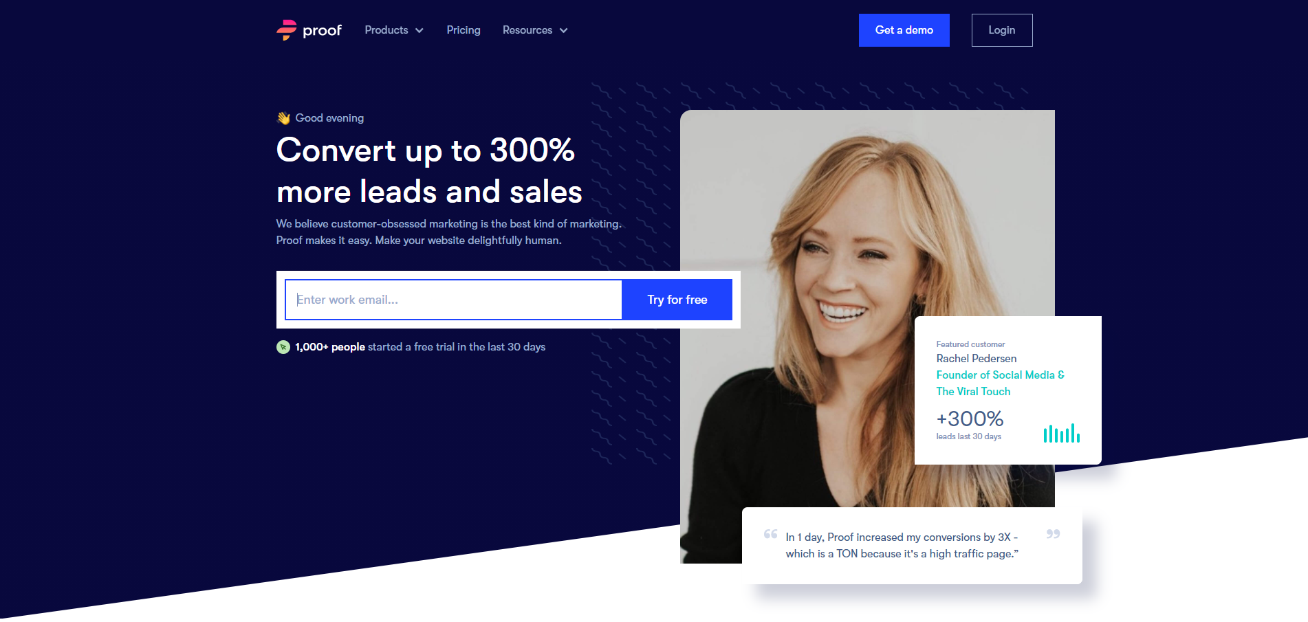
Proof is a website design platform that allows you to personalize your website. The slogan is bold and eye-catching. If you want to create a great user experience, it's essential to make visitors feel valued and take personalized elements into account. So, this website has done that and created something fresh. The layout is a live demo for their products. And the CTA is clearly shown in the middle of the page, which is great for conversion. Besides, the length of the page is not too short or too long. The information they provide is easy to understand.
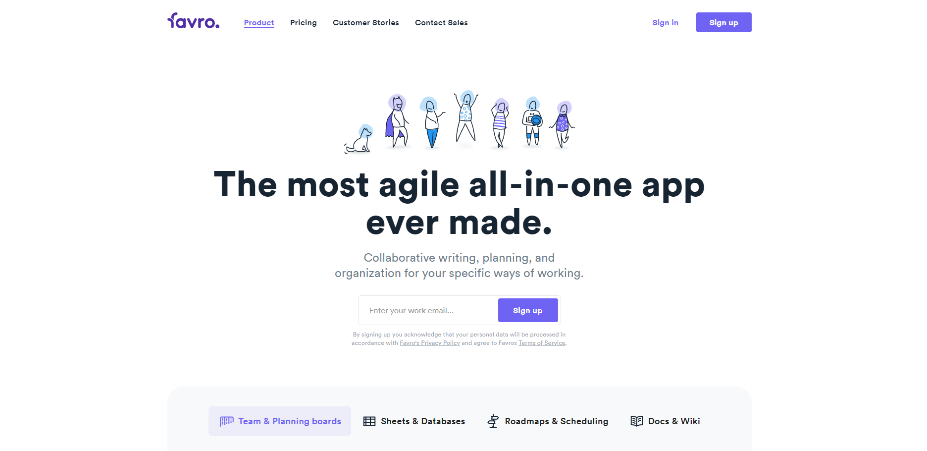
Favro is an all-in-one planning and collaboration app. The slogan is large and clear enough for any visitor to take notice of. It serves as a good method to introduce the benefits of the app. The menu on the top provides information in a simple and straightforward manner. With no extra categories, it just needs a click to take you to the related page. There is a tab on the home page that you can switch and check the four major features they provide.
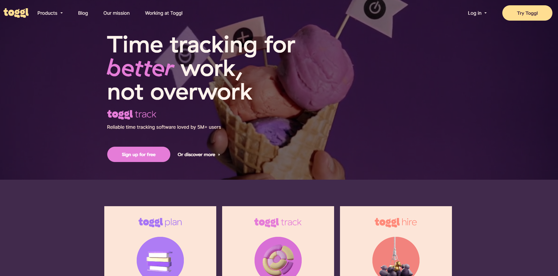
Toggl is a time tracking app that offers online time tracking and reporting services. The site is a great example of SaaS website design. The luminous color scheme gives the website a lively and dynamic feel. The simple and whimsical illustrations add extra personality. These bright colors and energetic images together act as effective attention grabbers. As opposed to average sites that are full of various texts, this website design is quite clean and vigorous. The combination of short slogans and terse descriptions is great for visitors to understand the main features. And the words are also italicized or highlighted.
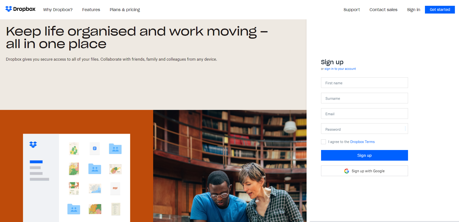
Dropbox is one of the most popular digital services. The bold slogan and simple sign-up form immediately make visitors want to start using their services. The layout is clean, simple, and straight to the point. As most people are already familiar with Dropbox, the design didn't include too many animations and introductions. What they instead focus on is the sign-up conversions. However, the method is not generic and suitable for all, especially those obscure start-ups. They still need to include necessary messages to tell visitors their strong points and why they need these products or services.
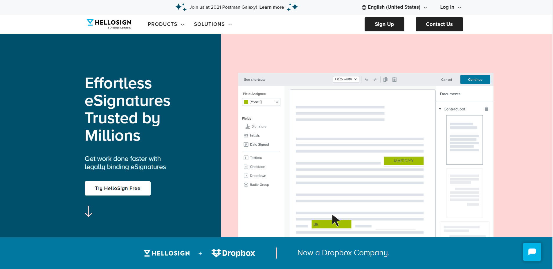
HelloSign is an eSignature provider that allows you to add signatures to any document, from new hire agreements to loans, to NDAs. The website splits their home page and use dynamic animations to liven up and illustrate their features. Split screens are a pretty common layout in today's design field. When pages are divided into two parts, more information can be put and packed on the limited area of the screen. There is also a table showing different types of plans. And different features are also clearly shown in this table.
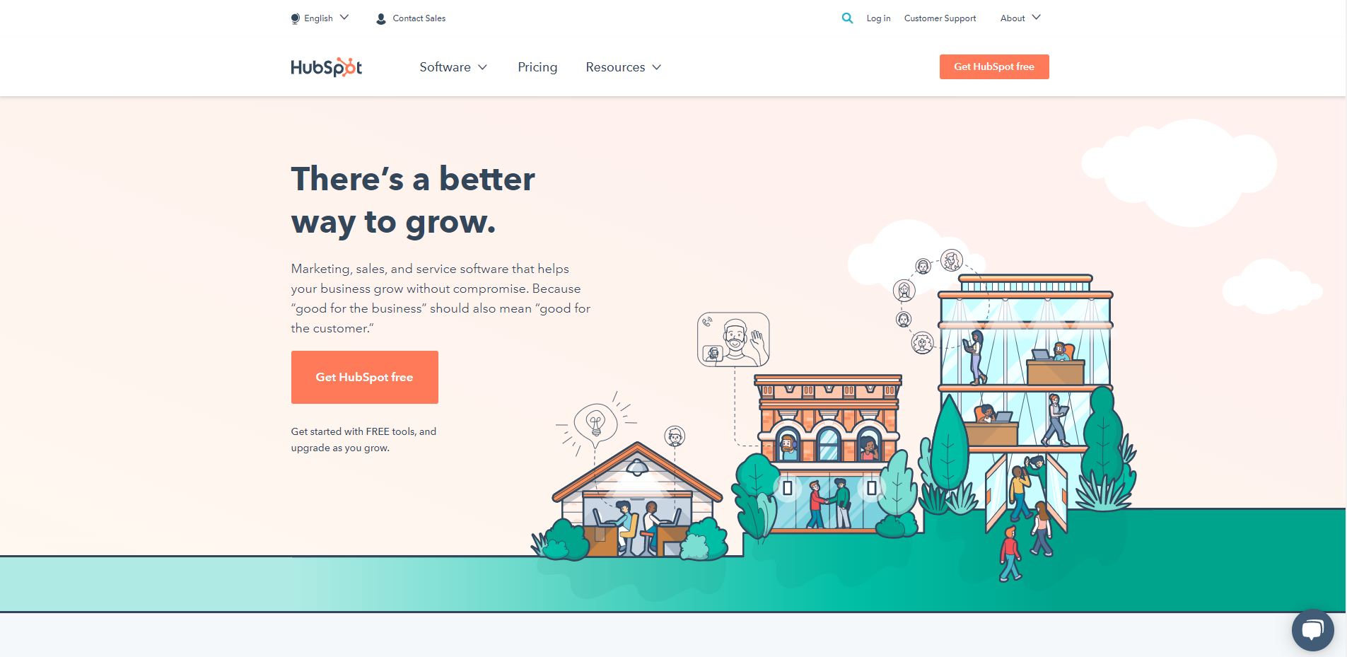
HubSpot is a developer and marketer of software products for inbound marketing, sales, and customer service. The slogan is terse. The layout is simple. The combination of texts with images or video is something great. As you scroll down, you will not be overwhelmed by the density of information. The curve elegantly divides the screen into two parts. The color scheme is subtle.
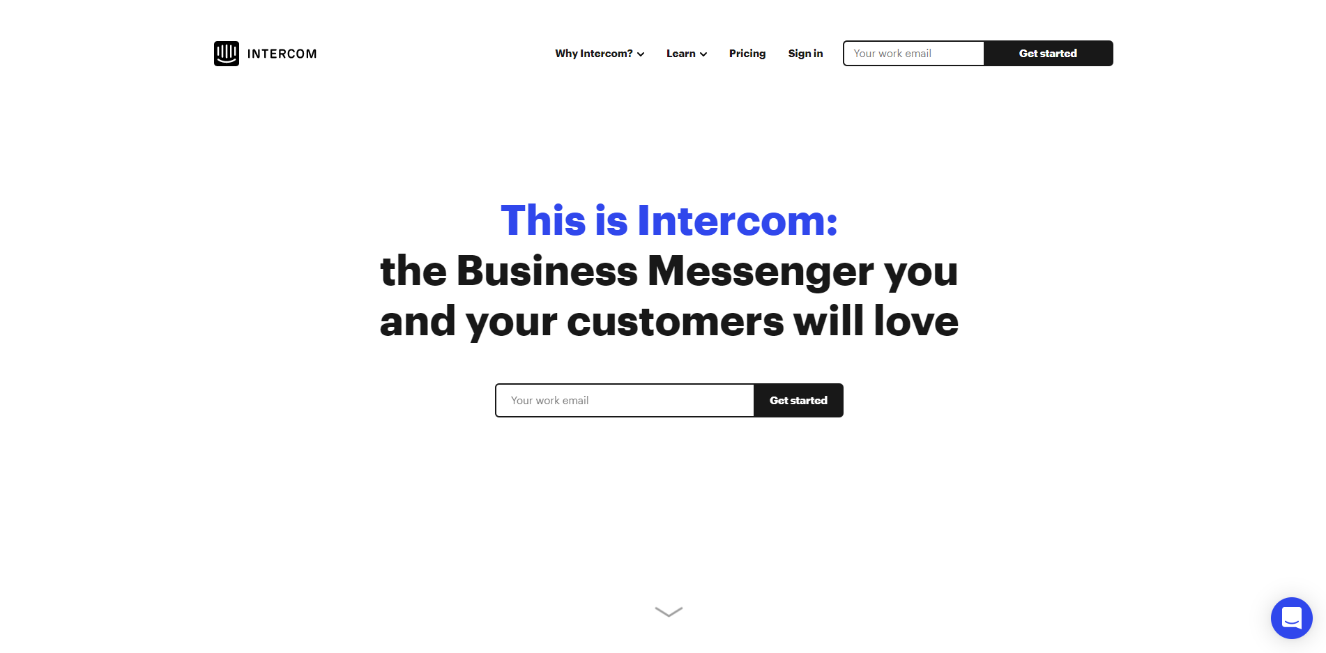
Intercom is a live chat system for support, sales and marketing teams. The design has an organic and simplistic feel. There are no extra texts or descriptions. What you can find are only two super large and bold slogans, which clearly show who they are and what they do. The carousel or animated illustrations also vividly show you their key features. The images are interactive and the color scheme is nice. They have put social proof ahead of and after their solutions. At first, there are lots of brand badges to certify this website. When customers are assured of their products, then they will come to the solution part. Then, there are lots of positive feedback from individual users.
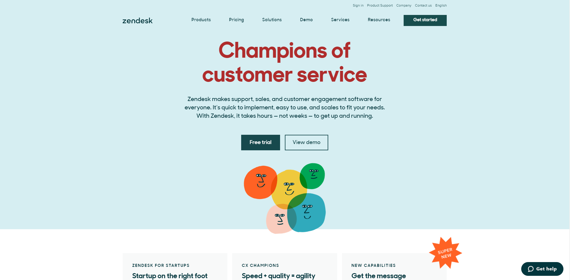
Zendesk is an American customer service software that provides digital solutions for sales, customer support, and customer engagement. The website has relevant and compelling copy and they change the copy from time to time, so as to better resonate with visitors and fit the current affairs. The use of visual brand elements is clever as images, shapes and illustrations match well with each other. There are also lots of badges that build a strong social proof to endorse their products and services.
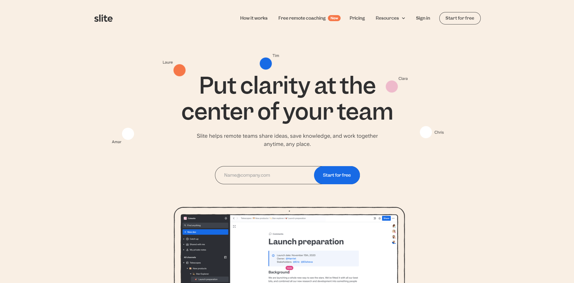
Slite is a great tool for taking notes. It offers a new way of working to keep remote, flexible teams on the same page. The website design has a soft and mild background. The slogan is clear and bold, making it quite eye-catching. They have also done a fantastic job to nail their logo design and ensure this tool is consistent their brand’s identity. The space between different design elements is broad enough and different patterns are unique and geometric.
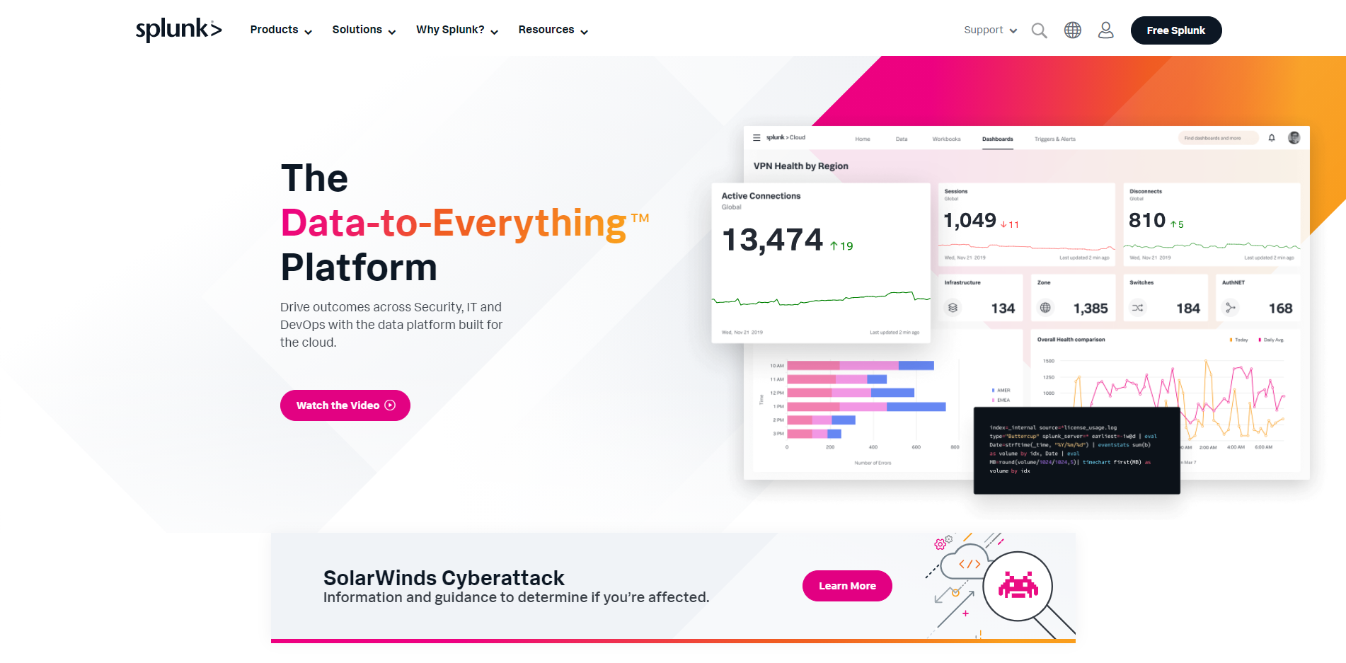
Splunk is a software platform to search, analyze and visualize data in real-time. The website shows clearly what they offer and what they can do for their clients. The key information is highlighted and different visual elements are balanced on the site. So, it's easy and intuitive to navigate and find what you need. As data are abstract, this site uses dynamic graphs and images to visualize them. The color scheme is active and energetic. The combination of pink and orange plays into their branding and represents the brand images well.
Wrap up
At first, it might be challenging to build a top-notch SaaS website. But, you can always get inspiration from the best examples. When you are abreast of the new trends, you will surely create excellent SaaS ones. Hopefully, the above examples will help you with your next project.
 Mockplus RP
A free prototyping tool to create wireframes or interactive prototypes in minutes.
 Mockplus DT
A free UI design tool to design, animate, collaborate and handoff right in the browser.
