Good table UI designs visualize web or mobile data in a clean and neat way that allows users to scan, compare, filter, sort and analyze data and decide what action to take.
In this article, Mockplus has picked 30 of the best table UI design examples, templates and best practices to help you create great looking and effective tables for your next project.
In the world of UI/UX design, table UI designs are form elements that use columns and rows to display different interface information or data in a grid.
A good table UI design—one that uses hyperlinks, CTA buttons, and vertical or horizontal scrolling—not only displays all the interface data clearly but also allows users to interact with table information to speed up their design-making processes.
So, when looking to present very complicated information or heavy data from the dashboard page, pricing page, purchasing page, or delivery page in a more intuitive and simpler way, website or mobile app designers often choose table UI designs to achieve this.
Let's first look at an example of a table UI design:
A table UI design is a great solution when you need to display either a large amount of numerical data or lists of objects, people, or other items of the same type. Designers and product teams appreciate the benefits of this approach:
Great use of web or mobile app interface space
Clean and neat layout and outlook
The ability for users to catch all desired data
Simplification of the design process for users
Ease of the process to modify and maintain
Boost to interface loading speed.
So, if you and your team are looking for ideas to visualize user or product data better, a table design might be just what you are looking for.
Putting data together is not an easy task. We've collected 10 of the best practices that you can follow to design a better table UI design for your website or mobile app project:
The style of a row can be a big factor in how easy it is for users to scan or read when looking to find data quickly. So, when designing a table element, you should also try to choose the row style that best suits the overall style of your website or mobile app.
There are four main row styles to consider:
Tables with grids: This type of table looks just like an Excel spreadsheet and uses grids with both vertical and horizontal lines to separate data. However, too many grids can be distracting to the user and make for a negative user experience. So, this type of table is only recommended for presenting very dense or heavy data.
Tables with horizontal lines: Without the vertical lines, this style of table helps you reduce the visual noise of a full grid. So, this style of table works well for nearly all interface data.
Tables with Zebra Stripes: This type of table alternates different color backgrounds for each row which makes it easier to focus on a single row. So, this type of table can also work well in presenting heavy data.
Free forms: With no vertical or horizontal dividers, this type of table is effective in reducing visual noise and can also produce a very minimalistic look. If you are designing a minimalistic website or mobile app, this type of table might be appropriate.
A row header provides key information on the column that a user is reading. Getting the headings right can help the user scan, read, and parse the data better. There is no need to scroll up and down to check and recheck the column heading when the table is designed with too many rows.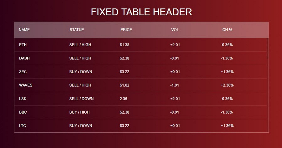
When you are working on a complex table UI design, you should also think carefully about the alignment of the numbers, text, and data in the table. You need to ensure it is easily scannable and readable.
There is one important rule that you should follow:
Align numbers to the right
Align texts to the left
In general, most column data, including the text, should be left-aligned so that users can scan and compare data naturally. However, when it comes to numerical data, especially the data related to size, it is generally accepted that this works better when aligned to the right.
When you are working on a table UI design with a large set of information, allowing users to scroll horizontally or vertically improves user experience. When trying to add a horizontal or vertical scroll, you should also remember to lock the first column so that users can easily compare and parse the data.
When your website or mobile app needs a long table to present a large amount of data or information, using a search box helps users find what they are looking for quickly. Proper filters also allow them to search for a specific value within each column faster.
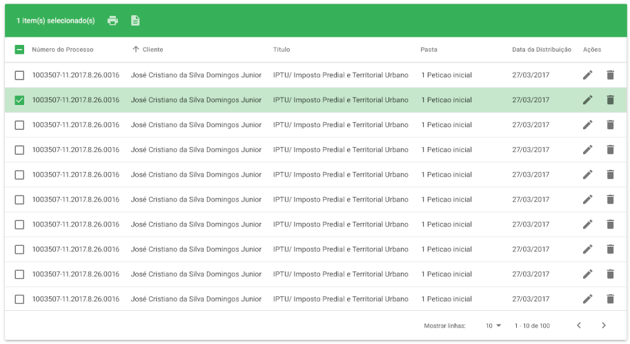
Entering a keyword or choosing a filter when searching for data within a table produces a set of results. A checkbox column should be added to accompany each row so that users can filter or select the rows they want, making the search easier and faster. Allowing multiple selections also makes life easier for users.
Colors, fonts, and other visual styles attract the user’s attention, helping them focus on a specific value or piece of information. But be careful: too many colors or fonts create visual noise and make it difficult for users to focus, read, and scan data.
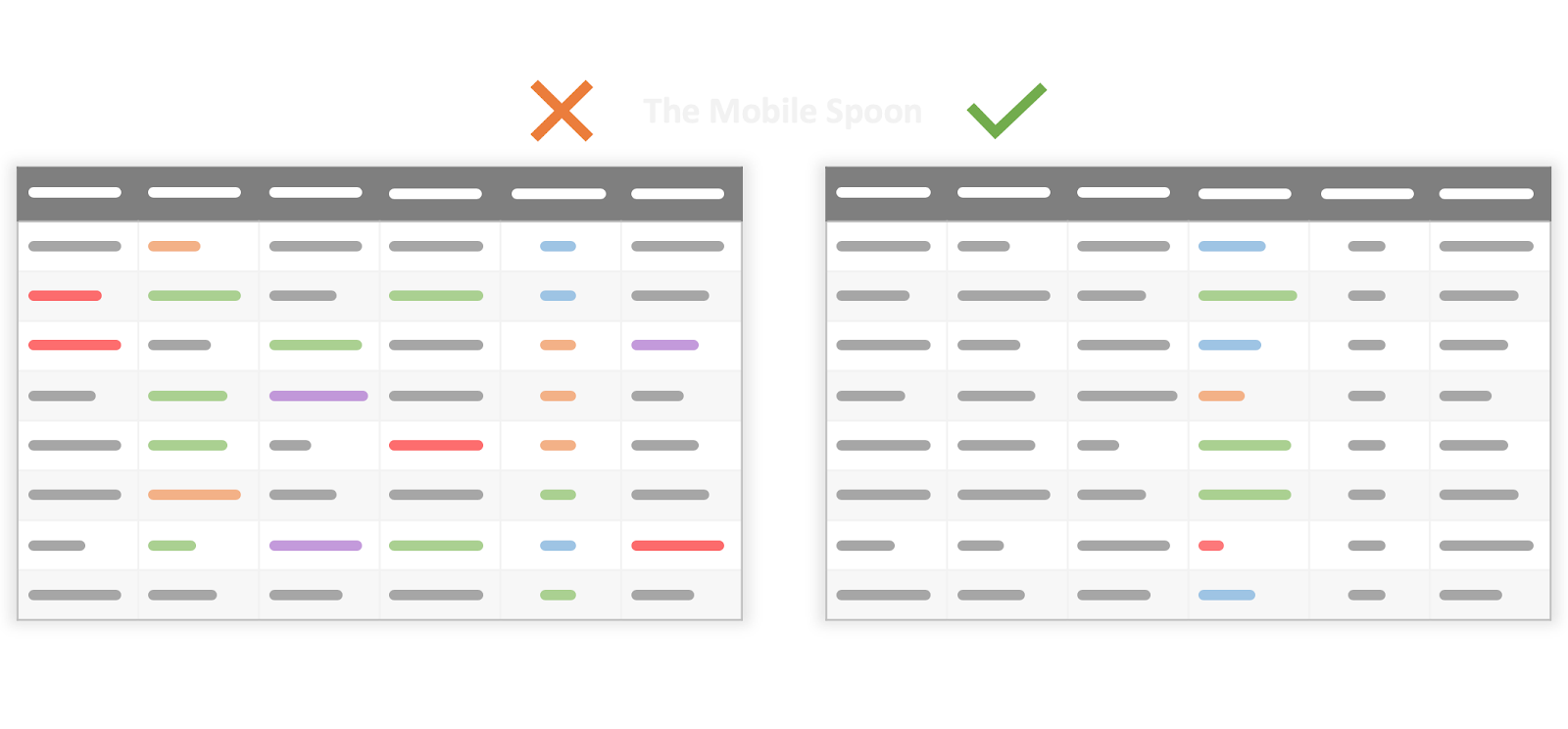
Too Many colors distract users and make it hard for them to find and focus on a specific value.
A smart hover or selection effect is a good way to help users focus on a row or specific data or information. It helps avoid information or data overload. However, sometimes, too many hovers or selection effects can slow the page loading and leave a bad impression on users.
To enable your table data to be visualized intuitively, it can be helpful to have charts linked to the data. These can be pie, bar, or line charts that appear when users hover over a row, column, or table, presenting the data in a more effective way.
When you need to show a large amount of information, it is worth trying to prioritize displaying the main information that users really need, coupled with an ability then to expand the table to view less important data if the user wants.
For example, when designing a pricing page, designers often add a section where users can compare the features of different payment plans to help them make the right decision. However, this section also occupies a very large interface space and forces users to keep scrolling down. Needless to say, not all users will want or need a feature comparison. So, an expandable table UI design is a good way to resolve this problem.
Users can easily click "More features" to view the feature differences between different payment plans. If they don't need the feature comparison, they can just skip this and go on checking the interface information.
We've also picked 20 of the best table UI design examples and templates that you should check to get inspiration and create appealing tables:
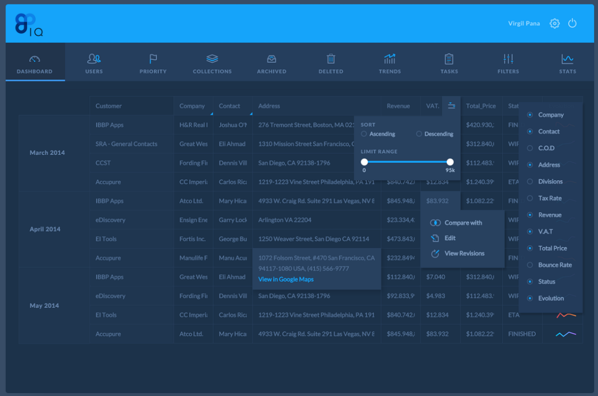
Dashboard Data Grid Example is shared by Data Grid on Dribbble and showcases how the designers display the user and website backend data on the Dashboard page. A clear Gif image is also provided to show you how to create a quick view for a long table.
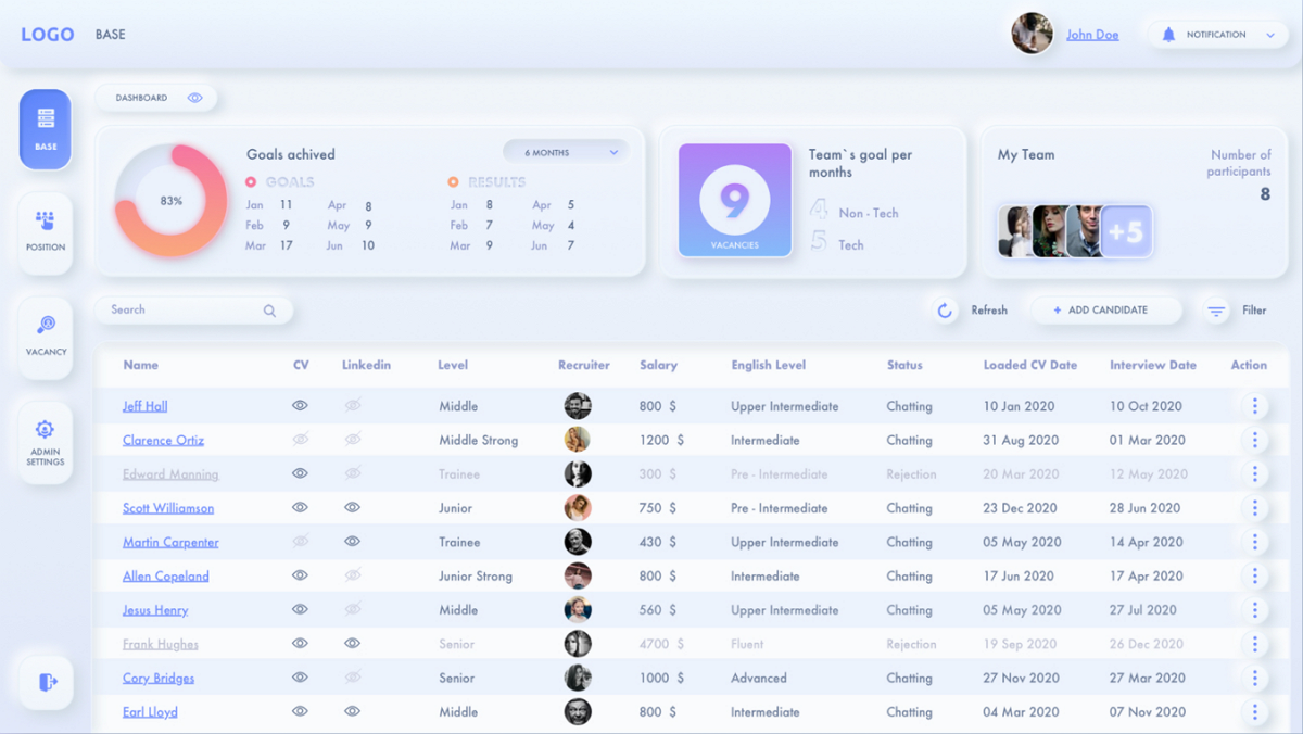
CRM website or app becomes very trendy these days. The biggest problem for designers to create a good CRM website or app is how to present the complicated and heavy data of users, companies, businesses, and others. This CRM for Recruitment Example is specially made for a CRM project and shows you how to present the Recruitment information in a good way.
If you are also working on a CRM project, this CRM Desktop app template can help you save a lot of time.
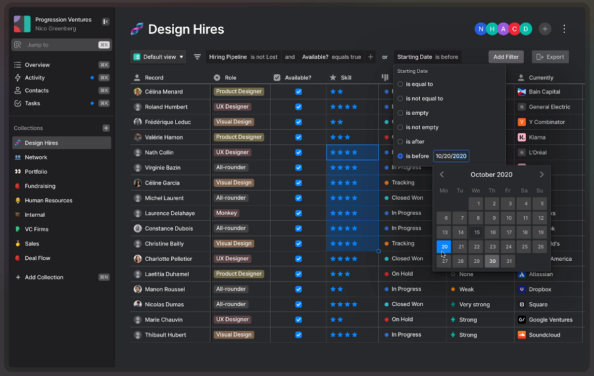
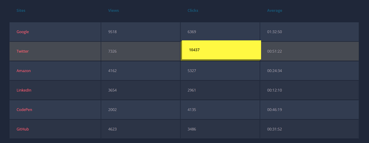
Dark mode designs are intended to be easier on the eye; they create impressive visual contrasts and enable important data to be highlighted. If you are trying to design a dark mode for your project, this example of Dark Mode best practice shows an excellent way to use a dark mode table.
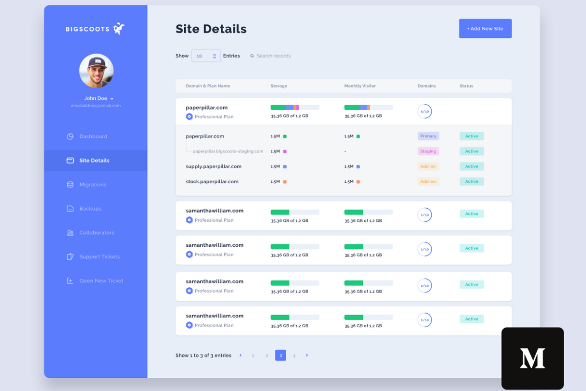
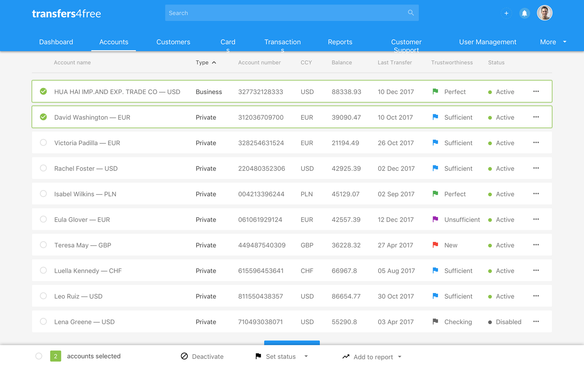
A dashboard on a website is an effective way to gather the most significant information on the site in one place. But it can make it difficult for users to visualize all the information intuitively. If you are designing a website with a dashboard page, Dashboard Table Redesign is a great example of how to present different data with rich colors, progress bars, and circular bars. The card designs used to divide different rows also make the table easier for users to scan.
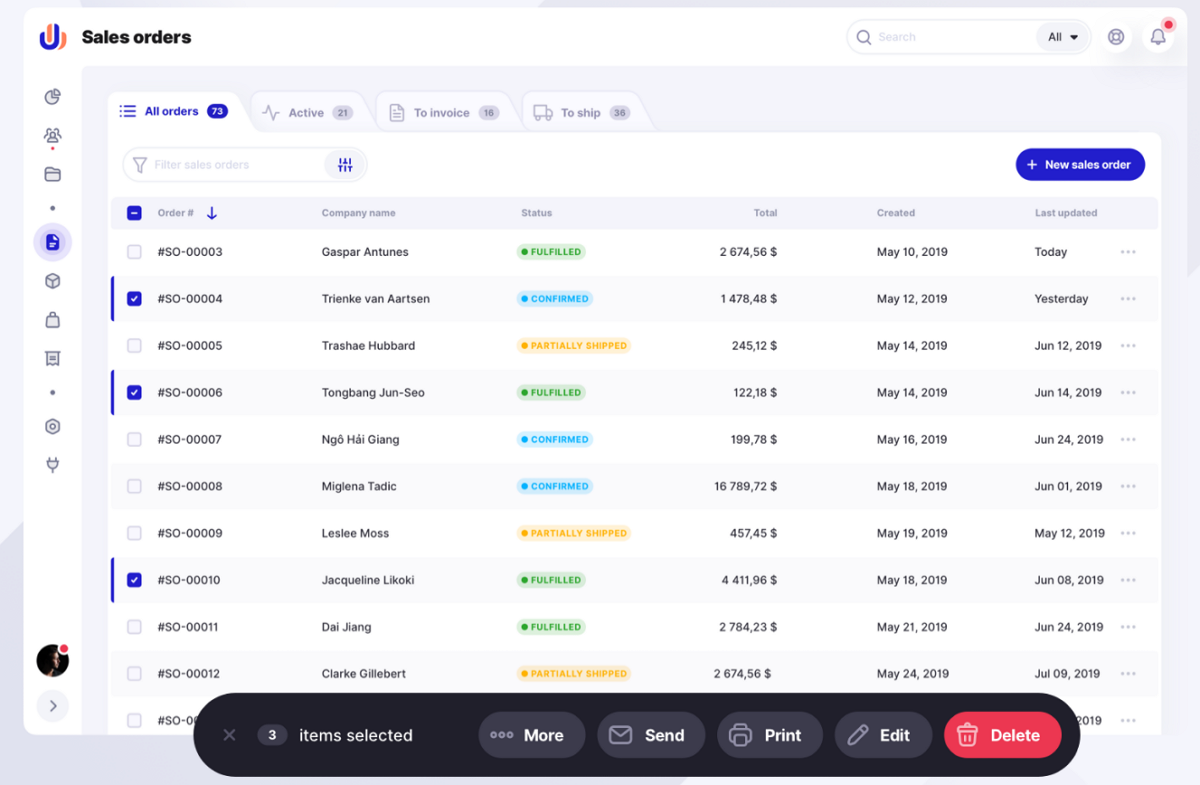
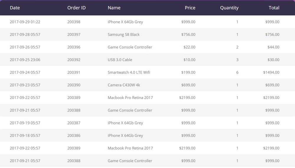
Sales Order Table is a typical free form that doesn't use any horizontal or vertical lines to separate data. However, the alternating rows with different colors make it easy to present every row of data clearly.
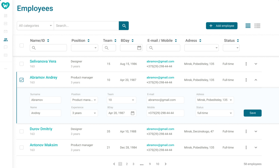
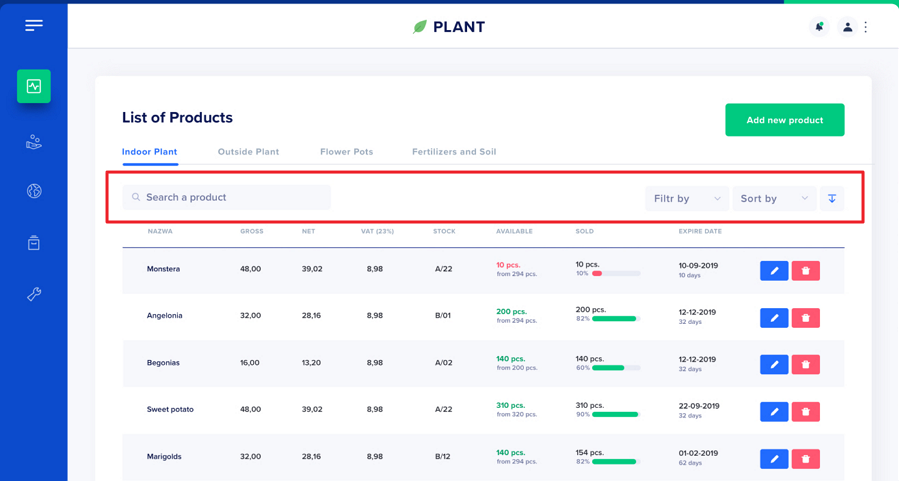
Table UI Design Sample is a long table UI design sample that displays employee information. To help users find the right information quickly, this table design gives a powerful search bar. The top filter bar is also another fun point that you should follow.
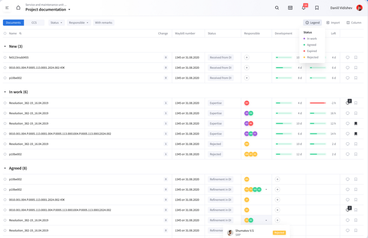
Project Document Table is a grid table made for an engineering data management system. Different from the traditional tables with symmetric grids to separate space for each value, this table design uses broken grids to place the related values and information together, making it better for users to scan and catch their data quickly.
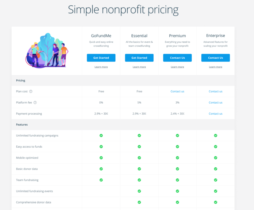
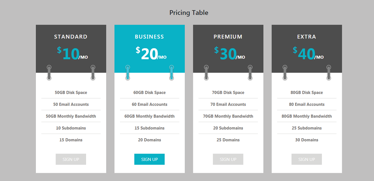
The biggest challenge for creating a pricing comparison table is how to illustrate payment plan information clearly and deliver the difference between different plans. This WIP pricing comparison table finds a perfect solution to resolve that challenge by using a clean grid table, minimalistic look, and clear feature lists.
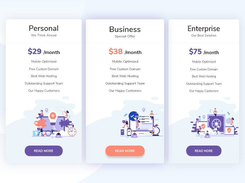
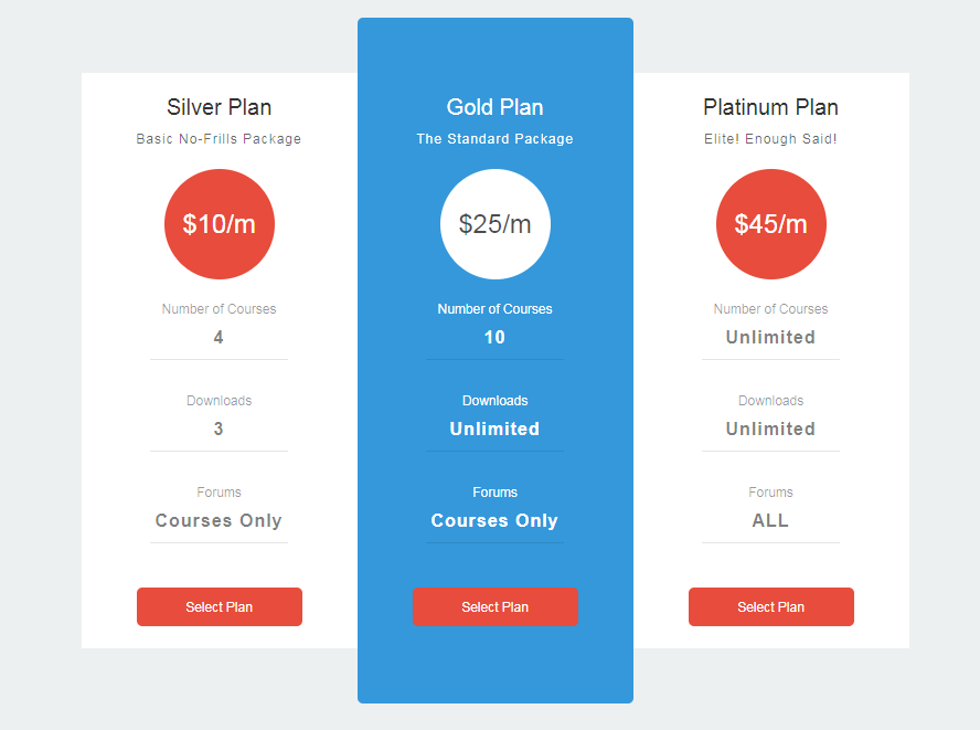
If you are considering an illustration-style website or mobile app, this Simple Pricing Table would be a good example to emulate. As well as the colorful illustrations, the long table design without dividers also allows the designers to add plenty of information.
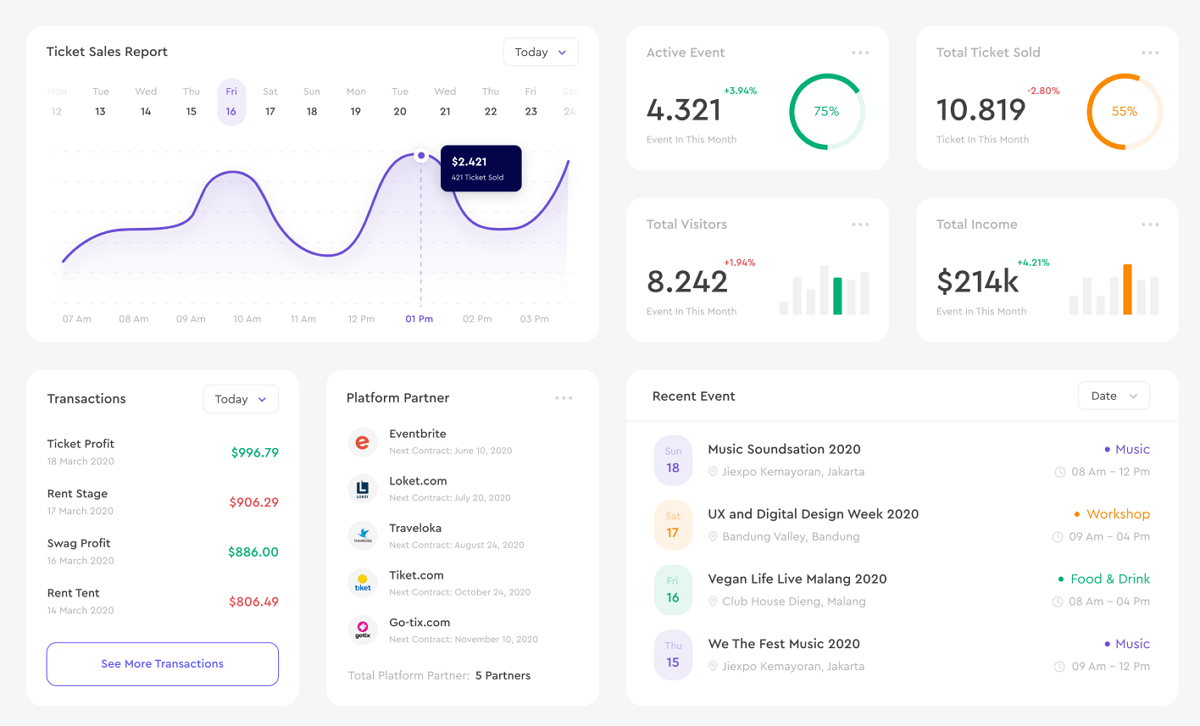
Kios Web App Table is a dashboard table design for an event management platform, Kios Event. Apart from the common free forms without dividers, this table design also combines intuitive line and pie charts as an effective way of presenting data.
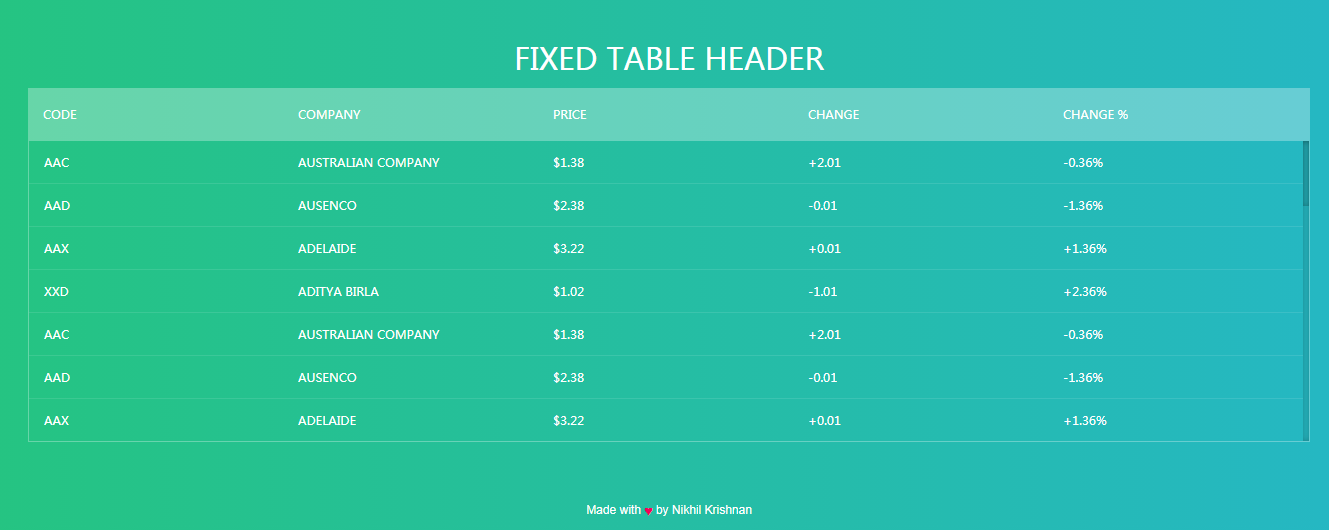
Free CSS Table with Fixed Header is a free CSS table template with five variants fixed on the top. It features a gradient background and a vertical scrolling option. All its columns don't have any borders so that you can get plenty of space to add long data or information.
Free HTML CSS Flat Price Table Template is a minimalistic flat pricing table design. The white and red color contrast makes the prices stand out and encouraged users to choose a plan quickly. The bright blue background color highlights the best plan and makes it much more appealing to users' eyes.
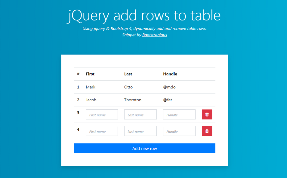
If you are looking for a table design that users can interact and add or remove a row, this Bootstrap table template would be a good option. With this template, users can easily add or delete a row with simple clicks. To keep the table valid all the time, two default rows are also not allowed to delete.
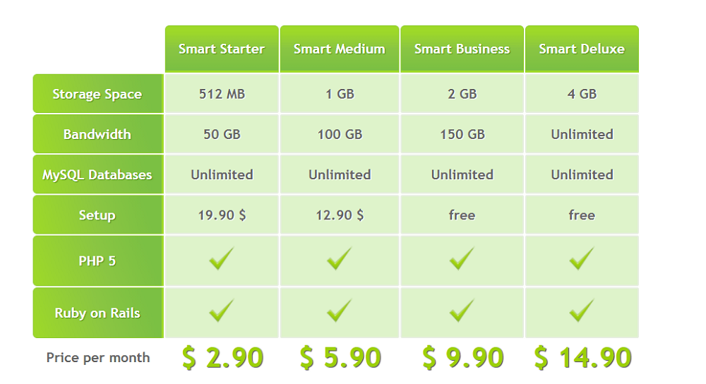
Free CSS3 Table Template is a beautiful grid table designs that can be used to compare different payment plans or services. The green color scheme is good for users' eyes. The dark and light color hues help highlight important data easily.
This table template is a simple HTML3 and CSS3 package with 6 color options. Without any dividers, this template highlights the column and the row that users are hovering. So, they can easily cross-check the value that they need easily.
 Responsive websites are very common these days. To help you create your own responsive website quickly, we've picked this responsive table template that would auto fit to different screens and devices.
Free CSS3 Responsive Table is a gorgeous free responsive table template that uses 3D technologies. When users hover over any value, a 3D hover effect will show up to highlight the value. A bright yellow color also grasps the users' attention quickly.
Free Graphic Bootstrap Pricing Table is an informative pricing table with four offers. The table design is clean and neat, and can help you present all possible offer details. Hovering on any column, the color will also change, making it easy to highlight the column information.
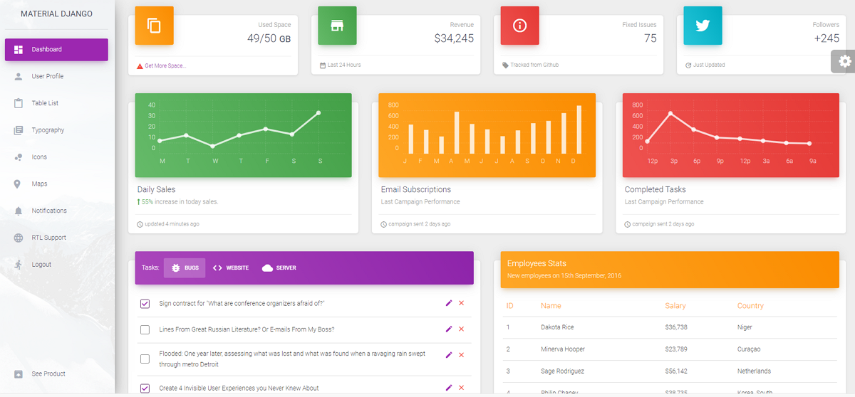
Material Dashboard Template is a free modern Bootstrap Admin template for Django. It also provides rich table and chart designs to improve the dashboard page of your website project.
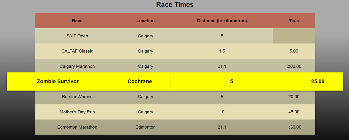
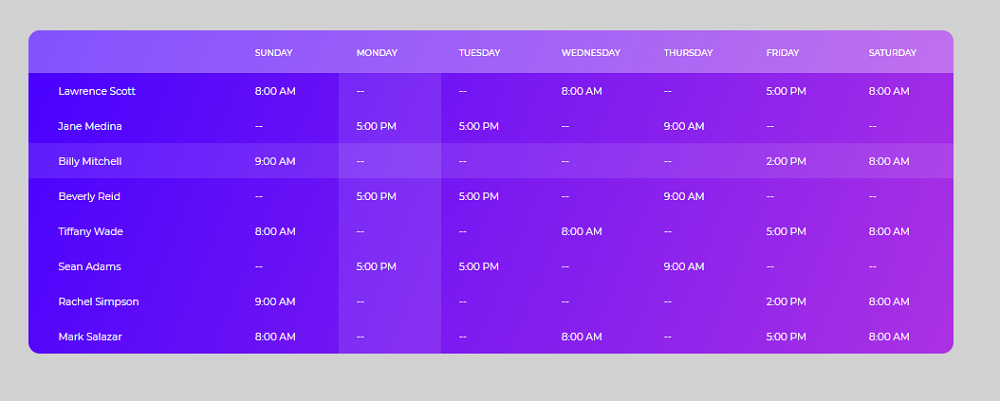
Race Time Table is an HTML/CSS table template with a cool hover effect. The color scheme is also great to showcase your data in an engaging way.
Conclusion
Tables can display interface data and information in imaginative ways, making web or mobile apps easier to use.
We hope those table design examples, templates, and best practices can give you good ideas to create a stunning data table for your next project.
 Mockplus RP
A free prototyping tool to create wireframes or interactive prototypes in minutes.
 Mockplus DT
A free UI design tool to design, animate, collaborate and handoff right in the browser.


 Sign up with Google