A good dashboard design, with a stunning visual design, clear layout and intuitive way of presenting data/contents, makes a website/app stand out and helps users take quick action or navigate more quickly.
However, as designers of these website/apps, designing a visually stunning, intuitive and effective admin dashboard design is not as easy as one might think.
Today, Mockplus has gathered 23 of the best free dashboard design examples, templates and UI kits for you to create awesome admin dashboard designs.
Note: To help you create a gorgeous dashboard design, some website/app design prototyping skills ( which have been illustrated according to an easier, faster and smarter prototyping tool, Mockplus) will be shared in the following section. Hope they are inspiring to you.
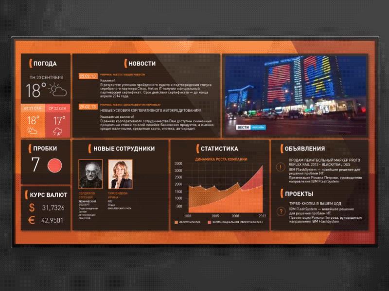
Designer: Aman Singh
Rating: ★★★
Highlights: Real-time data update; Eye-catching video
A good dashboard only navigate allows users to navigate a website/app easily, but also highlights important information and helps users process data more quickly.
To achieve its goal, this dashboard design uses a real-time update system to show all related data in a timely manner and even includes an eye-catching video in the top-right corner.
What can you learn:
Update dashboard data or content in real time for better UX
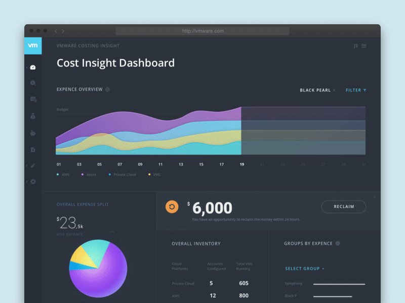
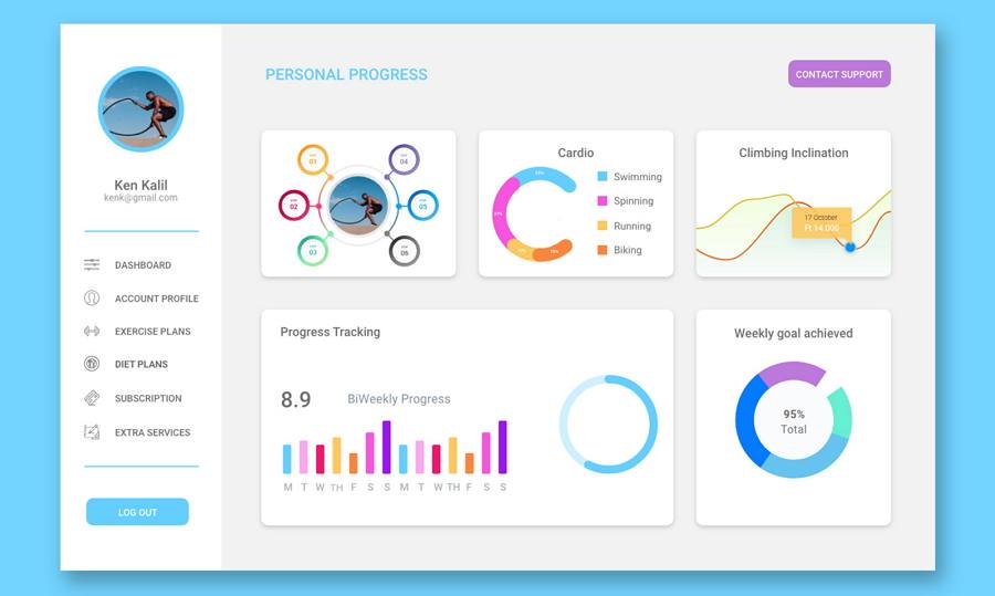
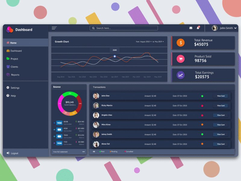
Designer: Clay
Rating: ★★★★
Highlights: Excellent data visualization design
For designers, the challenge in dashboard designs is to present key numbers and contents in a straightforward manner.
This dashboard design example features excellent data visualization. Users can easily click the pie and line charts to see more.
What can you learn:
Use intuitive charts to show all dashboard data
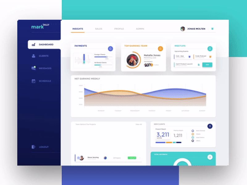
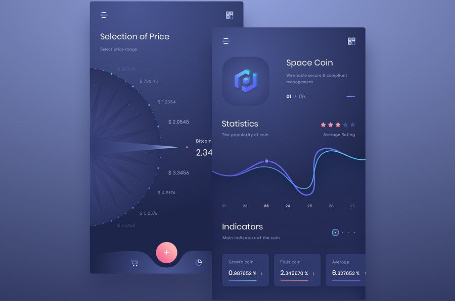
Designer: Aman Singh
Rating: ★★★★
Highlights: Interactive dashboard UI design
When compared to static UI design, interactive designs are always more appealing to users. This dashboard website uses various interaction designs to improve UX.
What can you learn:
Use interaction designs to boost UX design of your dashboard
Dashboard design prototyping skills:
In Mockplus, designers can easily create rich interactions for their website admin dashboard design prototypes. There are also many transition animation options to improve interaction designs.
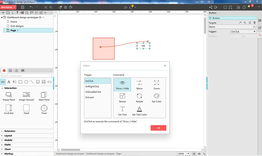
Users can choose diverse interaction commands to create interactive dashboard designs.
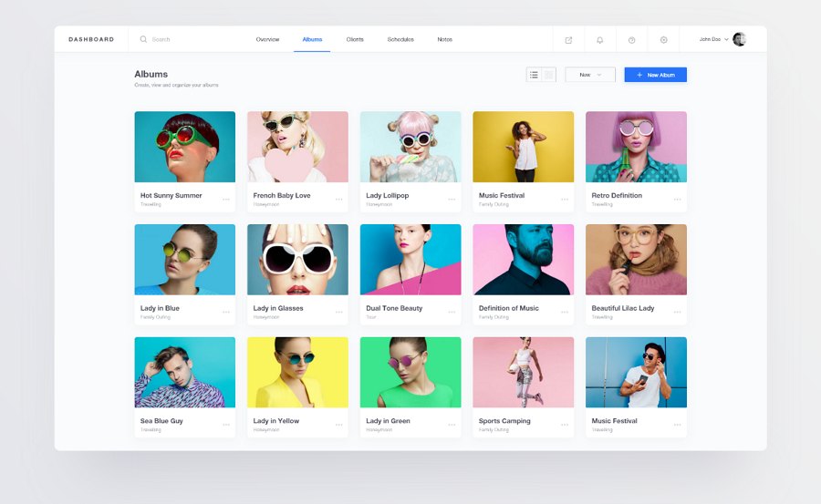
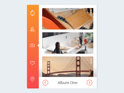
Designer: Dumnoi Ikechukwu
Rating: ★★★
Website theme: Photo management website
Highlights: Gird designs
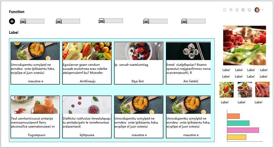
As a dashboard design for photo management website, this design example uses clear grid layout to present photographers' work intuitively. Its minimalist design style makes the photos stand out, beautifying the entire design.
What can you learn:
Create clear layouts with intuitive girds
Dashboard design prototyping skills:
Girds are widely used for creating clear and neat layouts for a website and app. With Mockplus, designers can easily create grids with its “Repeater” and “Auto fill” functions.
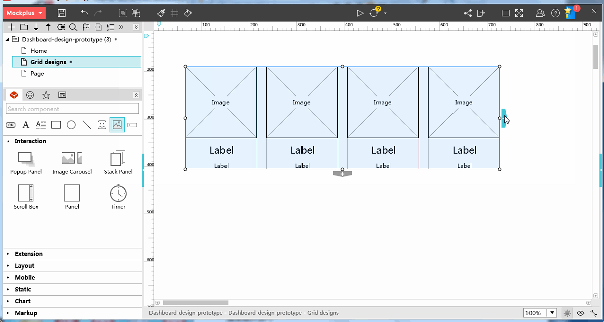
In Mockplus, designers can create dashboard UI designs with simple clicks.
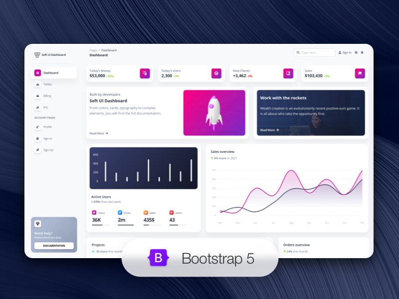
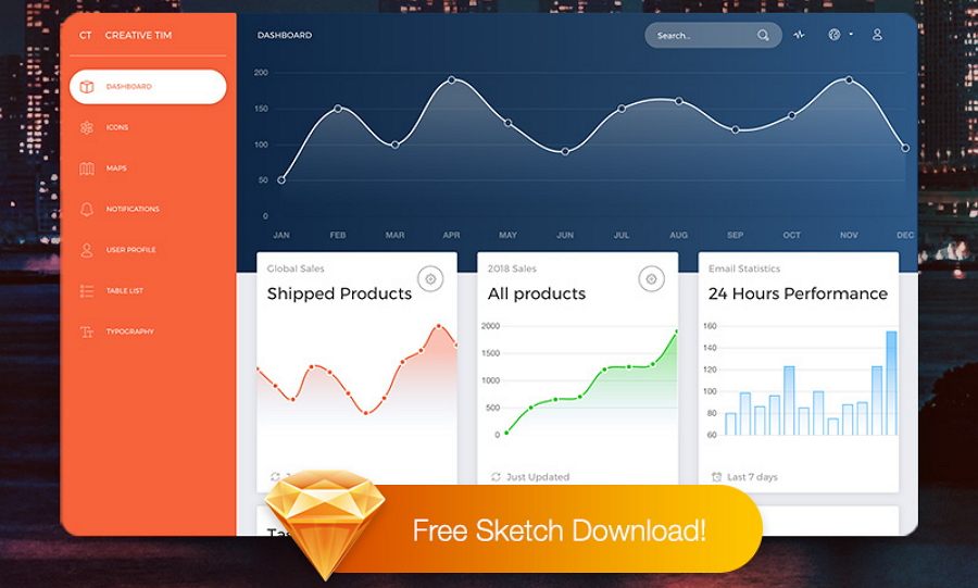
Designer: Creative Tim
Rating: ★★★★★
Highlights: gradients, bold colors, realistic textures
Soft UI Dashboard by Creative Tim is a stunning Bootstrap 5 dashboard template that combines minimalist design with glassmorphism influences. It comes with many prebuilt design blocks that allow you to choose and combine to create your own customized admin panel. With its bold visuals and colors, this is anything but a boring dashboard design.
What can you learn:
Create a stunning dashboard design with bold but easy on the eye colors
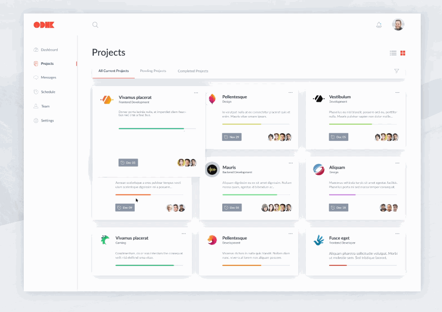
Designer: Luke Peake
Rating: ★★★★
Highlights: Gorgeous card UI design
In addition to grids, intuitive card UI design is another useful element for creating clear layouts. This design example follows this idea and creates intuitive layouts to present different website data. Users can not only click the card designs for more details, but can also reorder these cards with a simple drag-and-drop.
What can you learn:
Use card UI design to visualize your admin dashboard design
Dashboard design prototyping skills:
In Mockplus, designers can easily use “Shape” or “Panel” component to create intuitive card UI designs. Also add texts, icons, photos, interactions and animations to create better card designs.
Also create beautiful card UI designs in Mockplus with ease.
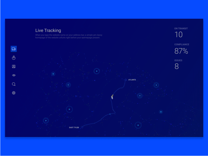
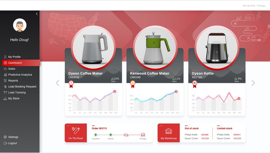
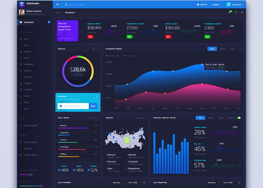
Designer: Arun Raj
Website theme: Fleet management website
Rating: ★★★★
Highlights: Real-time data presentation
This dashboard example uses a real-time presentation to help manage trucks. Its black and white color scheme makes it easier for users to grasp the changing data.
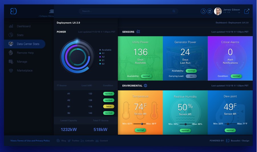
Designer: Bradley Bussolini
Rating: ★★★
Highlights: Visually beautiful color scheme
Color is one of the most important visual elements for users to create a visually stunning website. This website uses a deep blue color scheme to create a visually attractive dashboard design. The color blocks also help divide the website into different functional areas, creating a clear layout for better UX.
What can you learn:
Create a visually attractive dashboard design with colors
Gradients, as one of the most popular website design trends of 2018, help create visually appealing dashboard designs.
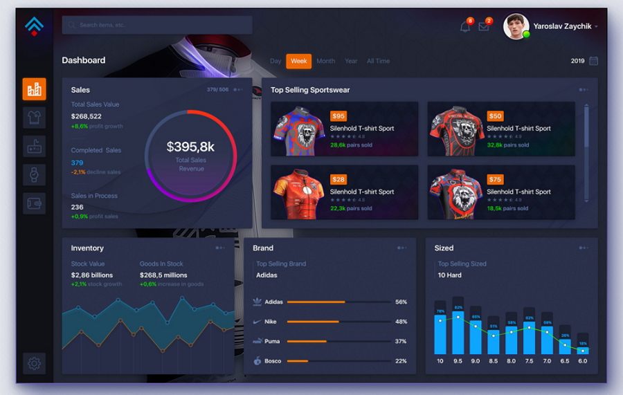
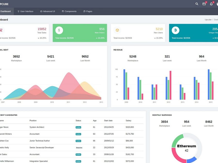
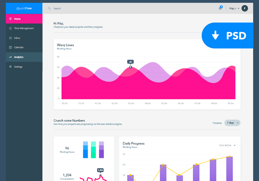
Designer: Oswaldo Gino Abreu
Rating: ★★★★
Highlights: Various chart designs
This dashboard design uses a variety of charts to present website data in a simple and intuitive manner. Whitespace in this example helps the data charts stand out and makes it easy for users to read the data at first glance.
Dashboard design prototyping skills:
Charts are essential elements in information/performance/management dashboard design. In Mockplus, designers can easily create intuitive chart interfaces by expanding the ‘Chart’ panel and choosing the desired chart types.
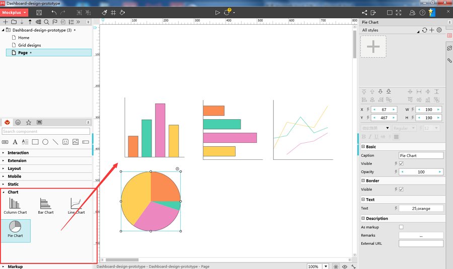
With Mockplus, users can freely edit the colors and numbers of these charts correspondingly to create beautiful dashboard designs.
Designer: Nandini Bhattacharjee
Website theme: Logistics company website
Rating: ★★★★
Highlights: Visual hierarchy design
This data dashboard design features visual hierarchy design. Laying product photos over the data charts helps to create a clear visual hierarchy, which offers users a unique visual experience.
What can you learn:
Improve your dashboard with visual hierarchy designs
Follow golden tips and examples to create visual hierarchy in website design.

Designer: Casey Baggz
Website theme: Rate and rank company website
Rating: ★★★★
Highlights: Rich icons
This company dashboard design uses various icons to simplify its UI. The emotional icons on the top-right corner help elicit users' emotions.
What can you learn:
Simplify your dashboard design with rich icons
Use emotional icons or texts to create attractive and enjoyable UI
Dashboard design prototyping skills:
Mockplus is designed with a powerful icon library (over 3000 icons) for designers to enrich their website dashboard designs.
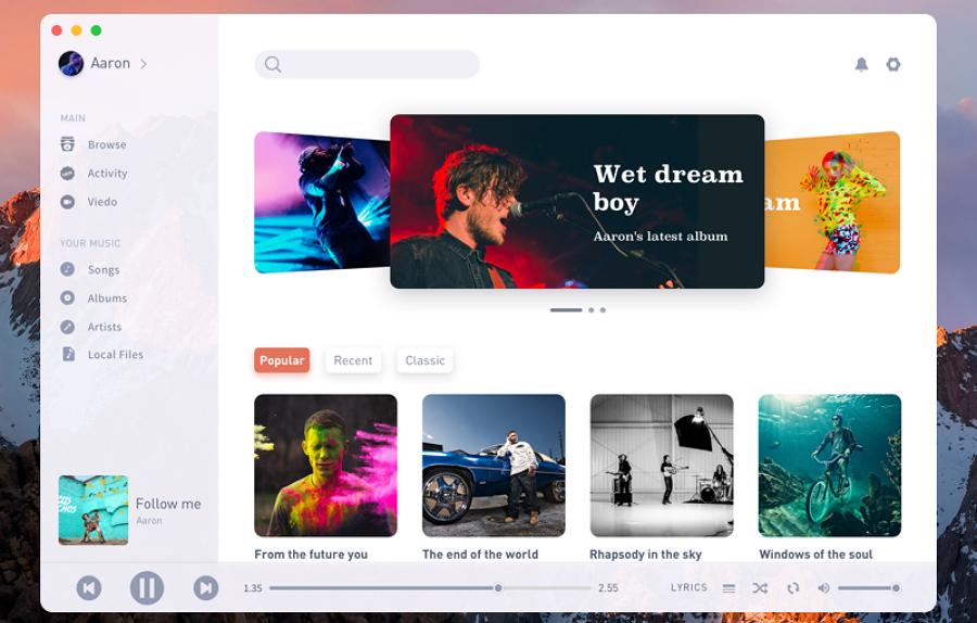
Designer: Aaron
Website theme: Music player
Rating: ★★★★
Highlights: Large photo carousel
This music dashboard example uses large photo carousel to grab users’ attention.
Dashboard design prototyping skills:
With Mockplus, designers can easily use the “Image Carousel” component to create such eye-catching large photo carousels.
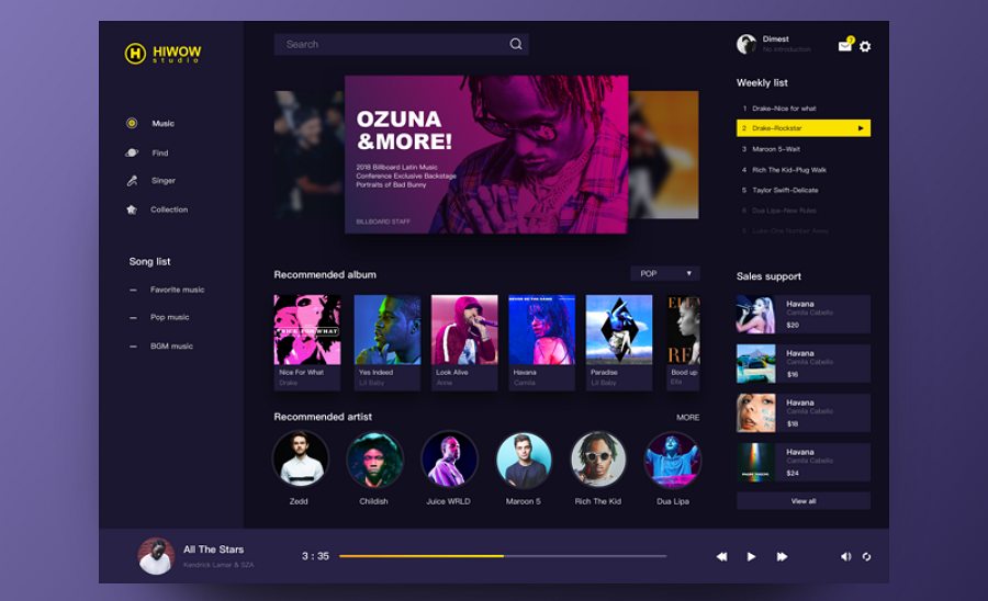
Create beautiful and interactive music player dashboards in Mockplus.
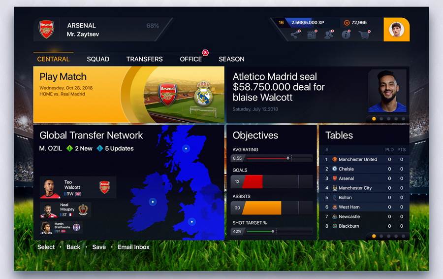
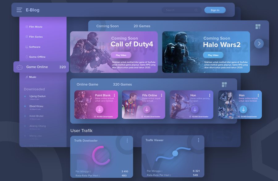
Designer: Yaroslav Zaitsev
Website theme: Game website
Rating: ★★★★
Highlights: Clear layout
This football game dashboard design has a very clear layout for users to view and check their stats.
We hope these best dashboard examples, templates and UI kits can inspire you.
Below are a few remarkable design principles and tips to help you create stunning website dashboards:
Appropriate color schemes, gradients, transparency and shadows help designers create visually appealing website designs. Also use such visual elements to create visually stunning information/performance/data/management dashboard designs.
Light and dark color scheme can bring users completely different visual experience.
Please note: Never overuse colors
Just as colors can create visually appealing designs, colors can also ruin a website/app design.
Keep colors consistent throughout your information/performance dashboard UI design. Also use a consistent color to highlight the most important data or content. You can use the dashboard presentation templates to prepare compelling dashboards with visually appealing graphics.
Data placed on the top, in the top-left corner or center of a website/app page tends to catch users attention most easily and quickly. So, put the most important data or content on the top, in the top-left corner or center to enhance UX.
Interactive website designs encourage users to spend more time on the website. So, make interactive dashboard designs for a lower bounce rate.
A visualized dashboard design tends to be more popular within users. So, try to build visualized designs using the following guidelines:
There are many types of charts, including bar charts, line charts, pie charts, column charts, etc. Be sure to choose the chart that best helps visualize your data.
Layouts affect the visual experience of a website/app. Create clear layouts to optimize your data/performance dashboard design, being sure use grids, card designs, color blocks, etc.
Create customizable dashboard designs by adding search boxes, website theme options, skin options, an item reordering system, etc.
Search box design helps create a customizable dashboard UI design.
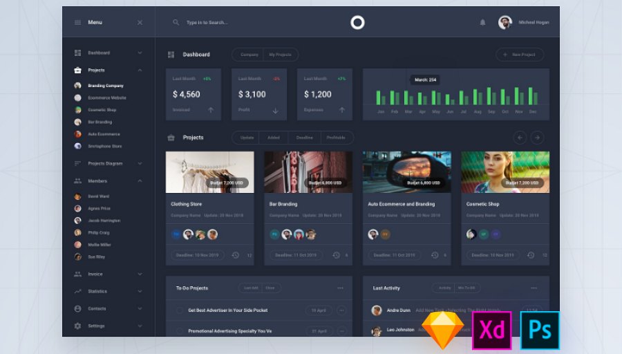
Brilliant dashboard designs cannot be completed in one step. Apart from great design ideas, handy prototyping and collaboration tools are essential for designers to create an awesome website dashboard UI design. For example:
As we've illustrated in above prototyping skills, Mockplus, an all-in-one and easy-to-use prototyping tool, has very powerful features for designers to create, test, iterate and test their dashboard designs.
iDoc, a comprehensive online design collaboration tool, offers designers, developers and product managers a real-time design platform to iterate and handoff your dashboard design collaboratively and effortlessly.
A good design tool cannot be clearly illustrated through words alone. Download and try them out yourself. Once you’ve tried them, you will certainly love them.
Overall, no matter how you choose to design your website/app dashboard UI, we hope this collection of 23 best free dashboard design examples, templates, UI kits and design principles can help you.
Of course, to help iterate and test your dashboard design ideas effectively, it is best for you to choose a useful design prototyping tool, such as Mockpus. To collaborate and handoff your website dashboard effortlessly online, a handy online collaboration tool, Cloud, is a good choice. These options will help you to create the best dashboard design at the lowest cost.
 Mockplus RP
A free prototyping tool to create wireframes or interactive prototypes in minutes.
 Mockplus DT
A free UI design tool to design, animate, collaborate and handoff right in the browser.


 Sign up with Google