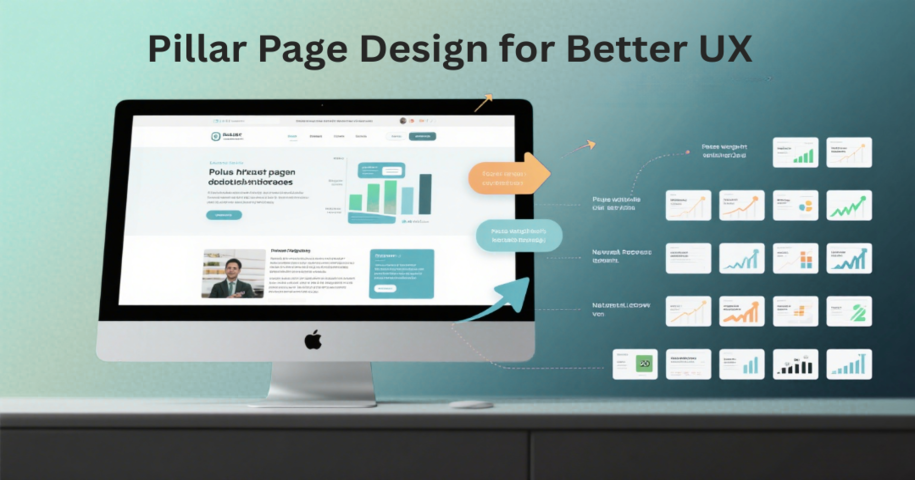
In web and app design, a well-structured pillar page is more than just content—it is a cornerstone of user experience (UX). Pillar pages organize information around a central topic, helping users navigate complex content, discover related resources, and engage efficiently.
This article highlights the top 20 pillar page design examples that excel in UX. By examining these pages, designers can learn how to structure content, use visual hierarchy, and incorporate interactive elements. While checking these examples, also do not forget to use our free design and prototyping tool to visualize and test your design ideas for your next proejct with ease.
A pillar page is a comprehensive webpage that serves as the central hub for a specific topic on your website, designed with user experience (UX) in mind. Unlike typical blog posts or landing pages, which focus on a single point or goal, a pillar page organizes a wide range of related information into a clear, structured format. By covering all key subtopics in one place, it allows users to access in-depth knowledge without feeling lost or overwhelmed.
One of the core elements that improves UX is its thoughtful structure. Pillar pages often include internal links connecting to related articles, guides, or resources, guiding users through the content seamlessly. This logical interlinking helps users explore topics intuitively, reduces friction in navigation, and encourages deeper engagement with the website.
In essence, a pillar page enhances UX by acting as a well-organized content hub, helping visitors find what they need quickly, discovering related information naturally, and enjoying a smooth, intuitive browsing experience that keeps them engaged longer.
Creating a good pillar page requires more than just filling it with content. It needs to be structured in a way that makes it valuable to both users and search engines. Here are the key elements that make a pillar page effective:
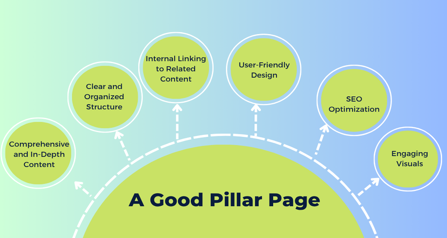
A good pillar page should provide thorough coverage of the chosen topic. It should answer all the major questions related to the subject, offering insights, statistics, examples, and actionable advice. This comprehensive approach not only improves the user experience but also signals to search engines that your page is an authoritative resource on the topic.
The content of a pillar page should be organized into clearly defined sections. Use headings, subheadings, and bullet points to make the page easily scannable. This structure helps users navigate the page efficiently and ensures that important information is easily accessible. A well-structured page also enhances readability and user engagement.
One of the most important features of a pillar page is its internal linking strategy. A pillar page should include links to related blog posts, articles, case studies, or other resources on your website that dive deeper into specific subtopics. These internal links not only improve SEO by spreading link equity across your site but also keep users engaged by encouraging them to explore more content.
Good design is key to making a pillar page engaging and easy to navigate. A clean, minimalistic design with clear calls to action (CTAs) will help keep users focused on the content. Additionally, the page should be mobile-responsive, as more users access content on their smartphones and tablets. Make sure that the design enhances the user experience rather than distracting from it.
To rank well in search engines, a pillar page must be optimized for SEO. This includes using the right keywords, having meta descriptions, alt text for images, and ensuring fast loading times. Additionally, ensure that your content is long enough to cover the topic thoroughly, as longer content tends to rank better in search results. Also, include high-quality, relevant outbound links to enhance the page’s authority.
While content is king, visuals play an important role in keeping users engaged. Good pillar pages incorporate images, infographics, videos, and charts to illustrate key points. These visuals not only make the content more engaging but also help clarify complex topics, making the page more user-friendly.
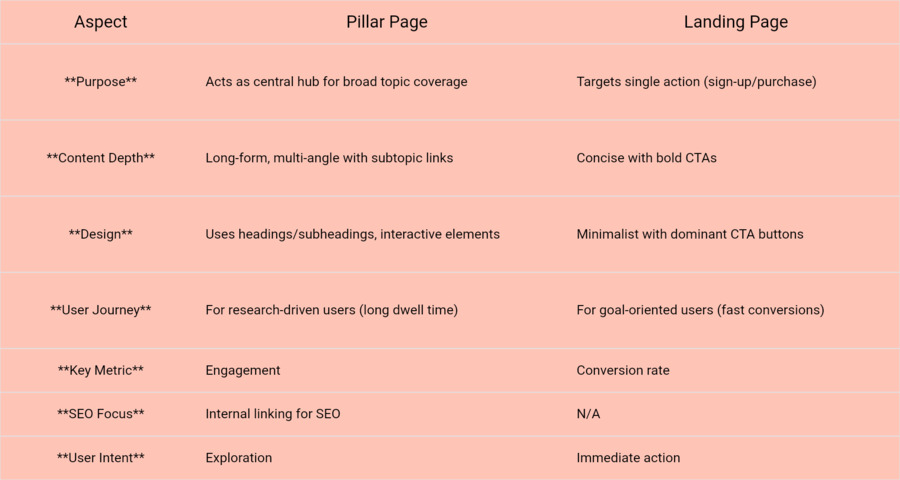
While pillar pages are crucial for better UX, many people often confuse them with landing pages. In the next section, we’ll clarify the differences between the two and explain why it’s important to understand these distinctions when designing and optimizing your pages.
While both pillar pages and landing pages play important roles in a website, they serve different purposes from a user experience perspective. Understanding these differences is crucial for designing pages that guide users effectively and meet their needs.
Creating an effective pillar page requires inspiration and a keen eye for design and content structure. To help you visualize the best practices, here are 20 top pillar page design examples.
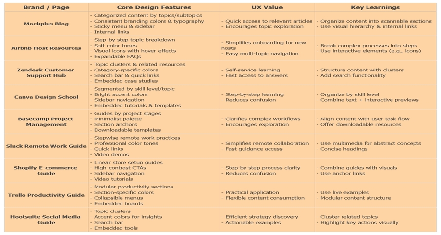
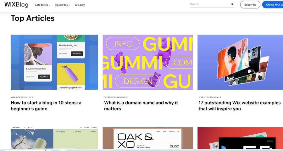
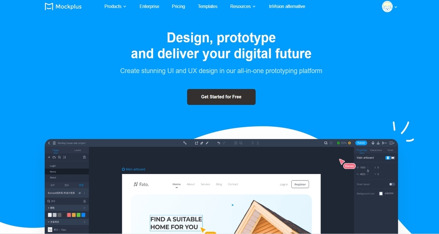
Mockplus Blog is a fantastic example of a well-executed pillar page designed for UI/UX designers and product teams. The page aggregates a wide range of articles on design systems, prototyping, and UX trends. It links to numerous blog posts and resources related to design, offering a comprehensive learning hub.
Core Design Features:
UX Value:
What you can learn:
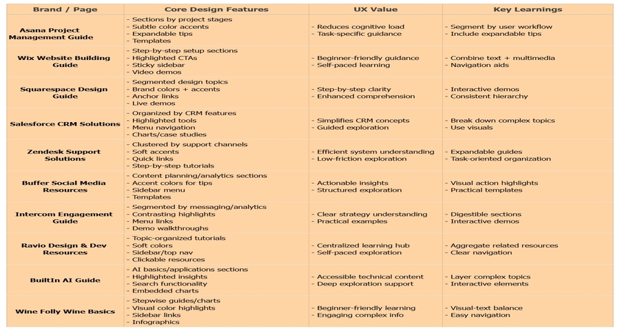
Airbnb’s Host Resources page is a great example of a product-focused pillar page. It provides comprehensive resources for new hosts, covering topics like property listings, pricing strategies, and managing guest interactions. The page links to various related blog posts and guides, ensuring hosts have easy access to everything they need to succeed.
Core Design Features:
UX Value:
What you can learn:
Zendesk’s Customer Support Hub serves as a comprehensive resource for businesses looking to enhance their customer service. It covers everything from setting up help desks to best practices for resolving customer issues. The page provides links to relevant articles, case studies, and product guides.
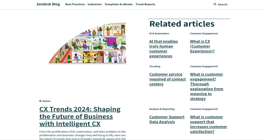
Core Design Features:
UX Value:
What you can learn:
Canva’s Design School is a great pillar page that offers design tips, tutorials, and resources for anyone looking to improve their graphic design skills. The page links to step-by-step guides, templates, and tutorials, providing users with everything they need to create beautiful designs.
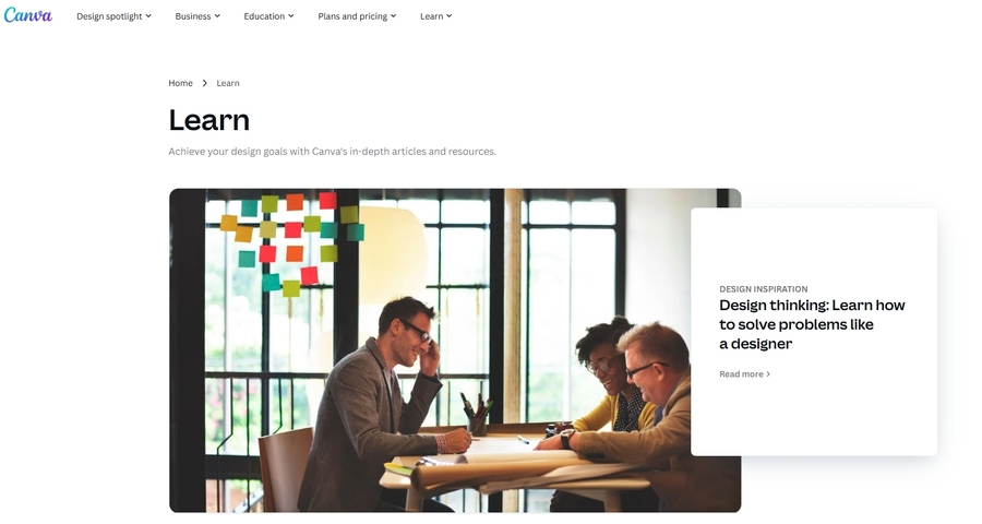
Core Design Features:
UX Value:
What you can learn:
Basecamp’s Project Management Resources page is a comprehensive pillar page that covers everything about project management, from planning to team collaboration. It links to related blog posts, case studies, and tutorials that help users get the most out of Basecamp’s tools.
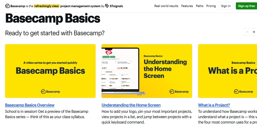
Core Design Features:
UX Value:
What you can learn:
Slack’s Guide to Remote Work is a pillar page that provides resources, case studies, and tips for teams looking to transition to or improve remote work. The page links to articles and other resources related to remote communication, productivity tools, and team collaboration.
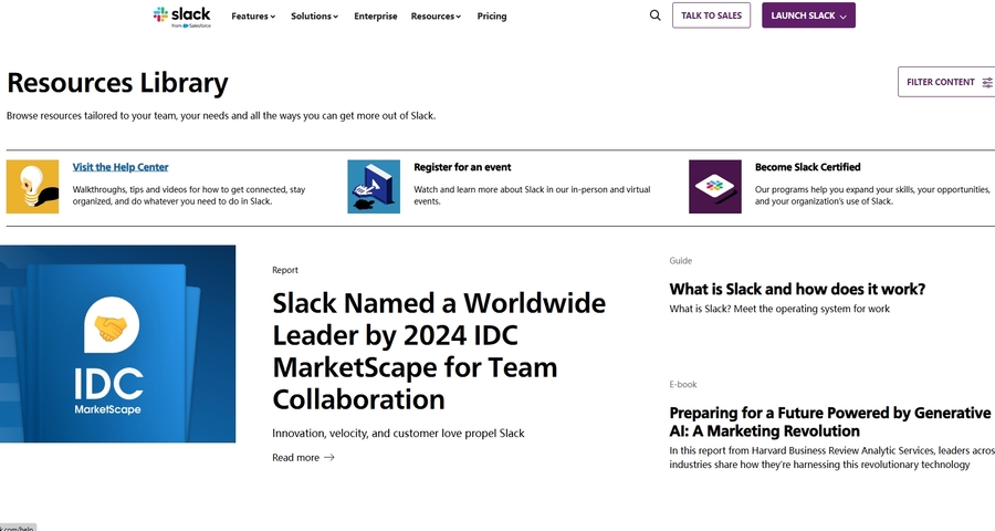
Core Design Features:
UX Value:
What you can learn:
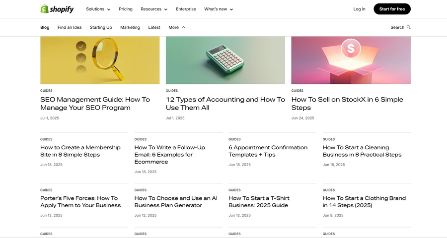
Shopify’s E-commerce Guide is a comprehensive resource for entrepreneurs and business owners looking to start or grow an online store. The page covers everything from choosing products to setting up payment systems, with links to additional resources, such as detailed guides and tutorials.
Core Design Features:
UX Value:
What you can learn:
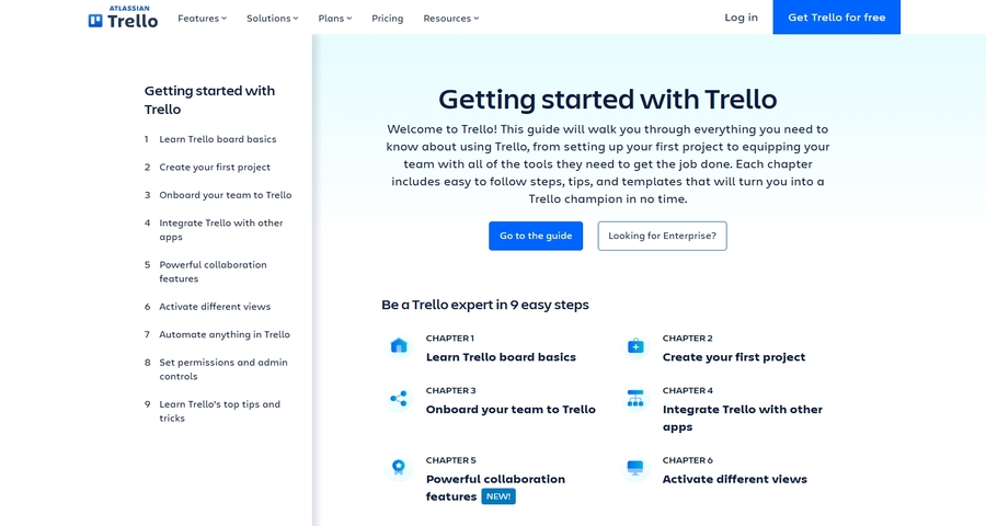
Trello’s Productivity Guide is a pillar page designed to help teams organize their workflows and manage projects. The page covers a range of topics, from task management to project tracking. Each section links to related blog posts and guides on using Trello for different aspects of productivity.

Core Design Features:
UX Value:
What you can learn:
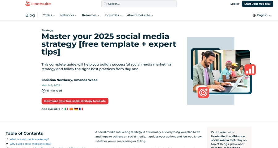
Hootsuite’s Social Media Marketing Strategy Guide is a comprehensive pillar page designed to help businesses create effective social media marketing strategies. It covers everything from the importance of social media marketing to the step-by-step process of creating a successful strategy.
Core Design Features:
UX Value:
What you can learn:
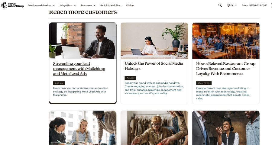
Mailchimp’s Email Marketing Hub is a pillar page offering resources on email marketing, from creating campaigns to understanding analytics. It provides a variety of content, including blogs, e-books, and webinars, with internal links to detailed guides and case studies.
Core Design Features:
UX Value:
What you can learn:
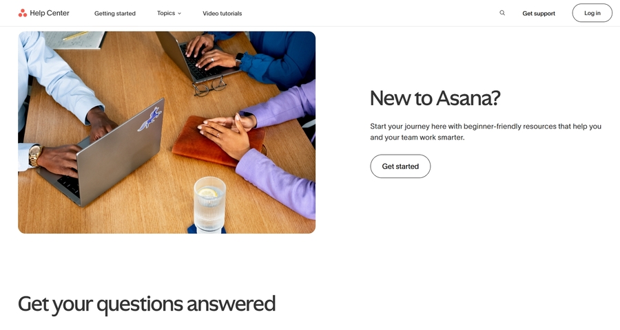
Asana’s Guide to Project Management serves as a detailed resource for project managers and teams. The guide covers everything from project planning to execution, with links to various tools, templates, and related articles.
Core Design Features:
UX Value:
What you can learn:
Wix's pillar page is valuable for users who are looking to build a website from scratch. It’s easy to navigate, and its internal linking connects users to essential resources that help them throughout the website creation process.
Core Design Features:
UX Value:
What you can learn:
Squarespace’s Design and Build Your Website page is a comprehensive pillar page focused on helping users understand the design process. It offers tutorials, videos, and guides on how to design and set up a website using Squarespace.
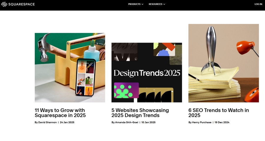
Core Design Features:
UX Value:
What you can learn:
Salesforce’s CRM Solutions Guide acts as an educational resource for businesses seeking to enhance their customer relationships through Salesforce. The guide covers various CRM features, including automation, analytics, and customer service.
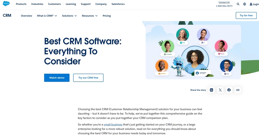
Core Design Features:
UX Value:
What you can learn:
Zendesk’s Customer Support Solutions pillar page provides businesses with resources for setting up customer service systems. The page includes sections on ticketing, live chat, and self-service support options, with links to additional resources and case studies.
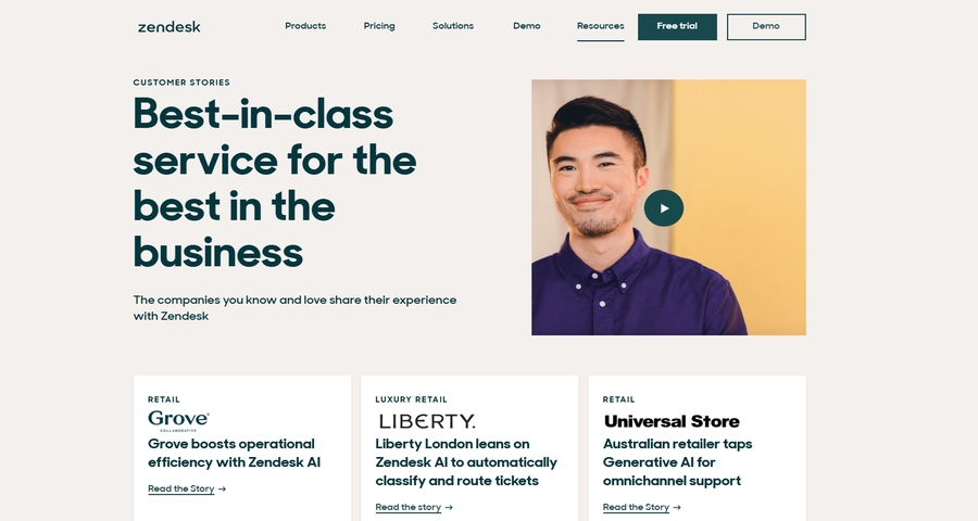
Core Design Features:
UX Value:
What you can learn:
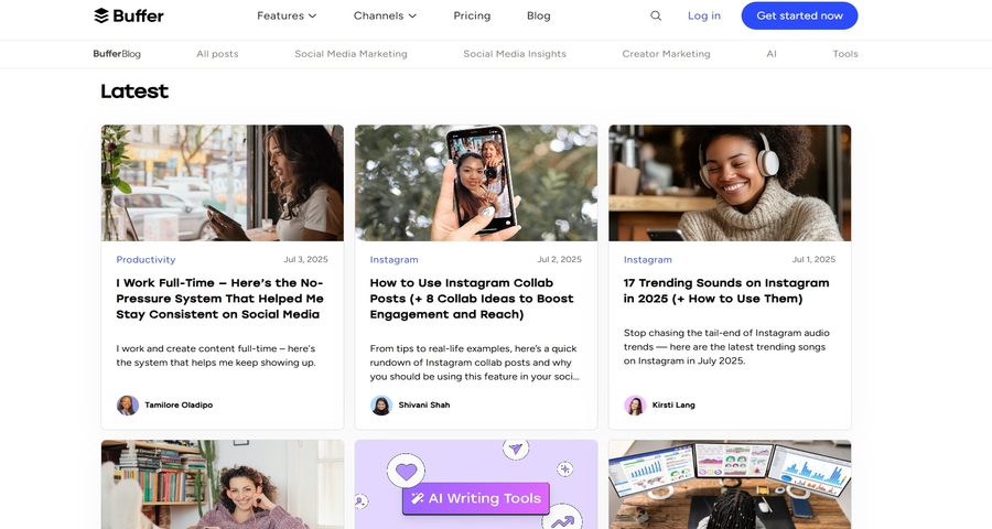
Buffer’s Social Media Marketing Resources page provides a comprehensive pillar resource for businesses and marketers. It covers everything from content planning to social media analytics, with links to articles, templates, and tutorials.
Core Design Features:
UX Value:
What you can learn:
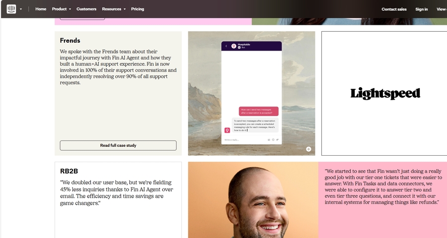
Intercom’s Customer Engagement Platform Guide is a pillar page designed to help businesses engage with their customers more effectively. The page covers topics like automated messaging, live chat, and analytics, with links to detailed case studies and tutorials.
Core Design Features:
UX Value:
What you can learn:
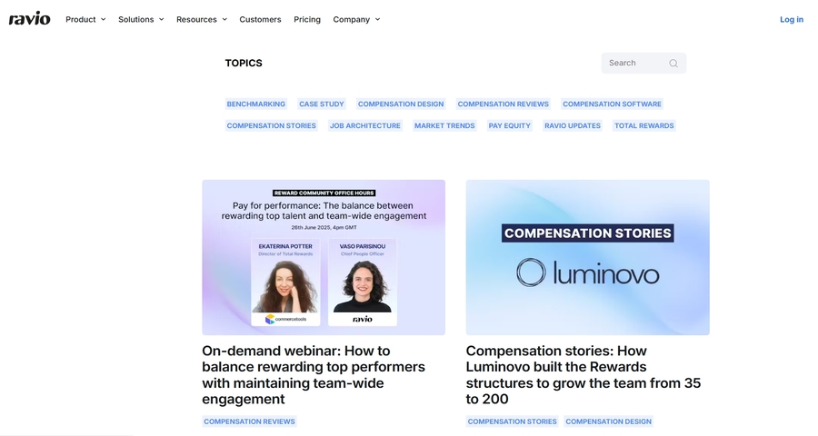
Ravio’s Design & Development Resources page is a well-organized pillar page providing a comprehensive overview of topics related to web development and design. It includes various articles, tools, tutorials, and case studies, all aimed at helping users learn and grow in the design and development field.
Core Design Features:
UX Value:
What you can learn:
BuiltIn’s Artificial Intelligence Guide is a comprehensive pillar page designed to help users understand and navigate the complexities of AI. The page covers everything from the basics of AI to its implementation in various industries.

Core Design Features:
UX Value:
What you can learn:
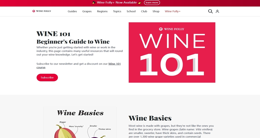
Wine Folly’s Wine Basics for Beginners is an excellent pillar page that provides an in-depth introduction to wine. It covers a variety of topics, including wine types, tasting notes, food pairings, and more. The page also includes visual guides, charts, and internal links to more detailed resources on specific wine-related topics.
Core Design Features:
UX Value:
What you can learn:
Designing an effective pillar page goes far beyond filling it with content. A well-crafted pillar page serves as the backbone of a user-centered website, improving navigation, engagement, and overall user experience. Here are some of the best design tips to ensure your pillar page is intuitive, usable, and highly engaging:
A pillar page should be easy to navigate and logically organized. Divide your content into clear sections with descriptive headings and subheadings, guiding users naturally through the information. A thoughtful structure helps users quickly locate the content they’re interested in and reduces cognitive load.
Tip: Consider adding a table of contents or sticky navigation menu to allow users to jump to the sections they need instantly.
Internal links help users explore related topics without leaving the page, creating a seamless learning journey. External links to authoritative sources provide additional context and enhance trustworthiness. Thoughtful linking keeps users engaged and encourages deeper exploration of your content.
Tip: Only link where it adds value to the user’s experience, and make sure the links open in a way that doesn’t disrupt navigation.
Long blocks of text can overwhelm readers. Incorporating visuals such as charts, infographics, images, or videos helps clarify complex concepts and makes content more digestible. Visuals guide the eye and create natural pauses, improving comprehension and retention.
Tip: Use visuals that complement your content. Ensure they enhance understanding without creating distractions.
A significant portion of users will access your pillar page on mobile devices. Ensuring that the page is fully responsive with readable fonts, well-aligned images, and intuitive navigation is essential for a smooth user experience.
Tip: Test your pillar page on multiple devices to make sure that content hierarchy, buttons, and links remain usable across screen sizes.
Many users skim pillar pages to find the information they need quickly. Use bullet points, numbered lists, short paragraphs, and callout boxes to make key points stand out. This approach improves readability and helps users scan efficiently without missing essential information.
Tip: Highlight actionable or important content with bold text, color accents, or visual cues to catch the reader’s eye.
Offering practical resources adds real value for users. Include downloadable templates, checklists, or interactive tools that users can use immediately. This not only increases engagement but also reinforces the page’s role as a helpful, user-focused hub.
Tip: Resources like free guides, e-books, or templates allow users to apply the information directly, enhancing the overall UX.
Page performance directly affects user satisfaction. Slow-loading pages frustrate users and increase bounce rates. Optimize images, minimize unnecessary scripts, and streamline your design for speed to maintain a smooth browsing experience.
Tip: Use tools like Google PageSpeed Insights to identify bottlenecks and ensure that users can access content instantly.
By following these UX-focused design tips, your pillar page can become more than just a collection of content—it transforms into a user-friendly resource, guiding visitors through information seamlessly, keeping them engaged, and providing an enjoyable and intuitive browsing experience. Prioritizing structure, interactivity, visuals, mobile optimization, and actionable content ensures your pillar page delivers maximum value and satisfaction to your audience.
Designing a high-performing pillar page involves using the right tools to streamline the process and enhance both the design and content quality. Here are some of the best tools you should consider to design a better pillar page:
Mockplus is a comprehensive prototyping and design tool that offers a variety of features specifically suited for designing effective pillar pages. It allows teams to visualize and iterate on their pillar page design quickly, without needing advanced design skills.
Why use it:
Google Analytics is a must-have tool to track user behavior and gather data on how visitors interact with your pillar page. With Google Analytics, you can identify which sections of the page are performing well and where users are dropping off, allowing you to make data-driven improvements.

Why use it:
Ahrefs is a powerful SEO tool that helps you analyze keywords, track backlinks, and audit your site’s SEO performance. When designing a pillar page, Ahrefs allows you to research related keywords and topics, ensuring that your content is both comprehensive and optimized for search engines.

Why use it:
Trello is a project management tool that helps teams organize tasks, manage workflows, and track content creation. You can use Trello to map out your pillar page design, from the initial brainstorming stage to final content creation, ensuring everyone stays aligned and deadlines are met.
Why use it:
Hotjar is a tool that provides valuable insights into user behavior through heatmaps, session recordings, and surveys. By using Hotjar, you can see exactly where users are clicking, how they’re scrolling, and where they might be getting stuck on your pillar page, helping you optimize its design.
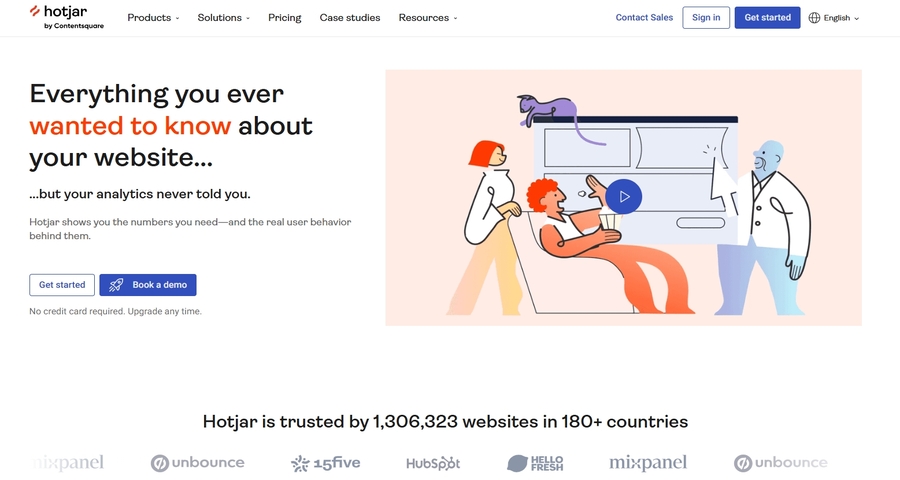
Why use it:
Designing an effective pillar page is not just about showcasing content—it’s about creating a seamless and engaging user experience. By focusing on a clear structure, intuitive navigation, and thoughtful design, you can craft pillar pages that guide users effortlessly through information, encourage exploration, and make complex topics easy to understand.
With these strategies and tools, you’re equipped to design pillar pages that not only engage users but also provide meaningful, actionable experiences. Applying these best practices will help your pages stand out, keep users exploring, and ultimately create a better, more user-centered web experience.
 Mockplus RP
A free prototyping tool to create wireframes or interactive prototypes in minutes.
 Mockplus DT
A free UI design tool to design, animate, collaborate and handoff right in the browser.


 Sign up with Google
 Join our Discord community
 support@mockplusapp.com