Making a good Welcome Page isn’t an arduous journey—but it does take some work and effort to get it right.
Designers need to learn how to make a good welcome page that gives users what they want at the first sight. What users see on their first sight is a critical step during the onboarding period, as this is when the new users will make a decision if you can follow through on the promises you made on your homepage, or if they will leave. If the experience on your app/website meets or lives up to their expectations, they'll stay on your website; If not, they'll quit and choose other websites/apps. This article will explore some top examples and best practices to optimize your Welcome Page design and improve your conversion rate.
Table of Contents:
What is a Welcome Page?
How to create a successful welcome page?
Top 12 examples to optimize your welcome page
Best practices of a welcome page
By definition, a welcome page is usually an overlay of one or more pages or modes that appears the first time when you open an app or website. It usually acts as an introduction for new visitors, telling them what the app or website is about, and often prompts the user to take an action.
With a great Welcome Page design, you can guide the user directly to the message you want to get across as well as give a short introduction to your product. This is the first impression and you need to show how your product will meet their needs or desires. If a user clicks onto your app or website and is instantly captivated, then you buy yourself much more time to sell them your product or service. This initial pitch is crucial because once their first impression has been formed, it can be difficult to change users' minds.
So, how can you make a great and successful welcome page? What elements does a great welcome page include?
Here are some key elements you can include when creating your welcome page:
Clear and attractive headings. The main title on the page is the first thing a visitor will read. This has to be clear and concise and not confuse visitors about you and your product. Use clear headings and entice the user to discover more.
Plenty of colors. The eye is drawn to color and visitors are attracted to welcome pages that have different but matching colors that can catch the visitors’ eye.
Informative photos. It's widely acknowledged that a picture or an image that represents your product or company is worth a thousand words, so do have some on your welcome page. These images speak volumes about the quality of your website/company.
Simple and concise information. A great and successful welcome page should be summing up your website/company as concisely as possible, just a few sentences max.
Use of a strong Call to Action. A Call to Action can be a button or phrase of highlighted text that initiates the visitor to perform an intended action. Generally, phrases like “Get Started” or “Get your FREE trial!” or even just “Download Now” are considered to be calls to action.
Here are the top 12 welcome page examples, which do help to improve and optimize your design.
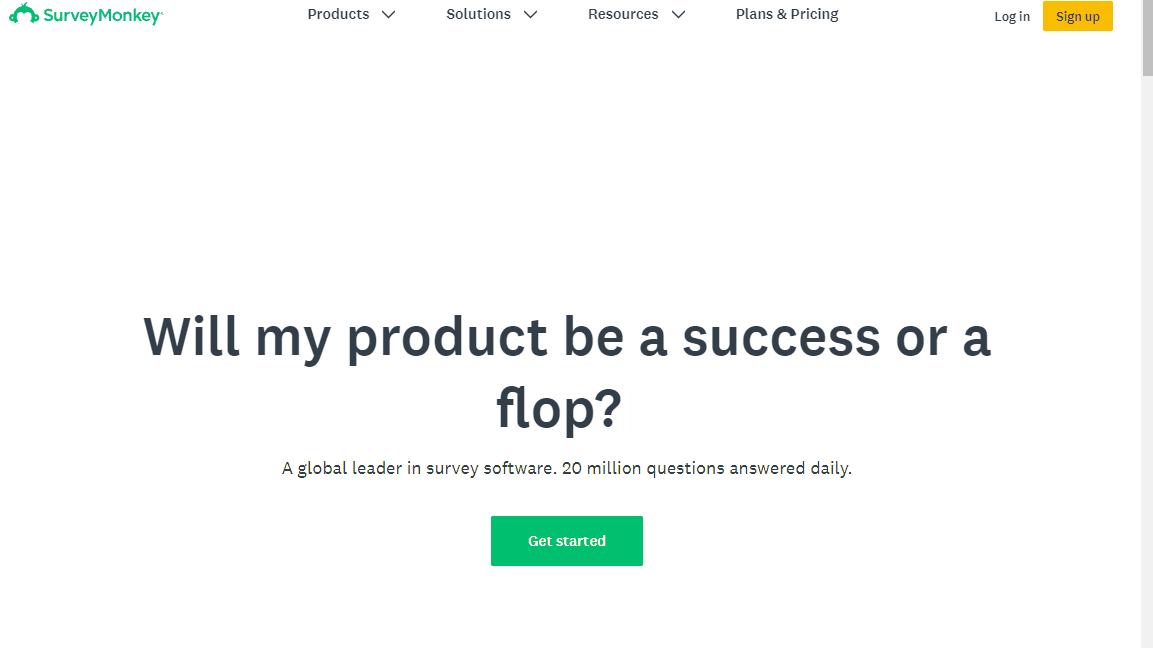
SurveyMonkey’s welcome page includes simple and concise information, showing exactly what they are about with examples of their tool in action. Below their initial product explainer, they have another heading telling visitors exactly what their company is about: A global leader in survey software. 20 million questions answered daily. This CTA and product explainer is simple, to the point and helps visitors quickly understand exactly what SurveyMonkey does and who they are.
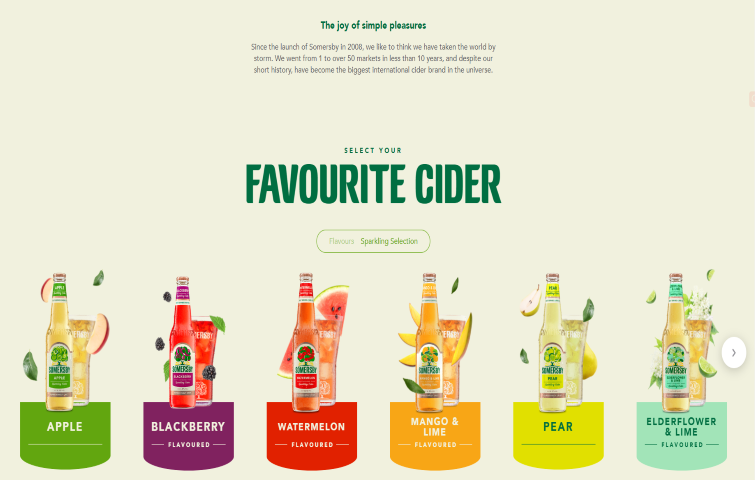
This welcome page of Somersby includes different but complementary colors, making it more like a visual spectacle than a simple written welcome area. There is the simple welcome slogan“Favorite Cider" standing out right away, but the real impression is created by the beautiful photo manipulation, which shows off their product in an attractive way. This welcome page plays with the company’s product line and creates a sense of curiosity and intrigue for new visitors, pushing them to dive further into the website.
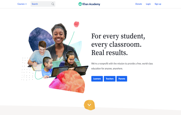
Khan Academy is one of the most commonly used free educational resources online and has a great welcome page. There are related images of students, a short and sweet headline, along with CTA links guiding visitors to where they want them to go.
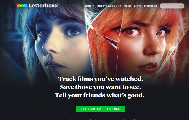
Letterboxed is a global social network for grassroots film discussion and discovery. The welcome page is very good, with bright and bold text on top of contrasting images, the user knows exactly what this website is about in only a few seconds. The text is to the point with a CTA directly beneath it to guide users towards signing up to the service.
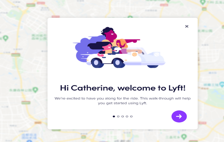
Lyft is a ride-hailing service, similar to Uber. On Lyft’s welcome page, there is a large image of a car with a welcome popup instantly guiding the user to start using the service. There are bright, contrasting colors, with CTA buttons in useful positions. With this welcome, visitors are very likely to quickly grasp what Lyft does and how they can start using it (both as a driver or rider).
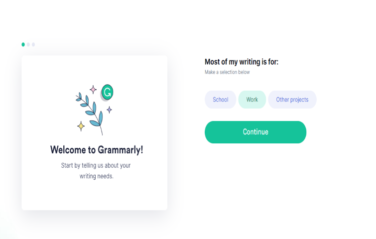
Grammarly is an online grammar correction and proofreading tool. Here's its welcome page. There are three options of "school" "Work" and "Other projects" that level up the user's experience on the website because of its simplicity and ease of use. Colors are nicely used, the whole page is well-organized and it will definitely catch the visitor's eye, making them click the CTA button to give it a try. It is both visually satisfying, and welcoming - any visitor will be able to start using Grammarly for their own needs in minutes.
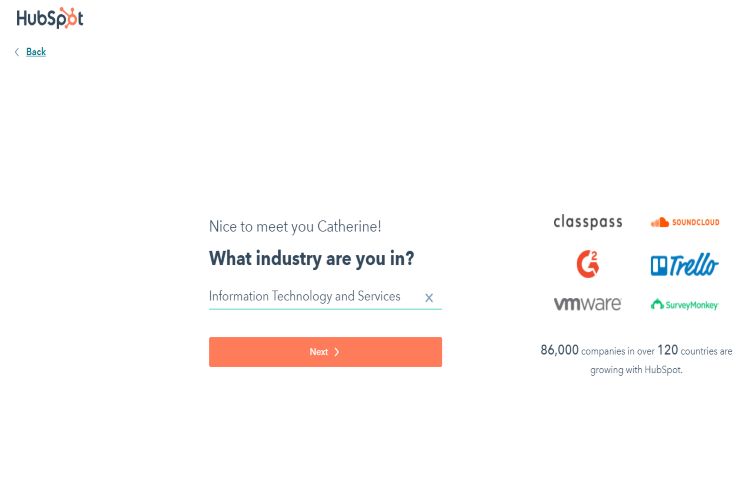
Hubspot’s CRM has everything you need to organize, track, and build better relationships with leads and customers. The welcome page offers the option to type the user's industry, quickly leveling up the user's experience, making the user feel better at the very beginning of the whole process. The information on the right clearly shows the great number of its customers. Also, the bright colors are nicely matched, making the visitor feel warm and welcoming. The striking orange color of the CTA button compels the visitor to click and take a closer look or read more about what is on offer.
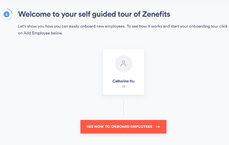
Zenefits’main objective on this welcome page is to tell you what you can get and how you can take advantage of Zenefits to improve your work. The page includes a big, positive headline that puts you in the right state of mind to act now. There is also a large, descriptive CTA showing you what to do next. There is no contrast between colors but there are colorful images with simple and concise information, which creates an overall friendly environment.
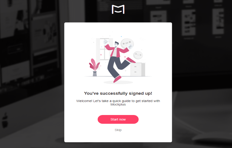
Mockplus is an all-in-one product design platform for prototyping, collaboration and design systems. The welcome page of Mockplus does an excellent job, catching your attention with a big, attention-grabbing headline inviting users in. Under that, visitors are guided on a quick tour of Mockplus. The final CTA has a bright red color to get you started for free which is less scary than diving in and buying the product right away. It is a well designed welcome page and does a good job of getting visitors attention and guiding them deeper into the product
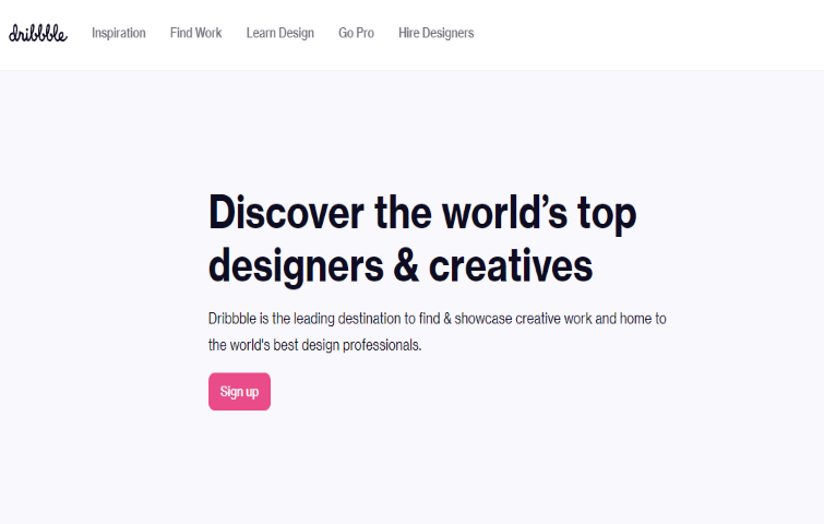
Dribbble is a go-to platform for design resources and for discovering and connecting with designers and creative talent around the globe. The welcome page of Dribble is also a great one. It has a clean and minimal welcome area with a limited color palette. The headline clearly describes the company’s key services, and with the sub-heading information shown, the visitor can get more information about what to expect from the website. The welcome message on this page uses a light font, with a solid colored background to help contrast it against the main pixelated website background.
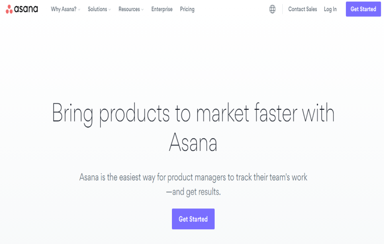
This welcome page of Asana might seem super simple at first glance, but it’s easy to see why it works. Asana targets product managers and attracts the attention of visiting product managers right away with a big, to-the-point headline and a more in-depth second heading. It has big and bold Headings that describe all the benefits of Asana at a glance. With the striking color of the CTA button, visitors are more likely to give it a try.
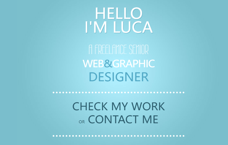
This welcome page of Luca Vercellio isn’t too complicated, it just has a nice simple message with a personal touch of "Hello, I'm Luca". Different from many of the above examples, Luca’s page has a very simple welcome page design where the welcome message takes up most of the page. This welcome area is relatively subtle, with soft lighting effects and a pale blue palette of white. It is simple and clean, but a cleverly designed welcome page that shows off all the information they want, while not distracting the user and guiding them to either check out previous work or contact them.
Welcome pages can vary in style, but there are a few key things to keep in mind if you want to create a successful one that keeps visitors on your website. Here are the best practices to ensure you're creating welcome pages that convert:
Write a clear and precise headline
It’s great that you have visitors looking at your welcome page, but we all know that visitors are making split-second decisions on whether or not they want to see more from your brand, product, or website. Take the time to craft headlines that get your message across in that time. Be clear and concise while ensuring your headline is relevant and informative about what your website or product does.
Choose impressive words
By using stand-out, impressive words, you can ensure you deliver a powerful and clear message to visitors. Use words such as “trusted worldwide”, “most used” and more to introduce your brand and product but make sure your choice of words isn’t too exaggerated.
A clear yet informative call-to-action (CTA)
A call-to-action is what you want your visitors to do. You need to make it clearly visible, enticing, and button-shaped. The color of the CTA button should also be considered: Does it match the rest of your color scheme, yet still stand out? When it comes to CTA buttons, there are two popular choices: Red or green. What's more, use phrases like “Get Started” “Get your FREE trial!” or even just “Yes, send it NOW!” instead of "Submit”. So it's important to include a strong visual focus and call to action to get visitors' attention.
Be original
Don’t copy other websites or apps headlines or sentences to introduce your product or company. Show visitors why they should pick you. Being original not only makes your brand more personal, but it also quickly attracts visitors to your unique selling points. As you create a new brand or product, you need to be different from others, so why copy what is already there? Be original and beat the competition.
Keep messages matched with your sales pitch
During the creation of a welcome page, you need to ask yourself these questions: Does the welcome page message match your best sales pitch? Does it cover all your possible benefits in a logical flow? Does it guide your visitors through your product or service in the best way possible? If all these questions can be answered through a combination of images, videos, and text, then you can have a welcome page that acts as your virtual salesperson, helping to generate highly qualified leads every single day.
Make a clean and neat design
A clean and neat design allows your visitors to focus on your call to action, while a larger font makes it easier to read and quickly understand what your site or product is about. More importantly, consider using bullet points so that your visitors can scan quickly instead of reading long paragraphs of text.
This blog post is just the starting point of your welcome page optimization. With so much information out there, it's easy to get confused and lose track of where to start. If your app or website doesn’t live up to your expectation to engage new users the way you thought it would take a look at what users see when they first enter. Do you have a welcome page that greets them, offers guidance, and steers them in the direction of the value they were promised or not?
If you are a new designer and don’t yet have a welcome page, my recommendation would be to review these high-quality welcome page examples and apply the best practices religiously, and perhaps, even imperfectly. So that you’ll see or get higher engagement from your new users -- and they’ll see how committed and dedicated you are to their success from the very first moment they use your product.
 Mockplus RP
A free prototyping tool to create wireframes or interactive prototypes in minutes.
 Mockplus DT
A free UI design tool to design, animate, collaborate and handoff right in the browser.


 Sign up with Google