We all know that inspiration is almost never there when you need it most. So, to make sure you don’t run dry, here is our monthly app design roundup.
In this roundup, we cover 5 app design trends in 2020: Neumorphism, Dark Mode, Minimalism, 3D illustrations, and multi-color matching. From these 5 trending categories, Mockplus carefully picked 20 amazing app design shots from the last 3 months for you to check out.
At the end of 2019, this new quasi-physical design style became a thing. By changing the light and shadow to highlight the content area or module, the overall experience becomes more immersive than a flat design. The shot below applies the neumorphism style in a smart home application of a washing machine.
Designer: Dimest
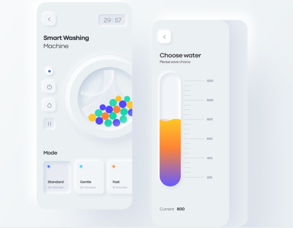
I usually hate neumorphism, as recently, it seems like every design uses it. But I'd say the animation in this app design is smooth despite the fact that no washing machine lets you choose the water amount.
As one of the design trends in 2020, dark mode has already risen to system-level design (iOS and material design). In addition, there are some main flow apps that also follow the dark mode trend, such as Facebook, Instagram, and WhatsApp. We picked 2 shots using dark mode and neumorphism in app design.
Designer: Anton Skvortsov
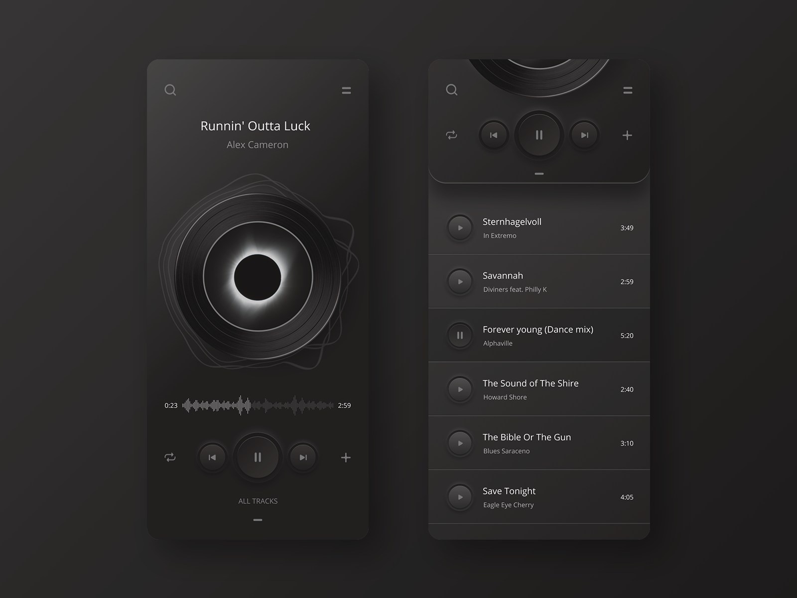
This player app only uses back and grey, which creates a truly dark affair. The entire layout is clean with a three-dimensional effect. The designer is good at playing with color. The neumorphism design of buttons feels like there is a shadow dimension with a realistic view.
Designer: Filip Legierski
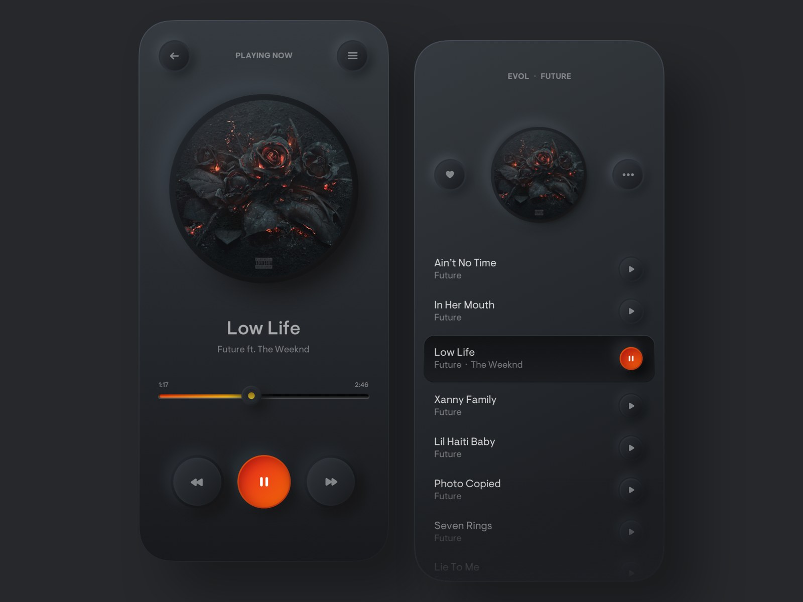
This player app design applies neumorphism with more realistic clickable buttons. Unlike other dark mode designs, it uses bright red to highlight the pause button.
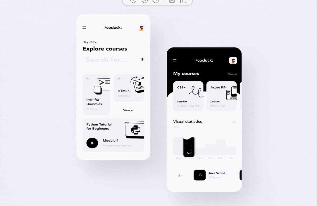
We are living in a fragmented information age. This has resulted in very short attention spans. Worse, we get distracted easily. Design is all about communication. In this regard, minimalism helps designers to deliver the most essential concept to the target audience. Here are some shots which make good use of minimalism.
Designer: Dannniel
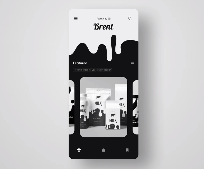
This is one brilliant app. The designer translated the concept visually with minimalistic design, smooth interaction, and fun micro animations. The designer implemented simple, elegant forms, and used only black and white. The cleanliness is just killing it!
Designer: Taras Migulko
This shot is a skill learning app targeted at developers and designers.
Using colorful illustrations on a landing page seems to be THE thing recently. However, this shot chooses cool black and white art on the landing page instead. The illustrations are a great fit with the coding topic and the target group. Designer Taras has played the grid well whilst making the information highly accessible to users.
Designer: Quan Ha
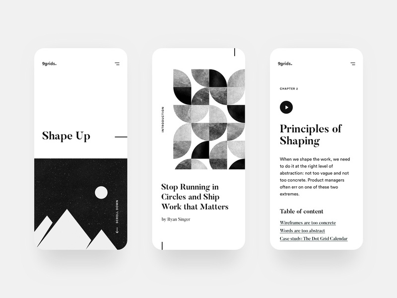
Another excellent example of breaking away from your run-of-the-mill mobile layouts. With a clean UI, an easily understandable layout, and nice geometrical illustrations, this layout perfectly suits the reading app. The simplicity of this design keeps users’ focus on the content itself. The beautiful serif font adds charm.
P.S. The book in the shot is "Shape Up" by Ryan Singer.
Designer: Quan Ha

This is another piece made by Quan Ha. The work is a self-motivation app which is designed to track your daily moods and understand emotional states.
Designer Quan is very brave to use detailed manga illustrations which make the app unique compared to other self-motivation apps. The typography, color scheme, and layout are sharp and gorgeous. Overall, brilliant work!
Young people have always comprised the majority of mobile apps users. Lively and energetic are characteristics of youthful expression, and designers express these through fresh, colorful, and bold colors, which give way to design resonance.
If you use one color for design, it is easy to make the interface monotonous and have application limitations. The design of multi-color matching can make the overall UI interface more layered and in line with the trend of youth. The following cases highlight youthful design through multi-color matching and contrasting colors.
Designer: Cuberto
Smooth transition with bold and contrasting colors such as blue and pink. The cool illustrations takemake this design to a new level. I can loop this forever!.
Designer: Andrey Levchenko
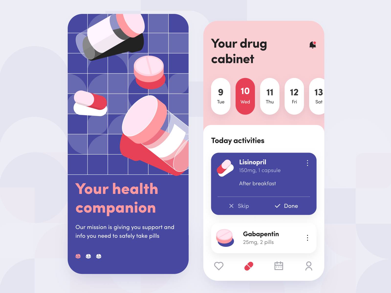
Not only elder people but also young generations take kinds of health care products. Whereas, it’s super easy to miss taking your pills, and since it is now fashionable to use reminders for everything, medication is not an exception. This work is a “take your medication” reminder with a clean and modern illustration.
Designer: Andrea Hock
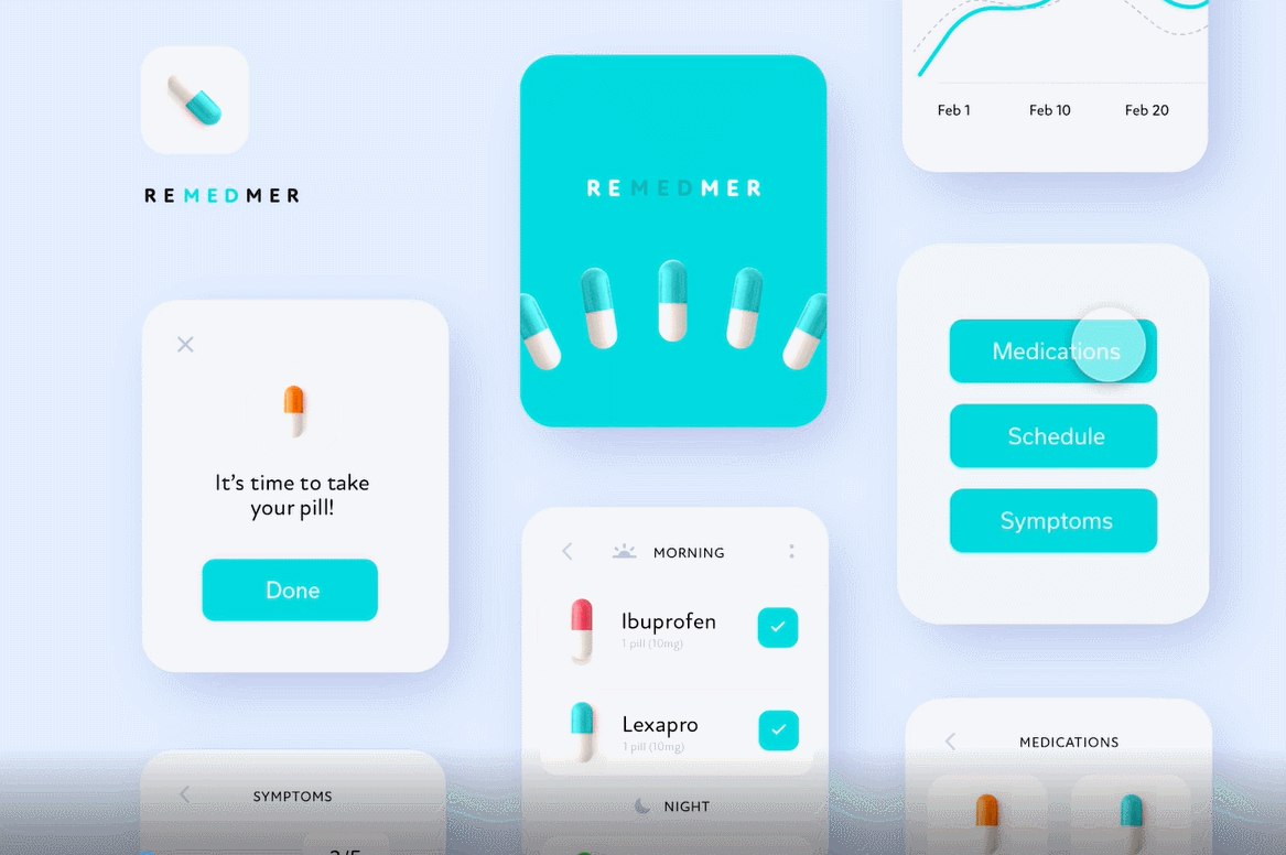
Same as the last shot shared, this is about medicine tracking but on a smartwatch. Now you can track your medication even when you’re working out. The designer uses a content-aware layout, which is clean and aesthetic. The color choice is smart, which kinda makes the pills in a cuter way.
Designer: Anastasia
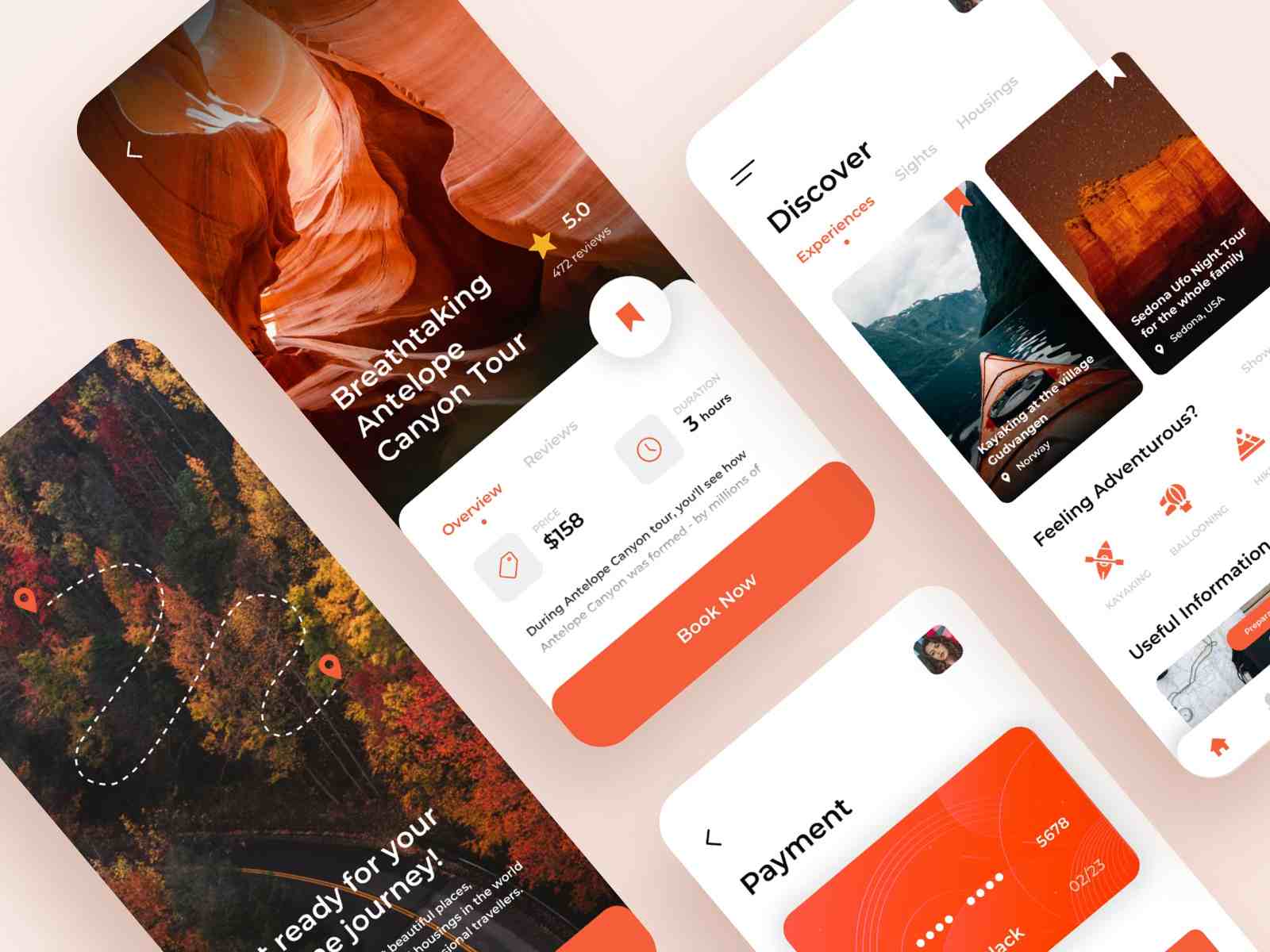
In this travel app case, designer Anastasia uses a primary color with multiple secondary colors. It allows the user to perceive the overall brand tone but does not feel monotonous.
Designer: Outcrowd
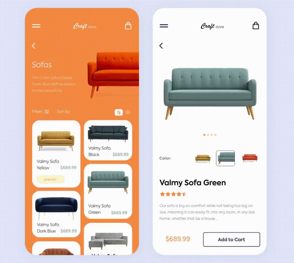
This craft store application implements multi-color matching in a smart way. A clean UI, minimalistic design, and amazing interaction transitions make this shot a brilliant app design.
Designer: Taras Migulko
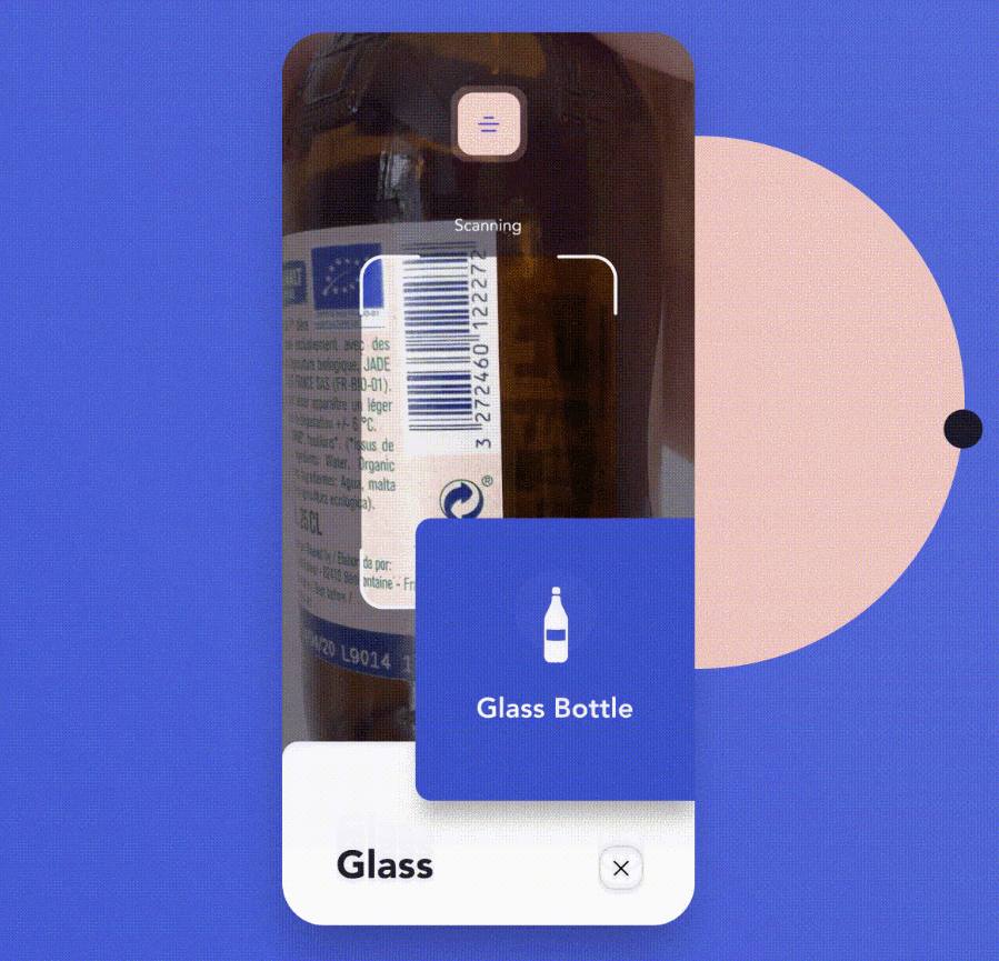
This cool animation is from a recycling app designed to help people sort their recyclables. It has a scanning system for the barcodes on any recyclable item, which makes it a handy tool for sorting. With such an awesome contrast of color schema and nice interaction, I’d love to use it to sort recyclables myself.
Designer: Cuberto
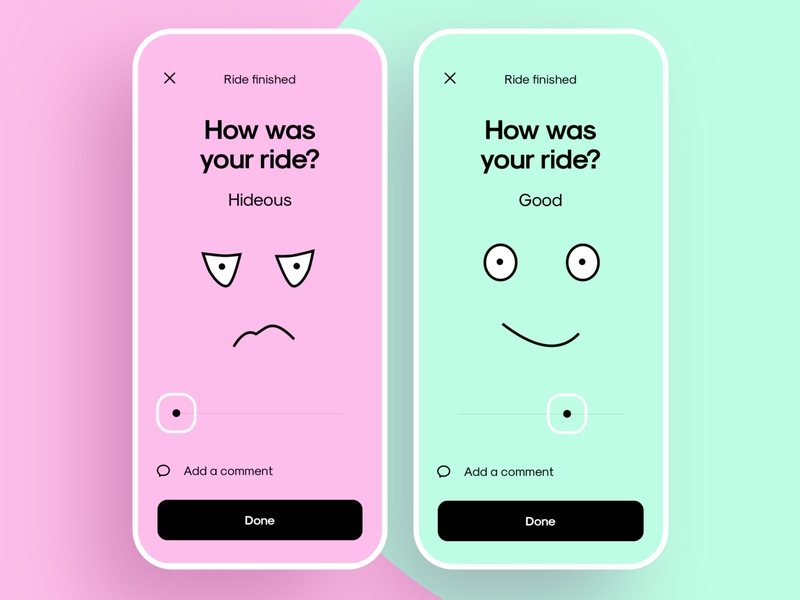
This ride rate page is for Uber. The colors look lovely and the illustrations add a little humor to it. The layout is clean and to the point. For me, I think I’ll rate both just to see the fun design. Would love to see the animated version of this.
Designer: Den Klenkov
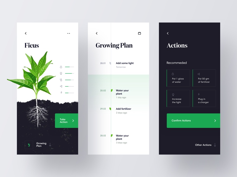
Gardening has become a popular hobby, but some people have trouble keeping their plants alive. This work is a tracking app which connects with IoT devices to have a better tracking of plants’ condition such as moisture and temperature. The timeline design is clean and simple. The color palette combines a primary color with multiple secondary colors, which makes for a magnificent layout. I’d love to try this app if it were real.
Designer: Alicia Lee
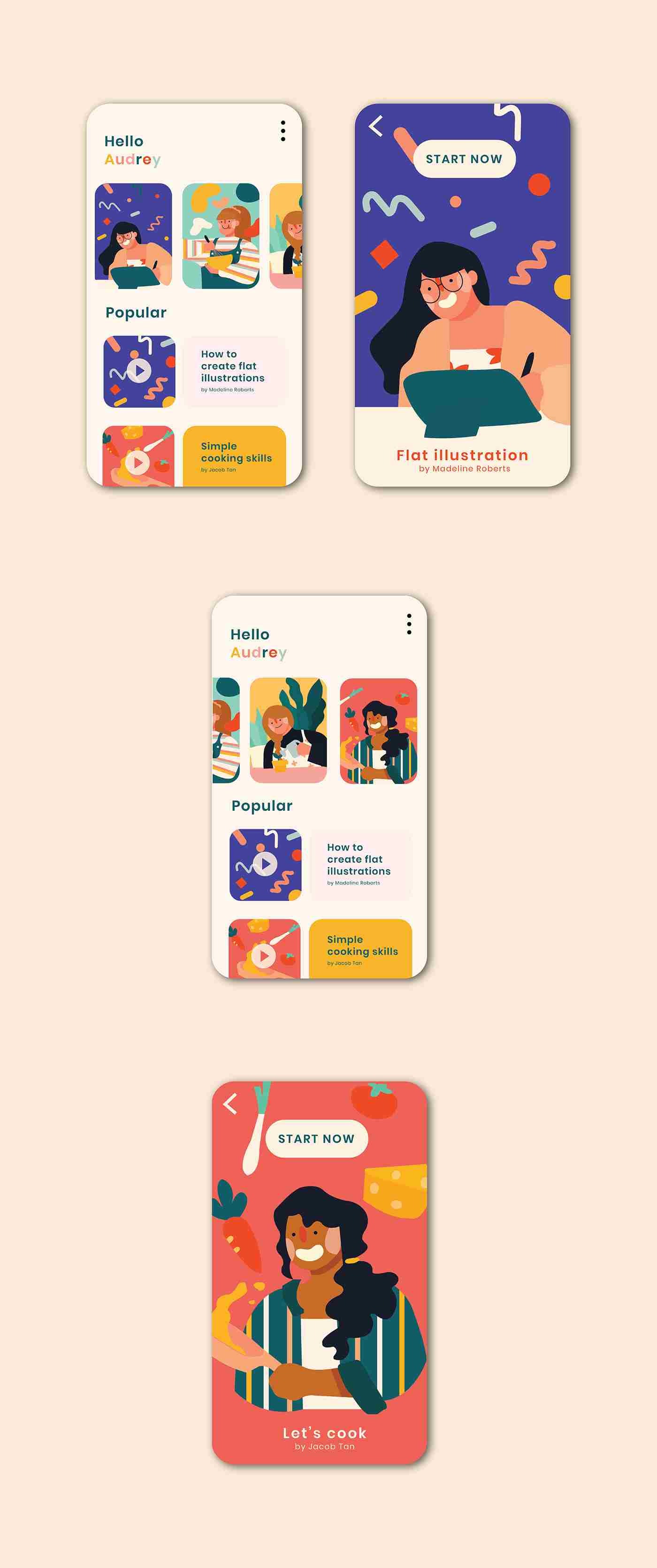
The app is designed for skill learning such as learning illustrations, cooking, and other skills. I loved this work at the first sight as the illustration is full of happiness and energy, which is achieved by using a warm color palette and rounded lines.
Designer: Makers Company
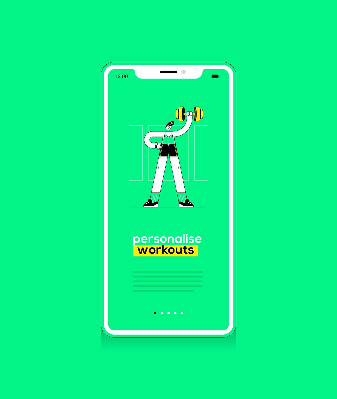
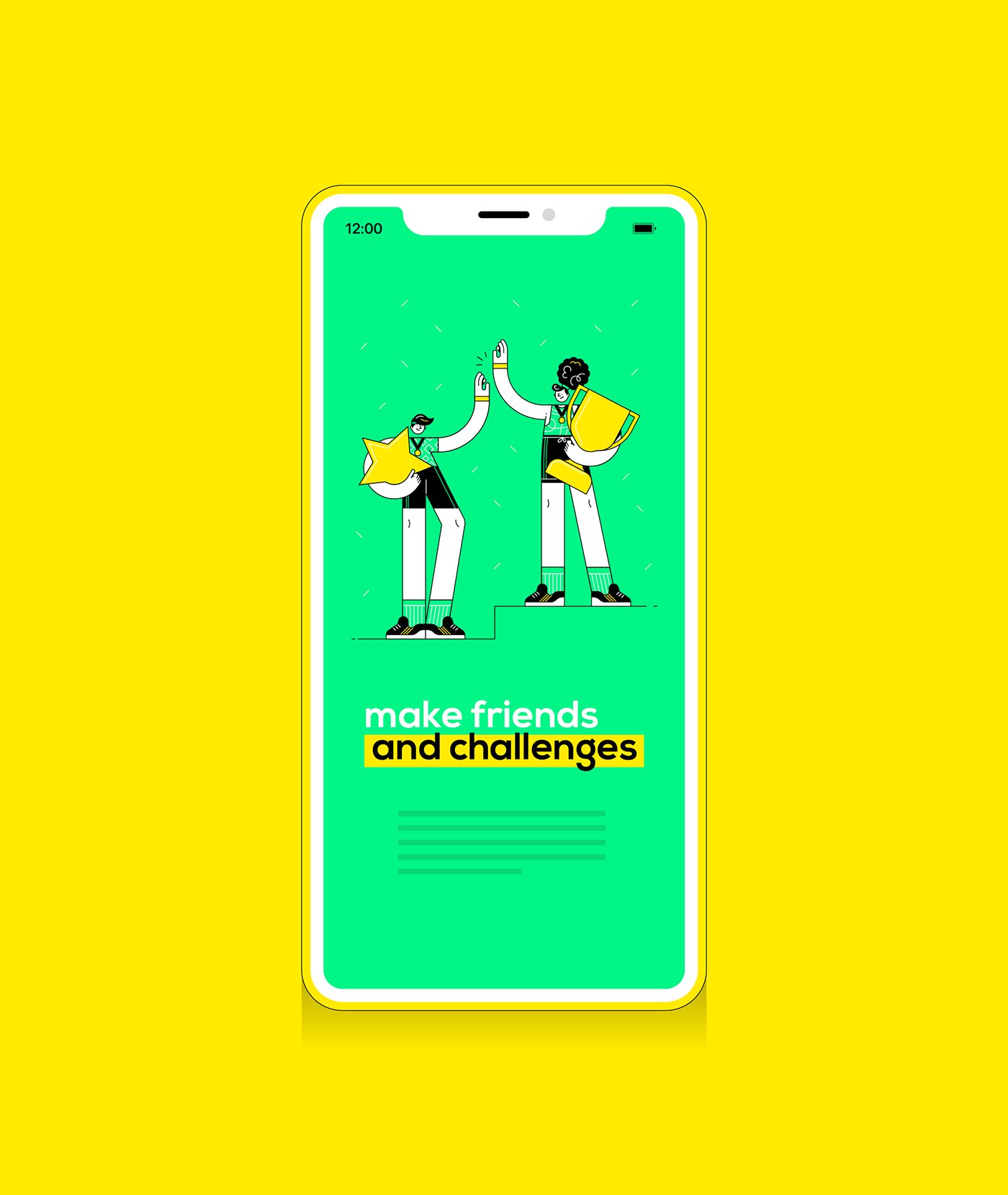
The color choice of this app design is superb. With yellow and green as the main colors, it presents an energetic and fresh impression. Such a bright color palette is a good choice when you need to create a fitness app.
Designer: Ліля Высоцкая
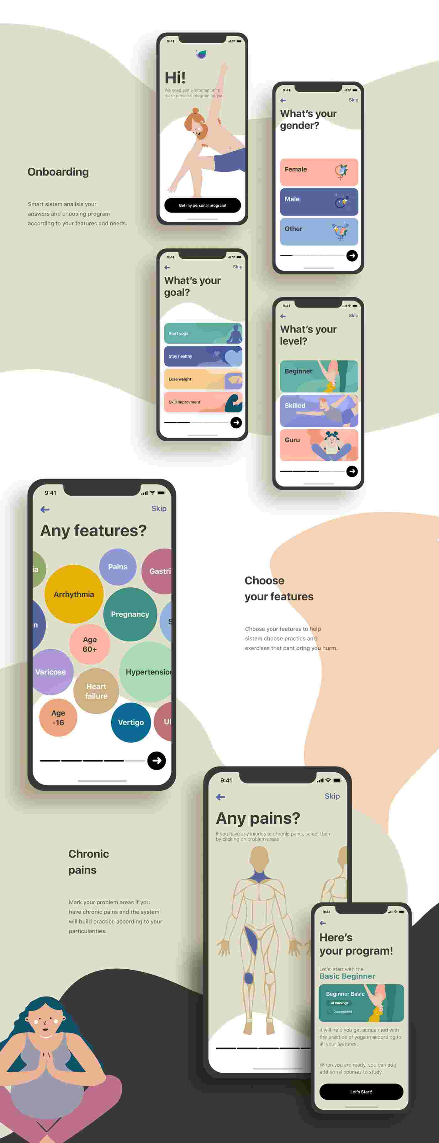
This yoga app concept is impressive. It uses universal color schemes but not is overwhelming. The fun and relaxing design of illustrations really suits yoga ideals.
Designer: Ahn Na Yi
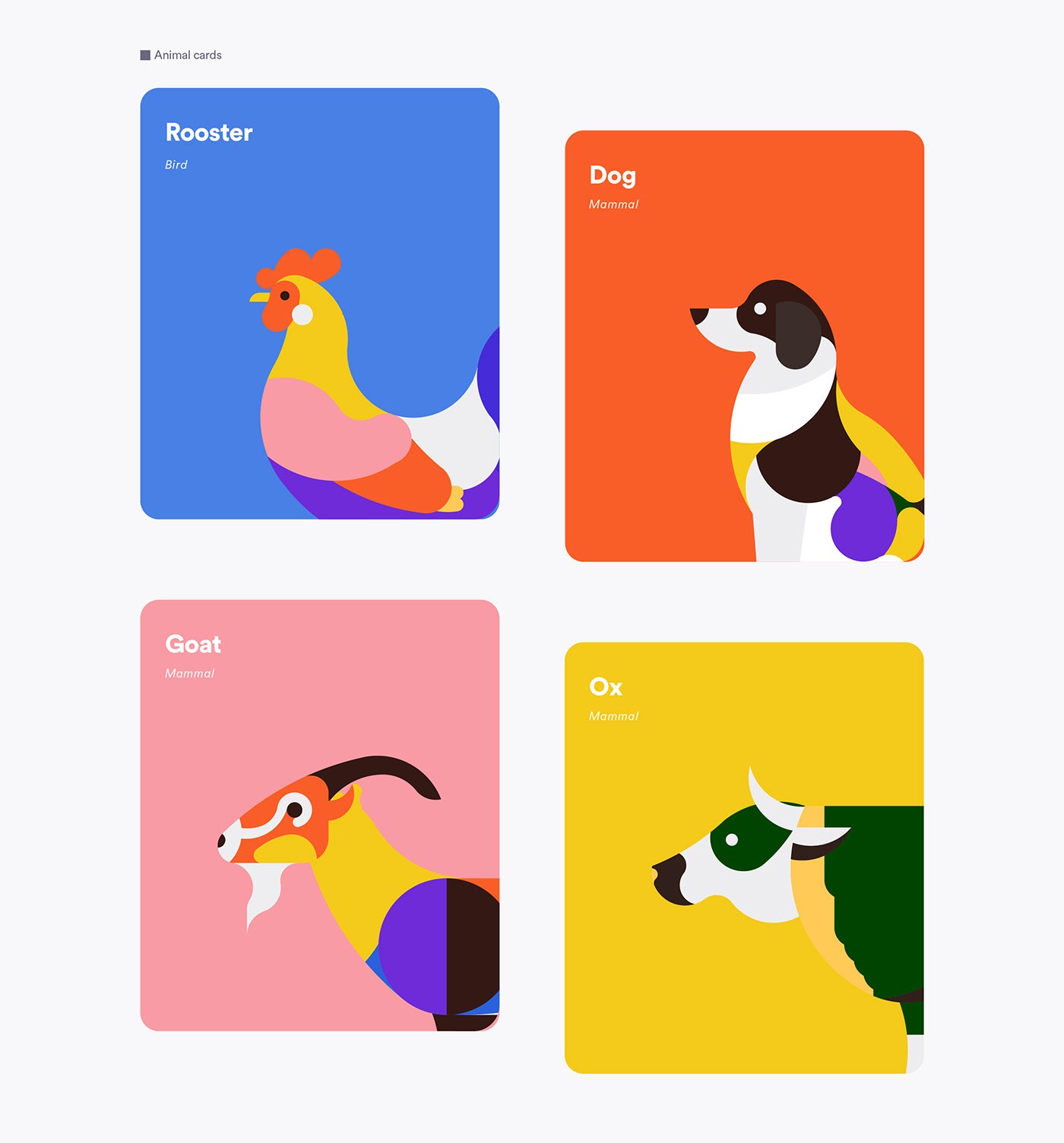
This is an educational app designed for learning animals. It’s easy to fall in love with it at first sight with its bright and smashing vectors. The animations on hover make for a cute design and is ideal for keeping (easily distracted) young learners focused.
Software technology develops at a fast past, and in recent years, 3D illustrations have become huge. Many companies, such as Starbucks, use 3D illustration to present their products.
Designer: Anton Skvortsov
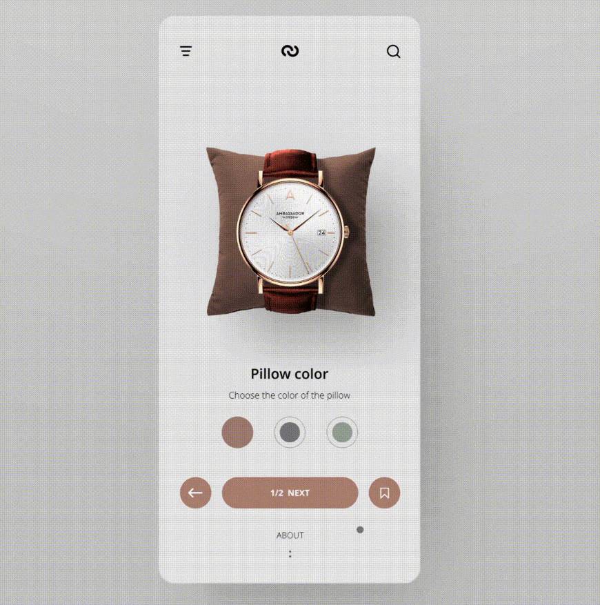
To cap this list off, I chose this watch shop app design. It applies 3D boxing in animation, which totally blows the buyer's mind. Not to mention the smooth and neat interaction. Ready to create your own app shot? Feel free to try Mockplus: a free web & aPP prototyping tool.
 Mockplus RP
A free prototyping tool to create wireframes or interactive prototypes in minutes.
 Mockplus DT
A free UI design tool to design, animate, collaborate and handoff right in the browser.


 Sign up with Google