Whether you are a designer beginner or expert, you may ever visit a website and found:
a line of huge, bold and monospaced texts dangling around
a centered product image rocking around in a "weird" rhythm
or a product list dominating the screen without normal navigation or hierarchy
Everything on the site seems very raw, but also irresistibly compelling to you?
OK! Don't worry! This "weird" website is not poorly designed. It is just wisely integrated with trendy brutalism. If you are interested in creating a stunning brutalist website, this simple guide will help you.
We'll walk you through the basics of brutalism websites, including what the website design brutalism is, why you need brutalism and what makes a good brutalism website. A collection of the finest brutalist website design examples, templates and other design resources also simplify your design process.
Table of Contents
Brutalism, firstly coming from the architecture design, talks about the "raw and rough concrete" design style that became popular quickly during the post-war period. However, when it comes to website design, the brutalism design focuses more on the term "raw" only.
Brutalism website follows a similar raw design style and tries to present website content and function in a reactionary, direct, ugly, unbothered or sometimes even weird way.
They often make full use of raw interactions like shaking, dangling, or autoplaying, bright color, gradient or shadow blocks, bold and huge typography, divided screens, and other eye-catching design to present core information in an extremely exaggerated way.
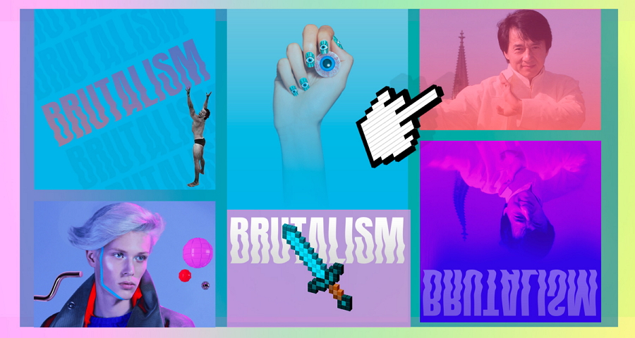
Some brutalism website design sometimes even has no clear navigation or hierarchy, but a simple list or table form design to guide users to navigate around.
In short, a brutalism website emphasizes more on what users will experience and get on the site at the expense of the aesthetic beauty. It quickly becomes popular for its raw appearance and experimentality.
When learning brutalism website, you should also pay attention to the difference between the brutalism website and the poorly designed website:
Brutalism websites actively use ugly designs to attract users and encourage them to click the ads or CTA buttons. They do add all "weird" elements on purpose for a better result.
But, poorly designed websites are often done unconsciously. The designers may add a special element for wanting to improve UX and eventually find it causes far more problems.
As you can see, this website is clustered with different hyperlinks, colors, and images, creating a really bad user experience. So, this example is obviously a poorly designed website, not a brutalist website.
Many companies and designers use brutalism design since:
While browsing websites online, you may find that nearly all conventional websites today look the same, since they follow the similar design trends and technologies. A website with raw layouts, interactions, fonts, illustrations and typography will surely stand out from the rest of modern websites.
The brutalism design style is a design trend raised by younger generations. It keeps in line with the younger generations that love changes, new things and challenges. It helps websites attract far more younger users.
As we've described above, brutalism website always uses exaggerated ways to stand out the core content and functions, helping deliver core information to users easily. An unique brand identity will also be built in the same process.
No sure answer yet. There are two things you should consider:
Whether you like the brutalism design style is often the first thing that you should consider. Of course, this decision should also be made based on your design skills and levels. If you are not so good at brutalism designs, go learn about it or browse some brutalism website examples at first.
Obviously, only you can decide whether the brutalism design is right for your next project.
However, in case of any unexpected troubles, before you make the decision, you should first consider the website types.
When comes to some websites that require you to present everything in a serious style or mood, including the gornverment or educational website, a brutalism website seems not a good option. However, if you are designing a personal or portfolio website, the highly personalized brutalism design style can be a good try to make you stand out from the rest.
To make a brutalism website stand out, apart from the common website design steps, here are also some useful tips that you should keep in mind:
No matter which type of website you are trying to design, user research always matters. So does the brutalism website designing. To make the right content and features stand out, you should always first research your audience to know what the users really want from your website app.
To deliver website content attractively and effectively, you should also use unique shapes, choose an abnormal letter or image size, bold yet monospaced typography, and others to create a great visual impact on the audience.
Apart from visual elements like colors and shapes, you should also try to use strong color or size contrasts to highlight some important content or element.
As you can see, the contrasting color blocks help attract users and also divide the screen into different functional sections, creating a clear web layout successfully.
No matter why you choose to create a brutalism website, you should always learn and follow all basic web design principles. For example, no matter what happens, content always lies on the top. Keep your website or app consistent all the time. Never stop improving your website layout for fast scanning and many more.
You should always keep the basic design principles in mind to make sure that your website is effective, practical, and accessible to users. This is one of the key secrets to avoid creating bad websites.
To make a website popular among users, you should always translate your ideas to functional prototypes to fully test them all over and over again. So, when you are trying to design a brutalism website, you are also recommended to choose the right website design tool to fully test your ideas again and again.
We've also rounded up 20 of the best brutalism website design examples and templates to help you create your own one faster:
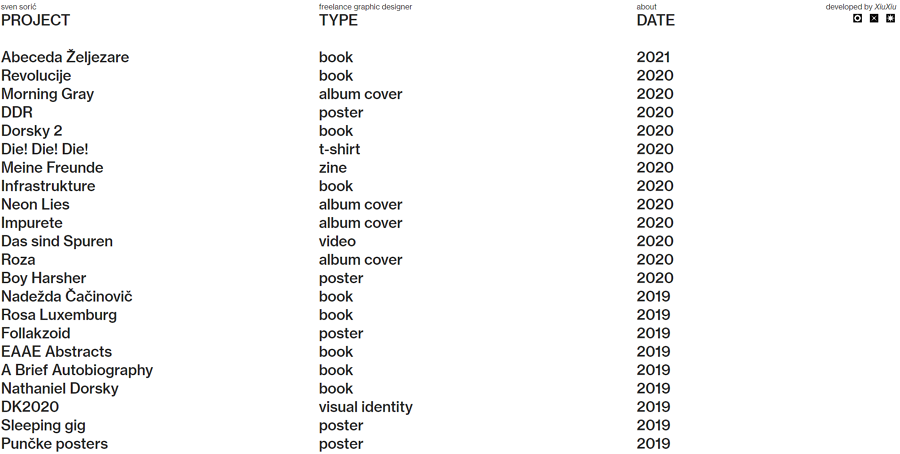
Sven Soric is a freelance graphic designers from Zagreb, Croatia. His personal website is a website example that combines brutalism and minimalism perfectly.
The home page presents all his design cases with simple and clear lists. When you hover on any cases, the case preview will show up aside. The case list is also taken as the sidebar to fix on the left side so that users can easily switch between different cases with simple clicks.
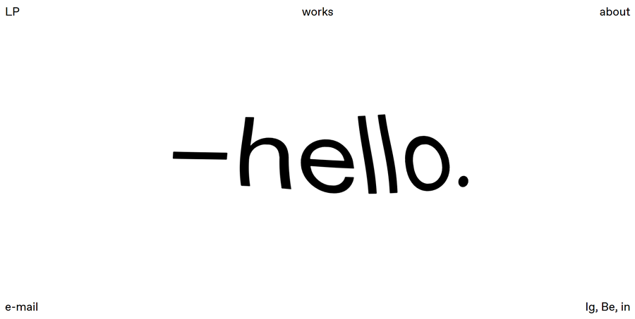
Luca Porracchia's portfolio website is another good example of minimalist website with a brutalism design style. The web pages is divided into two columns: one column illustrates the design projects in simple words, and the other showcases the design images. The cool image transitions and interactive home page give users a really interesting experience.
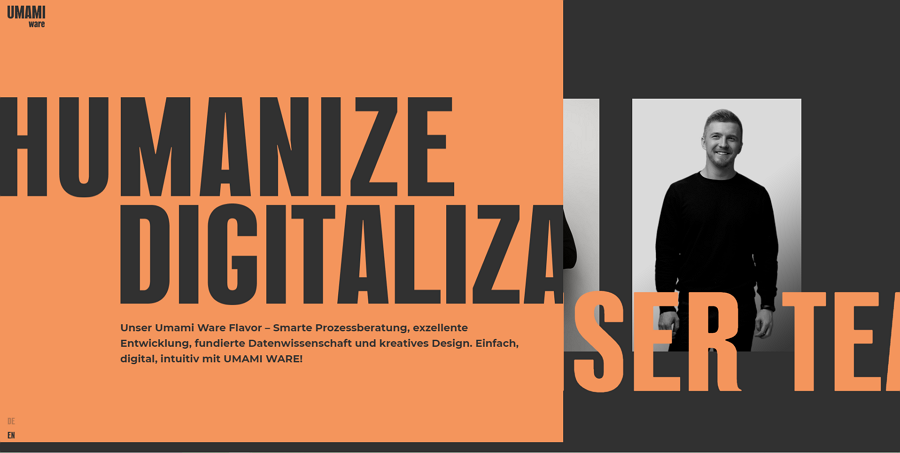
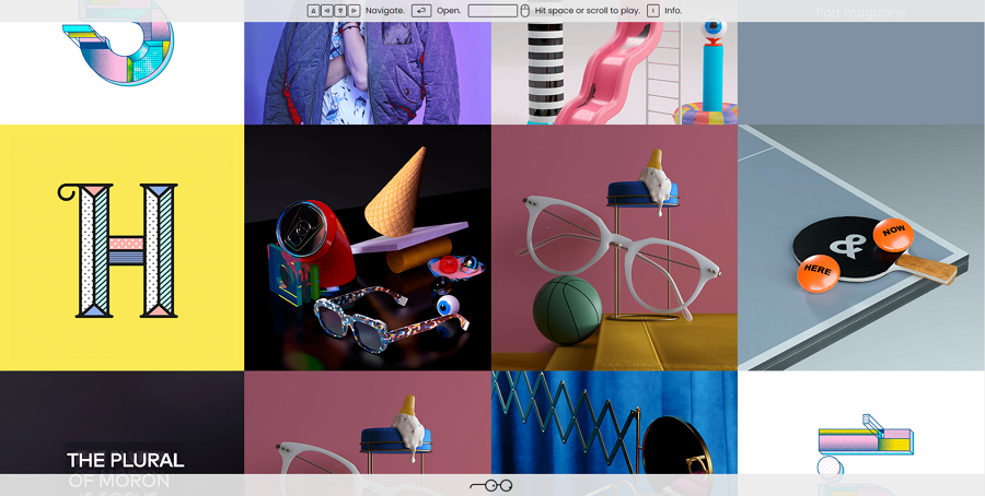
Umami Ware team's online website is a good example that introduces you how to create a stunning brutalism website with huge monospaced typography. The rich hover interactions, transitions, unique horizontal scrolling and many more create a great visual effect. All of them help to place a great first impression on users.
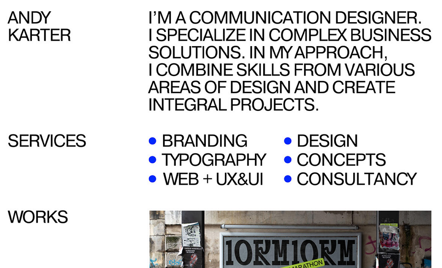
Andy Karter's personal website wisely places the monospaced words and images together or separately to create a clear visual layout. Even without the common navigation bar, you can still clearly know which part is the banner, title, subtitle and cases. A great example that teaches you how to make a user-friendly website out of disordered elements.
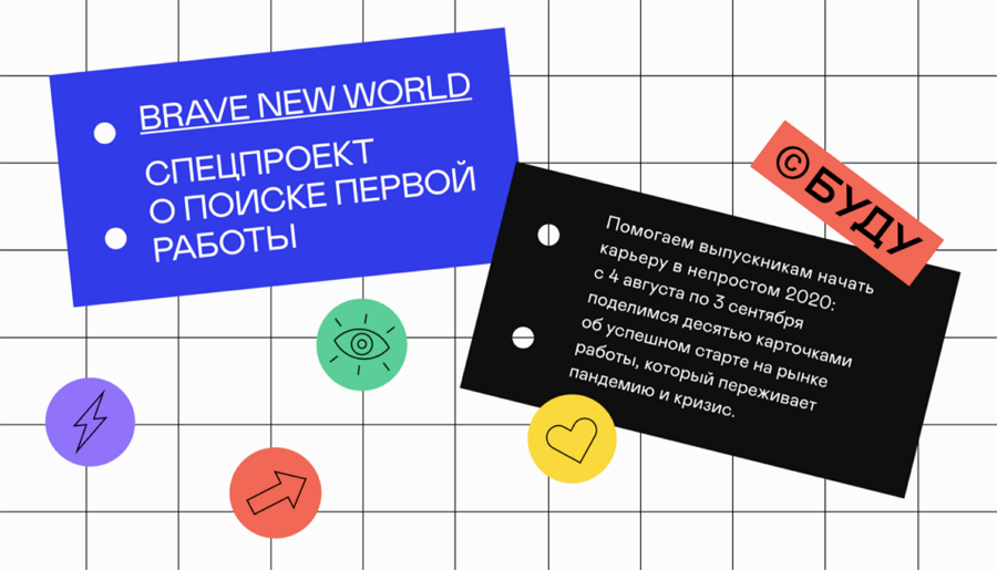
Brave New Word is one of the great website design examples made by Andy Karter. Its home page features a fresh noticeboard-like design. All important content is presented with colorful sticky notes. The bright colors contrast with the white background, highlighting the content.
A good example that you should check to learn how to use color contrasts to improve your website.
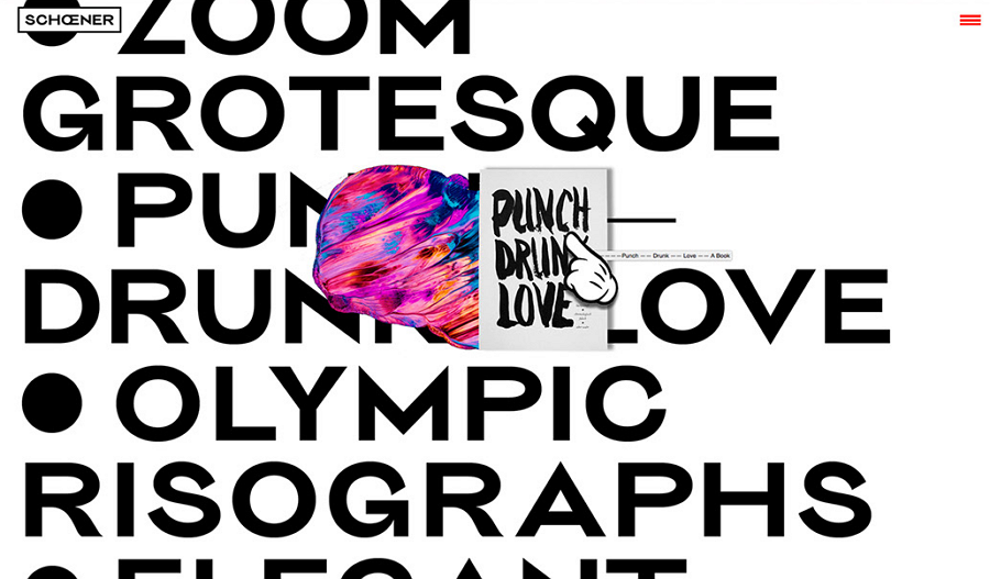
Schoener is a design studio website with a brutalist appearance. Apart from the typical large-sized typography, this website features rich hover effects and a storytelling design style. When you are scrolling down the website, you will trigger a series of interesting micro-interactions and also cannot help following its guide to scroll down to the end of the page.
The changing big mouse cursor, funny gif images and fresh preview images create a very immersive experience to scroll up and down there.
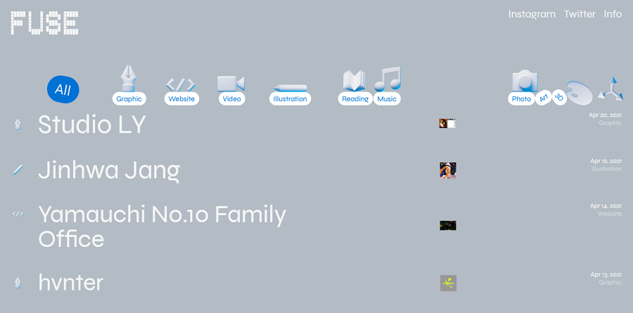
Fuse is a wonderful blog that shares creative references and digital entertainment regularly. Its home page is also designed in a fun brutalist style. Its page has been divided into rows that showcase great design projects separately. Hovering over the row, the project preview will also show up. The top tag bar is also interactive. You can easily drag and drop the tag "ball" to hit others, just like playing bowling.
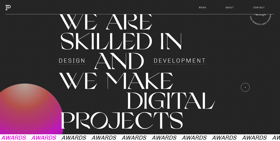
Patrick David is a creative website or mobile app design studio. The online website of this design studio also uses the brutalism design style. The large font size, changing background and always rotating banner helps grab the users' eyes easily.
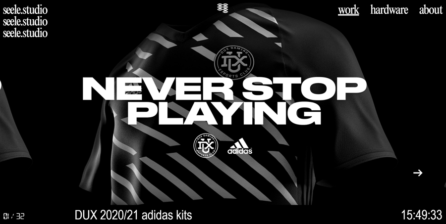
Seele Studio's online website features a horizonal scrolling. Its web pages also use large typography, "geeky" gif images and interactions, and short word introductions to give users a brutalist feeling.
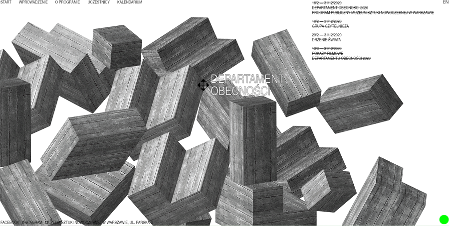
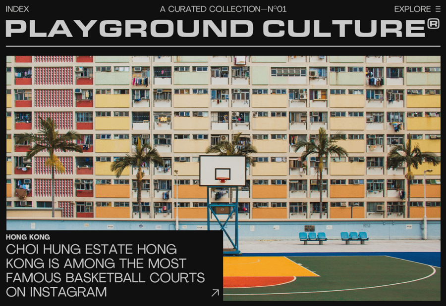
Department Artmuseum is a brutalism website created by arsaw’s Museum of Modern Art. It features an interactive home page, allowing you freely move the cement blocks as you wish.
When browsing different sections of this website, these cement blocks also rotate on the screen to block your viewing in a fun way. The rich micro-interactions scattered everywhere improve user experience effectively.
Amazonnaws is a brutalism website made for an online shop. All products, and introduction words seem to be dispersedly floating on the screen, moving and rotating, creating a very impressive visual effect. The model gifs also slide in or out on the background.
This is a good website example for you to learn how to create a great visual impact.
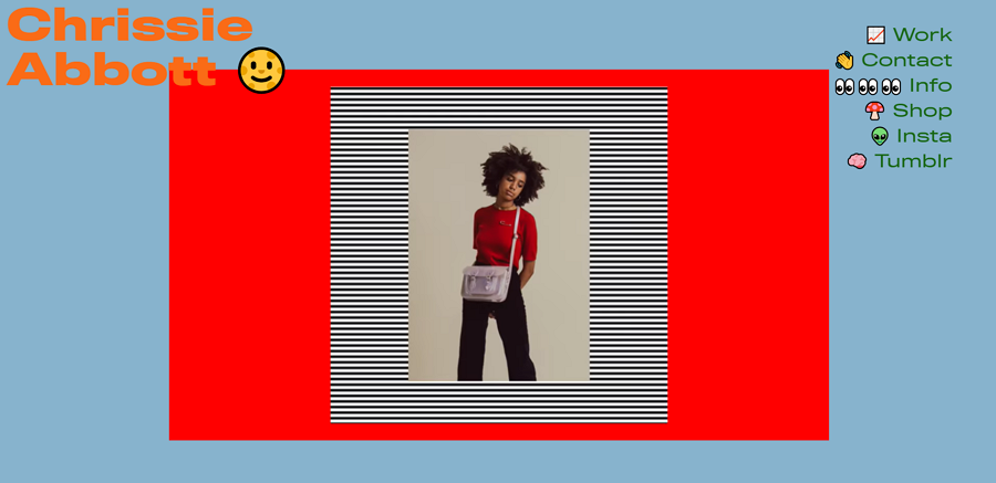
Chrissie Abbott is a designer and art director from London. The home page of her portfolio website is designed with a fun rocking tone - everything is shaking in a regular beat. This website is also a good example of how to highlight design works with stronge color contrasts.
Lazyeyes is a creative online website created for a professional design studio. Its home page uses simple grids to present all project images directly. Without a traditional navigation system, this website uses a simple bar to guide users to navigate around with the arrow keyboards of your computer or laptop.

Music Store is made for selling albums online. Its home page lists all music albums with fun images, transitions, scrolling effects and others. If you are planning to create a brutalism website, go check this one. You will get inspired.
Jack Wild is a digital designer and web developer from Berlin. The home page of his portfolio website uses words only to list different project and page content. However, while scrolling down the web page, the mouse cursor will change into a bomb. Click on the screen, the bomb will explode instantly and texts around will also escape.
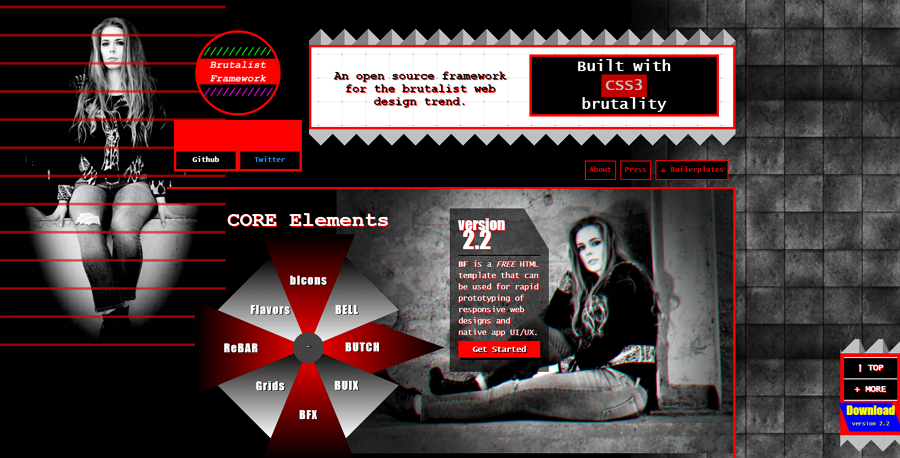
This open-source responsive HTML framework template is a perfect example of how a personal or portfolio website stands out from the rest even without clear navigation and hierarchy. Instead of the common navigation bars or menus, the home page embodies a polygon turntable to help users switch between different page sections.
A good free template for developers or engineers to create a distinctive portfolio website.
Breton is a creative website template package that contains multiple brutalist home page options. The dart and light mode options, unique layouts, rich animations full-screen presentations and far more features make it a perfect template for you to create a better design studio or personal website.
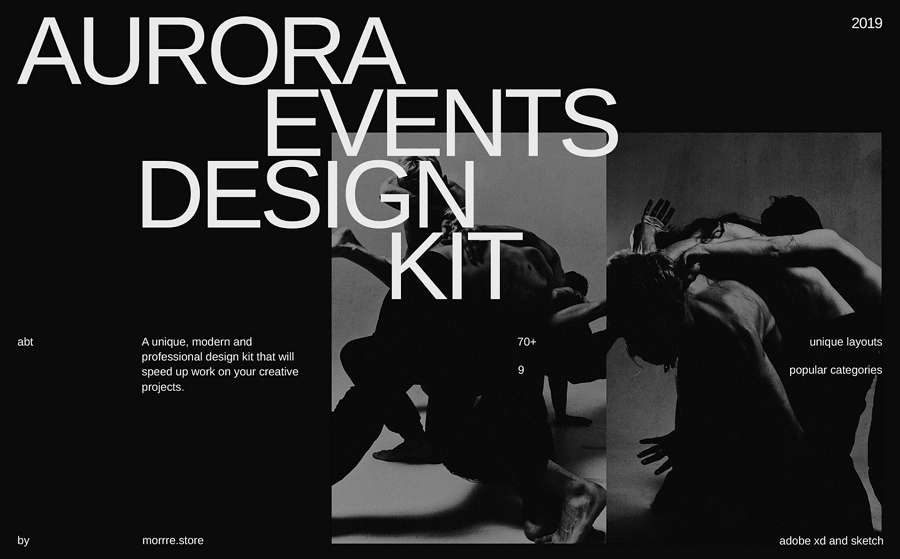
Aurora is a unique, modern and professional design kit that can help you create a brilliant brutalism website with ease. It provides 7 unique screens, 12 grid systems and high-quality components. All layers are well-organized to match your design needs.
This website design template connects a series of brutalist web design concepts. All design pages are decorated with special-sized fonts, colorful images and far more brutalist elements. Even though there is no any download link, you can still contact the designers if you are interested.
Trend Monster from Dribbble is a cool black and white website with brutalist elements. You can freely download the JPG version if you are interested.
Brutalism website design becomes very popular these days. We hope this simple guide helps you find clues to make your website design stand out from the rest easily.
 Mockplus RP
A free prototyping tool to create wireframes or interactive prototypes in minutes.
 Mockplus DT
A free UI design tool to design, animate, collaborate and handoff right in the browser.


 Sign up with Google