Mobile navigation designs come in various visual patterns offering users fast solutions to help them do and find what they want. Navigation serves as a bridge between the users and the app, helping them better interact with one another.
There are a wide variety of navigation layouts and each has its own pros and cons, with each type arousing different user reactions and emotions.
To help designers select the right navigation pattern for their smartphones, iPad, tablet, or other mobile app projects, we've compiled this guide on mobile navigation.
This guide will go over an introduction to mobile navigation, along with the 6 most popular mobile navigation patterns you will see. Then we will go over how to choose the right layout for your project, before showing you some of the best examples and templates.
Table of Contents
What is the mobile navigation
The challenge of mobile navigation
6 basic mobile navigation patterns
How to create a mobile navigation menu
Best mobile app navigation examples
Mobile navigation refers to an app’s elements that help users jump from section to section. This incorporates mobile navigation for users to easily find what they want. This helps you guide the user around the app with important buttons representing areas you want your users to go to.
Choosing the best mobile navigation for your app is an indispensable area of your app that helps deliver a high-quality user experience.
When designing navigation menus for websites and desktop apps, designers leave plenty of space for expanding the navigation options, listing search results, and using sliders or scroll bars around the page.
Designing for mobile apps is completely different. With a smaller screen, how to make all navigational options accessible and discoverable with limited screen space is one of the largest challenges a designer can face when designing navigation around an app.
Different mobile navigation layouts can bring different effects on the user and app. Let’s learn the top 6 layouts you should try in your future projects.
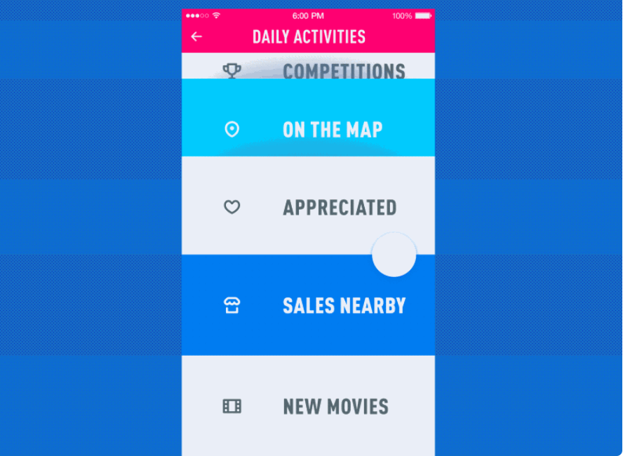
The top/bottom navigation bar is inherited from desktop design.
Navigation bars on websites or desktop apps stretch along the top section of the app interface to present shortcuts to main pages and important features. But on mobile, this has evolved into a simplified icon bar, with large icons making it obvious which icon represents what.
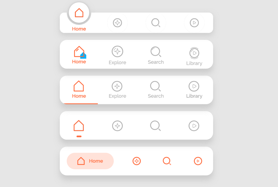
To help users better understand the options, some designers also add a simple text label below the icon button to explain the option.
Designers vary the number of buttons from three to five of the most important areas or categories of the app. This is then placed at the top or bottom of the screen and is often visible even when accessing deeper pages within the app.
The tab bar just looks like the navigation bar, but is always visible on the screen, even when users scroll up and down the app interface.
The simplified design is easy to understand for users.
The top or bottom location makes it easy to discover and navigate for users.
The sticky tab bar also makes it easy to be found even when scrolling.
Users can navigate only with their thumbs on a bottom tab bar.
The top navigation or tab bar seems to take more golden space on the top of the app.
With a 5 button limit, if there are too many options, you can’t fit them all into one tab bar.
This pattern is a good solution for mobile apps that have only 3 to 5 main categories or navigational options from the home page.
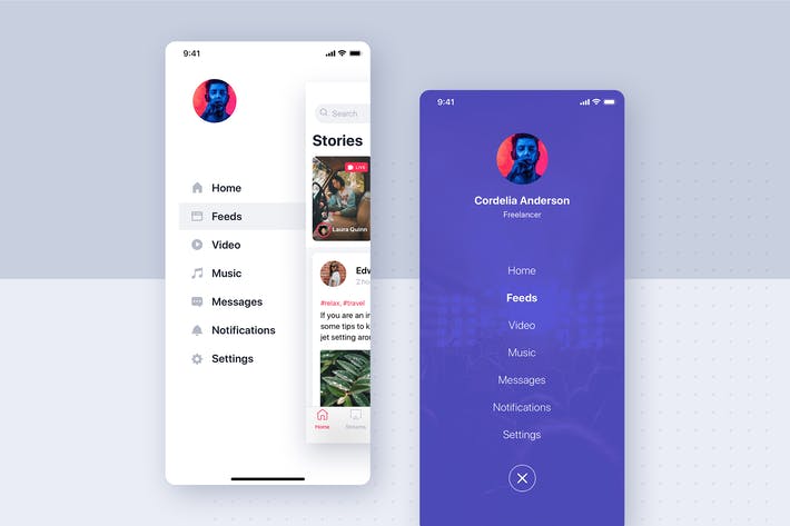
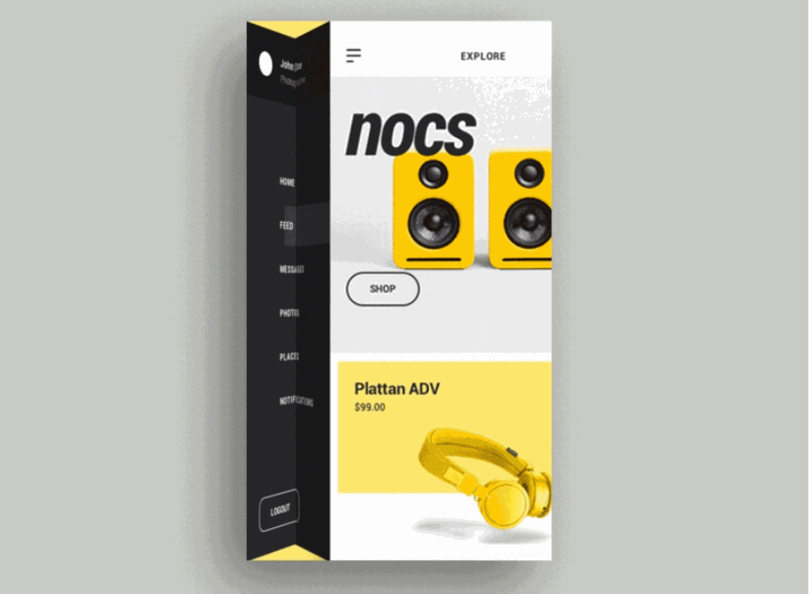
Sidebar navigation menus are also popular choices for designers who want to place icons with a title on the page, or if they want to place more categories than allowed on other navigation bars. Designers often place the sidebar on the left side and keep the titles simplified to not take up all of the space on the main page, keep
The vertical design direction makes it easy to fit on different mobile device screens.
The vertical sidebar is easy to notice.
The sidebar occupies lots of valuable screen space.
The sidebar may distract users when containing too many options.
The sidebar often requires more operations to find the right page content and can frustrate the user.
This layout is ideal when you need to create a mobile version for your web or desktop project. It also helps create a different navigation experience for app users.
Create an expandable sidebar
To decrease the negative impact of the sidebar, you can try to design an expandable sidebar. In most cases, the initial sidebar is only a simple icon bar. However, when users hover over or press an icon, the sidebar will be extended out fully showcasing all options in full.
To get more space to present the important page content, some designers craft an expandable sidebar to deliver a better user experience. Users can hover over the vertical icon bar or perform another action to expand the full version of the sidebar.
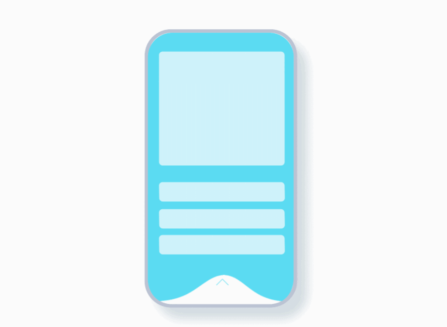
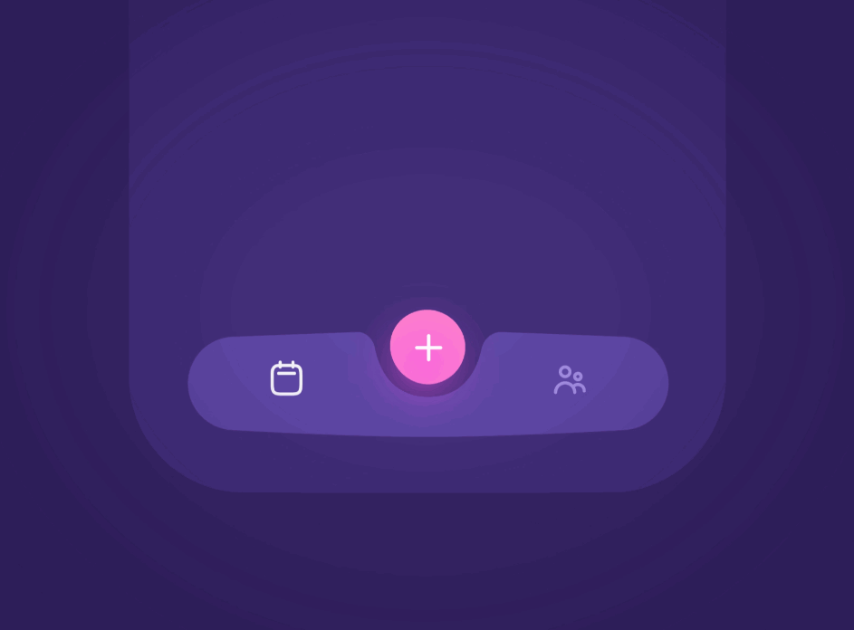
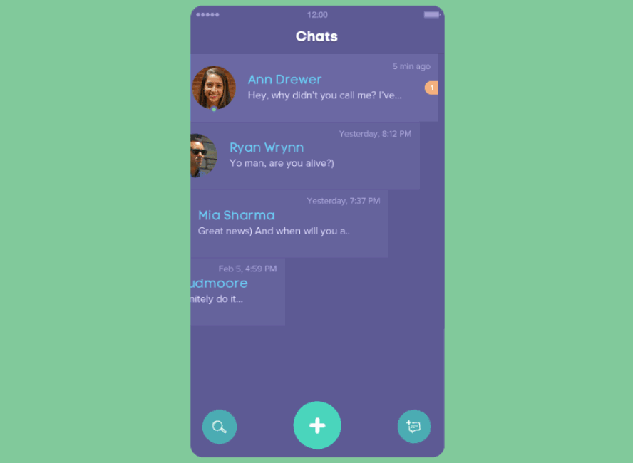
Floating navigation buttons (also called Floating Action Button) were popularized in Google’s Material Design platform and have become a great way to hide all navigation options under one floating button. When the user presses the button, the full version will expand out, with only icons or icons and text. This is great for mobile users as it minimizes any space taken up by the navigation menu.
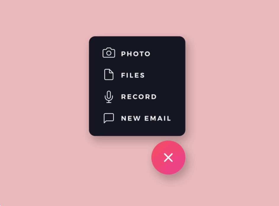
Takes up much less space than the other layouts
The sticky position is easy for users to access wherever they are.
Effective to help make important content stand out.
Not very good when used to show too many navigational contents since the expanded full version may block the UI content below.
The floating position sometimes also distracts users.
Since the FAB is not very good at presenting too many navigation links, it is better to be used as an assistant to provide the most important or the most widely-used navigation options.
In other words, it is best used when trying to guide users to navigate through the app, in addition to the FAB, you may have to craft another top or bottom navigation bar as well.
Use icons to represent the expanded navigation options
When designing a FAB, designers often use icons to showcase all navigation options to simplify the navigation design.
Since the expanded full version may block the UI content below, designers are also recommended to use simple icon buttons to showcase all navigation options, vertically or horizontally.
Block the navigation content away from the UI content
Oppositely, you can also try to add a different background color or a mask to the navigation to block it away from the UI content below.
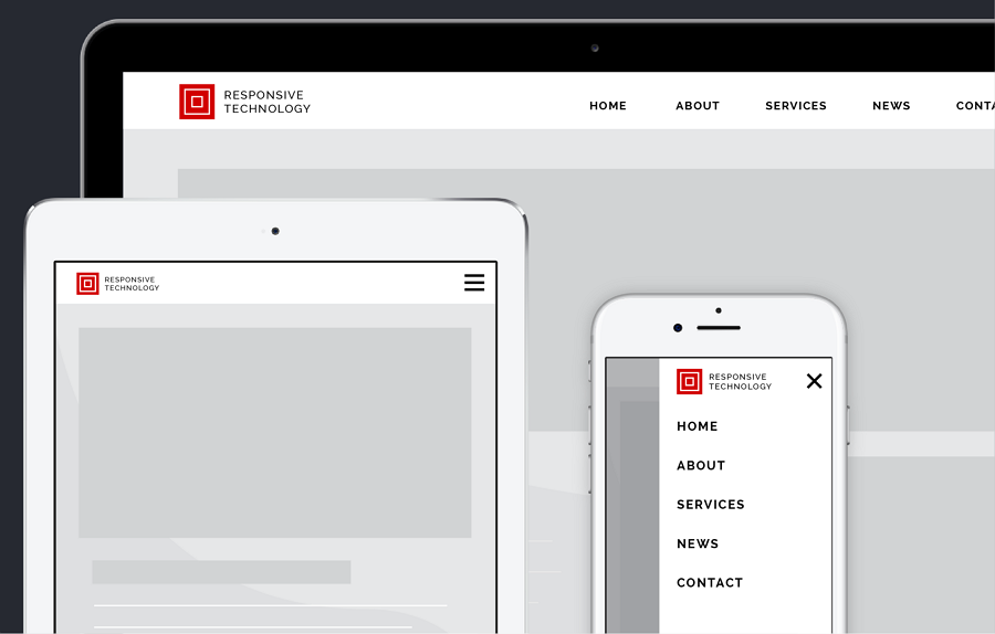
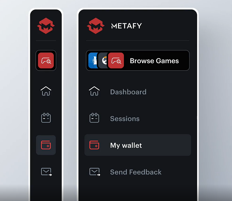
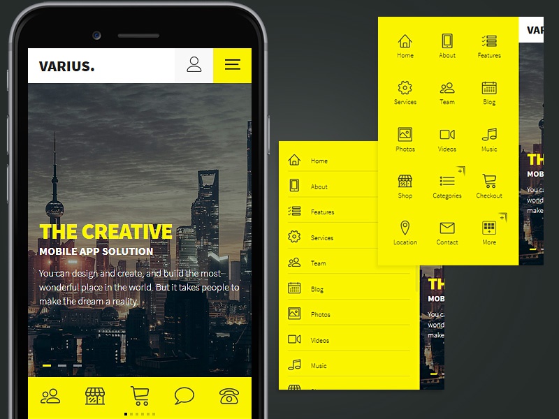
This menu pattern, also called a side navigation drawer, uses an icon or logo to hide all navigation options. When users tap on the button, the navigation drawer slides out, showing all categories and options as needed.
Unlike a FAB, however, the hamburger menu is fixed in its position (usually in the top left of a page), and gradually disappears when the user scrolls down the app.
Easy to contain lots of navigational information in one space, hidden neatly away until the user needs it.
Occupies as little screen space as the floating navigation button does.
Due to its small size, it might be difficult for users to find.
This navigation pattern is perfect for content-heavy mobile apps.
Create a clear visual hierarchy for the navigation options
If you choose this pattern to present a large number of navigation options, you should use different font sizes, styles, and colors to create a clear visual hierarchy. Submenus are good tools to help you out. Just make the important categories or options more noticeable and accessible.
No matter what patterns you choose, always create a clear visual hierarchy.
Add a different transition to enrich the user experience
Apart from customizing sliding effects, you can also add different triggers or transition animations to create a unique user experience.
All of the above navigation patterns attempt to minimize the space taken up by these navigation elements. You can go the other way and try to use large amounts of space or even a full screen for your navigational elements.
This immersive design uses the full screen to present a clear and easy-to-scan navigation hub, allowing users a fast route to their desired location.
Easy to scan, access, and discover all categories and sections.
Clear options help lead users to different navigation journeys.
Takes up too much interface space.
Users need to take several steps to find what they need.
This pattern is good for products or mobile apps that need to offer a wide variety of user journeys for the audience.
Add a button or link to help users directly go back to the home page
Different user journeys may cause troubles when users unfortunately select the wrong option on the home page. They may need far more steps to go back to the home page. So, you may add a button or link to help them go back quickly once they find they've selected the wrong one.
With Android and iOS both relying on gesture navigation now, this design is becoming more common. Users use swipes and taps to go through the app instead of classic navigation bars or menus.
Frees up more screen space
Much more natural for users to use.
Gesture navigation can be a distinctive feature of your app or product and helps immerse users into your app
New users need to first learn the gesture to get started and can be a big detractor if the learning curve is too steep.
Make your gesture as simple as possible
If you don't want to force away from the users by having complicated gesture navigation, implement the simplest and more natural gestures.
Add reminders or prompts to teach users
Like when designing a game, you should also add proper reminders and prompts to teach users in the right context. An Interactive animation or video can also make it easy for users to remember the gestures.
In fact, as mobile technologies evolve at an unprecedentedly fast speed, more innovative and high-end navigation patterns, like 3D touch and Voice navigation, are growing in popularity among designers. You should always evaluate them carefully and select the one that best suits your products and needs, if you attempt to implement the latest and greatest at the risk of usability, you will drive users away, but if implemented correctly, you can create a new unique selling point for your product or app.
After reviewing the above 6 popular mobile navigation patterns, the next step is to see how you can create a navigation menu for your mobile apps. Here are the best practices that you should follow:
Make your navigation as simple as possible
Your app’s navigation system is designed to guide users through the app and to some of your most-used features and areas of the app. Therefore users will use this navigation frequently and you want this to be as simple as possible, otherwise, it may become useless and negatively impact your UX.
Add a search box
When designing your app’s navigation, it is also recommended you add a search box due to the limits of the above-mentioned navigational elements - namely you can’t fit everything you want in them. Therefore, for easier usability, you should add a search bar for users to find what they are looking for right away.
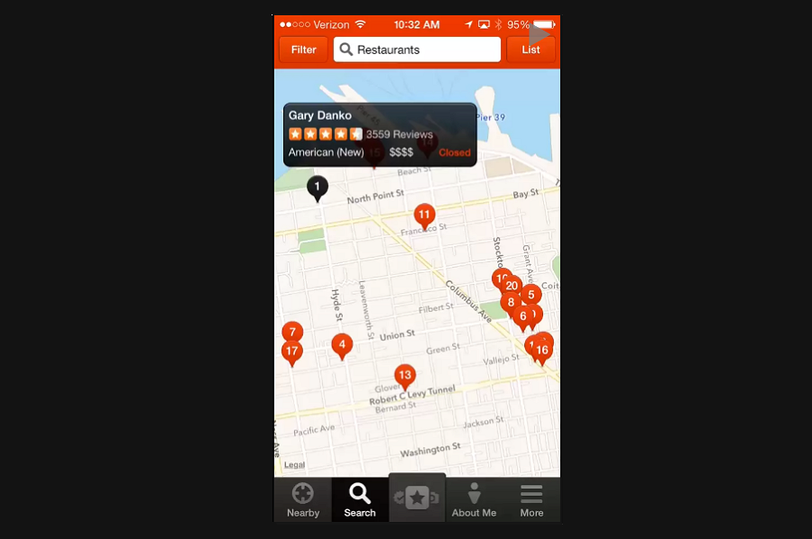
Add a searching option for users as the Yelp app does.
Combine some of these patterns together
When working on your mobile app, you can also try to incorporate two of these layouts together. For example, you can have a FAB with widely used navigation shortcuts and with a hamburger menu for important, but less frequently used links such as My Account.
Fully test your mobile navigation and app
No matter which interface you ultimately choose to use, you should always test out early on the viability and usability of such a design choice. By prototyping, you can test out your design choice in no time. A design tool like Mockplus that can help your team instantly prototype, collaborate and test on the details would be essential to help you save time and effort.
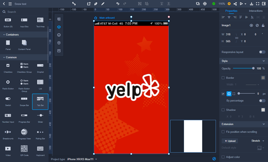 Mockplus offers Tab bars, Scope Bar, Tree, Droplist, List, and more ready-to-use components to help you visualize your mobile navigation. Creating floating navigation buttons, card UI designs, clear text visual hierarchy, and other designs are also easy on Mockplus.
To make sure your app’s navigation is as good as it can be, get real data by inviting users and stakeholders to test your app. Work on the navigation and use the data from testers to find out the best layout and refine your navigation from there.
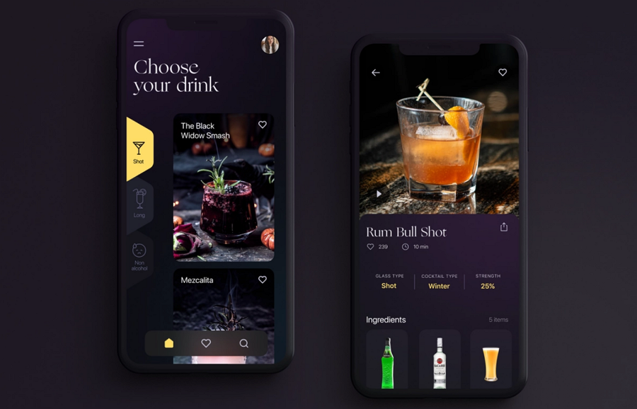
This cocktail recipes app concept creates an impressive party vibe by using a dark theme, a nice visual hierarchy with components laid out according to importance, and rich, high-quality images.
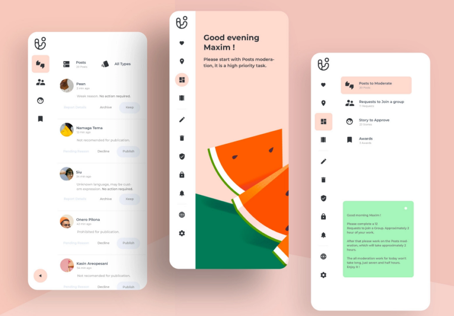
For navigation, this app uses a simplified hamburger menu in the upper left corner. There is also a navigation sidebar on the left-hand side with icons to main categories for fast access to the main recipe pages and to help show this, the selected icon is highlighted in yellow.
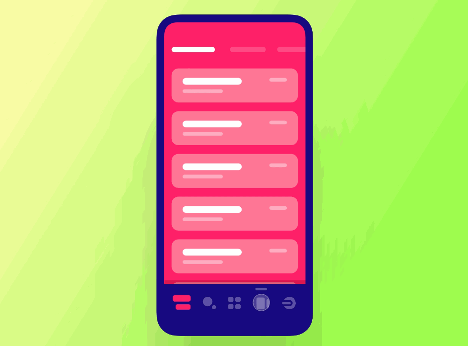
This concept design brings a new perspective to navigation by incorporating a regular bottom tab bar with a more in-depth submenu. Each main category has different submenus and can help users further refine their experience without needing to tap several times or search.
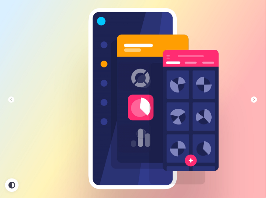
This prototype app concept features a hamburger menu with hidden double menus. This interface helps store and layout large amounts of content such as a favorites list or quick orders, for example. This helps users access large amounts of data in a quick manner.
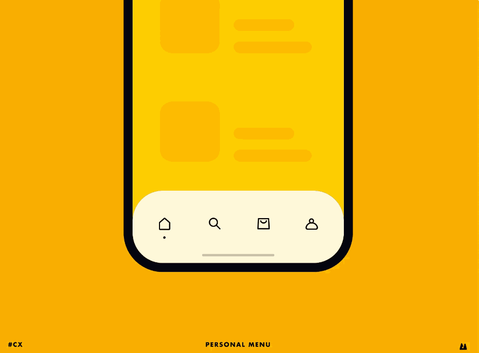
This mobile app concept brings a personalized bottom tab bar navigation menu that allows users to change the main categories based on their own preferences.
This example is another UI exploration of the icon sidebar menus. Next to vertical scrolling pages, this type of layout is perfect for a sidebar navigation menu.
When designing a common tab bar, there are ways of making your app stand out. By adding micro-interactions to your app, your animations seem natural and bring a more personalized feel to your app. This bottom bar example uses a fancy liquid effect to showcase its submenus.
An app’s content changes depending on where you are in the app. This animation shows a good example of incorporating an adaptable bottom navigation bar into an app so that every screen has the most usable shortcuts.
As this example shows, you can also try to fold your navigation menus. This both saves space as well as provides important information when opened.
This solar system mobile app features creative circular navigation, based on gestures. Users can just rotate the circular bar to the navigation between different pages. This is a neat use of an app-specific navigation menu.
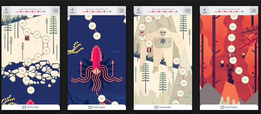
Apart from the common vertical or horizontal bar, you can also try to use linear map navigation to guide users through your app. While it takes up a full screen, this navigation interface is perfect for storytelling and games.
Baymard navigation menus - this website lists a wide range of mobile navigation design examples. You can find nearly all the patterns here.
Mobile patterns - this website collects and shares inspirational design libraries for iOS and Android apps. You can search for the most creative navigation designs to get inspiration. Share your favorite ones online and keep discovering creative navigation menus.
CSS mobile menus - 16 mobile menu demos are shared here, including circle menus, sidebar menus, sliding menus, and many more types.
 Mockplus RP
A free prototyping tool to create wireframes or interactive prototypes in minutes.
 Mockplus DT
A free UI design tool to design, animate, collaborate and handoff right in the browser.


 Sign up with Google
 Join our Discord community
 support@mockplusapp.com