Split-screen layouts divide the screen into two or more vertical parts, giving designers a good approach to showcase two or more products, messages or primary screen focuses on one screen successfully.
If you want to create a split-screen website, here is a collection of 30 split-screen website design examples and templates to help you better create those websites. We'll also share some practical design tips while introducing the examples.
In website design, a split-screen layout is an interface layout that has divided the home page or landing page of the website into two or more vertical parts. With this design, designers can separately present diverse content or messages on the same page. As a result, users can easily make a choice to follow different user flows in a very natural “left or right” style choice.
When promoting more than one type of service or product on a website, a split-screen layout is useful for designers.
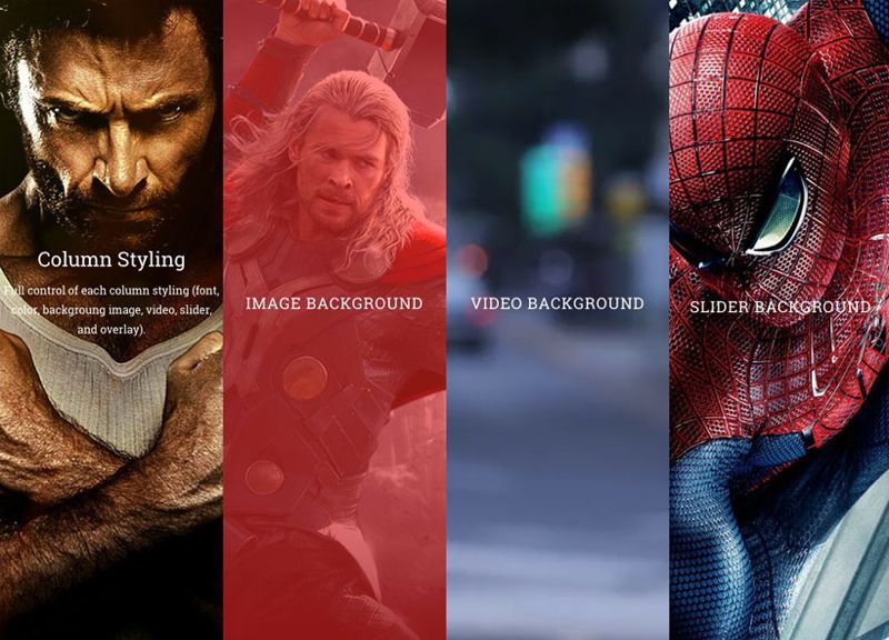
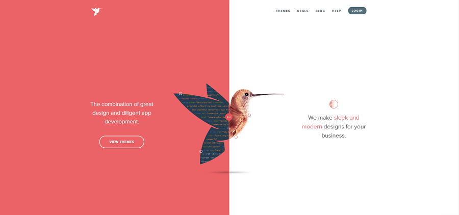
A fresh and responsive website design from the Themify developer club has split its landing page into four parts, offering four options for different target users to choose from.
Many designers use a split-screen layout in their website project because it:
lists more products and messages at once
Increased vertical columns increase the amount of space to present products and messages while keeping a solid structure.
draws the users' attention to the desired part as you wish
When using a two-column split-screen, larger screen space brings users' attention to an intriguing image or CTA button, allowing you to funnel users to the part of the website you desire.
The section with more screen space tends to grasp users' attention first.
encourages users to make a decision for better UX
When visiting a split website, users often need to first make a choice and then follow the designed guide to find what they need. No more irrelevant information can distract users as before because they are made to make a decision early on. This practice helps create a more pleasant experience for your project.
has an unconventional format and visual appeal
While most websites use the whole screen to display all products or services, the split-screen website has a more unconventional visual format, visually differentiating itself from other websites.
is a nice choice for responsive frameworks
A split-screen layout is great for creating a responsive website. Split screens can be presented differently on different computer or mobile screens and adapt more easily than a regular design. When on a mobile device, a split-screen design can stack up with several vertical parts, while on a computer the website adapts according to the device.
A split-screen website design provides more options and sometimes can distract users when it has been used incorrectly. So, you should only use split-screen layouts in the right projects:
It is good when you need to promote two or more things
When your company offers two or more products, a split layout would help first allocate the target users to different tools so that you can introduce the relevant features, pricing plans, and other information specific to the right people.
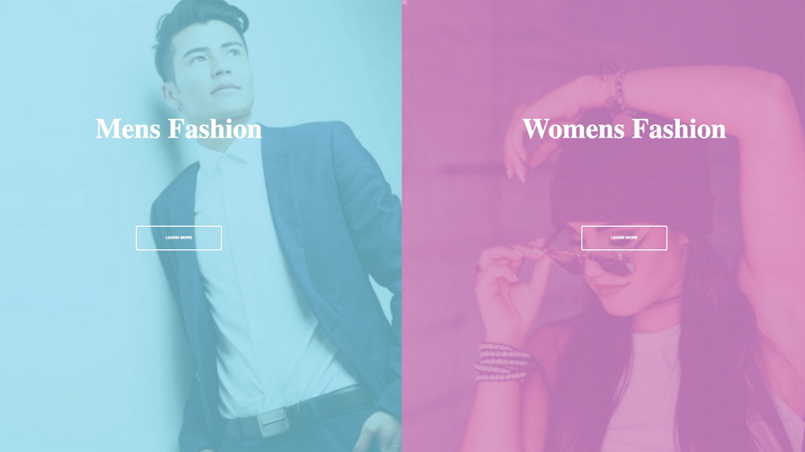
For fashion websites, a split-screen that gives options for men and women separately helps users find their desired fashion gears quickly.
It is a perfect fit for minimal website designs
Minimal website designs present content with fewer elements, having more free space to display different products or content side by side. The contrast between different columns, along with white space helps to guide users to very specific areas of the website.
Avoid using it in content-heavy projects
Let’s imagine: you enter a website and see several clustered columns with various types of content. You have to take time to find your content but become frustrated quickly because you can hardly read anything and no content is standing out.
A great tip when creating a split-screen website, you should prototype your split-screen layout and fully test it to see whether it works perfectly with your theme. A realistic web prototype can help you resolve many problems before your team devotes resources in developing everything.
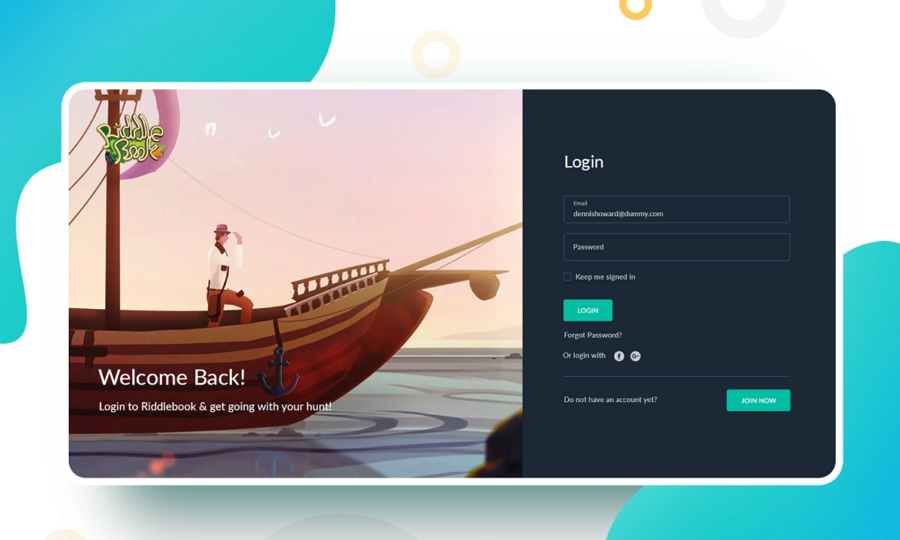
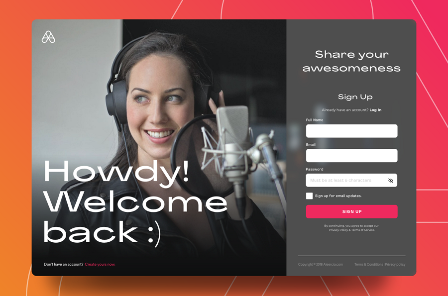
This login page for a concept game portal uses a split-screen layout featuring a beautiful illustration and a clear and neat login form. The section on the right presents a form to guide users to log in. While the section on the right uses an intriguing illustration to engage users. Both of these split screens work together to create a more pleasant and easier login experience for users than a regular single-page layout.
What can you learn from this example:
Use split layout to ease the login or signup process
Split-screen layouts are commonly used in the signin and signup page for showing off nice content from your brand in addition to creating an easy signin or signup process.
You can easily use a split-screen layout as the above example does (one section for login or sign-up forms and one section for brand-relevant images) or directly set the login and sign-up options side by side on the screen.
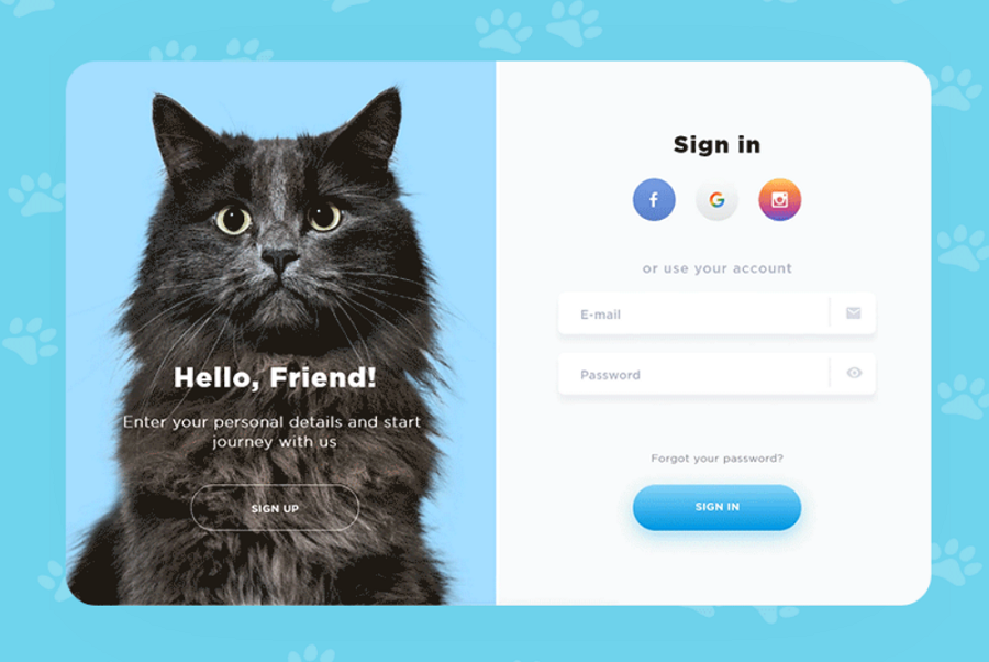
This Cats Shop Signin Signup page puts the signin and signup options side by side on the screen and adds fun animations to differentiate it from competitors.
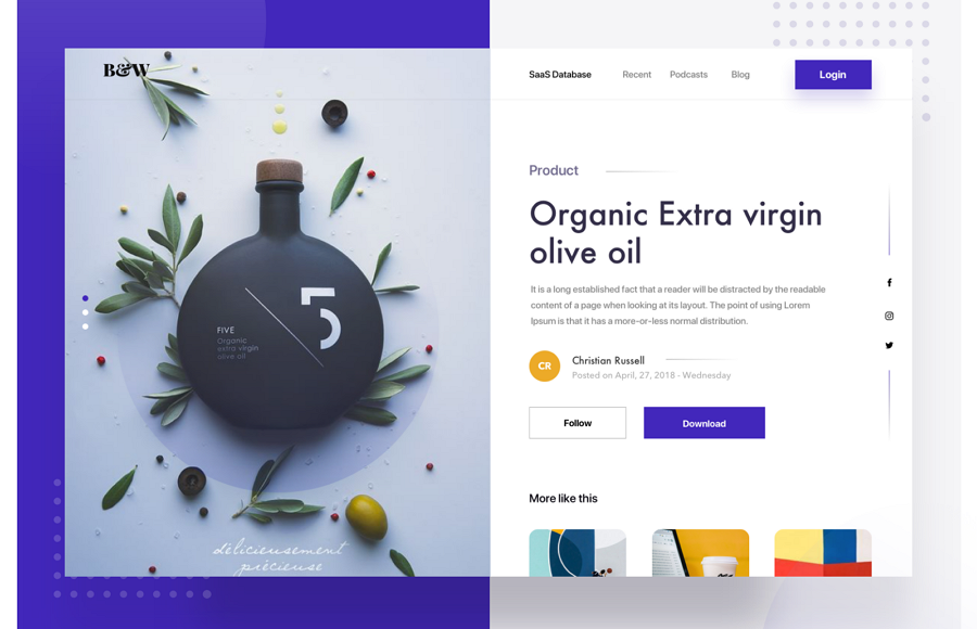
The Split Fold landing page is a perfect example of how to use a two-section split-screen layout to deliver in-depth product information on product pages.
One section has a high-quality product image and the other section displays all of the product's information. There are additional CTA buttons that encourage users to buy and check out more products.
What can you learn from this example:
Use a split-screen layout to deliver product information
This split-screen layout allows shops and brands to present product images alongside product information and CTA buttons on one screen. This encourages users to act quickly by not needing to move around the page to find additional information and purchasing buttons.
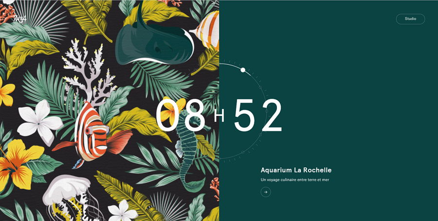
Most traditional split-screen website designs divide the screen into two near-equal sections to give both sections the same amount of importance. However, not every split-screen design is done in this way.
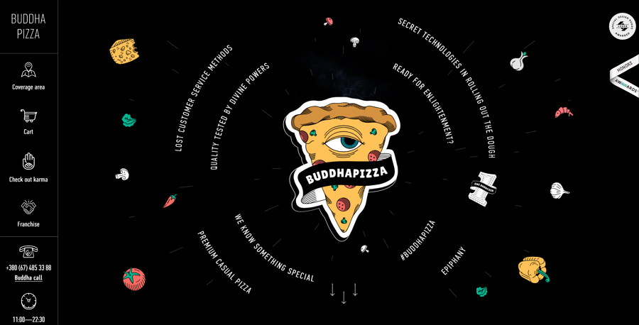
Look at Buddha Pizza. The design is based on a small column on the left-hand side for categories of food while giving the sub-categories and specific options on the right-hand side. Giving the final choice of food more prominence.
What can you learn from this example:
By using uneven sections, you can draw the users' attention to the more important content.
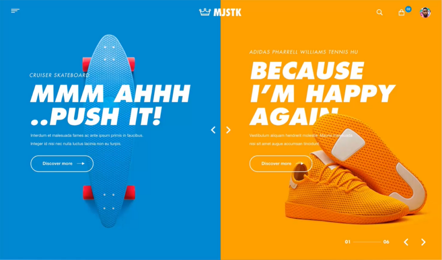
This website concept displays products with an asymmetric split-screen layout. When users hover over one section, this section automatically expands to full screen instantly for them to better view the product details. . This helps users find more information on the right section before entering that page and is extremely useful UX.
Additionally, the contrast and bright, bold color schemes also help the columns stand out on this website.
What can you learn from this example:
Add fun or intriguing interactions or animations to add uniqueness and increased usability to your website
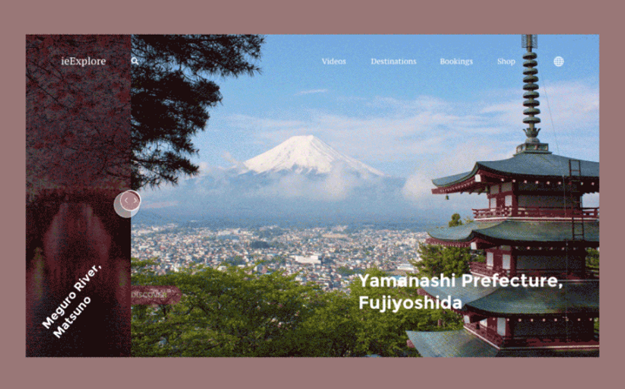
The ieExplore website shows two columns with an adjustable split-screen. If your website is content-heavy and wants to show off each column's content in a beautiful manner, try this style out.
The designers also share a brilliant animation collection here.
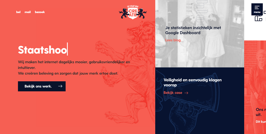
This design studio website is a great example of how you can break your screen up into more than two separate parts. The combination of different sized columns works well in creating a priority hierarchy and the inclusion of micro-interactions creates a distinctive experience on their first visit.
What can you learn from this example:
Use a grid-like layout to divide your screen into at least two parts, and use column size in addition to color to create a proper content hierarchy
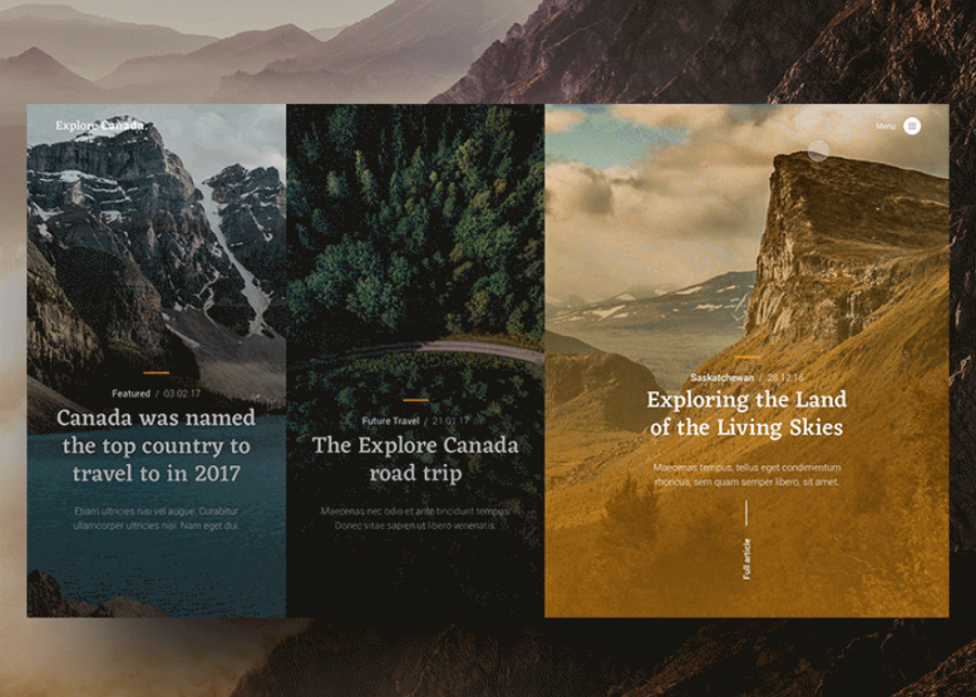
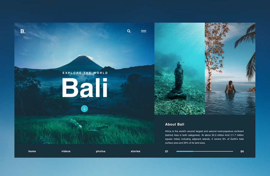
A grid-like layout is not the only solution for designers to create a split-screen website with more than two sections. This modern travel/photography blog concept uses a layered background-foreground design with three equal sections in the foreground, when hovering over a section, there is a nice animation when the section expands into the space of the other columns. The overall effectiveness of the split-screen implementation and the transitions immerse users into the website.
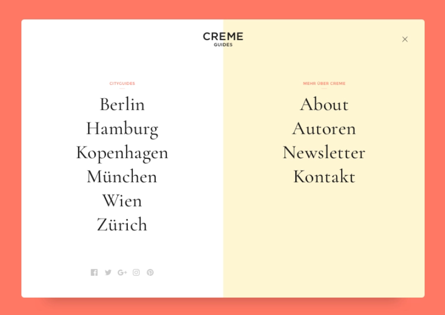
A split-screen website does not always have to "divide" the screen into two sections. Like this navigation concept, the designer uses different background colors to visually "break" the screen into two parts, creating a different visual effect to show off the two different types of content and links in each section.
What can you learn from this example:
Use different background colors or images to visually "break" the website screen to show differences in content or links
The different sections in a split-screen layout are not completely disconnected from each other. Designers should always try to make a link between the different sections, either visually linking the sections or done through content.
The design in this website design shows how you can use a split-screen design with different designs to visually connect the two together.
What can you learn from this example:
Craft a way to connect the different parts of your split screen together
For example, you can try to use a brand logo or a horizontal navigation bar that is floating in the middle of the split-screen. Or you can try to add a background image that stretches the entire screen.
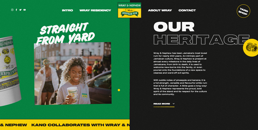
A floating brand logo visually connects the right and left sides together.
A floating bar connects the two sides together. The same video background also enhances that visual effect.
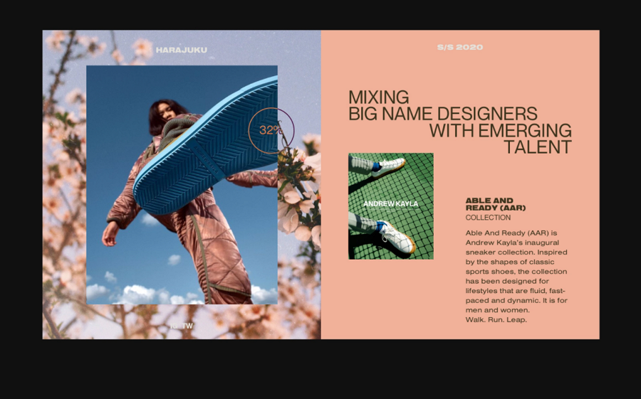
This fashion website design divides the screen into two parts and uses bold and big typography to highlight the most important content. It uses many creative elements and design ideas that you can follow to create brilliant modern fashion websites.
What can you learn from this example:
Use big and bold typography to highlight important content and mix that typography with other design elements to show off specific content
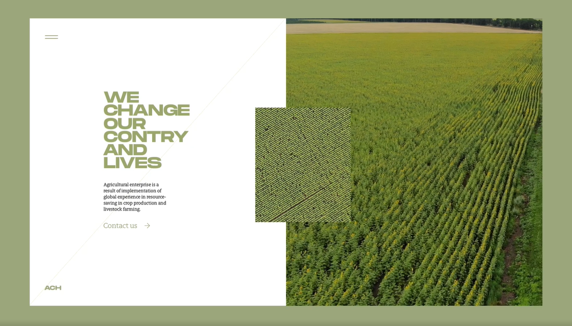
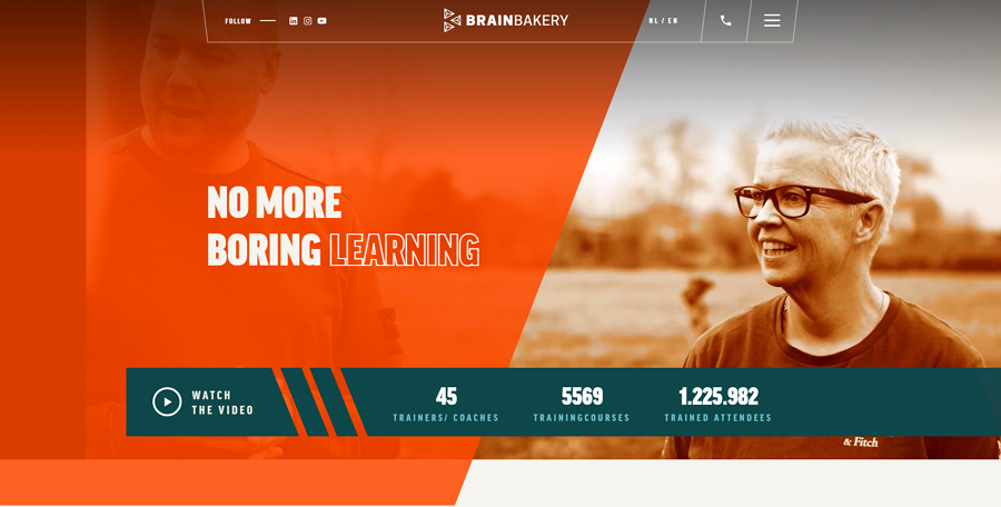
This agriculture website uses videos and fun transitions to attract visitors, showing off what field the company is in and showing off polished branding.
What can you learn from this example:
Add multimedia like audios and videos to enrich your split-screen website
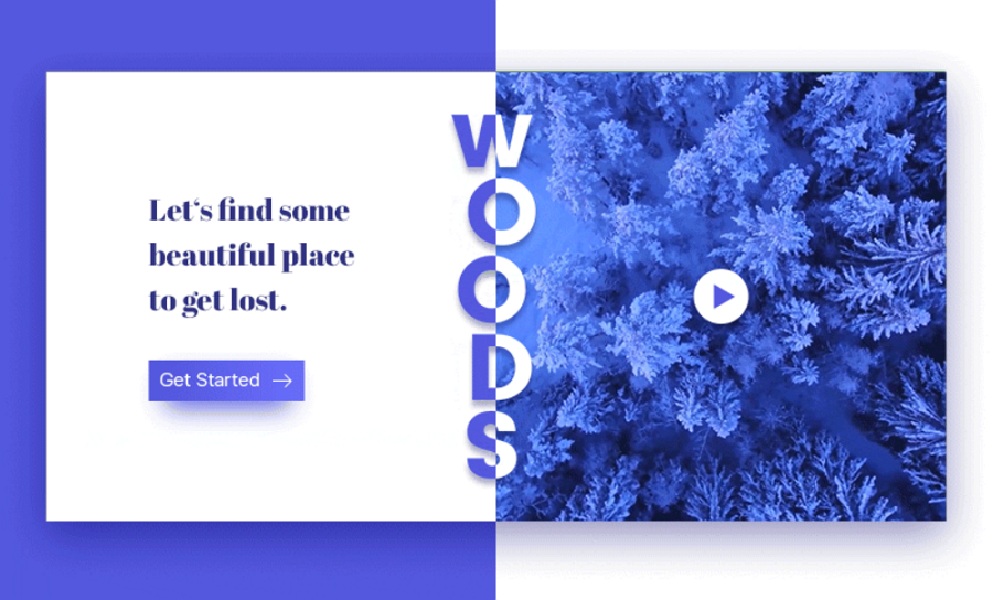
This minimal woods website also uses a video to directly show the website’s theme.
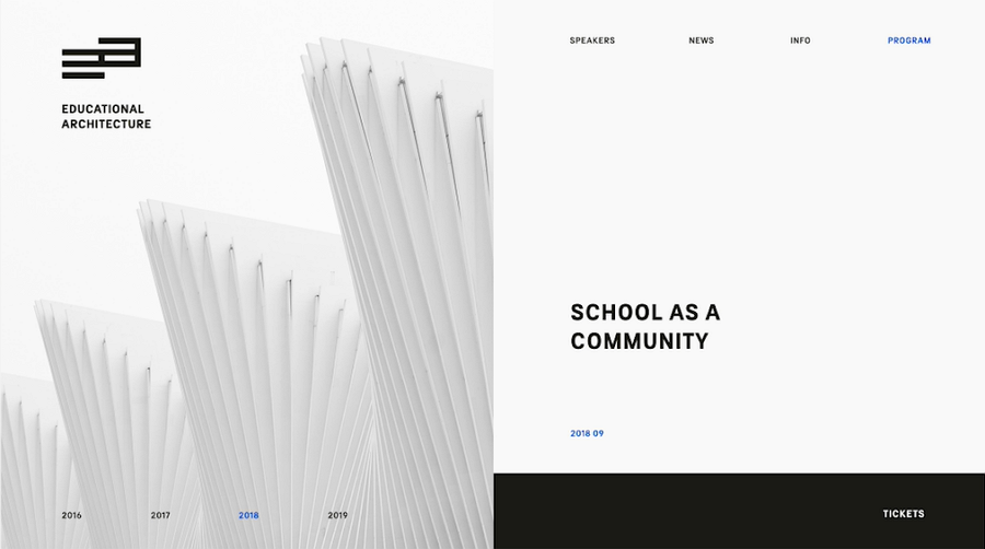
This educational architecture website uses rich transitions to present different content between the columns.
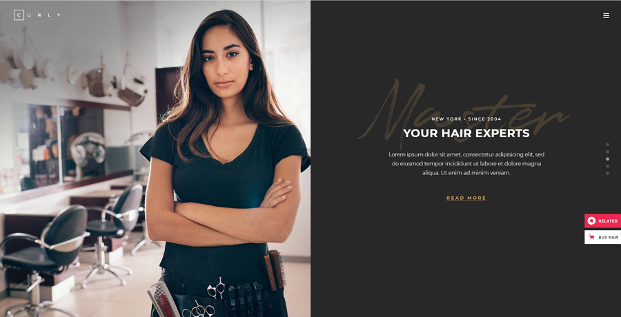
Curly Qodeinteractive is a website for hairdressers and hair salons. Its home page uses a high-quality image slider with a split screen layout to create a great visual feast for users. The creative scrolling is also worth checking out, with every new section combining an image on one side and related content on the other.
What can you learn from this example:
Try to combine an image slider with your split-screen layout, providing important content on the other column
Engine Themes is one of the most stylish examples when designers are talking about split-screen design. It uses two colors to split the screen. When users drag the dividing line, one side expands and the logo changes its appearance depending on which side you expand, intuitively changing the look of the brand depending on which column visitors look at.
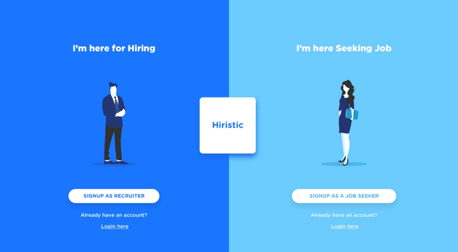
Hiristic Signup UX is a good example of how a split-screen layout can help users log in with different roles, dividing up the website easily into two distinct categories.
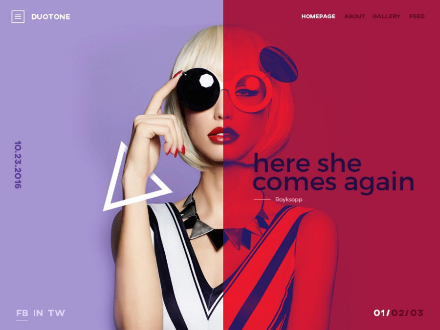
This duotine website concept shows designers how to create a "fake" split-screen by adding a colored mask and putting all extra text information and CTA buttons on the mask to guide users around.
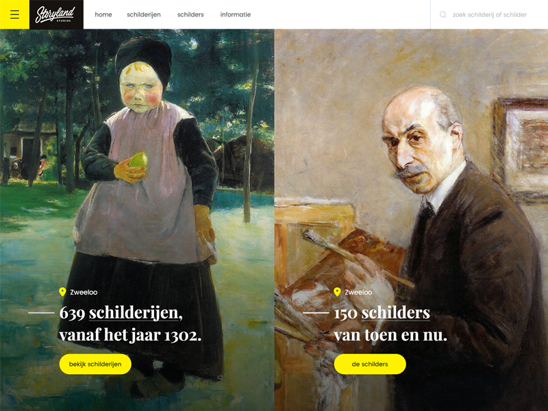
Alt: Art Site Split Screen
This concept is a great split-screen design example for art websites. The minimal design style is really inspiring and separates content simply
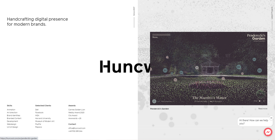
Huncwot is a minimal website for an award-winning design agency. The home page also uses a clean split-screen layout. While users scroll the mouse, only the right section will scroll up and down showcasing different design projects while the left side stays fixed offering all related links and content so that users can navigate around with ease.
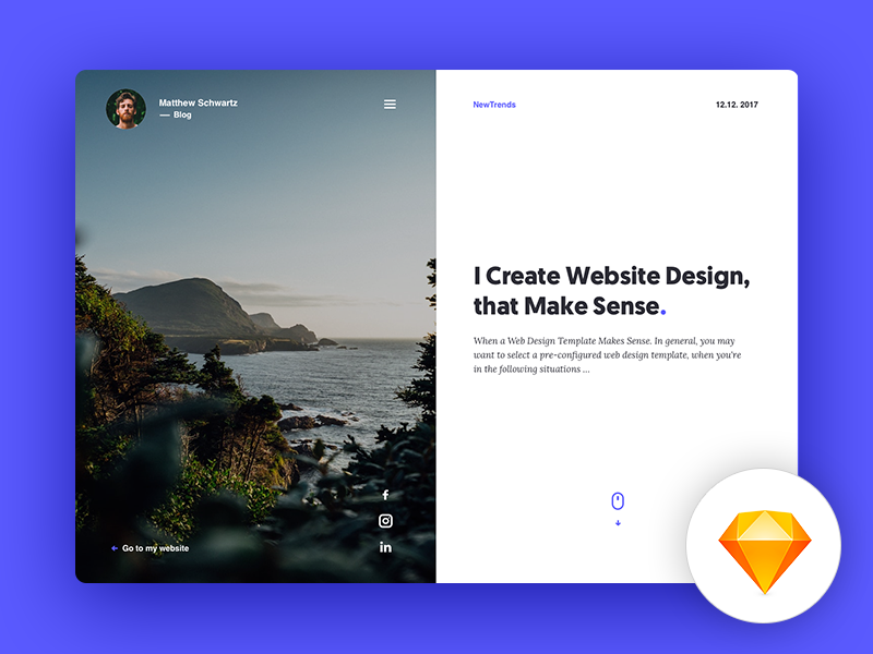
This freebie is a Sketch design template with a split-screen format. You can easily change the image and customize the texts to match your needs. A good option for blog post designs or portfolios.
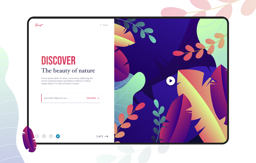
This flat split-screen design freebie has a bright appearance and allows users to upload videos or animations to present web content. You can freely open and edit it on your Sketch to personalize it to your own needs.
This free template is a typical split-screen signup and signin screen. With this template, you can create your own in Adobe XD in no time.
Price: $14
Hintio is a clean and bold HTML landing page template that offers a split-screen option. It comes with 4 home screen types and 14 ready-to-use demo variations. It is a great template to help you create your own personal portfolio or agency website.
Price: $75
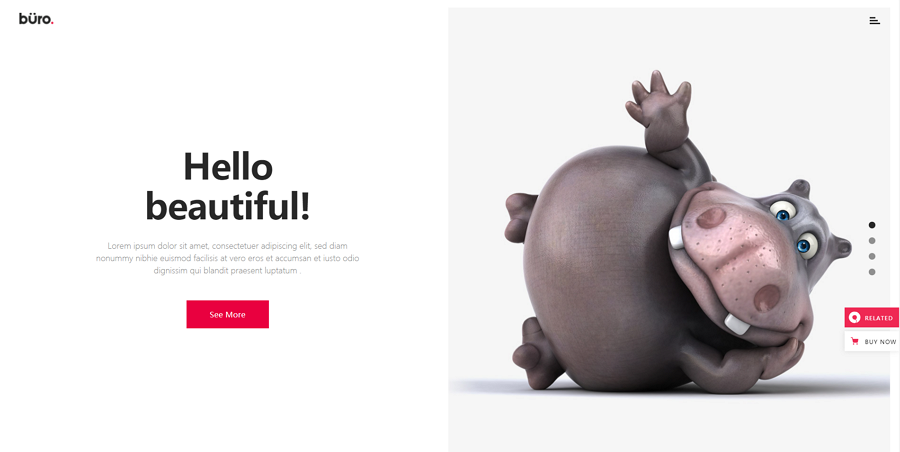
Buro is a fully customizable website template perfect for freelancers, design agencies, and studios. This template offers many page layout options, including the split-screen layout, and allows users to import content with one click, helping you quickly create your design.
Price: $75
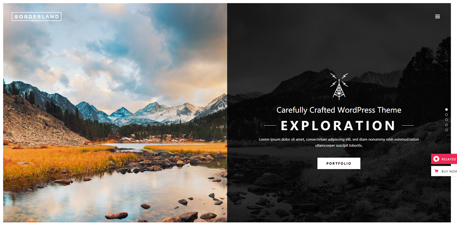
Borderland is a multipurpose website template with 12 modern demos. It offers vertical split-screen sliders, one-page layouts, and tons of customizable elements. It is a good tool for designers looking to create travel, trip or similar types of websites.
Price: $59
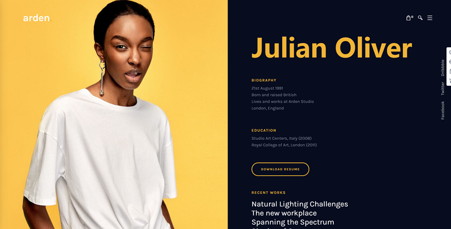
Arden is a modern business website template with a split-screen option. It offers 30 home pages, 6 layouts, 6 blog options, 17 preset header styles, and more.
Price: $59
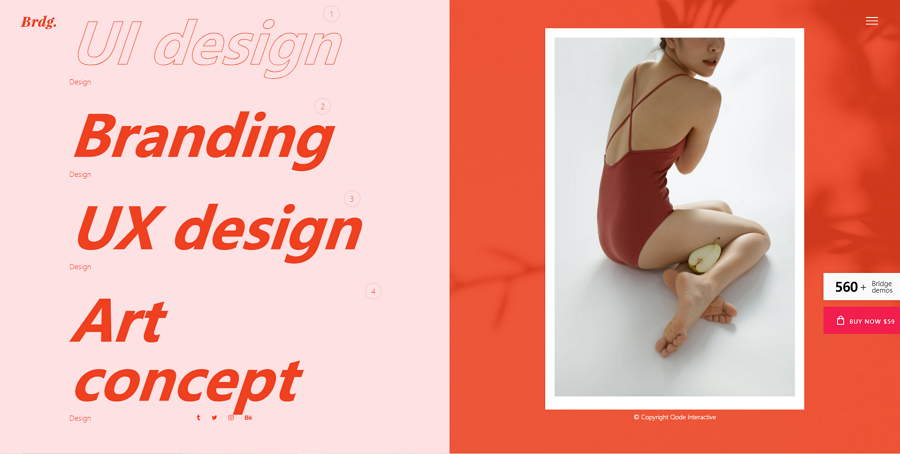
Bridge is a website template collection that offers 560 complete website demos. Many of them have a split-screen layout. This template is a good tool that can help you create different themed websites quickly with high quality split-screen layouts.
Price: $69
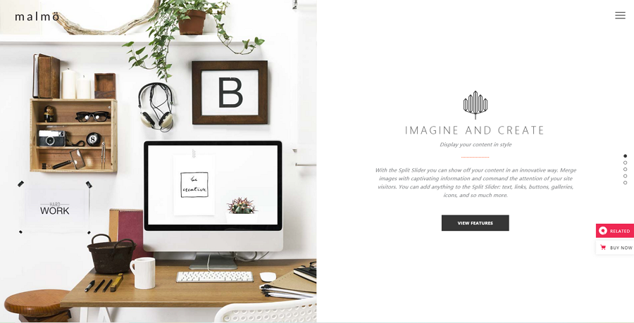
Malmo Template provides a split-screen layout option featuring attractive transition animations. It is a multipurpose website template that you should not miss out on.
Price: $49
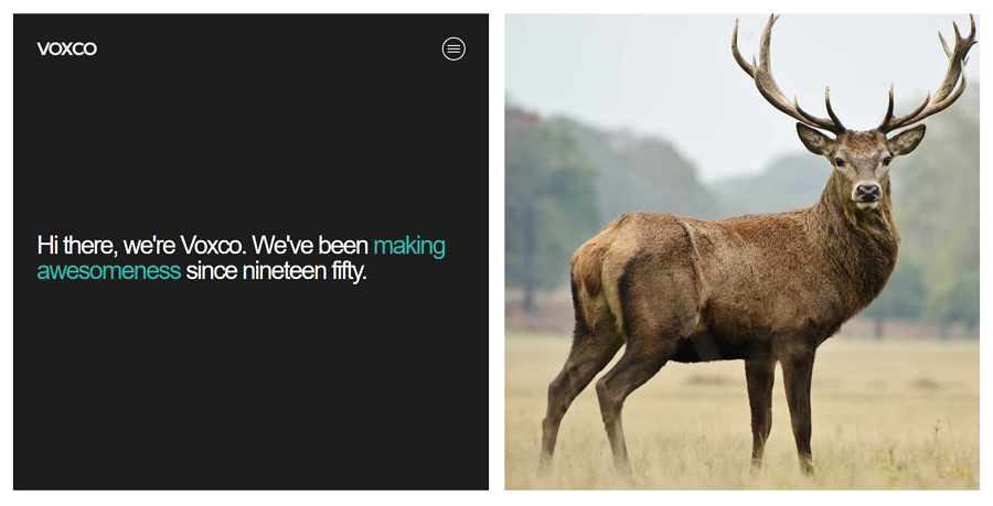
Voxco is a responsive portfolio website for designers, illustrators, photographers, and other artists. The two-section split-screen layout is perfect to showcase different design works and give them a brief introduction on the side.
A split-screen layout creates a strong visual contrast between two different columns of content or text. This helps guide users towards specific areas of your website and divides up target users accordingly. With this type of design, it is easier for designers to create a more user-friendly experience with a unique layout in mind.
There are things to avoid, ensure you test out your website and ensure your split-screen website is as useful as it can be for your users.
If you are planning to use a split layout in your web design, we hope this collection of the best examples, templates, and tips are inspiring to you.
 Mockplus RP
A free prototyping tool to create wireframes or interactive prototypes in minutes.
 Mockplus DT
A free UI design tool to design, animate, collaborate and handoff right in the browser.


 Sign up with Google