Wireframing is an integral part of the design process. When product teams build new products, they rarely start with pixel-perfect prototypes. Most of the time, they start with wireframes. Wireframes are schematic representations of future pages or screens. Wireframes communicate the structure of pages and typically serve as a foundation for visual design. Once the team validates wireframes and ensures that the design works for their users, they turn wireframes into mockups and prototypes. But the validation process often requires increasing the fidelity of wireframes.
Mid-fidelity wireframes have a higher level of realism than low-fidelity wireframes, but lower fidelity than high-fidelity wireframes. When designers create mid-fidelity wireframes, they strive to keep graphic elements to a minimum. Mid-fidelity wireframes are created using one color (gray or black), generic font, and basic shapes such as ovals and rectangles representing individual UI elements available on the page. Mid-fidelity wireframes don't use actual imagery (photos and graphics) or visual styles (such as different colors, font styles, or shadows).
At the same time, designers try to create mid-fidelity wireframes with a sense of scale (maintain proportions of individual UI elements) because it will help them to evaluate the visual hierarchy of content on the page. Visual hierarchy defines where elements should be located on the page/screen, how much space must be allocated for each element and the order in which users see the elements.
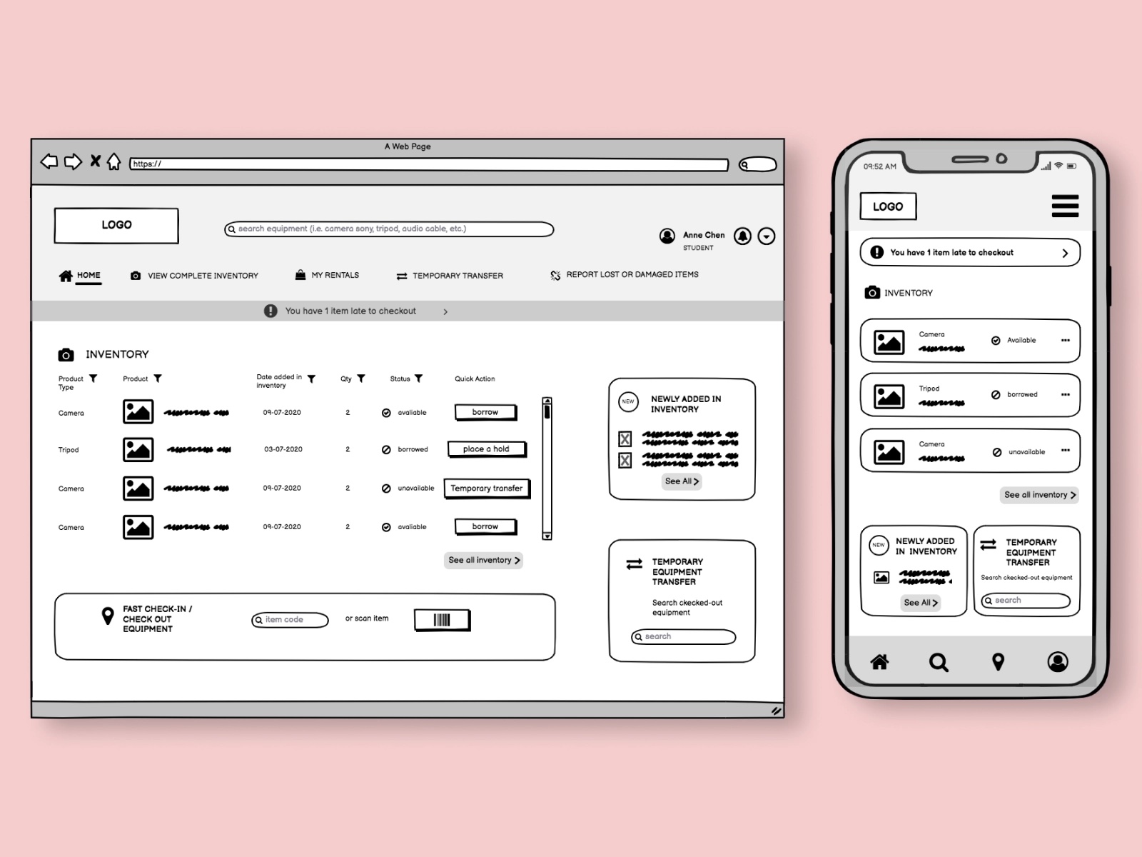
Mid-fidelity wireframe of a webpage and mobile app. Image by Ismael Lima.
Designers use mid-fidelity wireframes when they want to get a better understanding of how a design will look and work. Mid-fidelity wireframes make evaluating the visual hierarchy on individual pages easier so that designers can see if the content structure works well. It's also possible to use mid-fidelity wireframes to map a user flow, a series of screens/pages users go through to achieve a particular goal. Designers can create clickable wireframes and validate them with the target audience to ensure that it's logical. The validation also helps the team to identify areas where users can face friction.
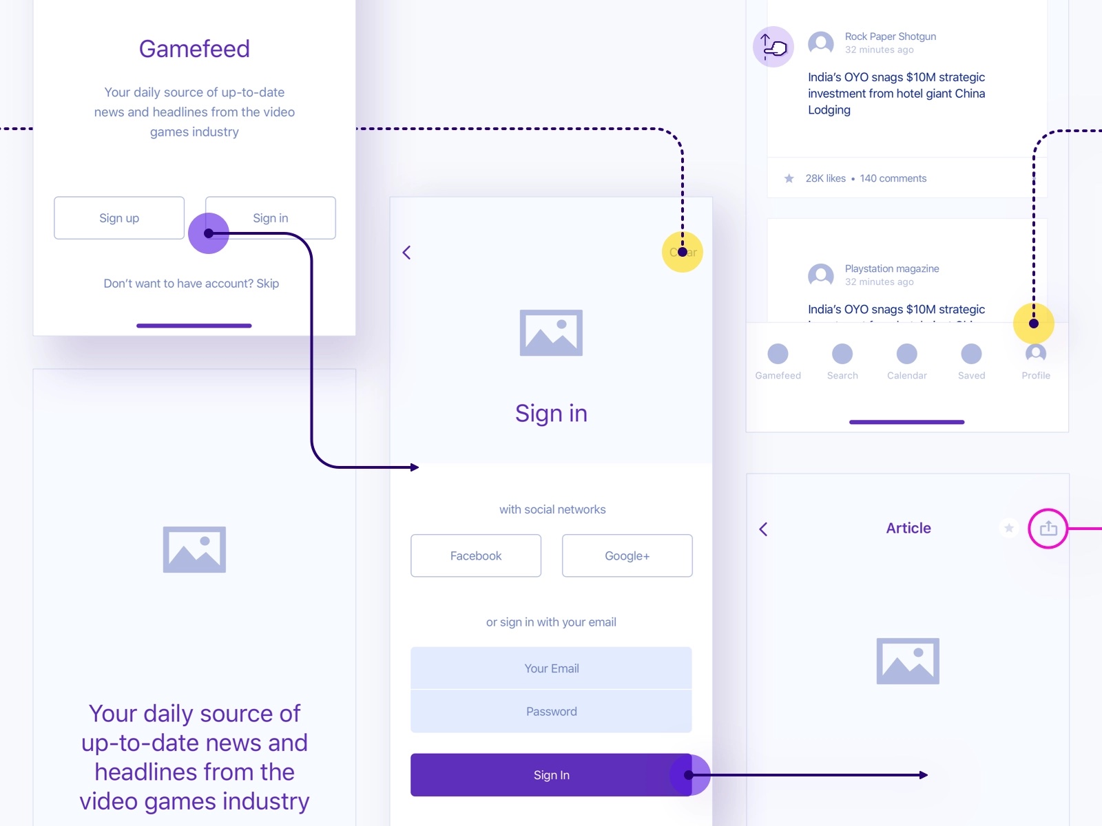
Clickable wireframes. Image by Piotr Kaźmierczak.
The fact that mid-fidelity wireframes don't look polished to viewers helps the team to collect more honest feedback about the design. People are more willing to criticize the design when they know they are criticizing the 'work in progress’ rather than the final design. But if you want to use mid-fidelity wireframes to test your design with real users, you should always invite a facilitator. A facilitator can help test participants to understand what they see on a peculiar page.
Mid-fidelity wireframes work best during the design exploration phase. They help designers to validate the design before moving to the visual design phase. Design can be validated internally (during design critique session) or externally (by inviting people who represent the target audience to usability testing). The team aims to collect valuable feedback, improve the design based on this feedback, and then move to the visual design phase (creating mockups and prototypes) with confidence that they are doing the right thing.
The great thing about mid-fidelity wireframes is that introducing a change in design doesn’t take much time. It only takes a few minutes to adjust the design of a mid-fidelity wireframe. In contrast, it can take hours to introduce the same changes in mid-fidelity mockups or prototypes.
Low-fidelity wireframes can be created either using pen & paper or digital tools. But when it comes to mid-fidelity wireframes, such design artifacts are created using a wireframe design tool. The fact that mid-fidelity wireframes are digital design artifacts gives designers a benefit—mid-fidelity wireframes can be easily shared with other people.
When it comes to the actual process of creating mid-fidelity wireframes, it's worth mentioning that there is no universal right approach for creating wireframes. That's because different projects have different needs. Yet, it's possible to share a general process that can apply to many projects:
Understand what your users will want to achieve on this page/screen. The actions that users will want to take will be relevant to the goal they want to achieve.
How does this page fit in the user flow you design? Knowing the answer to this question will help you create more natural navigation between the screens.
Think about what information users will need to achieve the goal. Remember, the more information you show on a page/screen, the more brain power it will require from users to process it. Try eliminating unnecessary information that doesn't help users achieve their goals.
Functional elements are buttons, menus, and other controls the user can interact with on this page. Choose the functional elements according to the goal that the user wants to achieve. Strive to make the page focussed. Ideally, a page should focus on one particular action.
Think of a page as a collection of blocks or containers. Each block will represent either the content section (i.e., text paragraph) or functional element (i.e., call to action button).
For mid-fidelity wireframes, you can use elements that resemble real objects. For example, you can use the "lorem ipsum" placeholder for a text paragraph and a rectangle for a call to action button.

Think about the order in which users should see individual elements (i.e. what element the user should see first, second, etc). Always try to prioritize information in a way that helps users achieve their goals and, at the same time, increase your conversion rate. For example, once the user learns specific information, they will be ready to make a decision so that you can place a call to action button that will allow them to do something.
Use different visual attributes of the object to communicate its importance. For example, you can use different font sizes for the headline and body text to make the headlines more visually prominent.
Mid-fidelity wireframes can be hard to understand for people who see them for the first time. Annotations will simplify this task. Annotations should be short and to the point. You don't need to write a paragraph of text to describe the meaning of a particular element. Strive for one or two short sentences.


 Join our Discord community
 support@mockplusapp.com