"Design is a plan for arranging elements in such a way as best to accomplish a particular purpose." - by Charles Eames, a renowned American designer, architect and filmmaker.
A great design is usually a combination of creativity and a good arrangement of elements. These elements of design are the basic tools that designers use to visualize ideas, convey brand messages, and evoke emotions. They all work just like the ingredients in a food recipe.
However, do you know what the core elements you should include to make your logo, web and app successful? For that, how can you effectively arrange them in your design work?
You may also learn more about the basic UI/UX design elements and keep using our online prototyping tool to visualize and test your design ideas that truly pop.
Design elements, simply put, are the basic components that help designers define the visuals to create effective and stunning design work. They all have an impact on whether or not your design work can guide the audience as you imagine and provide them with a better experience.
So, to help you better learn and use these design principles in your design work, we've handpicked 7 of the most widely-used elements that you should use to create your own project and bring it to another new level:
The line, as we all know, is an element that connects any two points and makes up nearly everything around us. In design, it is also the first and most basic element, helping designers compose different objects, divide up functional sections and even evoke a variety of emotions.
Lines come with different types and styles
In a design project, lines are created with different types, styles and textures to present ideas in a more intuitive and personalized way. The lines can be vertical, horizontal, diagonal and curved. Designers also use smooth, broken, thick, thin, solid or dashed lines to create a clear visual contrast. Different colors, textures and even movements also highlight important content effectively.
Different line types, straight or curved, create different design effects.
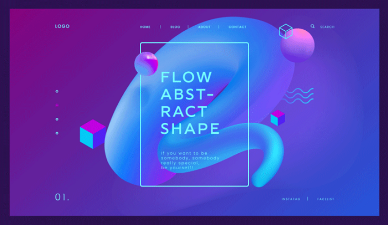
Lines help layout your design work
When working on a design project, especially a web or mobile app project, lines are used as frames to divide the content of the interface, guiding the audience to easily navigate through the interface.
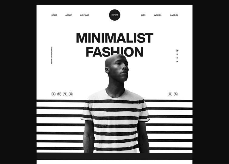
Lines convey different moods
Lines in different types and styles imply different emotions. For instance, straight lines are smooth and balanced, often conveying a sense of excitement and seriousness, while the curved lines are easy on the eyes, usually suggesting calmness and stability.
So, when choosing the line styles and types, don’t forget to consider the emotions they can bring to the audience.
The shape is a 2D element that encloses an area by lines. Everything around us is a shape shown in different ways. But for designers, shapes work more than just plain elements of design, they offer a chance for innovation.
Geometric or organic shapes
Two types of shapes are widely-used to help you create more familiar objects and visuals for your design work: geometric and organic:
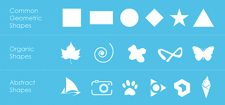
Geometric shapes are mechanical shapes that we often use in design, such as rectangles, triangles and ellipses.
Organic shapes are irregular shapes that are often complex and look like the shapes in our natural world, such as leaves, stars and animals.
Like lines, shapes can also be designed with different colors, textures and forms to convey different messages and moods. When you are using a shape in the background and give it a different color, it can work just like a color block to easily help a certain part of your design content stand out.
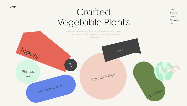
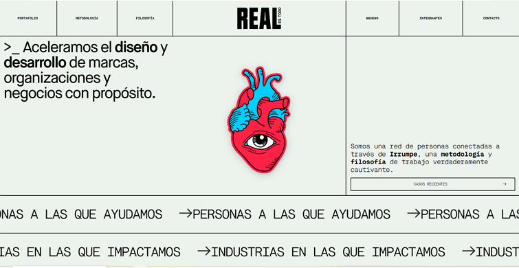
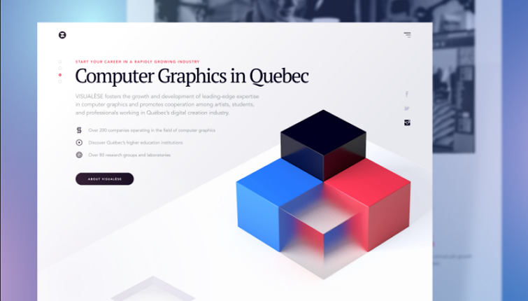
This website redesign example uses color blocks in different shapes to show the page menus to help the audience navigate through the site.
Combine shapes to customize a new object
If a single geometric or organic shape cannot meet your design needs, combine two or more shapes to customize a new one. Many design and prototyping tools like Mockplus allow you to create vector shapes and combine them together to create a new object.
Decorate your design with artistic shapes
In recent years, UI/UX designers also create aesthetic and artistic images, illustrations, components and decorations by using shapes to spice up their design work, delivering a sense of modernity and futurism.
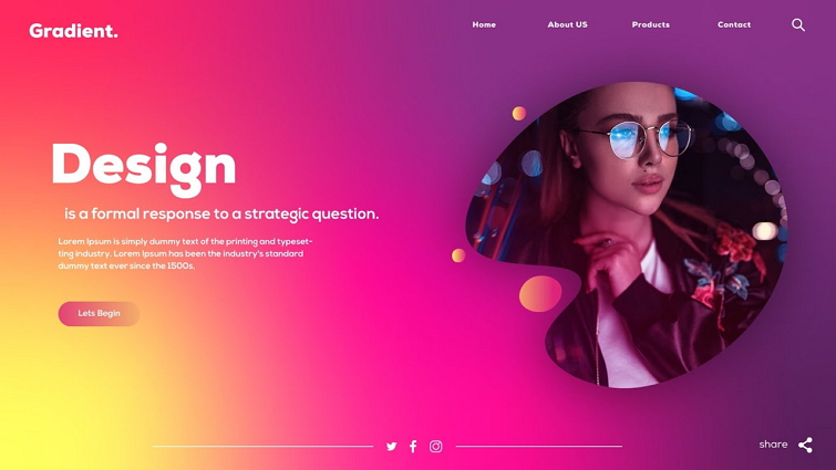
Colors, the result of light reflecting back from a design object into our eyes, is another important element you should never forget. Designers and artists usually use a color alone or as background to visually describe or emphasize a specific object, area or action in their design works.
Colors create a mood for your design
The color is regarded as one of the most challenging design elements since it can evoke specific emotions when the audience is viewing your design, affecting the first impression.
For example, red is eye-catching, making people feel passionate, optimistic and energized. Green is comfortable and refreshed, often symbolizing health and wealth, while blue is a much muted color implying calmness, relaxation, security and trust.
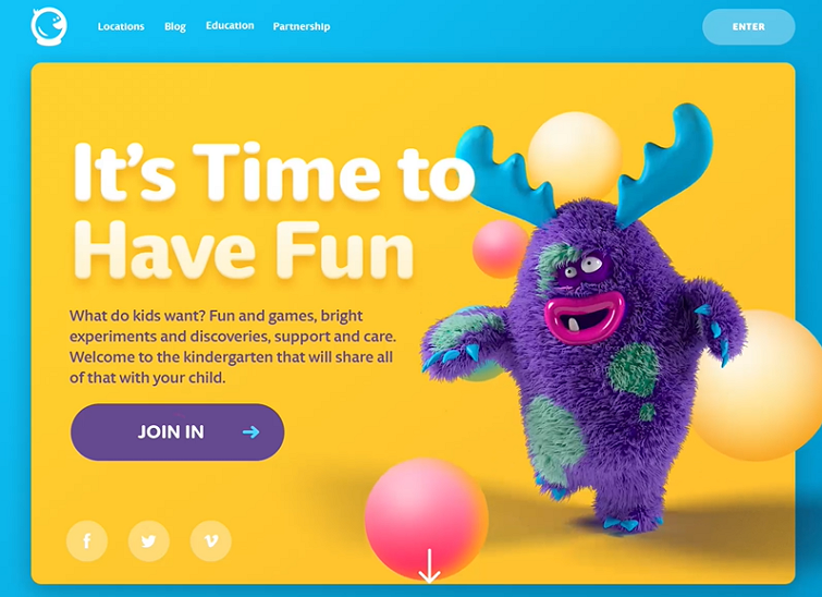
This children's website uses bright colors to engage the audience, giving an optimistic and energetic feeling.
Three color properties help define your color scheme
To create a color scheme that best suits your theme or brand, you need to first get acquainted with three properties that help you describe colors:
Hue - refers to the color in its purest form, which you can simply tell from its name, such as Red, Green or Yellow.
Saturation - talks about the intensity or purity of a color, making the color more vibrant or muted.
Value - describes the brightness of a color. When the color is combined with white, it would be much lighter, while being combined with dark, it would become much darker.
All these three properties enrich the color options of your color scheme, and also add depth to your design.
Besides, when choosing a color scheme, you should also follow these tips and use some useful color tools like a color wheel.
Ribbon and gradient colors are very trendy these days
Except for these three properties, ribbon and gradient colors are also another popular way of adding depth to your design, also becoming one of the top design trends.
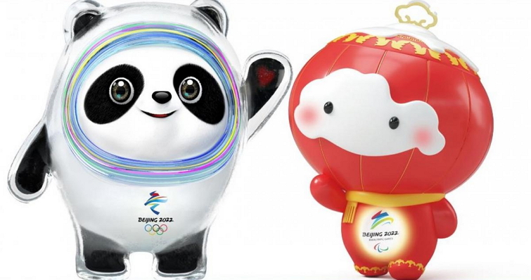
Even the popular Beijing Winter Olympics mascot - Bing Dwen Dwen - is decorated with ribbon and gradient colors on its face to present the "futuristic concepts'', making it even cuter. So, do you now understand how popular ribbon and gradient colors are in design?
Gradient colors create an impressive visual experience.
Notes:
While combining or using colors to improve your design piece, also pay attention to the different meanings of the same color in different countries and regions.
For example, in China, red often suggests luck and happiness, which is good, while, in the Middle East, red implies danger and caution, which can be a bad signal.
So, when designing a project, also take the countries and locations into consideration.
Typography, one of the most important elements of graphic, web and mobile app design, refers to the words and fonts that designers use to tell a brand story, describe a concept and convey a message in their design work. To use this element right, you should pay attention to the below tips:
Font types set a basic emotional tone for your design
Like colors, the type of fonts that you've chosen can also convey a mood, setting a basic emotional tone for your web or interface design.
For example, the well-known serif fonts like Times New Roman and Garamond signify classic, sophisticated and formal brands, better to be used in some government and high brow commercial web or designs. While sans serif fonts like Arial and Helvetica are more minimal, modern and casual, better for more social websites or designs.
The typographic hierarchy affects the readability of your design
Typography also helps create visual hierarchy when you use different fonts, colors, headlines, sizes and colors in your design. In fact, whether the audience can clearly understand what you convey through the design also depends on whether you can create a clear and easy-to-scan visual hierarchy.
Use different fonts, headings and sizes to create a clear visual hierarchy.
A fun animation or micro interaction also helps your most important words stand out.
Notes:
Do not use too many types of fonts in one single page or design. Two or three types of fonts are definitely enough to meet your design needs.
If you want to learn more about typography design, read this typography guide.
The Texture is an element used to present the physical and visual qualities of a surface or design. The physical quality, also called "Tactile texture", refers to the physical feel that a design or surface can bring to the audience, whether it is smooth, rough, beautiful or ugly. The visual texture, also referred to as the "Visual texture", refers to the imagined feel of a design or surface, whether it can echo with the audience mentally.
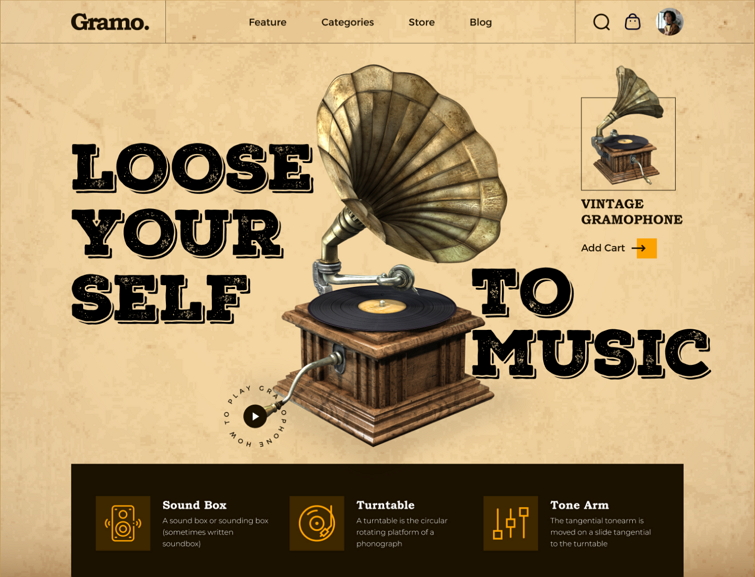
The yellow paper-like texture gives this site a vintage style, which matches perfectly with the vintage gramophone shop.
Never make your texture distract the audience
No matter if a texture belongs to the tactile or visual, it is used as an assistant to stand out your important content or create the right atmosphere for your design. So, never make your texture visually louder than the design content.
For instance, be careful not to mix too many textures or texture colors on one single surface as they can distract the audience. Also, do not choose a texture or texture color that is too close to the important content, making it hard for the audience to read the design content, ensuring contrast remains.
Space, the positive and negative space that we often talk about, refers to the area around, above, below, and behind an object in your design. The positive space indicates the area where an object is positioned, such as the space inside the image or button in your UI design, while the negative space talks about the area outside and between objects in your design, giving your design objects breathing space.
Balance the negative and positive space of your design
Designers use both negative and positive spaces to create a much clearer visual hierarchy, and also carefully balance those two to create a much better design.
For example, when designing a minimal design, the most challenging part is how to perfectly balance the negative and positive space. Why?
Just like the site below, too much negative space makes the site a little empty, so the audience may not understand what this website is about, while too much white space may make the site a bit crowded, and not easy for the audience to read the page content, both may bring a bad experience.
Form talks about the 3D space that an object occupies. It is often measured by height, width and depth, giving your design a 3D effect. Instead of adding a real 3D physical object to create a form, you can also use light and shadow to get the same visual effect on a flat surface or design.
Basic design tools you should use to design
Knowing what these basic elements are, and understanding when and how to use them correctly is the first step increating an appealing and useful design.
Helping you present your ideas as quickly as possible
Whenever any great design idea hits you, you can use any of these elements to sketch your ideas out on paper or digitally as quickly as possible.
Allowing you to better understand and evaluate others' design
When browsing or evaluating a design of others, you still can tell which part is good or bad.
Simply put, knowing and understanding the core elements of design is a basic step that you should take to create a better design.
When using these 7 basic elements to present your design ideas, you should also keep the following design principles in mind to effectively use them:
Define elements in advance for design consistency
To create a consistent brand image amongst your audience, we suggest you gather your whole team together and create a design system, discussing which elements should be included, when and how to use them in your design. A design system manager that allows your entire team to define, reuse and share elements, such as colors, components, shapes and other assets, making this process much easier.
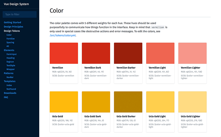
Create a design system to define the colors, components, shapes and other elements before you start to design.
Combine these design elements
All these design elements explained above can be used alone or together to enrich the visual experience. For example, when using the typography, after selecting the right font, you can also use different colors to highlight certain words or sentences to lead users to the most important part of your design. When using textures to highlight the web content, you can also add a line, shape or even color blocks to create a unique texture for your design.
Balance the contrast among elements perfectly
Whether you are using these elements alone or together, try to balance and contrast them all perfectly to highlight the most important content as well as muting the less important content. Many things should be considered, such as which element or object should be emphasized with a different color, size or animation, which part should be designed with more negative space, and which part should be hidden.
Conclusion
These are all of the 7 core design elements that you need to create your own design. Having a solid understanding of these elements and principles is only a small step forward towards the creation of an aesthetically pleasing and functional web and interface design. You should always fully test your ideas by using a prototyping tool like Mockplus and collaborate better with your team's designers, developers, product managers and even stakeholders.
 Mockplus RP
A free prototyping tool to create wireframes or interactive prototypes in minutes.
 Mockplus DT
A free UI design tool to design, animate, collaborate and handoff right in the browser.


 Sign up with Google
 Join our Discord community
 support@mockplusapp.com