Did you know that the fonts you choose can shape how users feel about your website or app within seconds? Research has shown that typography not only enhances readability but also plays a pivotal role in influencing emotions, trust, and engagement. In fact, studies have found that font choices can make a huge difference in how users perceive your brand's credibility and usability.
In this article, we dive into fonts psychology in UI/UX design—the fascinating science behind how different fonts impact user emotions and behavior. We’ll explore why fonts matter, how to choose the right ones, and share best practices to elevate your design. Plus, we’ll showcase 20 of the best website examples where creative font use takes center stage.
Whether you’re designing a personal project or working with a team, understanding font psychology is crucial. To help you get started, tools like our design and prototyping tool can help you experiment with typography choices and bring your vision to life.
Font psychology refers to the study of how different typefaces influence the way people perceive, feel, and react to written content. In simple terms, it’s about understanding how fonts silently communicate meaning—even before a single word is read.
When users land on a website or open an app, the font is one of the first things they encounter. Its shape, spacing, and style can instantly trigger emotional responses like trust, excitement, calmness, or even tension. These reactions are often subconscious, yet they influence user engagement and perception from the very first second.
This is why font psychology matters: it helps designers make deliberate, emotion-driven typography choices that align with the message and tone of the content. Whether a product is serious, playful, modern, or luxurious, the font helps set that tone visually—long before users start to interact.
Fonts influence how users interpret and trust your interface. Good font use strengthens visual hierarchy, improves scannability, and enhances the overall flow of interaction. When users “feel” that a site is credible, modern, playful, or trustworthy—it’s often the font doing much of that work.
Fonts help establish information architecture. Through size, weight, spacing, and style, designers can guide users’ attention to what matters most. A bold, large heading draws users in; a lighter, smaller body text invites them to read further.
Without clear hierarchy:
A beautiful design is useless if users can’t read it comfortably. Readability refers to how easily users can distinguish letters, scan lines of text, and comprehend content. This depends on font family, size, spacing (leading, kerning), contrast, and even screen rendering.
Poor font choices can alienate users with visual impairments, neurodivergent users, or those on smaller/mobile screens.
For instance:
Fonts aren’t just functional—they’re emotional signals. Just as tone of voice affects how speech is received, font style affects how users interpret a message. A minimalist sans-serif font may communicate trust and innovation; a whimsical display font might evoke fun and creativity.
Every font has a personality, and that personality influences:
Fonts are far more than superficial design elements—they serve as powerful vehicles for psychological communication. Within the realm of font psychology, each distinct typeface category carries a unique psychological fingerprint, influencing not only how users interpret your content but also shaping their emotional responses to your product and their likelihood of sustained engagement. From the subtle emotions they trigger to the lasting perceptions they cultivate, the psychological dynamics behind font selection play a critical role in defining digital interaction experiences.
Let’s explore the most common font types and examine the specific psychological effects they typically generate in user perception.
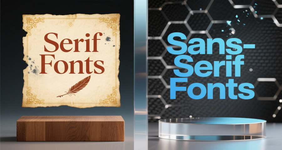
Serif fonts, with their classic “feet” or strokes at the end of letters, have been used in print for centuries. Our brains associate them with tradition and formality because of their long history in books, newspapers, and legal documents.
Psychological effects:
Elicit feelings of credibility, respect, and seriousness
Users may associate them with education, expertise, and institutional trust
User behavior implications:
Users may feel more secure or trusting when encountering serif fonts in financial or legal interfaces.
They may expect the content to be detailed, reliable, or formal in tone.
When to use:
Ideal for professional platforms (finance, academia, law), or when you want to convey timelessness and gravitas.
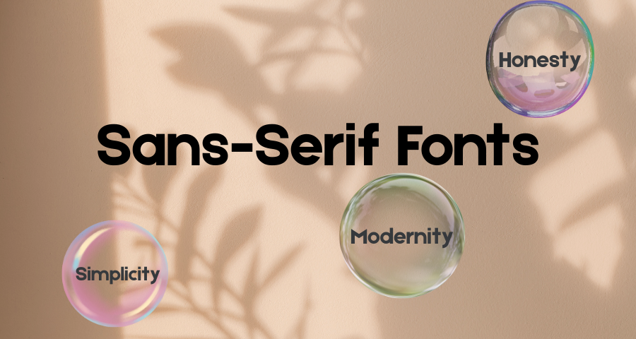
Sans-serif fonts remove the extra strokes, resulting in cleaner, more minimal letterforms. This simplicity signals modernity, efficiency, and clarity—qualities that align with today’s fast, tech-driven interfaces.
Psychological effects:
Trigger a sense of approachability, neutrality, and transparency
Often seen as non-threatening and inclusive
User behavior implications:
Users are more likely to scan and absorb information quickly.
These fonts promote ease of reading and mental comfort, especially on screens.
When to use:
Perfect for product dashboards, clean landing pages, or mobile-first UIs where space and speed matter.
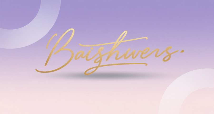
Script fonts mimic human handwriting, which instantly makes them feel more personal, emotional, or even romantic. The flowing lines and natural movement evoke emotional warmth and human connection.
Psychological effects:
Convey sophistication, grace, creativity, and sometimes nostalgia
Can also signal femininity or luxury
User behavior implications:
Users may feel more emotionally engaged or connected.
But if overused, you may find the design ornamental rather than functional.
When to use:
Ideal for branding, lifestyle content, or luxury products, where emotional tone and individuality matter. Choosing the right calligraphy font ensures the design feels both expressive and accessible.
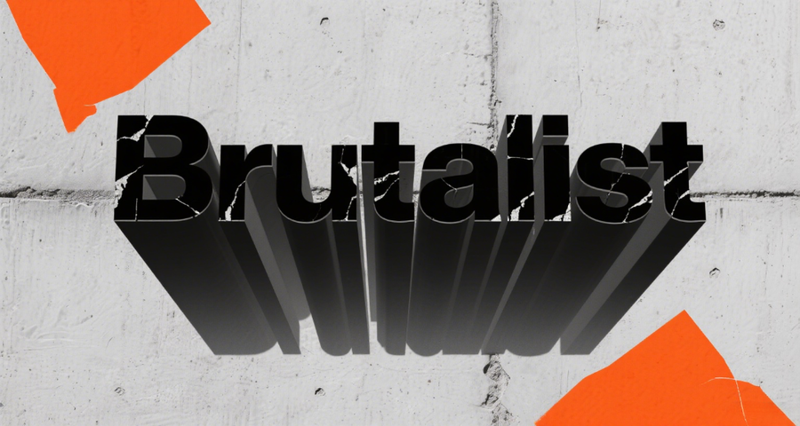
Brutalist font uses rough, oversized, or intentionally “ugly” fonts to break convention. This creates a psychological jolt—grabbing attention through discomfort or rawness.
Psychological effects:
Suggest bold individuality, rebellion, or anti-corporate ethos
May cause users to feel challenged, stimulated, or even unsettled
User behavior implications:
These fonts polarize: they attract niche, curious users and repel those seeking polish
They create memorable experiences but require contextual alignment
When to use:
Suitable for design portfolios, fashion campaigns, or indie brands aiming for a raw, unapologetic look. When applied intentionally, brutalist fonts can create bold visual identities that reject mainstream aesthetics.
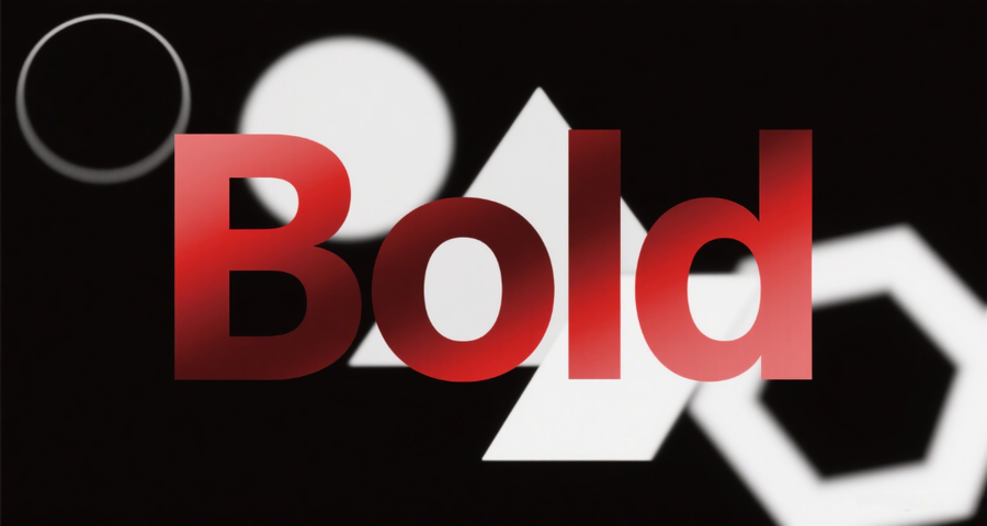
Bold fonts are visually heavy, often used to create immediate impact. They psychologically demand attention and signal that something is important, urgent, or unmissable.
Psychological effects:
Elicit feelings of assertiveness, confidence, and command
Can signal urgency or authority
User behavior implications:
Help users locate key actions (e.g., CTAs) quickly.
If overused,it can cause visual fatigue or feel aggressive.
When to use:
Effective for headlines, CTAs, or pricing tables, where grabbing immediate attention is key. Smart use of bold fonts can highlight key actions and boost user engagement.
Numbers have a different visual rhythm than letters. Fonts optimized for numerical data evoke feelings of structure, control, and technical competence—especially in analytics-heavy UIs.
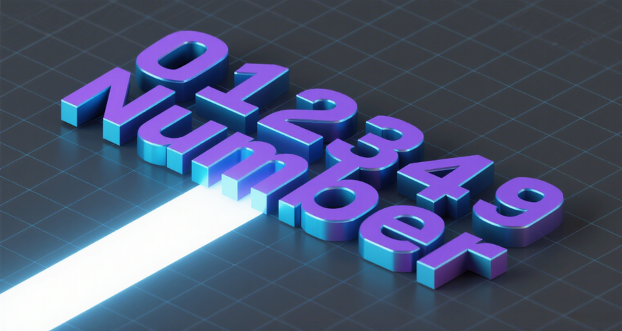
Psychological effects:
Reinforce a sense of precision, efficiency, and trust in data
Support user focus in decision-making tasks
User behavior implications:
Users more easily process and compare figures
Poor number fonts lead to misinterpretation or slow analysis
When to use:
Best for dashboards, ecommerce pricing, or data-driven platforms, where numerical clarity and structure are essential. Well-designed number fonts ensure users can scan and compare figures efficiently.
Impact is a bold, condensed sans-serif font originally designed for display use—especially in headlines where maximum visual force is required. Its thick strokes, tight spacing, and compact proportions make it one of the most visually commanding fonts in digital and print design.
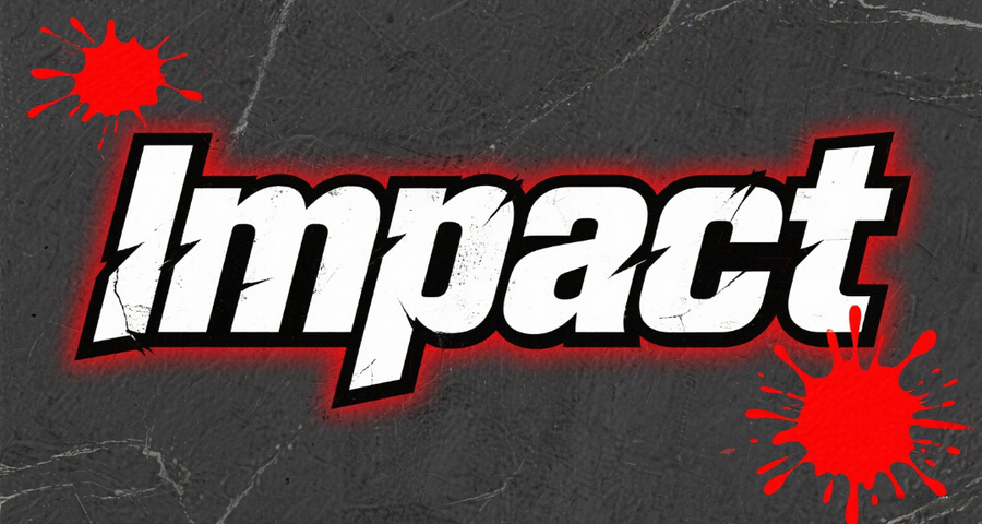
Psychological effects:
Creates a sense of urgency, energy, and boldness
Often associated with advertising, editorial impact, or direct calls to action
May also signal authority or even aggression when used in all caps
User behavior implications:
Users are likely to stop and pay attention when Impact is used in large, prominent areas
Overuse can lead to visual fatigue or perceived intrusiveness, especially in sensitive or minimalist interfaces
Works best when used selectively to emphasize key messages
When to use:
Ideal for hero sections, promotional banners, CTAs, or campaign-specific microsites where you need to instantly grab attention or create emotional urgency.
Understanding font psychology isn’t just about picking something “cool” or “clean”. It’s about choosing the emotional voice of your product. Every font type comes with baggage—visual, cultural, emotional—and your job as a designer is to leverage that baggage in favor of your user goals. When type choices align with intent and audience psychology, you don’t just make your product look better but you make it feel right.
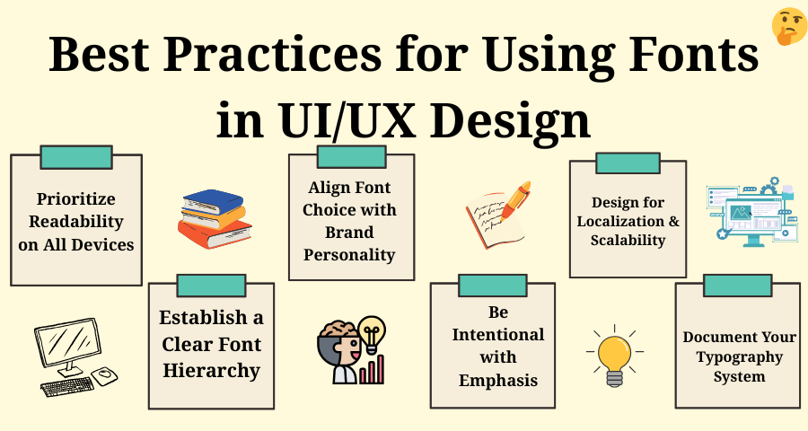
Choosing the right font is only the first step—how you use it across your product interface is what truly defines a great user experience. While the previous section focused on the psychological impact of font types, this section dives into practical, universal principles for applying fonts effectively in your UI/UX workflow.
These best practices are grounded in user behavior, accessibility standards, and design consistency, helping you build interfaces that are not only beautiful but also highly usable.
No matter how aesthetically pleasing a font is, if users can’t read it comfortably, the design fails. Readability depends on font size, contrast, line height, and how the font renders across different screen sizes and resolutions. You can try to choose the fonts that are suitable for the device and the screen. To do this, you can try to use some design and prototyping tools to test typography.
Tips:
A strong typographic hierarchy guides users through your interface effortlessly. By adjusting size, weight, and spacing, you can draw attention to headings, create natural reading flows, and support faster decision-making. You can try building a consistent hierarchy in your design system or style guide. Tools like Mockplus DT help teams maintain font consistency across products.
Tips:
Every font speaks—make sure yours says the right thing. Whether your product is serious, playful, elegant, or experimental, your typography should visually express that tone.
Tips:
Using bold or uppercase text can be effective—but only when used with purpose. Overusing emphasis leads to visual fatigue and diminished impact.
Tips:
If your product supports multiple languages, choose fonts that support global character sets and scale well with translated content. For instance, Chinese, Arabic, or Hindi text may require specific typographic treatment.
Tips:
In collaborative design teams, a clear typography system is essential for keeping the product consistent and scalable. Documenting font usage helps designers, developers, and stakeholders stay aligned.
Tips:
Fonts are one of the most expressive tools in UI/UX design. When used creatively, they can establish tone, convey emotion, and even disrupt expectations. These 10 websites showcase how smart font choices can transform interfaces into meaningful, memorable experiences.
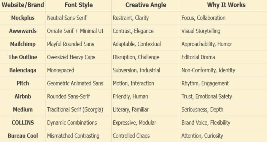
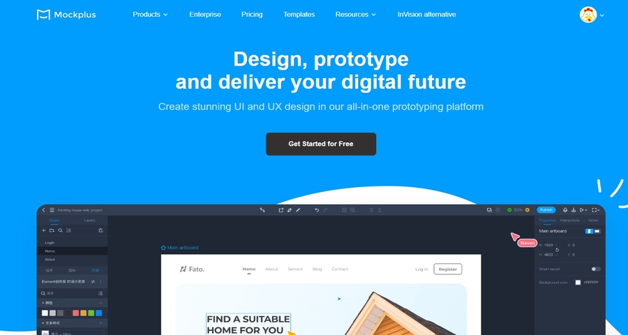
Mockplus uses a carefully chosen sans-serif font that reflects its product's values: clarity, efficiency, and ease of collaboration. The font is neutral, modern, and legible—designed not to attract attention, but to support task-focused workflows without adding visual noise.
Awwwards blends ornate serif headers with a highly modern, minimal UI—creating a striking contrast between expressive content and clean layouts. Serif fonts appear unexpectedly large, layered over visuals, sometimes partially cut off, reinforcing a bold visual identity.
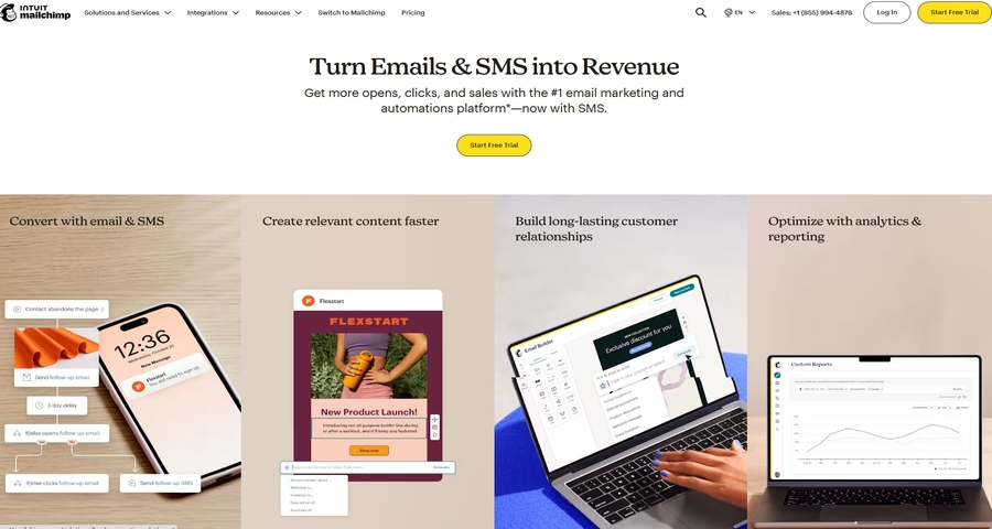
Mailchimp has long been known for its quirky tone—and its fonts reflect this perfectly. It uses rounded, friendly sans-serif fonts for headings and feature callouts that feel expressive without being childish.
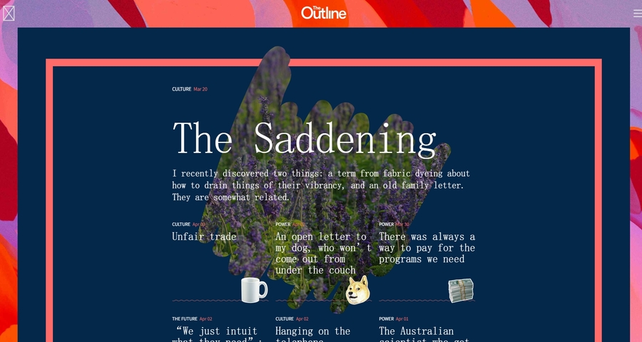
The now-archived The Outline made fonts the focal point of its UI. Its homepage often featured all-caps, ultra-heavy fonts as headlines, taking up nearly half the screen, forcing users to engage visually before even reading.
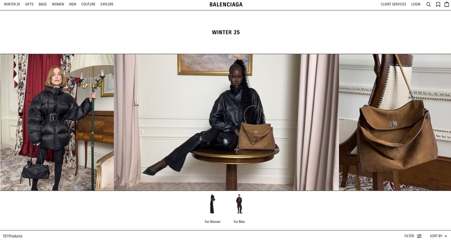
Balenciaga’s homepage uses a plain monospaced font, more often associated with code editors than couture. It’s a bold choice that intentionally disrupts expectations of elegance and extravagance in luxury design.
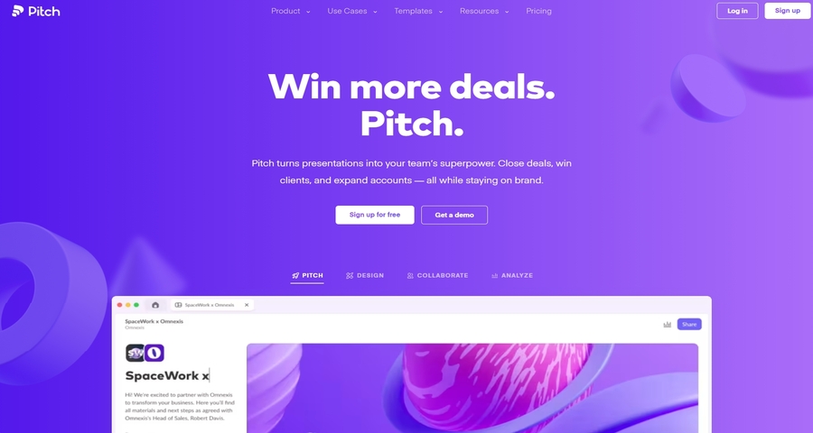
Pitch makes use of geometric sans-serif fonts with subtle weight variations and animations that respond to scroll or interaction. Fonts gently scale, fade, or shift position—adding rhythm to the interface without clutter.
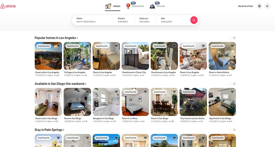
Airbnb’s signature font, “Cereal,” is a rounded sans-serif designed to evoke friendliness and inclusiveness. Used across the platform—from search to checkout—it reinforces a safe, approachable experience.
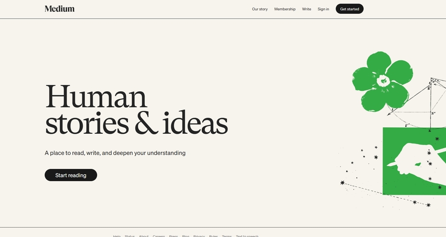
Medium uses Georgia, a traditional serif font, for body copy—unusual for a digital-native product. Paired with minimalist layouts and generous white space, it creates a focused, book-like reading experience.
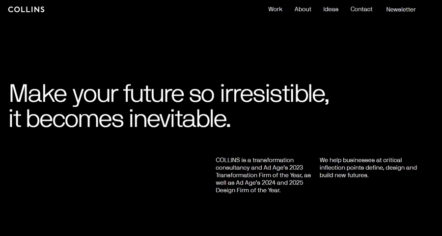
Creative agency COLLINS uses ever-changing font pairings across its site and client projects, creating a modular, responsive brand system through type.
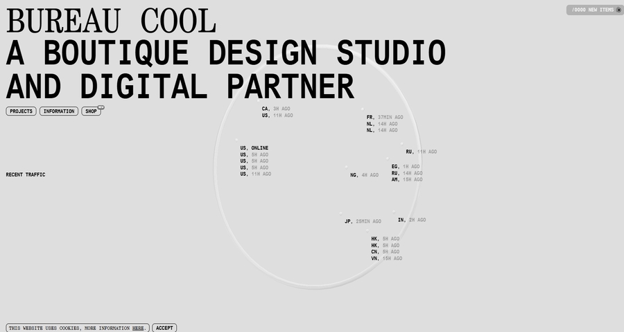
Bureau Cool’s site is a playground of mismatched fonts, irregular spacing, and asymmetrical sizing. Fonts are bold, serif, script, or compressed—often used in unexpected places.
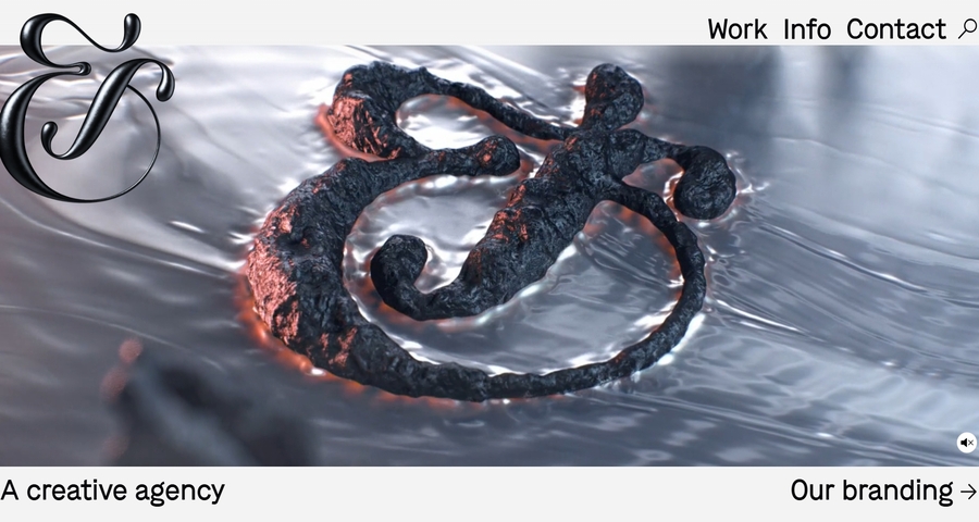
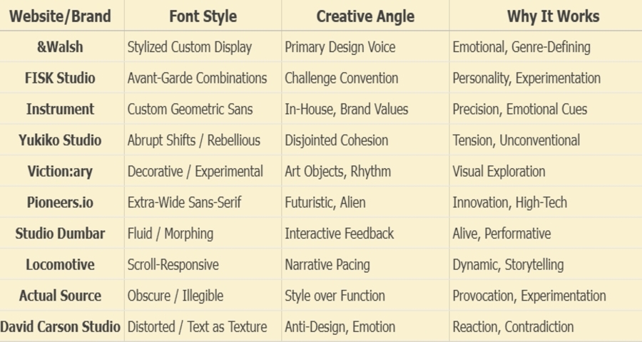
The creative agency &Walsh is known for its bold, provocative design direction—and fonts are often the driving force behind that impact. On both its own site and in client projects, &Walsh leverages highly stylized, expressive fonts as core visual identities.
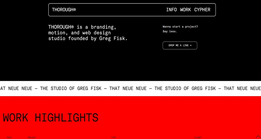
FISK is a design and art direction studio based in Portland, Oregon, known for their expressive and avant-garde typography choices. Their homepage and portfolio feature bold, unexpected font combinations, often blending serif, sans-serif, and abstract display fonts within the same layout.
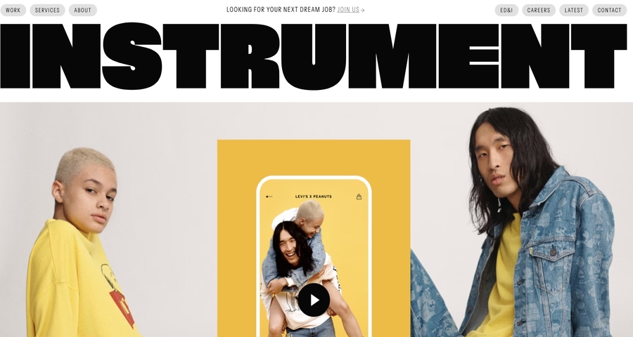
Instrument, a digital brand agency, uses a custom geometric sans-serif font that’s warm yet structured—subtly reinforcing its mix of creativity and professionalism.
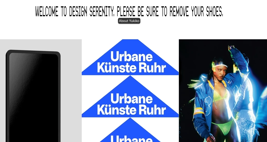
Yukiko Studio’s homepage features fonts that shift abruptly between bold grotesque, condensed serif, and pixel fonts—creating a layered, rebellious aesthetic.
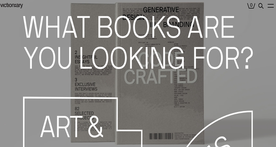
Viction:ary, a print/digital publisher, experiments heavily with decorative fonts, ultra-extended tracking, and expressive ligatures across its book showcase site.
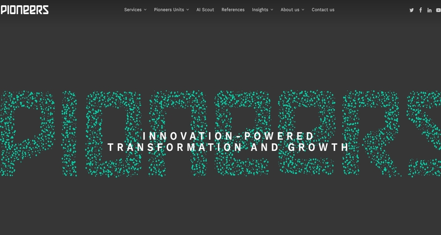
Pioneers.io uses an extra-wide, high-contrast sans-serif font as a branding device. The extended letterforms create a space-age aesthetic, evoking movement and innovation.
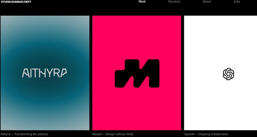
Studio Dumbar’s website responds to user input with fonts that flex, pulse, or morph, reflecting user engagement in real time.
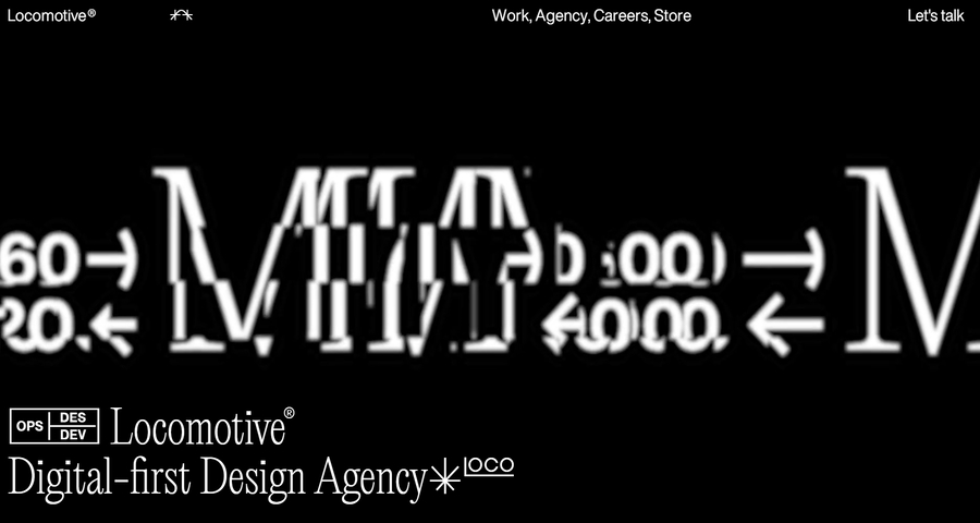
On Locomotive’s homepage, fonts change weight and spacing subtly as users scroll, responding to depth and direction. The changes are smooth, deliberate, and tied to narrative pacing.
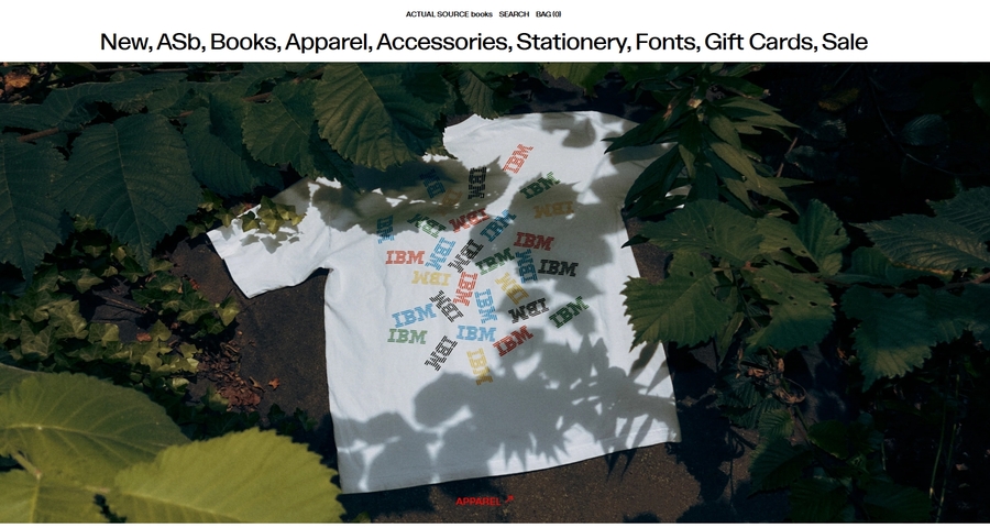
Actual Source leans heavily into obscure, ultra-modern fonts—sometimes nearly illegible—used for style over function. Fonts are chosen not for clarity, but for aesthetic provocation.
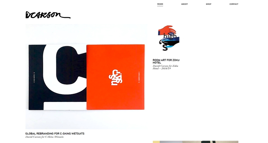
David Carson, legendary for anti-design principles, showcases fonts that blend, blur, distort, and clash. His site uses text as texture, rejecting hierarchy and alignment.
Even the most visually impressive typefaces may fail to resonate. More critically, they can cause user frustration when deployed without deliberate consideration. Below are some of the most prevalent pitfalls encountered by designers in the application of typography within UI/UX design, accompanied by practical guidance to circumvent them.
Using highly decorative or experimental fonts might look impressive on a mood board, but if users struggle to read key information, the design fails its primary purpose.
Tip: Always test your fonts at actual sizes across different devices. When in doubt, readability should win over flair.
Mixing too many font families or weights creates visual chaos and confuses the information hierarchy. It often signals inconsistency and lack of design discipline.
Tip: Stick to 2–3 complementary fonts max—typically one for headings and one for body text. If you need variation, use different weights or styles within the same family.
Some fonts simply don’t play well together—either due to clashing proportions, mismatched tones, or conflicting readability. The wrong pairing can make your design feel amateur.
Tip: Use tried-and-true font pairings or consult curated guides. You can explore font families and pairing ideas in this guide to different font types.
Fonts have psychology. Using a cold, rigid typeface for a wellness app—or a playful handwritten style for a financial dashboard—can send the wrong message entirely.
Tip: Think of fonts as visual tone-of-voice. Consider the emotions you want to evoke, then choose a font that subtly reinforces that feeling. For emotional interfaces, calligraphy fonts or soft rounded styles can enhance user trust.
What looks balanced on desktop may break on mobile. If your headings become overwhelming or your body text shrinks too far, it hurts accessibility and user flow.
Tip: Use responsive font units and set proper breakpoints. Platforms like Mockplus let you preview font behavior across screen sizes during early-stage prototyping.
Bold fonts can grab attention—but if everything is bold, nothing is. Similarly, decorative or themed fonts can exhaust the eye if used too heavily.
Tip: Use boldness to highlight hierarchy, not as a default. And keep decorative fonts for headlines or feature sections only.
Using “Lorem ipsum” or placeholder text often hides font issues like awkward kerning, line breaks, or poor legibility at paragraph level.
Tip: Switch to real or realistic text early in the design process to spot issues. Even better—test fonts in context with real user flows or microcopies.
Low contrast fonts, thin weights, or overly condensed styles may look trendy, but they can create barriers for users with vision impairments.
Tip: Use contrast checkers and adhere to WCAG standards. Ensure font sizes meet minimum readability (at least 16px for body text) and offer enough spacing and clarity.
Impact is a bold, condensed sans-serif typeface designed to grab attention instantly. Psychologically, it conveys strength, urgency, and confidence, which is why it’s often used in headlines, advertisements, or action-driven content.
However, because it’s so visually aggressive, overusing it can feel overwhelming or even shouty in UI/UX contexts. It’s best used sparingly, such as in call-to-action banners or hero headlines where you want users to stop and take notice. If you're testing strong fonts like Impact in a design prototype, tools like Mockplus let you preview how it performs across screen sizes and interaction states.
The best practice is to use no more than two to three font families in a single app or website. Using too many fonts creates visual inconsistency and can confuse your hierarchy. A common and effective setup includes:
Absolutely. Fonts subconsciously communicate tone, credibility, and professionalism. A friendly rounded font can make a healthcare app feel more approachable, while a sharp, serif font can evoke a sense of authority for financial services.
Studies have shown that people judge a brand’s trustworthiness in milliseconds, and font choice is a key part of that first impression. If your font doesn’t match your brand tone or feels hard to read, users may feel uncomfortable—even if they can’t explain why.
Mockplus enables teams to create prototypes with real font choices and messaging, so you can validate emotional tone before moving into full UI buildout.
Yes, it can. Fonts play a direct role in readability, hierarchy, and user emotion—all of which influence how easily users engage with content or complete tasks.
For example:
There are several ways to test font effectiveness:
Font psychology is emerging as a core component of modern UI/UX design, as brands and products seek to establish deeper, more emotional connections with users. The right font does more than enhance readability; it influences trust, shapes perception, and defines personality across digital experiences.
We hope this guide has aided your understanding of the psychology behind font selection, introduced you to best practices, and provided inspiration through real-world examples of creative font application. As design continues to evolve, those who master font psychology will be better equipped to create interfaces that not only have visual appeal but also truly resonate with users.
 Mockplus RP
A free prototyping tool to create wireframes or interactive prototypes in minutes.
 Mockplus DT
A free UI design tool to design, animate, collaborate and handoff right in the browser.


 Sign up with Google
 Join our Discord community
 support@mockplusapp.com