For UX/UI designers, healthcare website design demands a deeply human-centered approach. It's a field where usability affects well-being, typography ensures clarity, and every interaction must build trust and ease anxiety. Creating an effective healthcare website means balancing strict accessibility (WCAG) with empathetic, intuitive journeys for vulnerable users.
Successful healthcare designs are built on clarity and compliance. They turn complex information into scannable layouts, using responsive components and inclusive patterns to deliver seamless experiences across all touchpoints. More than a visual framework—a healthcare template is a vital communication tool.
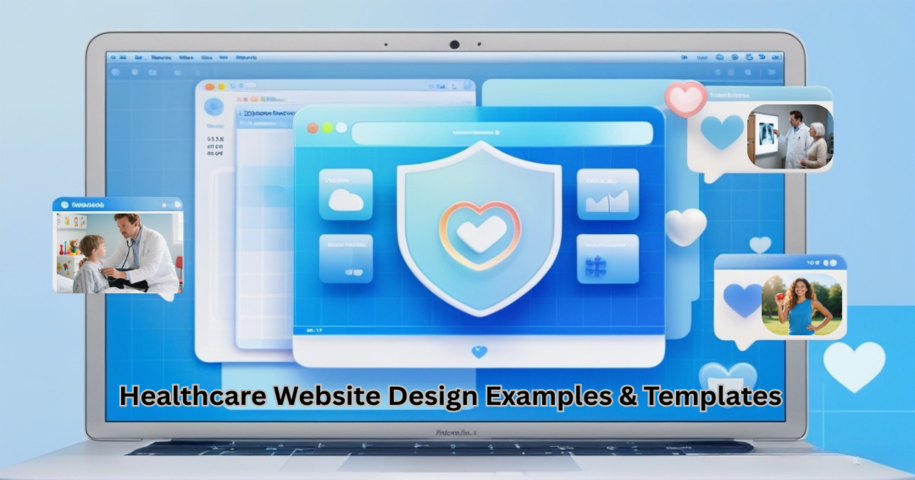
This guide explores 25 modern healthcare website designs and templates that excel in practice. Whether you're designing from scratch or adapting an existing healthcare website template, these examples offer inspiration and insight for creating compassionate, visually engaging digital experiences. Tools like Mockplus can help streamline this process, enabling designers to prototype, test, and refine interactions—ensuring the result is both aesthetically polished and intuitively user-friendly.
A healthcare website is a specialized digital platform designed to serve the healthcare needs of patients, caregivers, and medical professionals. It is the online presence of a healthcare provider or organization, offering information, resources, and services that are critical to a patient's health journey. These websites are often the first point of contact for individuals seeking medical information or healthcare services, making it crucial for the design to be user-friendly, informative, and trustworthy.
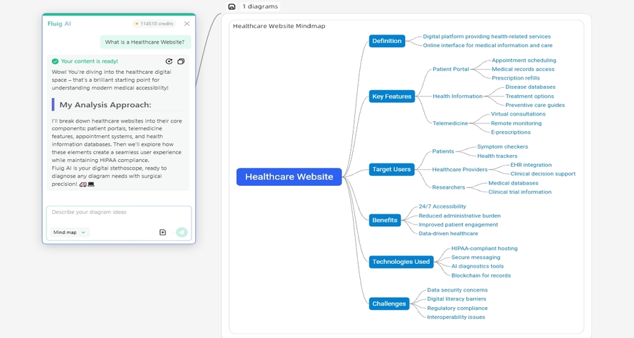
Key features of healthcare websites include:
The success of a healthcare website relies on trustworthiness and accessibility. These sites should provide a safe and welcoming experience for users seeking critical information. Ensuring accessibility, security, and user-friendly navigation is key for any healthcare website's success. Mockplus tool can aid in creating intuitive healthcare website prototypes and providing diverse design templates, allowing designers to streamline the process while maintaining usability and accessibility standards.
A successful healthcare website goes beyond basic functionality; it needs to be user-centric, secure, and trustworthy. The design should offer a seamless, intuitive experience while providing critical information, tools, and services that meet the needs of users—especially when they may be under stress. Let's dive into the key elements that define a well-crafted healthcare website.
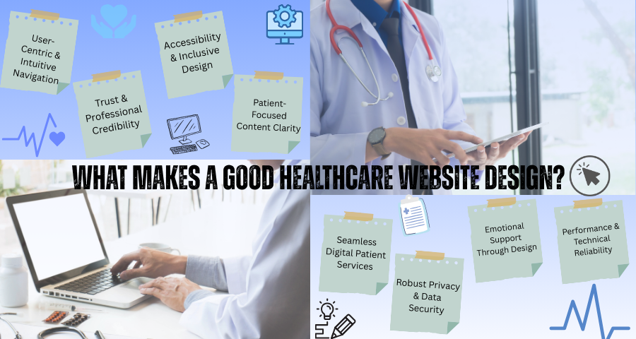
A healthcare website should be designed to offer a clear, predictable menu structure and visual hierarchy. Users, particularly those seeking health-related information, need to find what they’re looking for with minimal effort. Key actions, such as booking appointments or accessing patient portals, should be achievable with just a few clicks. A mobile-responsive layout is essential, ensuring that patients can easily navigate on any device, whether they’re on a desktop at home or on their phone while on the go.
A well-structured layout promotes a sense of confidence and ease, encouraging users to engage more with the content and complete tasks effectively. Mockplus allows you to quickly create prototypes that focus on user experience (UX) and test usability with real users, making it easier to refine your website before launch.
A healthcare website must establish credibility from the moment users land on the homepage. Displaying medical credentials, practitioner profiles, and relevant patient testimonials adds an extra layer of trust. Alongside this, professional branding with a clean, well-organized design fosters a sense of authority and reassurance. These elements help ease user anxiety, especially when dealing with medical concerns.
The overall design should reflect a trustworthy institution that prioritizes patient care. Elements like accreditations and certifications prominently displayed on the site provide confidence that users are dealing with qualified professionals.
Ensuring that your healthcare website is accessible to everyone, regardless of ability, is crucial. By following WCAG guidelines, you ensure that your site is usable by people with visual, auditory, or motor impairments. This includes offering keyboard-compatible controls, providing sufficient color contrast, and making text resizable. Also, adding alternative text for images and captions for videos allows users with disabilities to engage with content as easily as anyone else.
The design must be inclusive, providing equal access to information for all, ensuring that no one is left behind.
When dealing with healthcare, the clarity of information is paramount. Medical content should be both accurate and easy to understand. Avoid using excessive medical jargon, and instead, aim for clear, concise language that can be understood by users at various health literacy levels. Use headings, bullet points, and short paragraphs to enhance scannability. Patients and visitors should be able to quickly scan the content for the information they need.
The goal is to make sure the website supports users in making informed decisions about their health without feeling overwhelmed.
A healthcare website should provide practical and easy-to-use digital patient services. This includes offering online scheduling, enabling prescription refill requests, providing access to secure patient portals, and facilitating telehealth consultations. These services should be simple, secure, and streamlined—making it easier for patients to manage their healthcare needs directly from the website. Additionally, a responsive web design ensures that all these services are available and functional across multiple devices, including smartphones and tablets, without compromising the user experience.
Given the sensitive nature of the data healthcare websites handle, privacy and security are of utmost importance. Compliance with laws such as HIPAA (Health Insurance Portability and Accountability Act) in the U.S. is mandatory. Ensure that SSL encryption is used for secure data transmission and that privacy policies are transparent and easy to understand. Secure data handling practices must be clearly communicated to patients, making them feel confident that their information is protected.
In a sector where trust is paramount, data security becomes a non-negotiable element of the design process.
The healthcare website design should consider the emotional state of the users. Health-related searches are often conducted under stressful circumstances, so the design must foster calm and reassurance. Using calming color palettes, supportive imagery, and compassionate microcopy can help alleviate stress and guide patients through the site with empathy.
The tone of the website should be caring, with an experience that makes users feel like they are being guided through their health journey, not just navigating a cold, corporate website.
A slow or unreliable website can cause frustration and undermine the user’s trust. Healthcare websites should be optimized for speed and reliability, with fast loading times and cross-device compatibility. Users often access health information urgently, so websites must function smoothly across all devices and browsers.
Designing a great healthcare website is about much more than aesthetics. It’s about creating a platform that users can rely on for trustworthy information, easy navigation, emotional support, and security. Focusing on user-centric design, accessibility, and clear content while ensuring data protection and technical reliability will set your healthcare website apart and provide a seamless, reassuring experience for patients.
Here is a table of the 25 best healthcare website design examples and templates for you to quickly scan all of them:
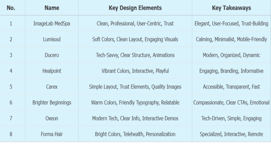
Imagelab MedSpa’s website embodies a clean, modern aesthetic that aligns perfectly with its brand identity as a premium, science-backed medspa. The design excels in visual storytelling through subtle animations, high-quality imagery, and a calming color palette that instills trust and sophistication.
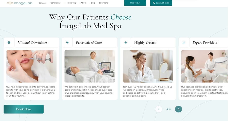
The website uses a minimalist design with neutral tones and elegant typography, establishing a calm and professional atmosphere. High-quality images of treatments and results engage visitors, showcasing the spa’s services effectively.
Clear and intuitive navigation allows users to easily access key sections like services, team, and appointment booking with minimal clicks, enhancing usability.
The site incorporates testimonials, before-and-after galleries, and certifications, helping to build credibility and user trust.
Lumisoul is a healthcare website designed to showcase mindfulness and wellness services. The website uses a serene, minimalist approach to make users feel relaxed and comfortable. It focuses on promoting mental and emotional health with an inviting and accessible layout.
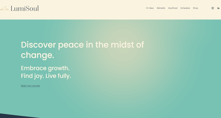
The website uses calming pastel colors, which create a tranquil and welcoming atmosphere, aligning with the themes of mindfulness and wellness.
A minimalist design ensures that there are no distractions. The clear structure allows users to focus on the content and services offered.
High-quality images related to wellness and therapy practices add an emotional element, helping to communicate the services' calming and restorative qualities.
Ducero is a modern healthcare website focused on providing digital health services. It incorporates a sleek, professional design that balances technological innovation with user-friendly features. The site is geared towards companies in the healthcare industry that want to present themselves as cutting-edge and trustworthy.
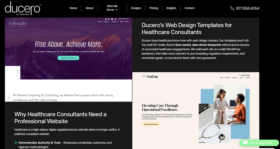
The website uses bold typography and geometric shapes to communicate a modern, professional feel.
Content is well-organized into clear sections, making it easy for users to navigate and find what they need.
Subtle animations provide a dynamic feel without overwhelming the user experience.
Healpoint's website design concept focuses on animation and interactive elements to make the user experience engaging. The design is modern, with a focus on telehealth services. The animation brings a dynamic visual appeal while still delivering crucial healthcare information in an organized manner.
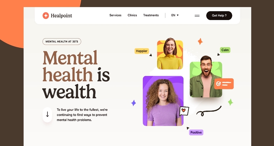
The site uses bright colors and clean lines, creating an energetic and welcoming atmosphere.
The design features interactive animations that help bring the healthcare services to life, particularly in the service explanation sections.
The use of animation combined with clean, professional design elements ensures a balance between fun and credibility.
Carex focuses on providing at-home healthcare equipment, offering products and services that enhance patient care. The website design emphasizes accessibility and trust, making it easy for users to find products and services that meet their needs.
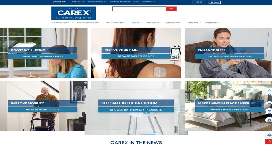
The website uses a clean and simple layout that focuses on clear navigation and easy access to product categories.
Displaying medical certifications, client testimonials, and product reviews helps establish credibility and reassures users.
The website uses real, high-quality images of healthcare products, reinforcing the trust factor and demonstrating their use in real-life scenarios.
Brighter Beginnings provides family services, with a strong focus on community support and childcare services. Their website design integrates compassionate imagery and a friendly color palette, creating a welcoming environment for users seeking social services.
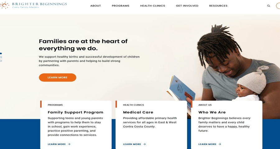
Soft blues, greens, and yellows help create a warm, welcoming feeling that aligns with the organization’s focus on community and support.
Rounded fonts and clear text create a sense of approachability, making the content easy to read for families and individuals.
High-quality, relatable images featuring families and children reinforce the emotional connection the website aims to establish.
Oxeon’s website showcases a clean and sleek design that focuses on their cutting-edge technology solutions for healthcare providers. The website aims to communicate innovation and efficiency, making it an ideal choice for tech-driven healthcare companies.
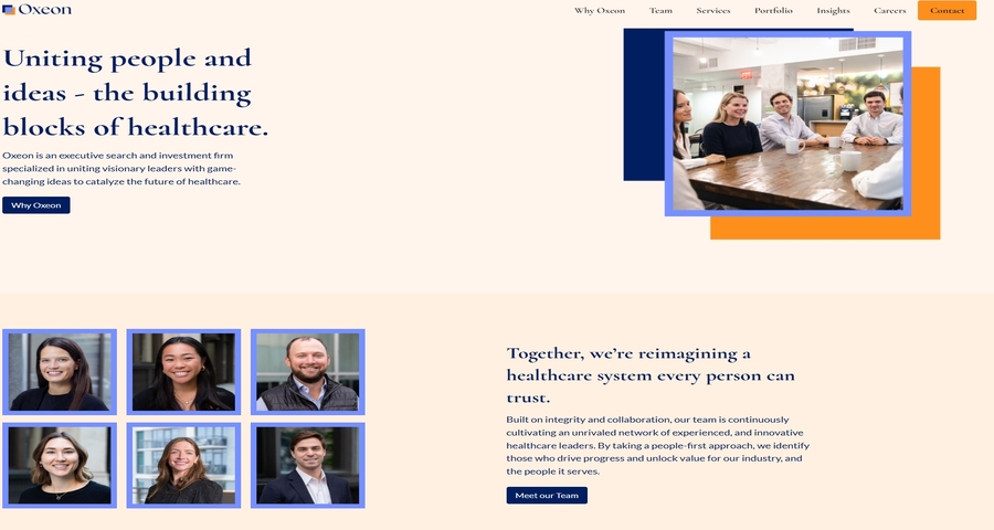
A combination of bold typography, geometric shapes, and cool tones (blues and greys) creates a professional and technologically advanced feel.
Oxeon’s offerings are displayed in a clean, organized manner with key features and benefits clearly outlined.
The website includes interactive elements, such as product demos, that allow users to engage with the technology before making a decision.
This healthcare website design template concept is focused on telehealth services for hair care. The design showcases how healthcare websites can incorporate specialized services into a modern, interactive platform that offers virtual consultations and treatments.
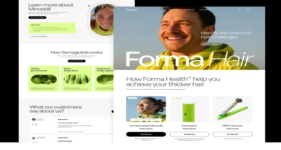
The use of bright colors, like soft greens and whites, makes the design feel fresh, modern, and approachable.
The site highlights the telehealth capabilities, ensuring users know they can access services remotely.
The design includes a personalized consultation option, inviting users to engage with the site directly.
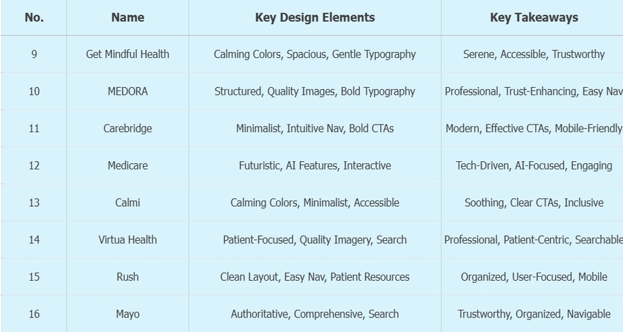
Get Mindful Health provides wellness services focusing on mindfulness and mental health. The website is designed to be calming, helping users connect with the mental health resources they need. The design emphasizes serenity and well-being, creating a peaceful atmosphere for visitors.
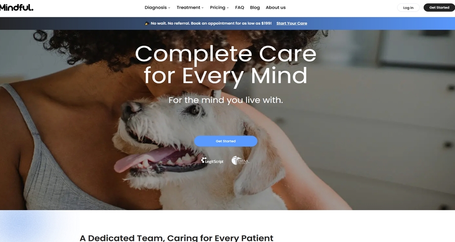
The use of earthy tones like greens and browns creates a grounding effect, aligning with the wellness and mindfulness theme.
The minimal layout ensures the site feels open and non-cluttered, which is key for a wellness-centered website.
The soft, rounded font choices help create a sense of warmth and trust.
MEDORA healthcare website design concept focuses on delivering essential medical services in a professional and clean format. The design uses a structured, easy-to-navigate layout and integrates elements that make medical information more accessible to users.
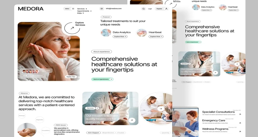
A clean grid-based design helps structure the content and makes it easy for users to navigate.
Professional, high-quality medical images help establish trust and show the real-world application of the services provided.
Strong, easy-to-read fonts ensure that key information is visible and accessible, especially for users with low vision.
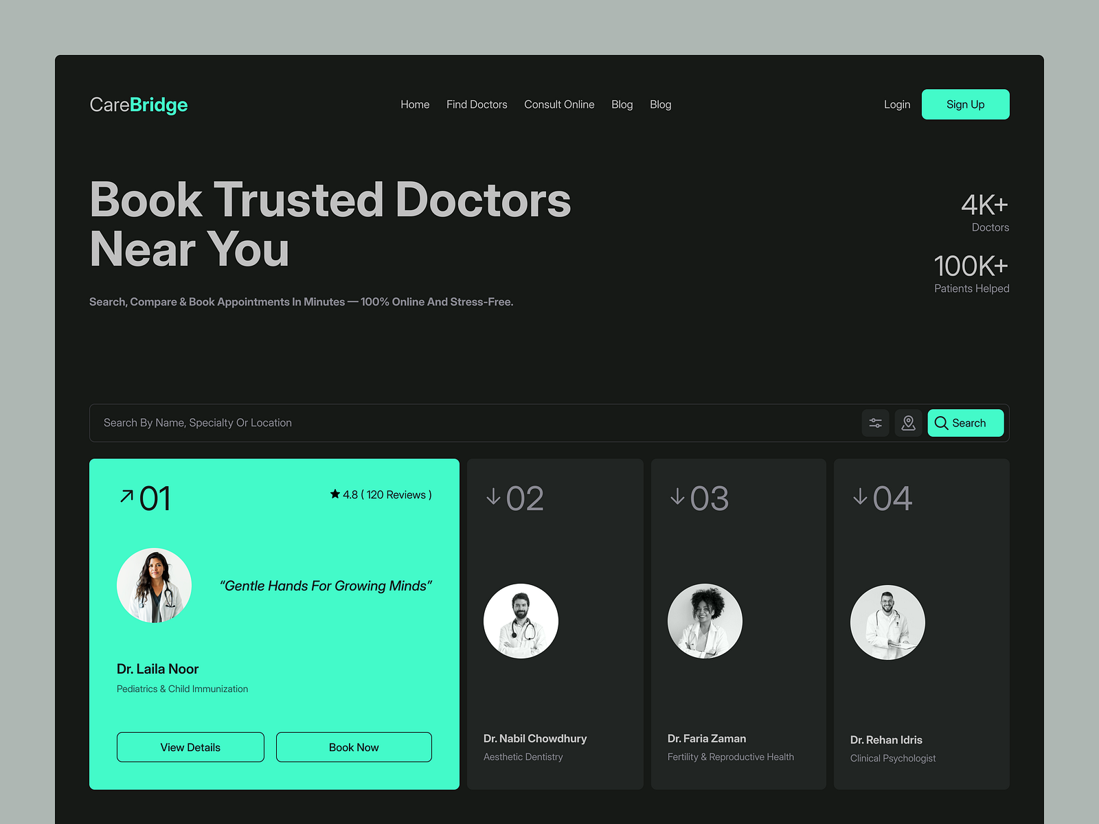
Carebridge healthcare website design focuses on modern aesthetics while maintaining a focus on user-centric navigation and accessible content. It aims to provide a visually appealing experience while making healthcare information easy to digest.
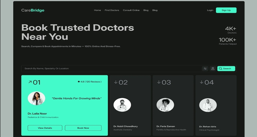
The website employs a minimalist design with modern typography, allowing for a clean and pleasant user experience.
The navigation bar is simple, with clear options for services, healthcare resources, and patient access.
Clear and eye-catching CTAs such as “Book Appointment” are prominently featured, driving user engagement.
Medicare showcases an AI-powered healthcare app and its accompanying website, focusing on cutting-edge technology in healthcare. The design is sleek, modern, and technology-driven, aligning with the future of healthcare.
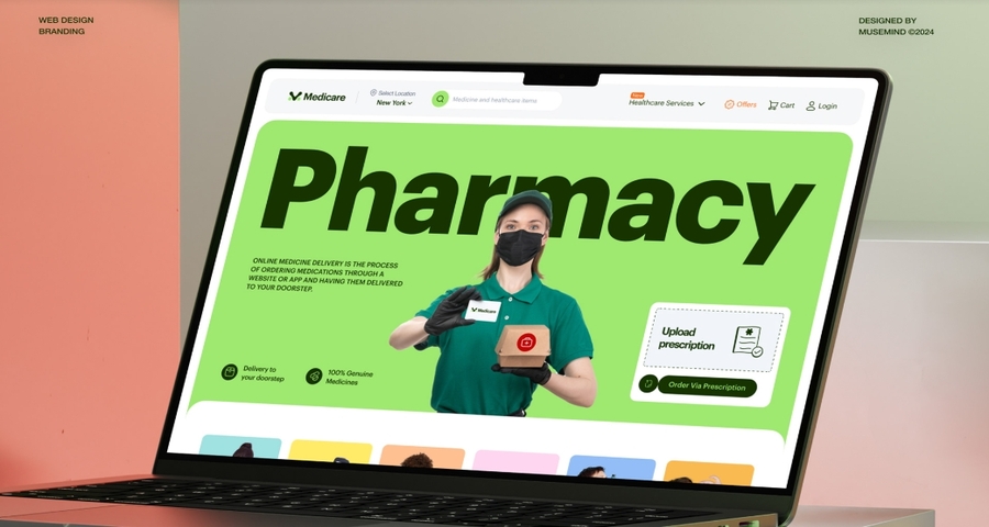
The design uses a dark color scheme with neon accents, giving it a modern, futuristic vibe.
The design highlights features of the AI technology, making it clear how the app can enhance healthcare experiences.
The design includes interactive sections that allow users to explore AI-driven features and benefits.
Calmi's website design focuses on mental health care, offering a calming and supportive environment for users. The design prioritizes emotional comfort and accessibility, aligning with the sensitive nature of mental health services.
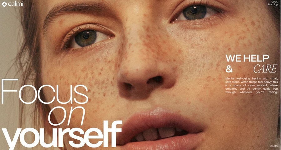
Soft blues, greens, and pastels are used to create a peaceful atmosphere, helping users feel at ease when navigating the site.
The website uses a minimal layout to ensure the focus is on content, avoiding visual clutter.
The site includes features like high contrast, resizable text, and easily navigable elements to ensure accessibility for all users.
Virtua Health provides a comprehensive healthcare website designed for patients and families. It integrates healthcare resources, service information, and easy navigation to create a streamlined experience for users seeking healthcare solutions.
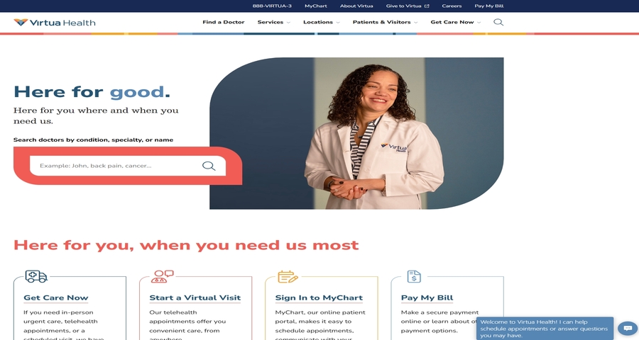
Services and resources are well-organized, allowing users to easily find information about healthcare providers, treatments, and locations.
High-quality images of doctors, staff, and patients help create a personal, inviting experience for users.
An intuitive search bar helps users quickly locate services or information across the website.
Rush University Medical Center’s website serves as a hub for both patients and healthcare professionals, with a focus on clinical care, education, and research. The website design is professional, providing easy access to information on medical services, patient care, and educational resources.
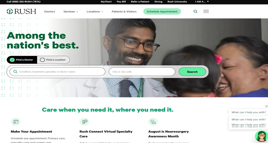
The design is clean and well-structured, with clear sections for different types of visitors, such as patients, physicians, and students.
A fixed menu bar offers easy access to the most important sections, including medical services, news, and educational opportunities.
Dedicated sections for patients, including appointment scheduling, billing, and patient resources, ensure users can find what they need quickly.
The Mayo Clinic’s website is a trusted source of health information, designed to be informative, accessible, and user-friendly. It serves a broad audience, including patients, researchers, and healthcare providers, offering an extensive library of articles, treatments, and patient resources.
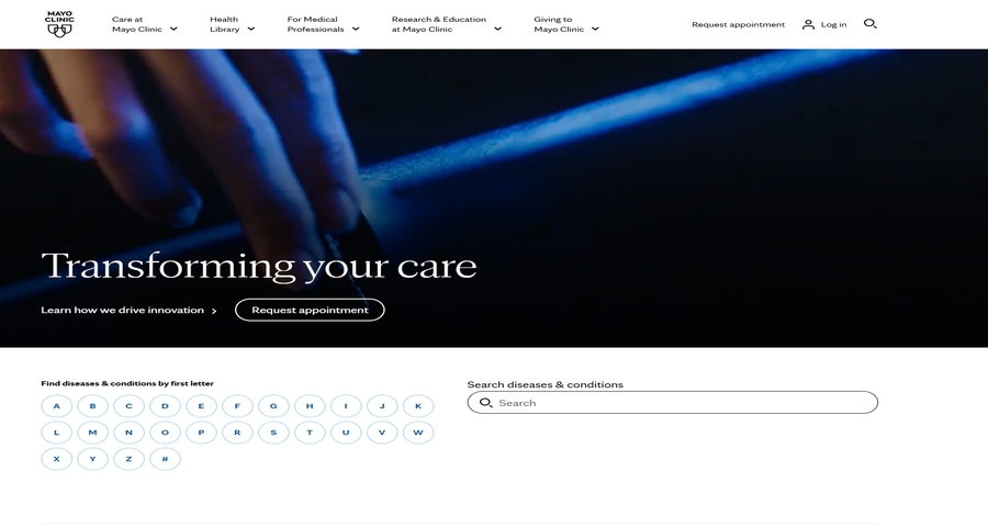
The site uses a blue and white color scheme, which is calming and professional, reinforcing the Mayo Clinic’s authoritative position in the healthcare field.
The website provides an extensive array of health articles, patient stories, and research resources, with each topic clearly categorized for easy navigation.
A prominent search bar allows users to quickly find specific information, such as conditions, treatments, or Mayo Clinic specialists.
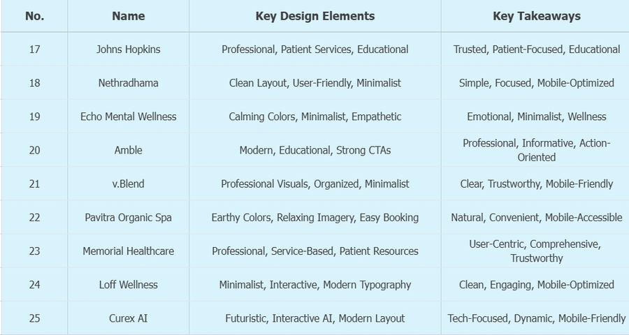
Johns Hopkins Medicine’s website is a highly informative platform that offers a variety of healthcare services, research, and educational resources. It is known for its clean, structured design that makes accessing medical services easy and intuitive.
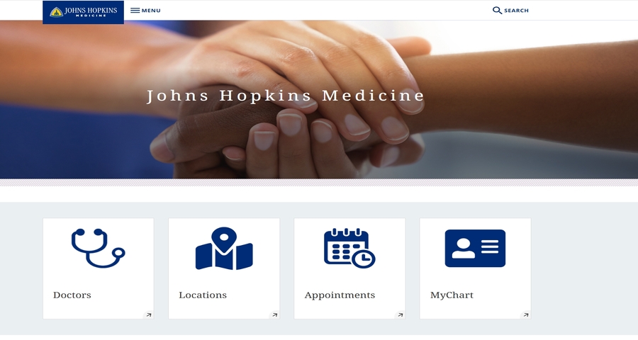
The website uses a blue and white color palette that is synonymous with healthcare professionalism and trust.
Key features like appointment scheduling, physician search, and patient portals are prominently featured, allowing users to access services easily.
The site provides an extensive range of articles, research findings, and clinical trials information, catering to both patients and medical professionals.
Nethradhama Eye Hospital’s website is focused on providing eye care services, including consultations, surgeries, and eye health resources. The design emphasizes simplicity and user-friendliness, making it easy for patients to find services and schedule appointments.
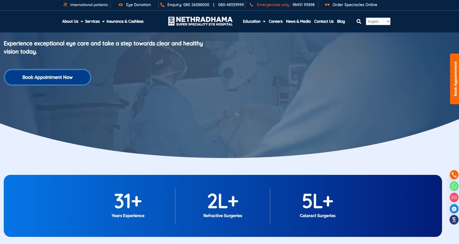
The design is simple, with clear sections for eye care services, patient resources, and contact information.
The website's top navigation bar allows visitors to easily access important pages such as “Services,” “Doctor Consultation,” and “Contact Us.”
The use of white space and a limited color palette creates a calming, distraction-free experience.
Echo's Mental Wellness self-care landing page is designed to create a calm, welcoming environment for users seeking mental health and wellness resources. The design focuses on simplicity, soothing visuals, and emotional support.
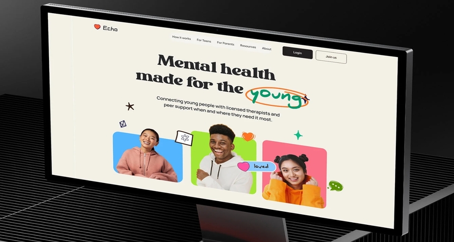
Soft, pastel colors help convey a sense of calmness and comfort, essential for a wellness-focused site.
The design is clean and uncluttered, with ample white space and simple navigation for easy user engagement.
Images of peaceful settings and wellness-related activities support the site’s wellness theme, creating an emotional connection.
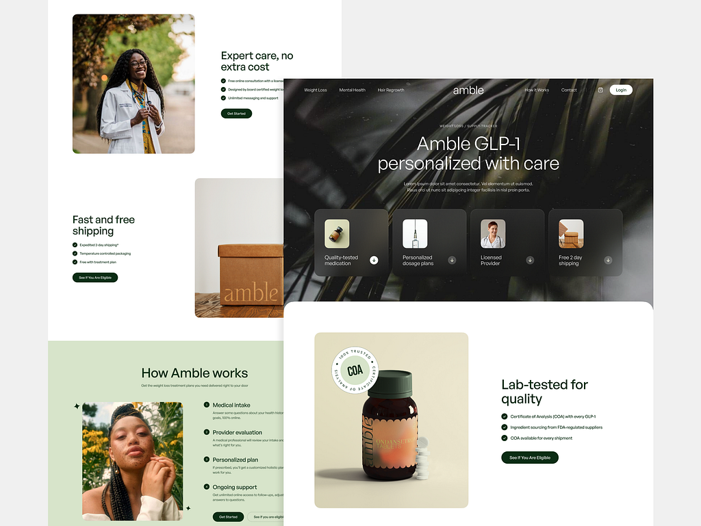
Amble healthcare website design focuses on GLP-1 weight loss treatments. The website is aimed at showcasing the benefits of treatment through a professional yet approachable design, ideal for users seeking information about weight loss options.
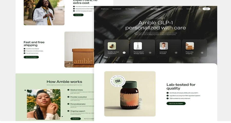
The design uses bold, clean typography and geometric shapes to communicate a sense of modernity and professionalism.
The site offers detailed explanations about the GLP-1 treatment, presented in an easy-to-digest format.
Clear and compelling calls-to-action, such as "Start Your Treatment" and "Learn More," encourage users to take action.
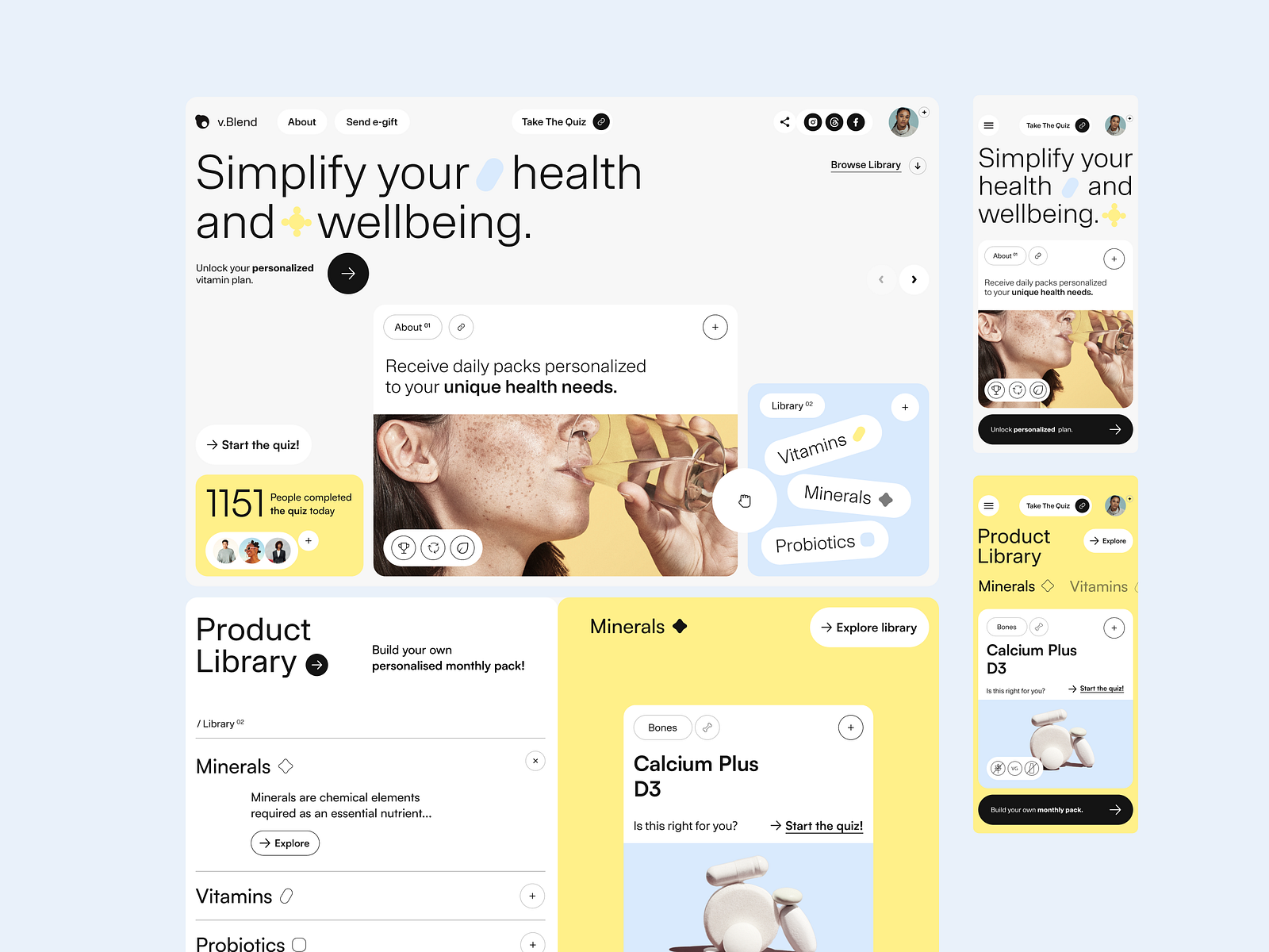
v.Blend healthcare website design emphasizes a clean, modern look with a focus on accessibility and user experience. The design aims to be informative, trustworthy, and easy to navigate, catering to users looking for healthcare services and resources.
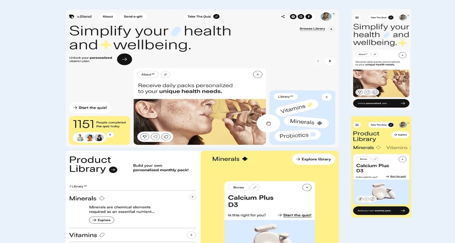
The site uses high-quality medical imagery, which helps build trust and credibility with users.
Services and resources are segmented into clearly defined sections, improving content accessibility.
The use of neutral colors helps keep the design clean and professional, focusing attention on content and navigation.
Pavitra Organic Day Spa provides a holistic approach to wellness and beauty, offering organic treatments. The website reflects this by using natural, calming visuals and a user-friendly design that appeals to users seeking relaxation and self-care services.
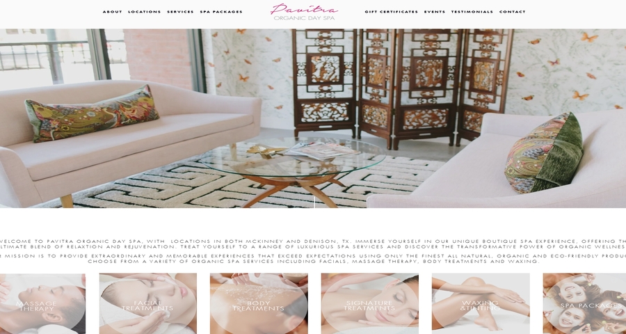
The use of earthy tones like greens and browns ties into the natural, organic offerings of the spa.
The website incorporates images of spa treatments, natural ingredients, and serene environments, reinforcing the spa's wellness theme.
A simple and clear appointment booking system is embedded, making it easy for users to schedule services directly through the website.
Memorial Healthcare System’s website is designed to be a one-stop destination for all healthcare needs, from medical services to patient resources. The site features a professional, user-friendly design aimed at providing comprehensive health-related information and resources.
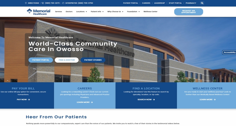
The layout is clean and straightforward, allowing users to quickly find the information they need.
Key healthcare services are prominently displayed on the homepage, making it easy for patients to navigate.
The website offers direct links to essential resources, including patient portals and bill pay options.
The straightforward layout and clear CTAs make it easy for users to find and book healthcare services.
By organizing services into clearly defined categories, the site ensures quick access to important information.
A clean, professional design reinforces trust and credibility in the healthcare services offered.
Loff Wellness offers a modern and sleek wellness service, focusing on personalized care. The website is designed to communicate innovation and healthcare expertise, using a clean and organized layout with interactive elements.
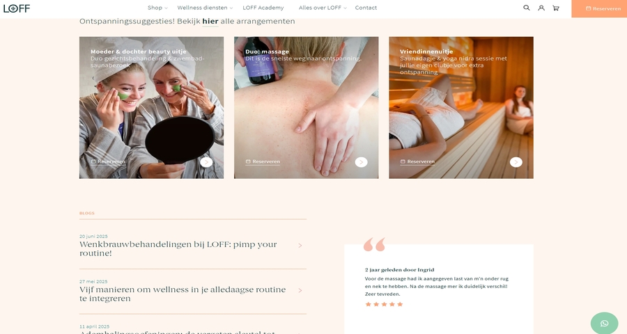
The website uses a sleek, minimal design with white space, allowing content to shine without distractions.
Service options are displayed interactively, letting users explore offerings in a dynamic way.
Bold and modern fonts help convey professionalism while maintaining an approachable tone.
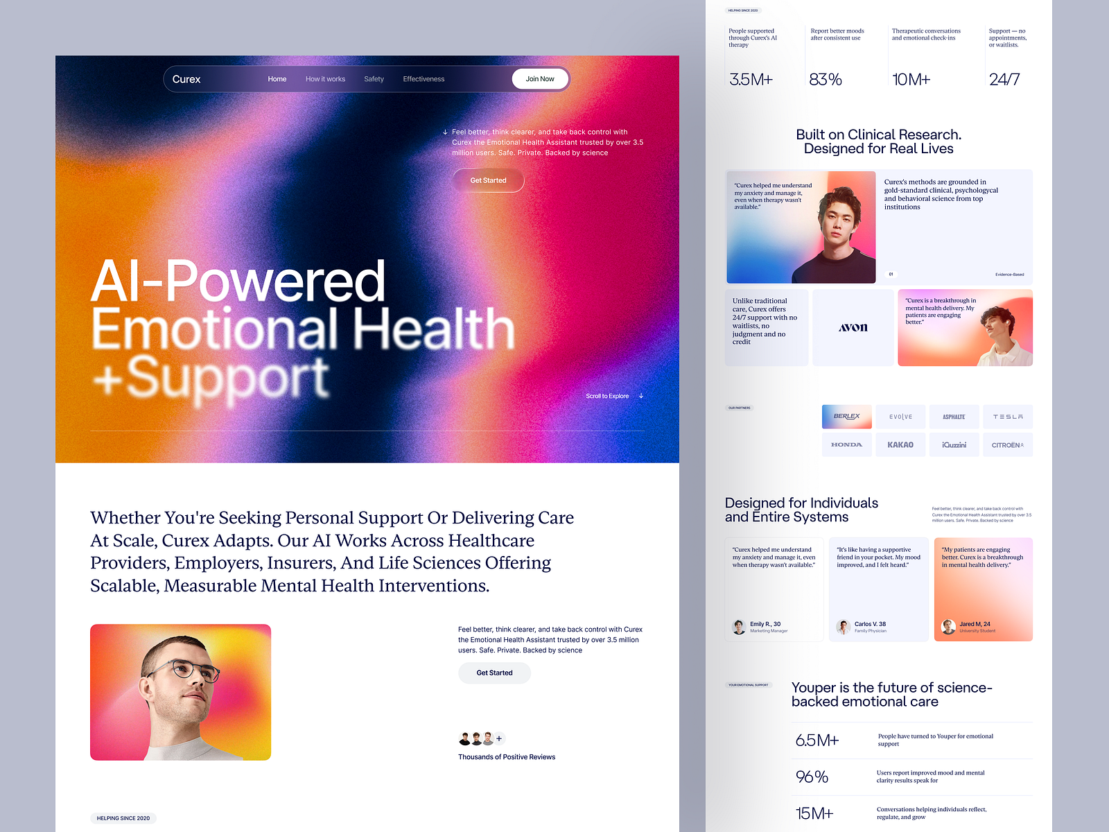
Curex AI’s website is designed for a healthcare technology platform that focuses on using artificial intelligence to improve patient care. The website has a modern, sleek design aimed at tech-savvy users interested in advanced healthcare solutions.
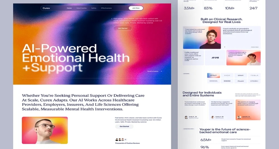
The website uses dark colors with neon accents to give it a futuristic, technology-driven look.
The design includes interactive AI-driven features, providing users with dynamic ways to engage with the platform.
Clean, organized layouts with large typography make it easy for users to focus on the content.
Colors play a crucial role in shaping the user experience on healthcare websites.
For a professional and trustworthy feel, blue is the most commonly used color, as it conveys calmness, trust, and reliability.
Additionally, green is associated with health, growth, and well-being, making it a good choice for health-focused websites.
White and soft pastels are also popular, as they create a clean and serene environment.
For a more modern look, consider neutral tones combined with vibrant accents to create visual appeal without overwhelming the user. Using tools like Mockplus helps you prototype and test various color schemes easily, ensuring that the color choices align with your brand’s values and the emotional response you want to evoke from users.
Finding the right healthcare website template is essential for saving time and ensuring you start with a solid design foundation. There are many platforms where you can find pre-designed healthcare website templates, including ThemeForest, TemplateMonster, and Mockplus, which offers templates that are fully customizable for your healthcare needs.
If you want something tailored to your specific goals, Mockplus is your ideal choice—it not only lets you easily create, prototype, and test unique templates that reflect your brand and users’ needs, but also offers a vast library of ready-to-use templates.
AI chatbots are a valuable addition to healthcare websites, benefiting both users and providers—here’s why to integrate them:
Trust is a fundamental aspect of healthcare websites, as users are seeking reliable and accurate information about their health. To build trust on your website:
To create a visually appealing and functional healthcare website, you need to use the right tools. Some of the top tools include:
Using Mockplus enables healthcare designers to create interactive prototypes and test user flows, ensuring that the website is both functional and meets the needs of patients and healthcare professionals alike.
The digital front door to healthcare is evolving. No longer a static brochure, your website is a vital touchpoint that shapes patient trust, guides decisions, and supports care at every step.
As we’ve seen, exceptional healthcare websites blend intuitive navigation, responsive design, and empathetic content—all built on a foundation of security and accessibility. Looking forward, AI-driven tools, telehealth readiness, and deeply personalized experiences will define the next generation of digital care.
To stay ahead, providers must prioritize platforms that are not just informative, but interactive and inclusive. Tools like Mockplus empower teams to prototype, test, and refine user journeys—ensuring your website delivers both visual clarity and seamless functionality.
Ultimately, great healthcare website design is a blend of art and empathy: building trust through clarity, easing anxiety through simplicity, and connecting patients to care—when and where they need it most.
 Mockplus RP
A free prototyping tool to create wireframes or interactive prototypes in minutes.
 Mockplus DT
A free UI design tool to design, animate, collaborate and handoff right in the browser.


 Sign up with Google