Users often visit a website for the content. Well, when the content is good but has a poor layout with clustered text and images, the poor layout can stand out more than the content, and sometimes, force the visitors aways. Crafting a suitable layout ensures users are engaged from the moment they first look at your website.
In this article, we'll review the top 10 website layout types that are popular among designers these days, learn their pros and cons, and see which one is the best fit for your project.
We'll also show you live examples and useful design tips, so that even a design beginner can understand and get inspiration from this.
Table of Contents
What is a website layout
Top 10 web layout types
How to pick the right layout type
Website layout design best practices
Website examples that use creative layouts
A website layout is a framework that helps organize images, text and other content on your website in a clean and neat pattern, making your entire website easy to read, scan and navigate around.
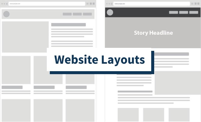
It works just like the blueprint of a website, helping you determine where to put the navigation bar, where to place the product images and introduction, where to offer a call-to-action button, and much more in advance. It gives you an overall plan of how to structure the larger details of your website interfaces.
On a well-designed website layout, the important content stands out and has a hugely important impact on user experience. The layout is essential for designers and brands wanting to increase sales and reach greater success.
Website layouts vary depending on the project themes, product features and even the designers that get involved. However, whether you are a design expert or starter, you can still learn 10 of the most popular and effective layout types:
The one-column layout is a popular website layout that presents all website elements in one single vertical column. As one of the simplest website layout types, many well-known websites and blogs are using this layout to showcase their content, like Instagram,Tumblr and Medium.
Easy and fast to design and build
When using a layout with more complicated column structures like a grid layout, designers always have to consider how to divide the content, how to balance the content and how to keep the content’s aesthetics.
However, when you work on a one-column layout, all you need to consider is how to pair the text and image to make it more accessible, intuitive and visually appealing.
As a result, designers and developers often spend less time and effort on this web layout.
Offer more space to present content
With a column that occupies almost the entire web page, this layout gives designers more space to showcase web content.
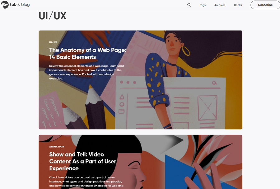
The famous website design blog - tubik blog - uses the one column layout to list all articles and offers much page space to introduce the article information. This special layout also makes users focus on only one article at a time.
Makes users focus on important content without distraction
When browsing a one-column layout website, users can only read the content shown on the current viewing area. No more distractions are around as in other websites.
Visitors may have to scroll a lot on the page
Presenting all content in one column requires long-scroll pages when you need to present a lot of content. And this may have a bad impact on user experience. So, try to design a smart navigation bar to fix this.
One Column Layout
One-column content is easy to fit to smaller screens, like mobile screens. The one-column layout is a perfect fit for designers looking to create a mobile-friendly website.
A perfect option for minimal blogs or websites with long articles
The one-column layout makes it easy to draw users' attention to the current article, image, CTA button or other important content. This is a good option to help you create minimal blogs and websites.
Create a sticky or floating nav bar for your one-column website
In case that the long-scroll pages of your website may have a bad impact on the users, you should try to design a sticky or floating nav bar so that they can easily switch to another page or page sections whenever users need.
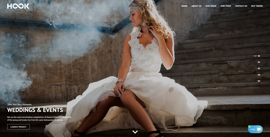
The full-screen layout indicates a visual structure presenting content upon a full-screen photo, illustration and video. This full-screen view makes it ideal for storytelling and presentation.
To fully release the charm of the photo, illustration and video in the background, designers add only the most important or enticing content to the landing page to attract users. To help users navigate around with ease, a floating navigation bar, header or banner is often paired. Some designers also use simple icon buttons to hide the navigation menus.
Drive more attention to your photos, illustrations and videos
This layout presents photos, videos, illustrations or other design works in a full screen, making it easy to attract users and keep them on the website for a longer time.
Offer great visual user experiences
The full-screen image, illustration or video with different colors and themes, improves the visual appeal of the website, and also makes it immersive for visitors to scroll all the way down to the end of the website.
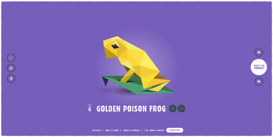
The species website uses the full-screen layout to tell stories of 30 endangered species. When users scroll the mouse wheel, the "live" animal on the screen will be broken into pieces and recreated. All these designs bring users an intriguing experience.
Not so good to showcase a large amount of content
Choosing to showcase all content on one screen makes it hard for designers to present all pages or product content at once. So, this layout is not good for lots of content.
Further operations required to see additional content
Since the website's first-level page presents limited content, to read extra content or product details, the user needs further operations, such as clicking the CTA button or expanding the sticky navigation bar.
Perfect for storytelling or presentation
With a full-screen space to showcase web content, this layout is ideal for you to list your products or design works in a storytelling or presentation pattern.
Perfect for personal, portfolio or game websites
Designers widely use this layout in personal, portfolio or game websites.
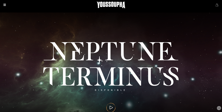
This music album website incorporates the full-screen layout to create a fancy galaxy world for the song playing in the background. The VR-like effects also make it more intriguing.
Pay attention to responsive design
Full-screen images, videos, illustrations or other content may not be so easy to fit on devices like computers and mobile devices. You should always communicate with your team to work out a scale set, so that all relevant images, videos or illustrations can be instantly adjusted in a unified size when being accessed on different devices.
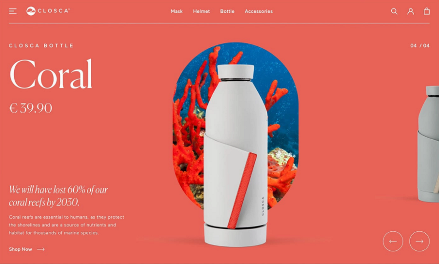
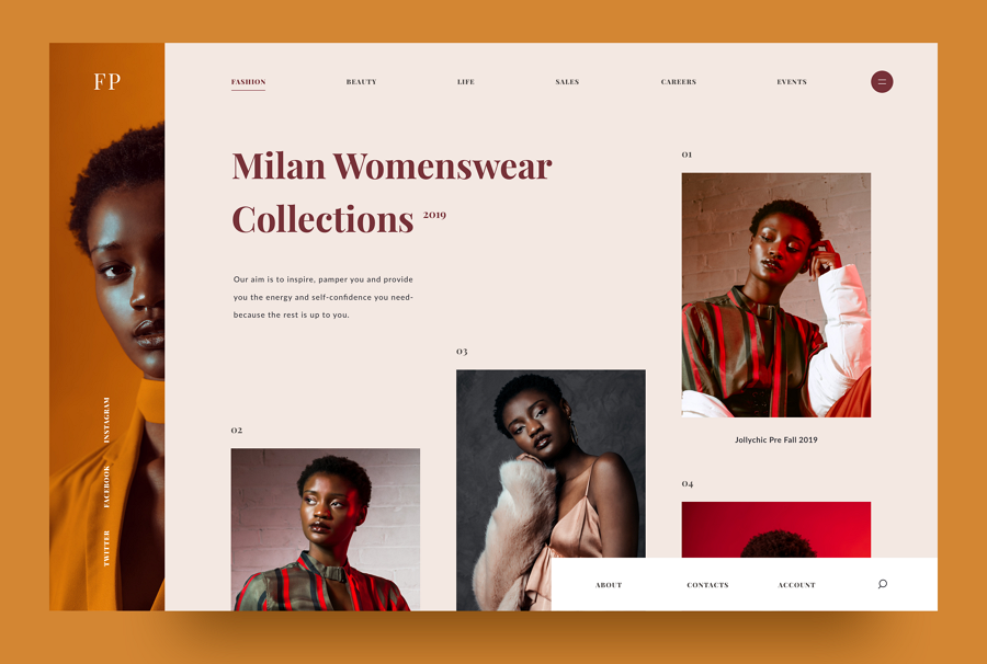
This layout features a high-quality image at one side of the webpage. The other side presents the text content about the website theme, including a bold inspiring title, a short description and an enticing CTA button).
The image in this layout is well-designed with eye-catching or interesting scenes to keep users on the site, and tries to concentrate the users' attention and interest on important content (like product or service info, or sale news) at the other side. So, this layout is perfect for delivering product information intuitively.
The image-and-text pair expresses your ideas clearly
Apart from a text description, an appropriate image can not only further explain your product or service information on the webpage, but also enhance its readability and visual appeal.
High-quality images required
To ensure the image can grasp users' attention as you imagine, an intriguing and high-quality image is required. But, that may also require a longer loading time.
A perfect fit for ecommerce or business websites
The image-and text pairs make it perfect to display the product or serve information. So, this layout is often found on ecommerce or business websites.
This carousel concept design uses the featured image layout to help introduce the product details. The combined slider also is easy for visitors to switch to the next product.
Combine an image slider or carousel to display more promotional info
To showcase far more promotional news, products or services, designers use this layout with image sliders and carousels. A distinctive sliding and carousel effect can easily distinguish the website from others.
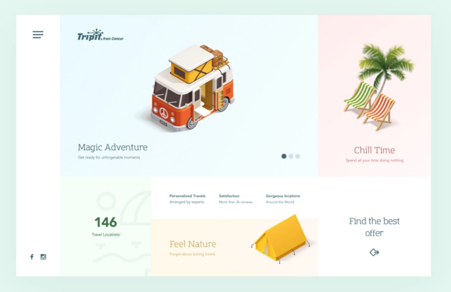
The split-screen layout refers to a layout that divides the screen of the website into two or more vertical parts, offering users multiple options and user journeys.
Most split-screen layout websites divide the home page or landing page into two even parts so that every part has got the same visual weight. Sometimes, designers try to distribute more space to one part to make that part more noticeable to users.
This layout is great for ecommerce or business websites.
Place equal attention to all options
When you need to promote multiple products or options and don't want to visually emphasize any of them, the split screen layout with even columns is perfect. Every part can get equal attention.
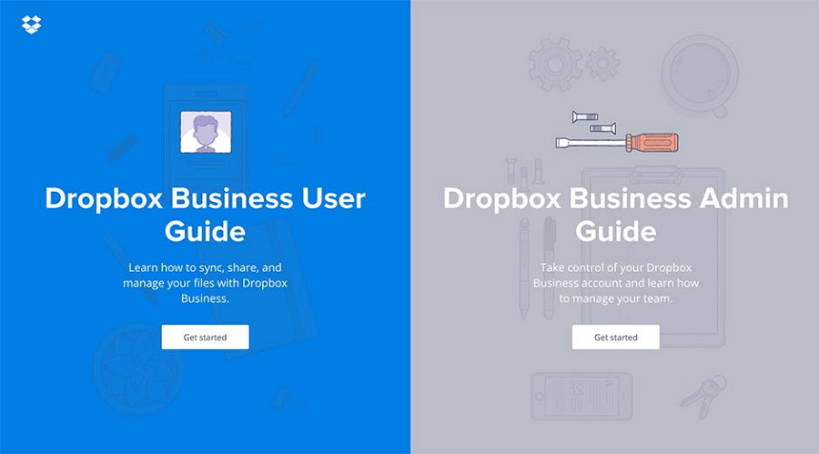
With even parts and symmetric elements, this website successfully places equal attention to both options, allowing users to select the right one based on their needs without distractions.
Serve users better
Split-screen layouts generally give users multiple options and require them to first make a decision to go into the next level page. When users select a different option, the website content they access also varies. So, split-screen is perfect for ecommerce or business websites that tend to offer different user journeys to users.
Create a strong visual contrast
Sometimes, even when the screen has been divided into two even parts, you can still create a strong visual contrast, successfully drawing users' eyes to the part that you want them to notice.
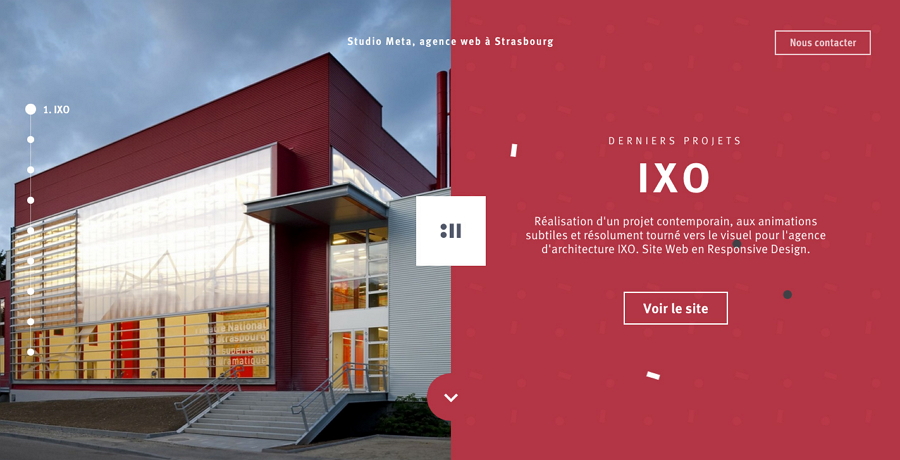
Unlike the above example that adds symmetric elements, this website places an image at one side and presents the text description and CTA button at the right side. When users find the left image is not so useful, they will naturally move their eyes to the right side.
Need more time and effort to design every part
Unlike other websites that focus on one topic or option, this layout gives users more topics and options, making it much more complicated to design.
You can try to use this layout when you want to:
Present two or more options to users
Craft different custom user journeys for the target audience
Emphasize one part of your screen
Divide the screen into more columns to offer more options
Most websites divide the screen into two parts. If you want to present more options or showcase more features, divide your screen into three or more columns based on your needs.
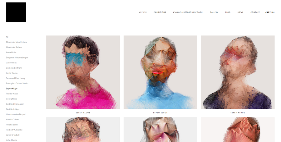
Grid layouts talk about the layout that uses grids to align and organize website elements. It firstly started with table-based layouts and can be found on most modern websites.
Many grid layout websites use symmetric grids to showcase images, texts, videos and other content, so users can easily browse and choose the one they love best.
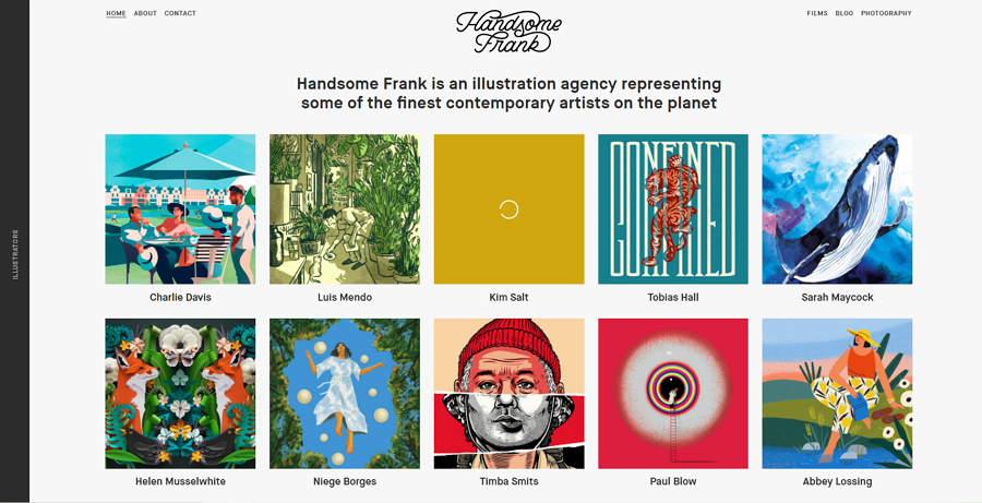
Perfect for portfolio or personal websites
Because of the clean and neat grid designs, the grid layout is well-suited to present art or design works on portfolio or personal websites.
If you are considering building a grid layout website, this UI grid layout design guide can help you learn more details.
Card layouts, as the name suggests, use card-like containers to organize website content. Popular websites like Pinterest, Dribble and Behance are typical examples that use clean and neat card layouts to show users different design works and resources.
This layout is a perfect fit when you need to present a large number of options, products and pricing plans on the webpage.
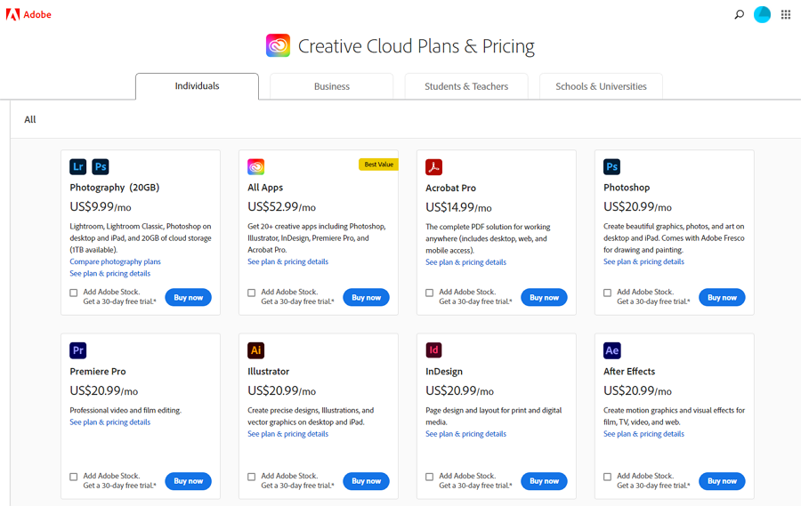
Adobe uses card layouts to list out all products in a clean and neat pattern. Each card is independent and provides detailed information about the product.
Easy to cover different content on one single page
The card layout allows designers to put content with distinctive themes or purposes on the same web page. Even the unrelated content or options can be included on one page.
Easy to give an introduction to each option
In a card layout, each card is an independent container that allows you to put all your desired information, such as the product name, a short introduction and a CTA button.
A good image can enhance the UX
To let users notice the web content, many designers add beautiful images into the cards to enhance the visual appeal.
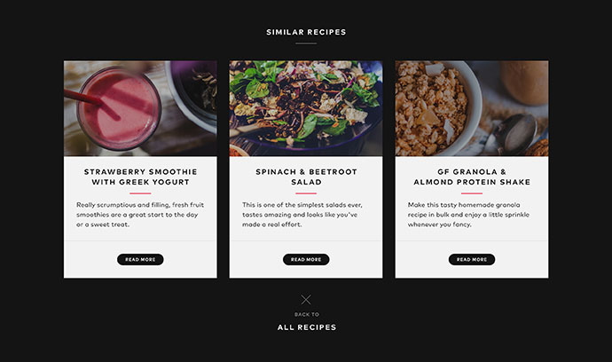
The card layout is good for content-heavy websites.
Some pricing pages also use card designs to present different options.
The single page layout arranges all visual and text content on a single page so that website visitors can instantly jump to the desired content part, such as the Home, About us, Pricing, and Contact us, through the navigation bar. There is no any loading lag issue as you may encounter on other websites.
The single page layout puts all content in one page so there will be no loading process when users switch between different page parts.
With a one-column layout, you may consider how to aesthetically and reasonably put the page content into one column. However, when you choose the single page layout, you should think about how to put all commonly-used pages into one single page.
The top navbar or sidebar helps you quickly navigate between different page content.
This website is good for websites with less content.
You can try to add impressive parallax scrolling effects to enrich the user experience.
This layout refers to a website design pattern that uses a sticky sidebar, at the left or right side, to navigate users around. The sidebar always stays at the same place, allowing users to switch to any other web pages or sections whernever they are.
This layout is ideal for designers looking to design a powerful navigation system.
Use a simplified icon sidebar
To extend the page space, some designers also use a simple icon bar to present web menus. When users hover over the icon bar, the full version sidebar slides out immediately to help users find what they need.
A simplified icon sidebar gives you more page space to present the important content.
This layout, as its name implies, is a magazine-like style layout that features using headlines and imagery to tell different stories. Designers first get inspired from print layouts and now widely use it on most online publications, like CNN news, The New York Times and Fox News.
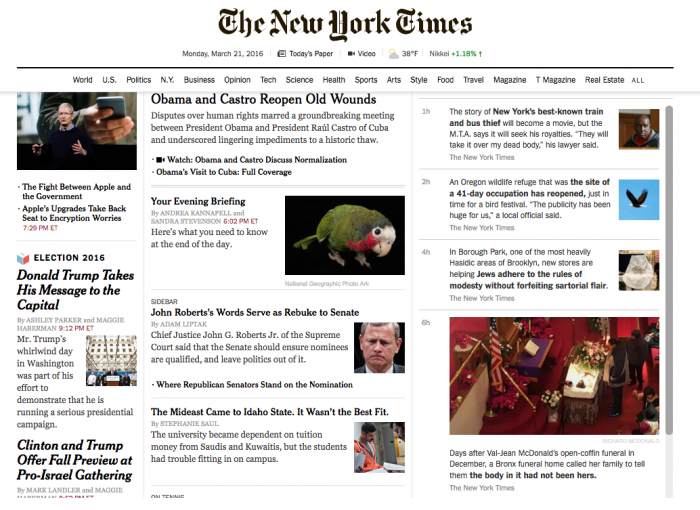
To make every story clear to users, designers incorporate uneven custom grids to align and arrange different stories on the web page. Thanks to the uneven grids, some of these stories get more attention than others..
With a large number of text stories presented on the same page, how to create an easy-to-grasp visual hierarchy has become the biggest challenge for designers wanting to use this layout.
This layout is great to build the online version of the news, magazines or other media publications. And it also works perfectly with content-heavy websites.
Center the most important content and give it more visual weight
When you have a lot of stories to display, pick out the most important one and center it on the web page. Of course, also give it the largest grid to make it more noticeable to users.
It is worth noticing that the "largest" is compared with other stories. You are not suggested to give it too large a space to break the visual balance.
Pay attention to visual hierarchy
You should not only consider how to design the headline and image of each story to make it readable and scannable, but also pay attention to the overall visual balance of the web page, ensuring all stories will not conflict or distract from each other.
Asymmetric layouts break the traditional symmetric rules and give one or more web sections a larger size to make it stand out from others. This layout has become essential for designers to create an innovative website or unique user experience, like the hottest brutalist websites.
However, as a more "personalized" or "innovative" layout, asymmetric type are not so proper for serious or strict websites, like government or educational websites.
A good option for personal or portfolio websites.
A good option for creating innovative visual experiences.
Always try to maintain the visual balance
"Asymmetric" means you have to break the common web design layout and outweigh some of the more traditional layouts. But, that does not mean you can randomly increase the size of the desired section. Increase one and decrease others. Always make all your elements visually balanced.
This website keeps the visual balance by adjusting the size and position of these presented images. The negative space also plays an important role for balance.
Of course, there are also other web design layout types. For example, according to the reading pattern of website users, there are F-shaped and Z-shaped layouts. However, all of the 10 layouts above are more than enough for most designers to cope with most website projects.
After learning the 10 popular website layout types, have you picked out the right one for your project? If not, you may try to make a decision by following this:
See what layout type your competitors have used
When you've selected several alternatives and don't know which one is the best one, you can try to check all your competitors and see what types they have used.
Browse more website examples in the same category
You can also get inspiration from other existing website examples. Easily Google similar websites over the internet and see how they cope with the layout issue.
Ask or research your audience
If the existing examples do not make sense, do some user surveys or interviews, and see what kind of web layouts they love to use.
Discuss with your teams or partners
Analyze the user research results and discuss with your teams or partners to see which layout type can meet their needs.
No matter what type you finally decide to use, you should follow several design tips:
Combine several layouts in one project
Nobody even says that you can only use one web layout in a project. In fact, to match the different design needs for different projects, designers often combine several layouts together in one project.
For example, when designing a portfolio website, you can use the grid layout or full-screen layout to showcase your design works, and use the featured image layout to explain the design work details, including relevant images, background description, design workflow introduction and more.
Prepare several backup plans
If you are not the one that makes the final decision, you should also prepare several website layout plans, so when one plan has been rejected, you do get another one.
Be brave to make a difference
Apart from the serious websites that may need a strict layout, you can just unlock your imagination and creativity to create a different and innovative layout.
Keep testing your layout with design tools
No matter which type of web layouts you've finally chosen, the best way to see whether it is workable is to fully test it with your team in advance. Use a design tool to visualize your layout and test it as if it’s the real website.
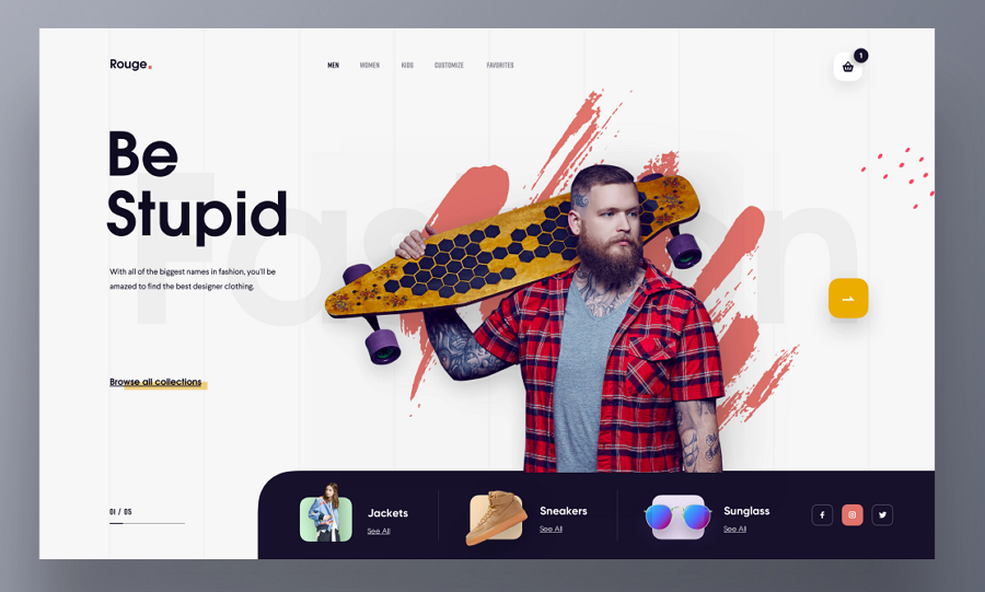
This example is a web UI exploration for a clothing store. The bottom navigation bar is worth following in your project.
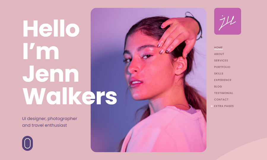
Fabius is a portfolio website template that features a fixed right sidebar. The oversized logos, images and buttons, innovative layouts, parallax scrolling and other designs give visitors a different visual experience.
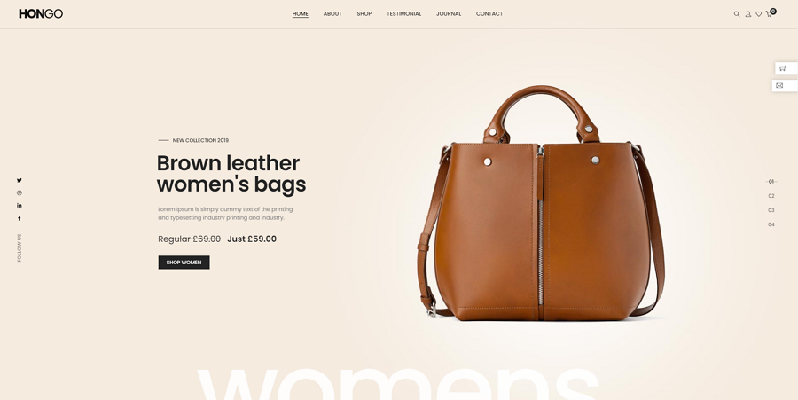
Hongo is a single page web template with a full-screen slider. It is perfect for e-commerce or business websites that need long-scroll pages to announce products and show off features.
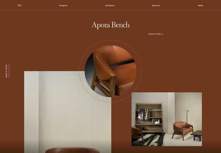
This Dribbble example explores the layout designs of a furniture website, and tries several layouts to present the furniture in one cohesive manner. A good layout design inspiration you should never miss out.
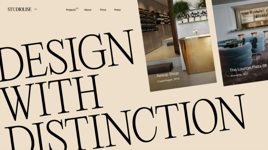
Studiolise is a layout design exploration for a design studio. Every page has a different layout and animation to present the design works.
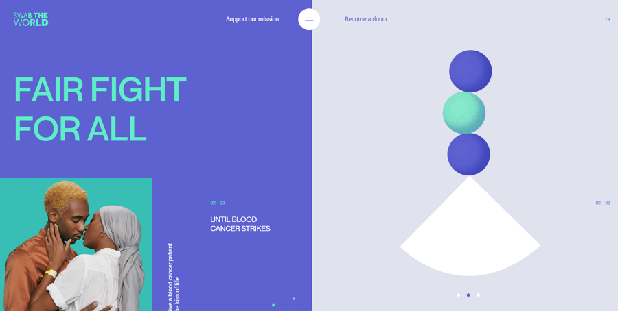
This is a creative website example that features a split-screen layout. The left side shows the website topic, and the right side has a slider with fun gifs. Scroll down this website and you will see far more impressive designs here.
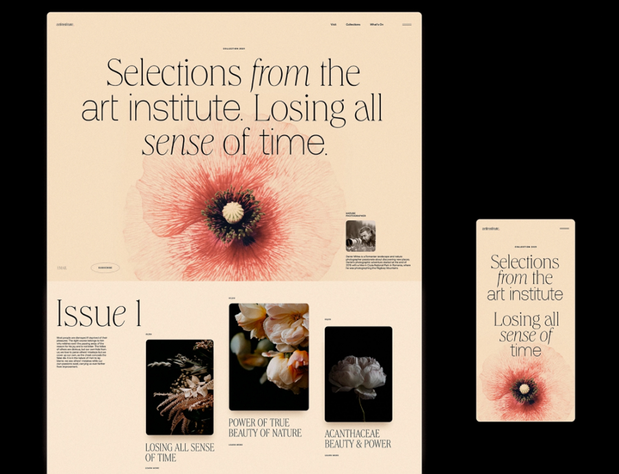
This website example is made for an Art Institute Blog. It features the balanced layout, beautiful visual content and elegant typography to let users have a distinctive experience here.
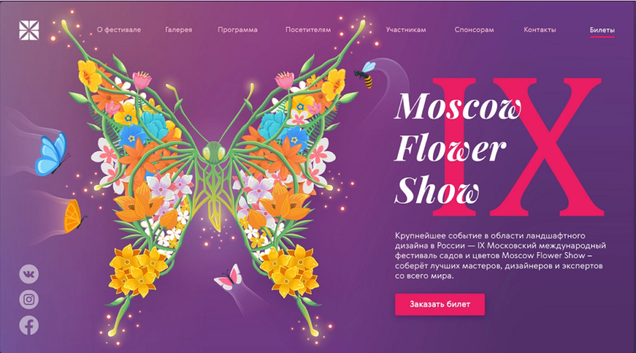
This website design concept is created for a flower show. It features a featured image layout and has crafted a beautiful and eye-catching image to catch users' attention from the first second.
This example is a landing page concept that features an unsymmetric grid layout. The colored grids help layout the web page and make the web content more accessible to users.
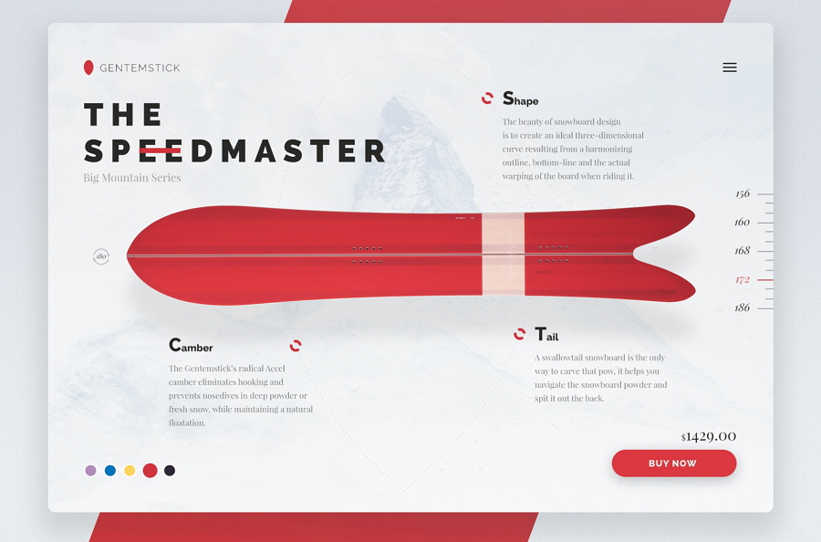
This website concept doesn’t seem to use any of the common web layouts we've learned above. It creatively customizes the layout only based on the snowboarding products, making a very unique website that grabs their target audience's attention right away.
 Mockplus RP
A free prototyping tool to create wireframes or interactive prototypes in minutes.
 Mockplus DT
A free UI design tool to design, animate, collaborate and handoff right in the browser.


 Sign up with Google
 Join our Discord community
 support@mockplusapp.com