The liquid glass effect is one of the most striking design trends of 2025. Popularized by Apple, this sleek and versatile style is making its way into websites, apps, and digital products, adding a modern, fluid touch that instantly elevates user experiences.
In this post, we’ve rounded up 20 of the best liquid glass effect design examples to spark your creativity, along with practical best practices you can follow to bring the look into your own projects. Whether you're searching for UI design inspiration or step-by-step guidance on applying this trend, you’ll find plenty of ideas here.
And if you’re ready to experiment, don’t forget to try our free design and prototyping tool to timely visualize, test and iterate your design ideas with ease.
The liquid glass effect is a popular UI design trend that creates the look of smooth, transparent, and fluid-like glass surfaces. It is different from traditional frosted glass effects because it adds:
This effect was popularized by Apple and is now widely used in modern apps, websites, and digital interfaces. Designers apply it to cards, buttons, navigation bars, and backgrounds to make interfaces look sleek, modern, and more engaging.
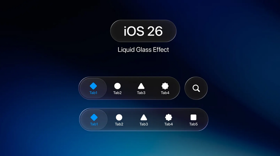
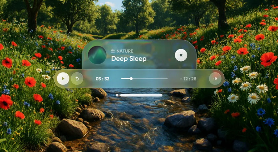
An iOS 26 liquid glass effect example
In short, the liquid glass effect helps create a futuristic, elegant style that improves readability, guides user attention, and makes UI designs stand out.
The liquid glass effect isn’t just a trendy look—it’s a smart way to make your interfaces feel modern, sleek, and alive. Here’s why it’s worth considering for your UI projects:
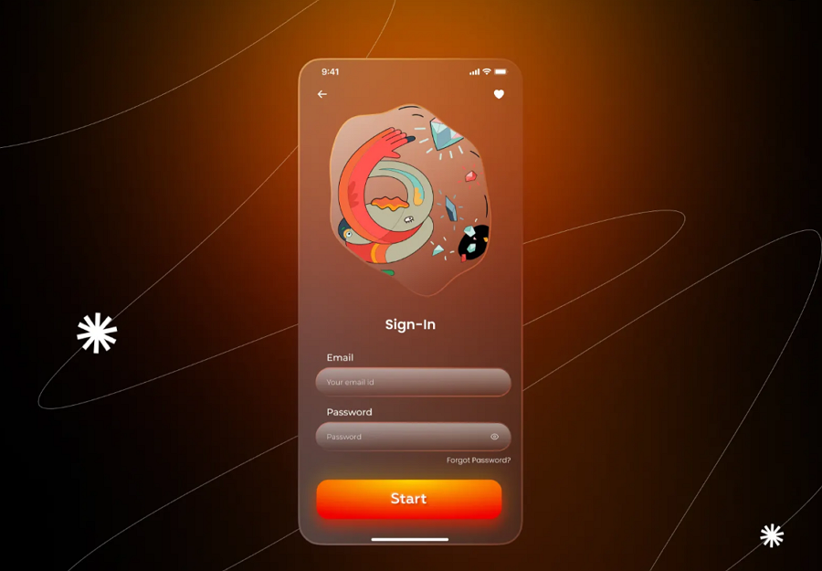
A eye-catching mobile app design concept with a stunnig liquid glass design
In one sentence, the liquid glass effect makes your UI look modern, feel interactive, and guide users naturally—while keeping designs clean and elegant— which is why many UI/UX designers use it to elevate the visual appeal of their projects.
Obviously, this effect brings many benefits, but its impact depends on where and how you use it. Here are the best scenarios to apply this effect effectively:
Well, as the minimalist design principle reminds us, “less is more.” Overusing liquid glass surfaces can overwhelm your interface, reduce readability, and lessen its elegance. Use this effect selectively, applying it only where depth, focus, or visual separation genuinely enhances the user experience.
To help you bring the liquid glass effect into your own projects, we’ve curated 20 inspiring examples from websites, apps, and digital products:
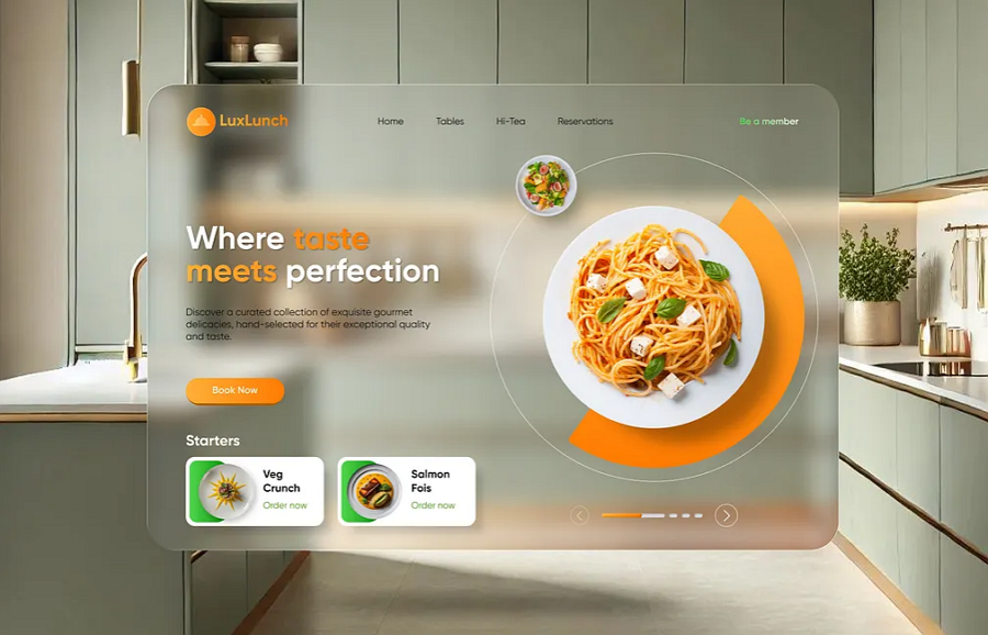
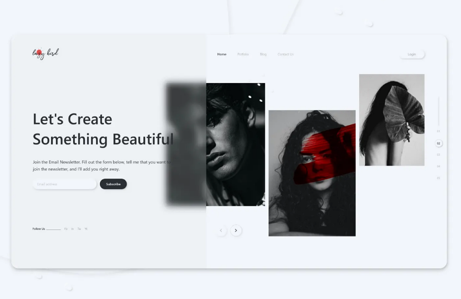
This food website design concept cleverly uses the liquid glass effect in the background, allowing all key content—including text, images, and sliders—to stand out clearly, creating a striking visual contrast.
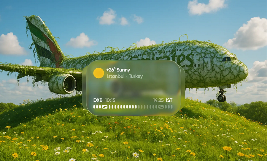
The Flight Steward design concept showcases a sophisticated application of the liquid glass effect on the audio player and calendar card widgets. By seamlessly integrating these translucent elements with the background, the design enhances visual hierarchy, draws attention to key interactive components, and improves overall user experience.
This website concept demonstrates how the liquid glass effect can be effectively applied to a modern VR-themed interface. The use of translucent diagrams, buttons, and card components not only adds a futuristic aesthetic but also enhances depth and focus—serving as a strong source of inspiration for your next project.
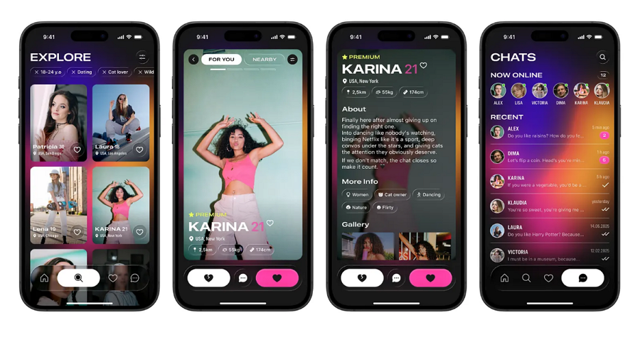
Designing a dating app and need inspiration? The liquid glass effect could be a powerful way to make your project stand out. This concept integrates glass-style buttons, toolbars, and related UI elements to evoke a futuristic vibe—perfectly aligning with music-driven and fashion-forward themes.
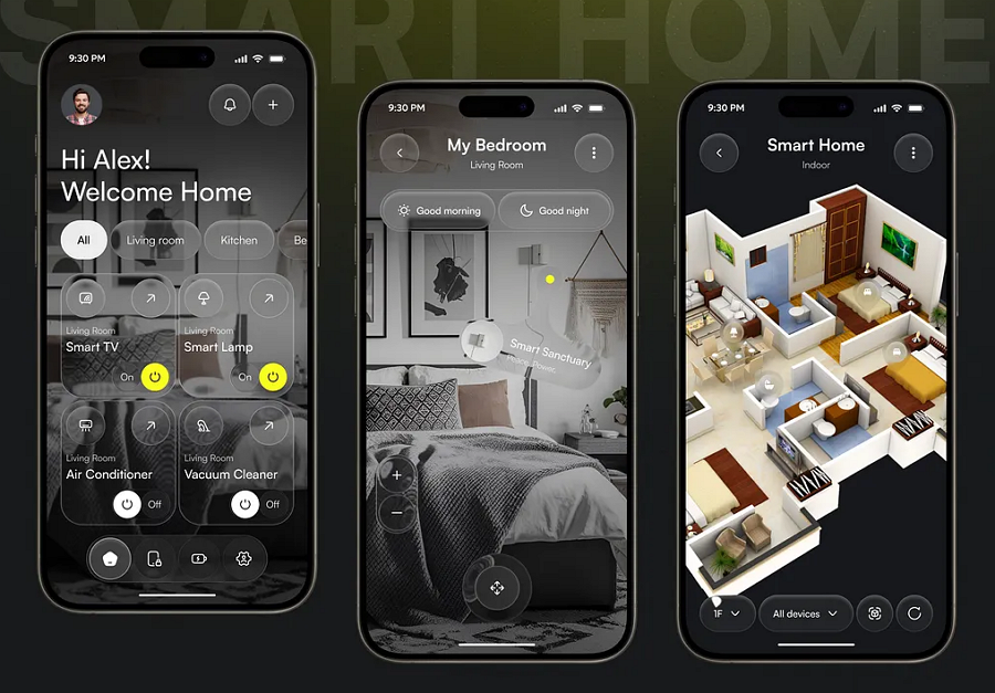
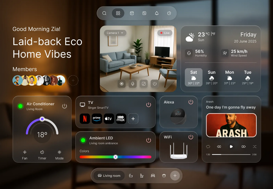
This smart home control app not only demonstrates how users can seamlessly manage their entire home from a mobile device, but also provides creative inspiration for interface designers. By applying the futuristic liquid glass effect, it shows how real estate, furniture, or rental apps can deliver a high-end, immersive user experience.
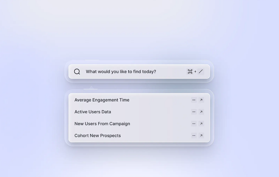
The liquid glass effect doesn’t need to dominate the entire interface—using it selectively on certain widgets can significantly elevate the overall visual appeal and contrast. This search bar concept is a great example, showing how the effect can be applied with subtlety and precision. It also opens up possibilities for integrating the effect into other interface components to achieve a more refined and modern aesthetic.
This website design demonstrates how Apple’s Liquid Glass aesthetic can be seamlessly integrated into a smart home dashboard interface. By applying the effect to various grid boxes, the design achieves a clean, structured layout with a modern, inviting feel that draws the eye and enhances usability.
Mobile apps continue to set design trends, and incorporating the liquid glass effect into mobile interfaces is quickly becoming a popular direction. This tab navigation example shows how the effect can be seamlessly applied to the navigation bar, enhancing visual appeal while maintaining clarity and usability.
This profile card design uses a translucent surface, soft edges, and background blur to create depth and a sense of lightness. The effect establishes clear contrast with the background, allowing profile content—including images and text—to stand out prominently and catch the user’s attention.
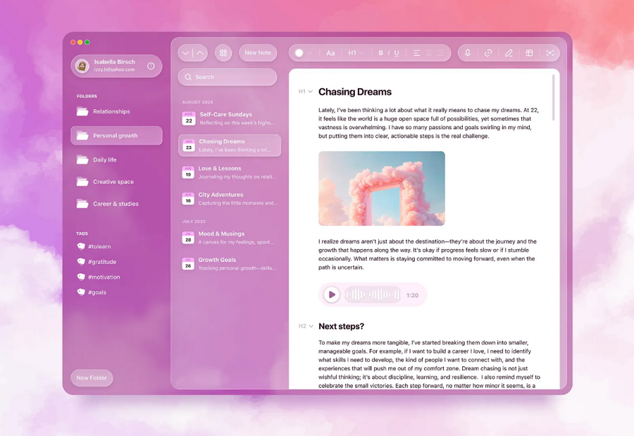
This note app design showcases a creative use of the liquid glass effect. By applying it to buttons, selection states, and toolbars, the design achieves a distinctive visual appeal that feels modern, elegant, and highly engaging.
The liquid glass effect isn’t just about transparency—it can also incorporate blur to create a frosted appearance, providing clear content separation while maintaining a futuristic vibe. This web app example applies frosted layers over background photos, effectively defining web layers and making key content stand out with clarity and elegance.
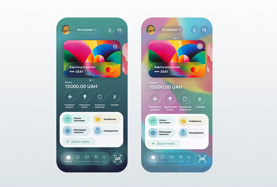
Combining the liquid glass effect with gradient tones and vibrant, candy-colored backgrounds creates rich, layered visuals that feel lively, modern, and eye-catching. This bank card app design is a great example of how to achieve that striking visual appeal using the effect.
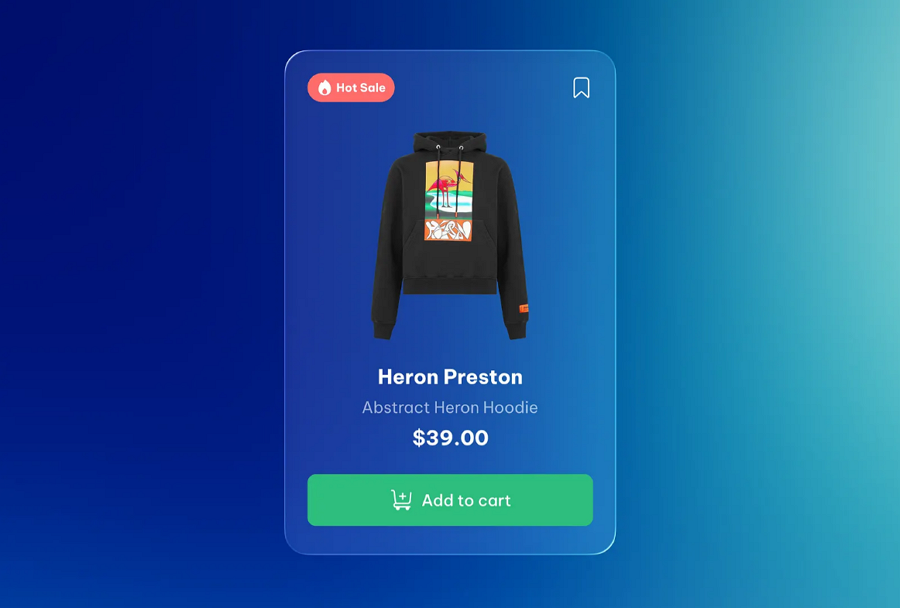
This e-commerce design concept captures users’ attention by applying the liquid glass effect to elevate its hot-sale product card. With translucent surfaces, smooth edges, and subtle layering, the card delivers a refined sense of depth and elegance.
The effect not only enhances visual appeal but also ensures product details stand out clearly against the background, making the design both stylish and highly functional for modern e-commerce interfaces.
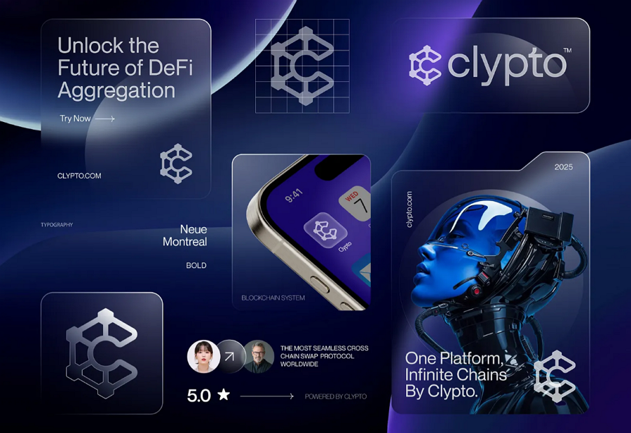
This concept also integrates the liquid glass effect into the logo design. With its translucent glow, smooth curves, and subtle depth, the logo feels modern and polished while maintaining strong brand recognition. The effect gives the logo a sleek, futuristic vibe that pairs seamlessly with the overall interface style.
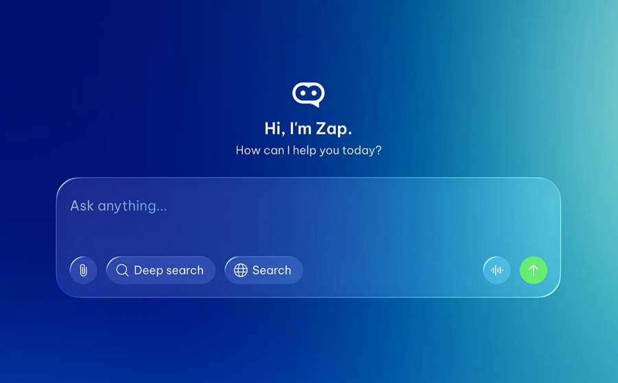
AI is reshaping nearly every industry, including IT. This AI chat design concept demonstrates how the liquid glass effect can be integrated into AI chat interfaces to create a cleaner, more modern, and visually appealing user experience.
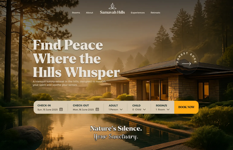
This hotel website design blends a striking vintage aesthetic with a liquid glass-style button on the homepage, guiding users seamlessly to the next step. It shows that even partial use of the liquid glass effect can make a design feel modern and engaging.
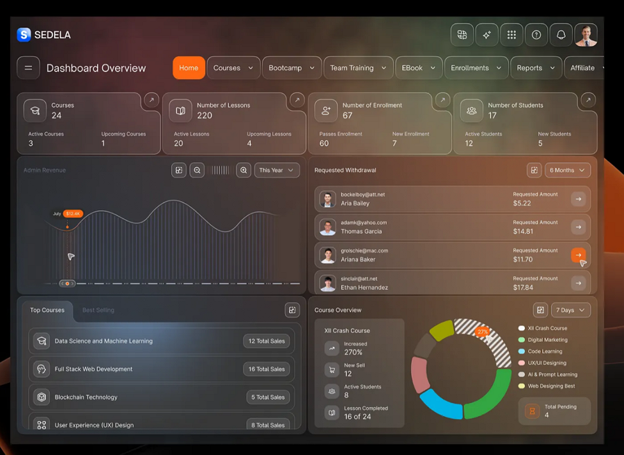
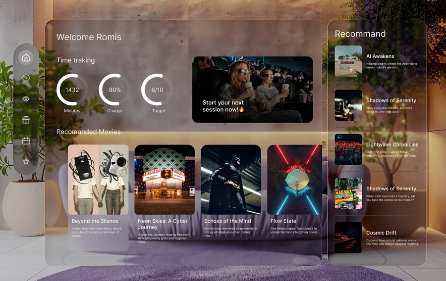
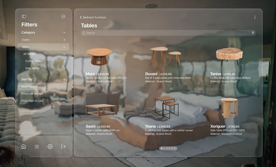
This educational dashboard design showcases a seamless use of the liquid glass style. Custom glass-style blocks and diagrams create a clean, organized layout, while subtle pops of bright color highlight key numbers and content, making important information easy to spot at a glance.
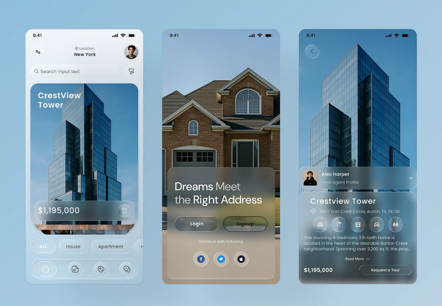
This modern real estate app stands out for its glass style visuals. Clean typography, well-structured cards, and subtle glass-like effects create a premium look and feel, while high-quality imagery ensures each listing stands out.
The design balances functionality with elegance, making it easy for users to explore, compare, and engage with properties.
This liquid glass VR website reimagines the traditional furniture site with a futuristic twist. By blending glass-style buttons and layered backgrounds with 3D furniture and objects, the design creates a sleek, immersive atmosphere where products stand out effortlessly.
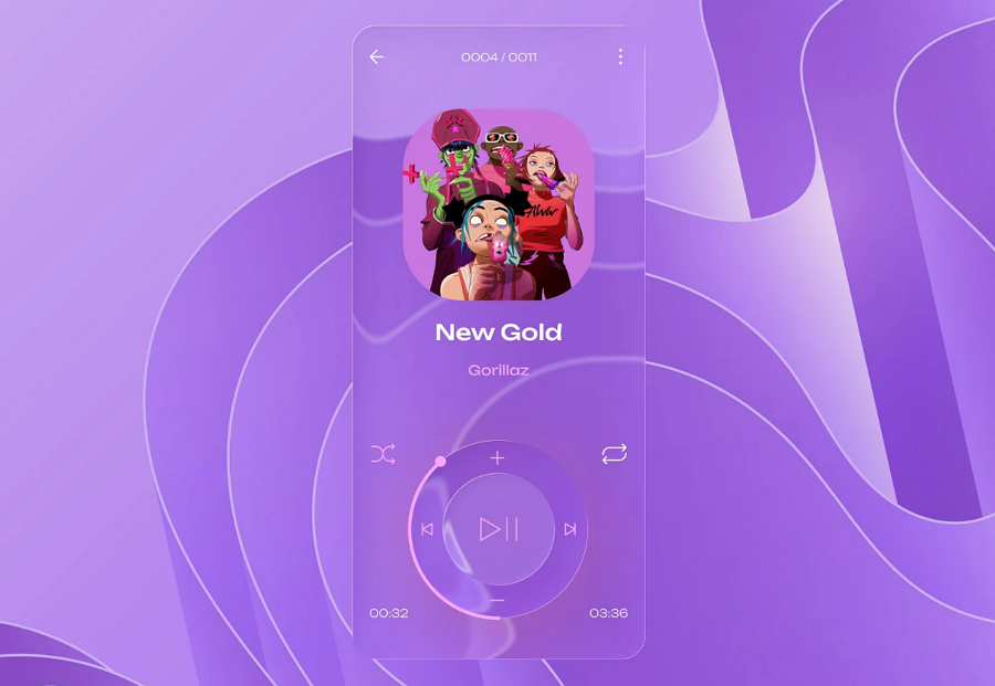
This mobile app interface design provides another example of applying the liquid glass effect to an audio player, showcasing how translucency and subtle layering can enhance both aesthetics and usability.
The liquid glass effect can make your UI look stunning, but to get the best results, it’s important to follow some practical guidelines:
1.Apply It Wisely
Use the effect only on key elements like buttons, cards, menus, or call-to-action areas. Overusing it can overwhelm the interface and dilute its impact. Think of it as a way to guide user focus, not decorate every corner.
2.Maintain Readability
The combination of blur, transparency, and subtle highlights can make text hard to read if not handled carefully. Ensure sufficient contrast between the text and background, and consider adding subtle shadows behind text or icons to improve clarity.
3.Use Depth and Layering
Layering liquid glass surfaces with soft shadows, highlights, or borders creates a sense of hierarchy. This helps users instantly recognize interactive areas, such as cards floating above the background or menus that visually separate from busy content.
4.Animate Subtly
Micro-interactions, like gentle hover effects, slight scaling, or slow background refraction, enhance the fluid feel. Avoid fast or erratic movements, which can distract or overwhelm users. Subtle motion communicates interactivity naturally.
5.Complement Your Color Palette
The liquid glass effect works best when paired with harmonious colors and gradients. Light tints, pastel overlays, or muted tones often blend beautifully with the glass surfaces. Avoid overly saturated backgrounds that compete with the effect.
6.Test Across Devices and Screen Sizes
Blur and transparency can render differently on mobile, tablet, and desktop. Make sure text remains legible, shadows consistent, and performance smooth across all platforms. Optimize filters and limit heavy animations on lower-end devices.
During this workflow, using a wireframing and prototyping tool or a UI design tool that lets you visualize, collaborate, test, and share ideas can help you and your team save significant time and effort.
7.Keep It Minimal and Purposeful
Minimalism enhances the effect. Place liquid glass surfaces where they improve visual clarity, add hierarchy, or highlight key content, rather than purely as decoration. Remember, “less is more”—strategic use amplifies elegance.
8.Observe Industry Examples
Study how Apple, and modern apps implement liquid glass. Observe how they balance blur, transparency, and layering to guide attention and enhance aesthetics. And the 20 creative examples mentioned above would help you get some clues.
1.How does liquid glass UI work?
The liquid glass effect uses a combination of transparency, blur, depth, and subtle highlights to create a smooth, glass-like surface that interacts with the background. It adds visual hierarchy, depth, and a fluid, interactive feel to user interfaces.
2.Is liquid glass effect suitable for mobile apps?
Yes. When applied thoughtfully, it works well on mobile screens to highlight key elements, separate layers, and improve visual appeal. Keep in mind that performance optimization is essential for smooth animations and readability on smaller devices.
3.How to create liquid glass effect?
You can create the effect using CSS (backdrop-filter, blur, and transparency), SVG filters (displacement maps), or design/prototyping tools like Sketch, Mockplus or Adobe XD. The key is to balance blur, transparency, and subtle highlights while maintaining legibility.
4.Can liquid glass effect improve user engagement?
Absolutely yes! By guiding user attention, adding depth, and creating a visually appealing interface, the liquid glass effect makes interactions feel more intuitive and enjoyable, which can increase engagement and conversion rates.
The liquid glass effect is more than just a visual trend—it’s a versatile design approach that adds elegance, depth, and interactivity to modern user interfaces. However, it should be used thoughtfully; overusing it can distract or confuse users. So, in this guide, we've handpicked a collection of the most inspiring liquid glass effect design examples and shared the best practices for you to get your own design ideas.
 Mockplus RP
A free prototyping tool to create wireframes or interactive prototypes in minutes.
 Mockplus DT
A free UI design tool to design, animate, collaborate and handoff right in the browser.


 Sign up with Google